(5 years and 2078 days ago)
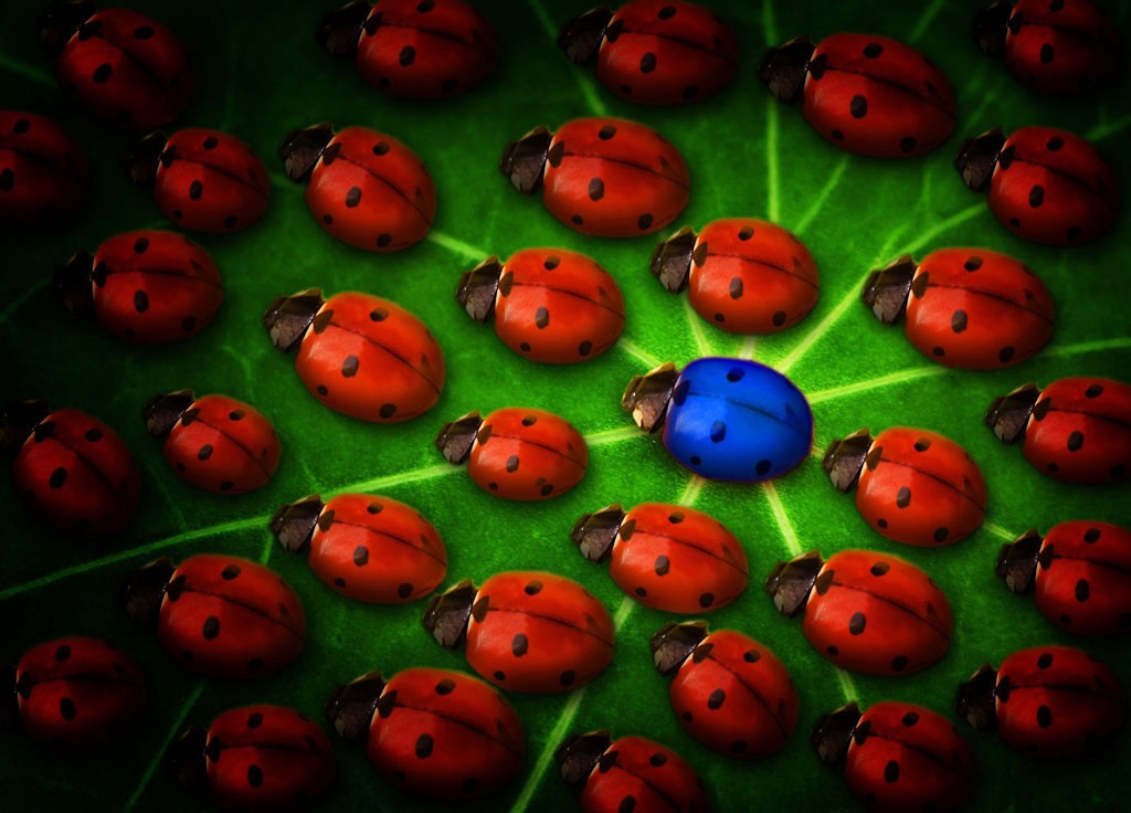
Originally I changed the spots on ladybugs, but eventually decided to leave them like they are.
Hope you like. =) (5 years and 3413 days ago)
Very nice idea, i like the difference in size and orientation. Great job!
Thanks! =)
Maybe give it more light, the vignette makes it very dark...
Nah, when I brighten it it looks to contrasted, and when I remove the vignette, it looks bad... I'll brighten it just a liiiiittle bit cause you're right about it being to dark =)
EDIT: Done. did +20 to the brightness, and it looks OK to me now. =)
Nice work! But a suggestion: instead of using a new layer filled with pure black, try to use, on this new layer, a very large soft black brush with 10% opacity, applying half of its diameter, or less, around the image border until you get satisfied with the result. You can always use the eraser tool with the same settings. It'll give you more control on your work and it'll look more natural  Good luck!
Thanks Divair! I'll make sure to try it out with this image and update it if needed. =)
Nice
Great message and nicely done. I like that you took the time to make them different sizes etc. 
Thanks. =) I also changed the spots on each one at first, but then I decided to leave them all the same, since it kinda fits the title even better. =) Tho, maybe I should've changed the spots on the blue one....? Nah, nevermind =)
Very nice idea,lighting is very good,maybe to make upper right corner a bit lighter because is closer to the central bug then lower left,and u have the same lighting on both sides...Beside that very nice final result...good luck author
Nah, I actually like the kinda 'asymetry' of the lighting compared to the blue bug.... The bug is already in the centre of attention. 
The vignette was done well and I think it puts more focus on the blue one. Well done and good luck.
Thanks. =)
Howdie stranger!
If you want to rate this picture or participate in this contest, just:
LOGIN HERE or REGISTER FOR FREE
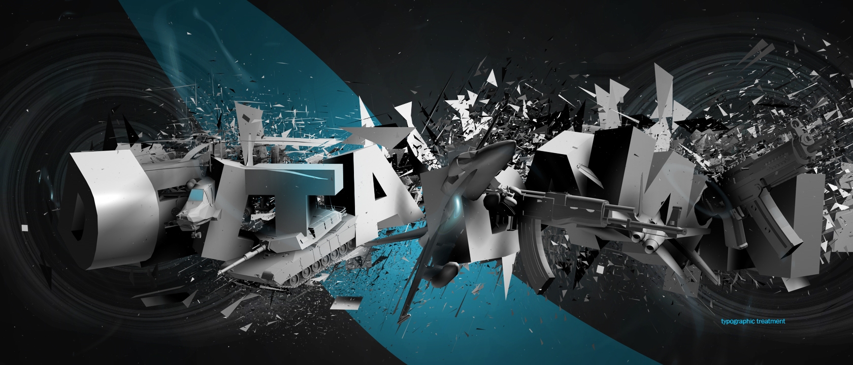
c4d+ps
the words says: delta dawn
sbs coming (5 years and 3450 days ago)
Author...although this is interesting...it looks to me that you have outside sources here...the tank, gun etc...I don't believe that those are allowed here...red flag it for the mods to check. Also...what is that lower right corner...'typographic treatment'?...hopefully this wasn't lifted from another place...
guns and tank are original 3d models. I'm gettin tired of people who question whether my work is original. I would remove this myself if you do find this anywhere on the internet other than my own profiles. the text simply says typographic treatment, I can remove that in a second.
awesome
I did not use any brushes! it's all c4d! you'll see when I post my sbs
Is it okay to collaborate C4D and PS or PS and Illustrator?! Or only PS?!
I FOUND THE ORIGINAL ITS RIGHT HERE http://www.pxleyes.com/images/contests/typography%20art/fullsize/typography%20art_4b0010af41d9f_hires.jpg Just kidding Good job.
Again, these are not added pictures, the background is pen+filters, and the text is a 3d text rendering combining some of my original 3d models
nice one!!!
This is really brilliant work well worthy of a fav, but I think the theme is text only.
sbs? did u used dynamics to blow up the letters?
Visual Candy!
I believe you, but you should still provide something in the sbs. At least 1 step. If you don't have the individual steps, can you render the tank model again(different angle), proving that these are yours. And add it as a step.
I will
if thats your sbs then i guess thats all we get lol..... would have been nice to see the individual images you have placeed within the words... I have just downloaded the program and can't figure out a thing lol.... goodluck anyway author.
i like a lot this king of works
other details: font created using illustrator paths, explosion is a built in effect. letters are saperate objects so that they can be rotated.
very very nice great job
Very good.
great work,gl author
Wow!!
great
Howdie stranger!
If you want to rate this picture or participate in this contest, just:
LOGIN HERE or REGISTER FOR FREE
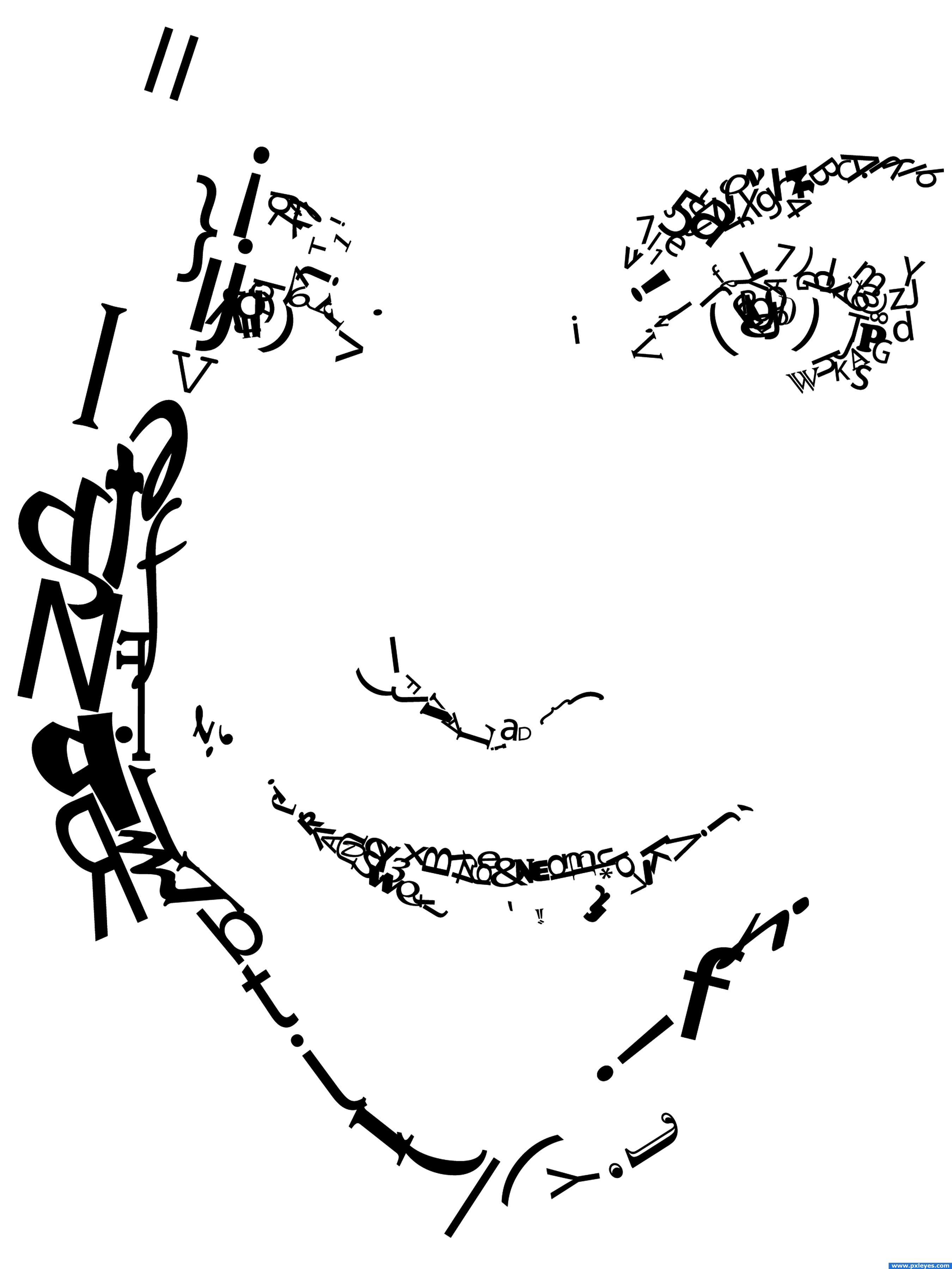
I just rotated and adjusted letters, numbers, and symbols to create a portrait. (5 years and 3452 days ago)
I am not sure that I fully understood the contest, hope this works
excellent idea
I think is on theme. It´s a very good idea, maybe you could add more details or shadows. Good luck.
Agrees with DML. But a unique entry.
seems on theme too me... it will definately stand out in this contest
i think this is a great example of "less is more" 
very creative, nice work great idea .
Nicely done...
nice design, very elegant.
very much on THEME> well created and artistic.
Great!
great job
Artistic work,Thumbs up!
Congratulations for 3rd, great job.
Congrats for your third place, Sulligirl!
congrats!
congratulations...
Howdie stranger!
If you want to rate this picture or participate in this contest, just:
LOGIN HERE or REGISTER FOR FREE
Photography and photoshop contests
We are a community of people with
a passion for photography, graphics and art in general.
Every day new photoshop
and photography contests are posted to compete in. We also have one weekly drawing contest
and one weekly 3D contest!
Participation is 100% free!
Just
register and get
started!
Good luck!
© 2015 Pxleyes.com. All rights reserved.


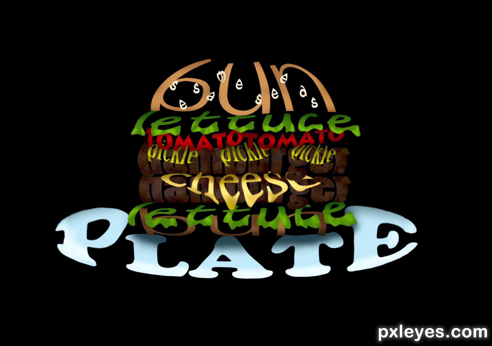
Yum!
Thanks for the votes. Oh Yeah! and the Comment!
Howdie stranger!
If you want to rate this picture or participate in this contest, just:
LOGIN HERE or REGISTER FOR FREE