
thanks to SingularStock for source 1 (5 years and 3442 days ago)
1 Source:
- 1: source1
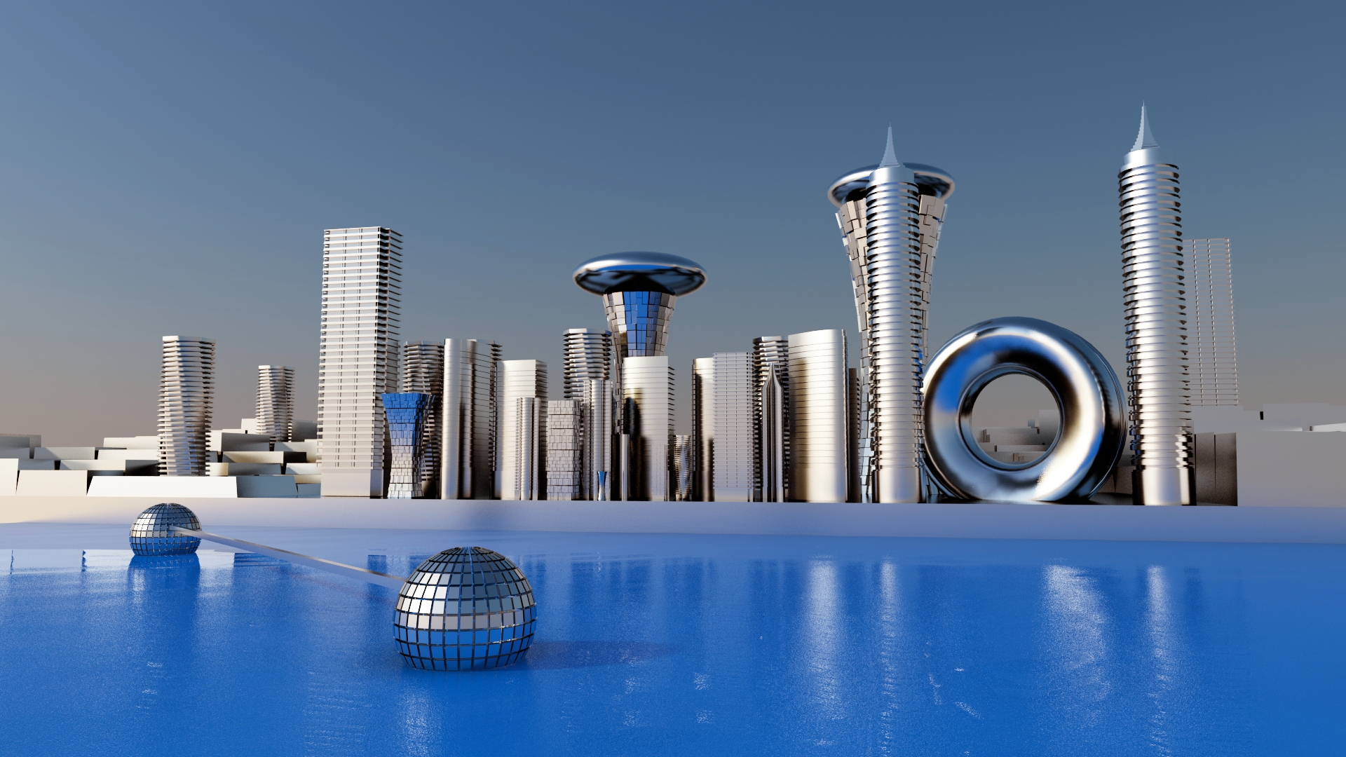
The idea is to create a cityscape in daylight mood.i rendered this with the 3ds max and vray.i have created some buildings.the creation process is explained in sbs.and used greeble modifier to create the background building and the default vray materials applied and no textures used in the scene and no reference images used.for the light source vray sun is used and a simple vray sky background.this is straight output from 3ds max and didn't use photo shop for this work.i have cleared the process in sbs. (5 years and 3442 days ago)
This image is stunning. But your reflections are a bit off. The reflection of the taller building to the left with the flat top is wrong! It has two disks! The reflections of the tall conal and cylindrical building with the point at the top are on an odd angle. So is the angle for the doughnut shaped building. But everything above the water is spectacular! See if you can fix it so I can rate it.
I liked the color and reflections in LO-Res, but not that much in HI-res.
The water looks weird - probably because it isn't flat. I also think you've ruined your nice looking buildings by cranking up the reflections way to much and using almost the same texture on all of them. You can do better than that.
Who knows, the future may be very reflective, but this one would look far better and more detailed with reasonable reflections and different textures.
Excellent image, really nicely done, i like the fact that you rely soelly on the shape of your buildings to let the viewer know that it's a futuristic cityscape.... very nice!
Wow, this is brilliant! Top 3 definitely! I just don't like that the buildings are way to shiny and reflective. I'd make them a little bit less reflective, and make the water a flat polygon with water bump/normal map and reflective, cause like this the reflection is to disorted. =) GL!
man , this is a master work , good job
thanx to downoff,dka and wlado.imade some corrections on the reflection and in the water. .
Reflections look better now. The composition of the city, however was better the last time. But anyway, high votes from me, since it's really brilliant any way you put it =)
The reflections are definitely better now! I don't remember how much different the buildings were before, but I still think that they're fantastic! High marks from me!
I love this...reflection is way better,whole mood is fabulous...gl author
great futuristic finish to your image. love the mirror balls in the water
thanks for ur comments
Nice!
very nice work machi...kalakita machi 
great work,gl
i see you have very nice and complex comments in here..so, i just have to say bravo..and you seem to be a very creative and skilled graphic designer. congrats!
Now this is futuristic - it is nice to see at least one person thinks the future does not involve the world going to cr@p
Very clean...very good
congrats
Howdie stranger!
If you want to rate this picture or participate in this contest, just:
LOGIN HERE or REGISTER FOR FREE
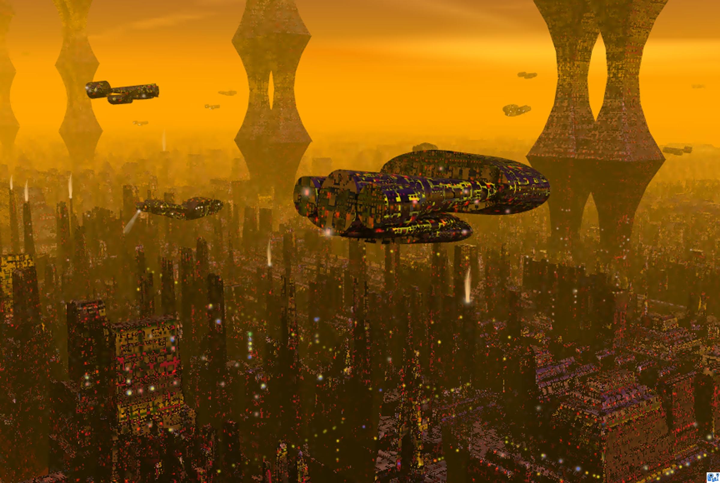
Bladerunner inspired cityscape. (5 years and 3446 days ago)
heart taken
Wow, it's really great! =D Great composition and camera angle. I'd do some alterations on the lighting, and render a better image, since this one is really blurry and too compressed. =)
great look..do upload the texturing part and light setup in sbs,
I don't understand why the same texture from the city is on the ships...
It looks interesting in LO-Res, you caught my attention, but it doesn't look very good in HI-Res. The image quality is not good enough - it's blurry, grainy and jpeg-compressed. Your 3D-software can render better than that.
The texture works on the distant buildings, but shows too much contrast on the close buildings. Especially on the closest ship.
About your SBS - it doesn't show your texturing and render settings. Anyway, this one has potential - I'll vote later.
dka120 Rendered in superfine and then, res higher in PS to 200. Maybe I should have left it, then the picture is too small, can I win?
nice work! good luck!
the high rsolution image looks blurry. post the high resolution image
love this entry. great colours wonderful veiw.
My favorite movie and good image.
Howdie stranger!
If you want to rate this picture or participate in this contest, just:
LOGIN HERE or REGISTER FOR FREE
Hope you like it :)
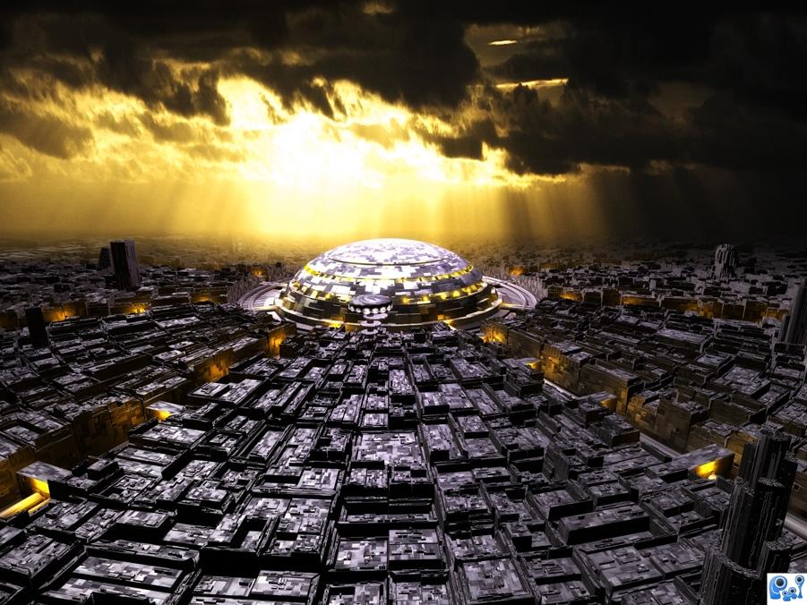
Inspired by making of 'The Hole', Making of 'The Lost City' and Piotr Jaroszek's 'Future City' whose city structure I liked the most and resembled in for my model. :)
Modeling techniques in SBS. (5 years and 3447 days ago)
Very good take on the image, The feel of the original is far less apocalyptic than yours, and i prefer the colours here
Thanks!
Fantastic! I don't think that I can make anything that can come close!
Really good image. I would say its the year 2285.Technology accelerates due to increase in population. Top 3 for sure. 
feels kinda like this: http://forcg.com/tutorials/modeling/create-an-awesome-3d-future-city-day-1/
great work,gl
yeah.. gr8 job and u have perfectly followed the procedure of the tutorial..lighting is very gud..i just want you to make it clear abt the render engine u used ,how u got thhose light rays..did u made it with the photoshop filters..sbs is lagging in material and rendering section ..and also the lighting part in the center sphere.overall itz a gr8 work..gl
good one. gl
Thanks everyone. @Lodd, yeah, as I said, I used that kinda layout for my work, cause I liked it most of the 3 I mentioned. @ramananjv - thanks I did not follow it step by step, I used some of the techniques both from it and others. As I said in the last step, the sky is one polygon (picture in source), with a gradient opacity map, from the bottom to the top, and some alterations to the gradient shade positions. Render engine.... Uhhh, I have no idea what that is. :lol: I just modeled it, set up the render resolution and rendered it. I think it's the default 3ds Max render?
Oh, and about the lighting in the center building, I just positioned free lights in the 'windows' or whatever they are. I think the picture in SBS tells enough about where they are positioned. =)
wow!! Seems real...What is the building in the centre?
nice composition
interesting
Thanks everyone! =) The building in the center.... Hmmm, I don't know, I guess it's something important that runs the whole city? 
Good job except for a few straight lines in the clouds at upper right that pull the eye there...
Thanks. The sky an image downloaded from the net, so....  Don't be so nitpicky here, this is 3D modeling, not Photoshopping =P =)
awsome.
Thanks =)
great work author
Nice work, author!
good perspective!
I do like it...awesome!
i would have been more impressed if you learnt the tutorial then made something you could call your own design. To me this is just copying someones art. Tutorials are only there to teach, not to take credit for.
Well, I don't know if I can agree or disagree with you. This is not a unique piece, but neither is the tutorial, TBH. I mean, really - A big city with circular composition with a cool building in the center... Classic. Also, as I said, I didn't follow the tut, I just liked it's design. But thanks anyway, here's a goldie thumb for you. =D
congrats
Tnx All =)
Howdie stranger!
If you want to rate this picture or participate in this contest, just:
LOGIN HERE or REGISTER FOR FREE
Photography and photoshop contests
We are a community of people with
a passion for photography, graphics and art in general.
Every day new photoshop
and photography contests are posted to compete in. We also have one weekly drawing contest
and one weekly 3D contest!
Participation is 100% free!
Just
register and get
started!
Good luck!
© 2015 Pxleyes.com. All rights reserved.


Hmmm, looks much better now! =)
very very cool! thumbs up!
Looks good
Interesting use of color here!
nice image,gl
nice shapes, nice colors...well, nice one!
good wrk author... but all the building looks next to each other... i wud have given sme depth, either by blurring the far off buildings or making it small compared to ones in front.... or by giving less details to building at back... gl autor..
Nice work
Good job, interesting shapes and a very grungy atmosphere. Good luck!
I like the domes.
Howdie stranger!
If you want to rate this picture or participate in this contest, just:
LOGIN HERE or REGISTER FOR FREE