(5 years and 3288 days ago)
3 Sources:
- 1: factory photo
- 2: smoke brush
- 3: rust texture
Chop  by mircea 11471 views - final score: 72% | Steam  by mircea 9218 views - final score: 66.7% | The corner of 'emo'  by HexaNode 13357 views - final score: 65.2% |
Skyscraper 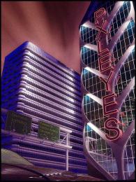 by Bitmap 10287 views - final score: 64.7% | Fish 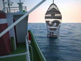 by enblanco 10068 views - final score: 64.5% | Green your Life  by Sandysanju 12425 views - final score: 64% |
Home is where...  by robvdn 12160 views - final score: 63.9% | The Violin 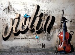 by genuine2009 8775 views - final score: 63% | Pxleyes  by Bitmap 6551 views - final score: 62.3% |
Typo 3D 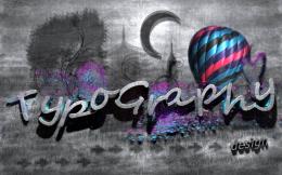 by genuine2009 6215 views - final score: 61.4% | wired~!  by HexaNode 6059 views - final score: 60.6% | Red Dawn 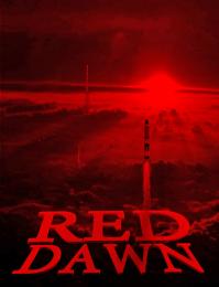 by lchappell 6603 views - final score: 59.8% |
Not Scared  by lchappell 8672 views - final score: 58.6% | Contemplata Aliis Tradere  by lchappell 6473 views - final score: 58.6% | Dead Man Clud  by Sandysanju 7766 views - final score: 58.4% |
Downtown  by enblanco 4727 views - final score: 57.6% | fencing 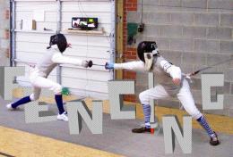 by happyme27 4791 views - final score: 56.3% | Just Another Brick In The Wall  by sodoff 13492 views - final score: 54.4% |
nICE  by enblanco 4601 views - final score: 52.8% |
Howdie Guest!
You need to be logged in to rate this entry and participate in the contests!
LOGIN HERE or REGISTER FOR FREE
Photography and photoshop contests
We are a community of people with
a passion for photography, graphics and art in general.
Every day new photoshop
and photography contests are posted to compete in. We also have one weekly drawing contest
and one weekly 3D contest!
Participation is 100% free!
Just
register and get
started!
Good luck!
© 2015 Pxleyes.com. All rights reserved.


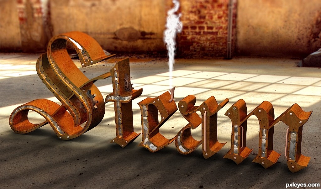
Great ambient, very nice composition, GL!
I think you should check your shadows. The light from the window in particular.
No difference in the high res.There are shadows cast by the Muntins in the window. These are not showing on your text model.
You know, I love a good steampunk anything - but by using an external image for your light source instead of the lighting abilities of a 3D program, you have negated the correctness of the shadows. Even close to the edge, some of the shadows SHOULD be falling across the letters. AND, you can see this all the better in hi-res. As much trouble as I have had learning shadows, even I can tell that this is way off.
Really nice work...But the surrounding picture & the text lightening is not matching at all.
I love how you made the letters, with the cutouts in the side and the gears in there, however, IMHO, the gears should be brass, or in this case, old tarnished brass, not silver (look up brass goggles, steampunk, etc.). Also, the 'steam' coming out of the pipe looks too heavy for real steam, try lightening it a bit, and maybe lenghening it also.

Author you still have time, may I suggest that you create your own window to mimic the one in the image - and to take its place - and then put the light through that one - let the program make it right. There are still incorrect shadows right under the letters, and none crossing over them.There's one spot where it's very obvious they should be crossing over.
This has real potential with some tweaks.
http://www.pxleyes.com/forum/viewtopic.php?f=4&t=3702&p=46683#p46683


Howdie stranger!
If you want to rate this picture or participate in this contest, just:
LOGIN HERE or REGISTER FOR FREE