:)
It's not properly a brand new stuff, but... (5 years and 3777 days ago)
2 Sources:
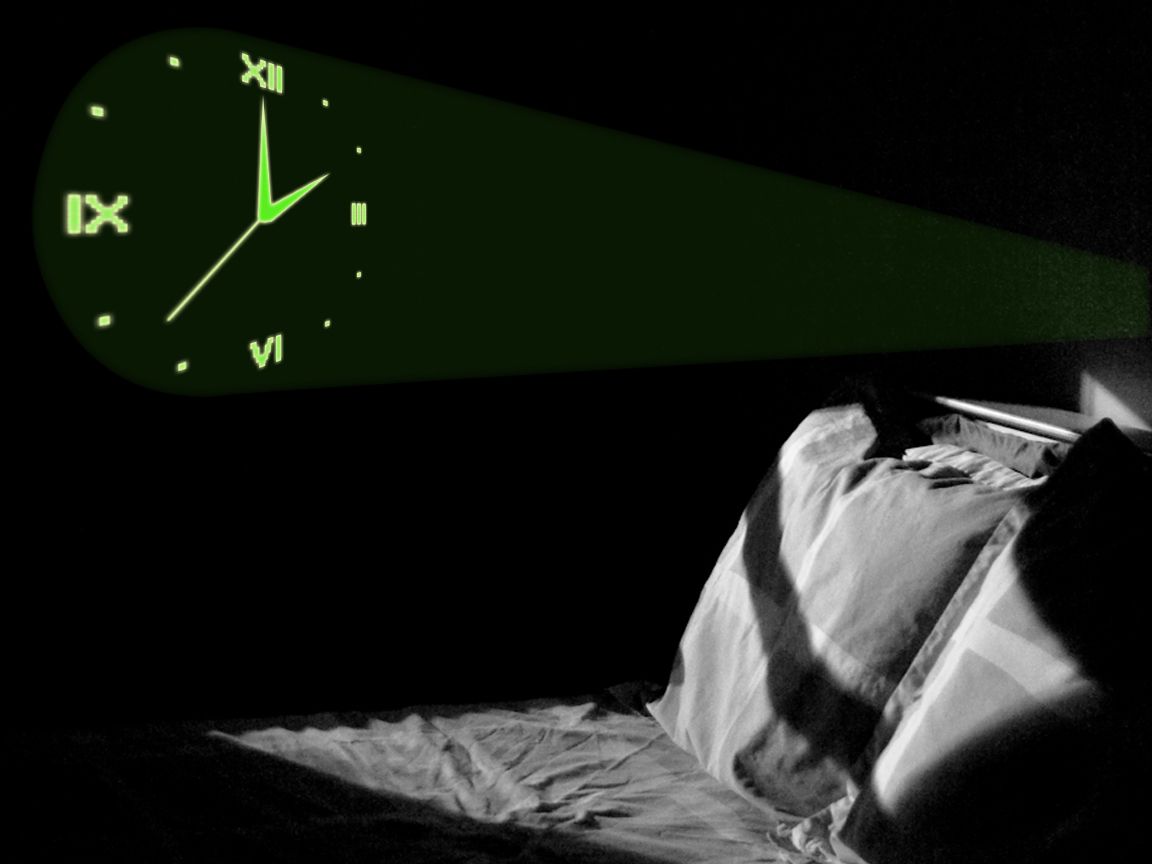
Authors of source images: AS Les Volcans-Niger, nightrose, funcrunch, Julian Berry (see source URL) (5 years and 3818 days ago)
nice idea
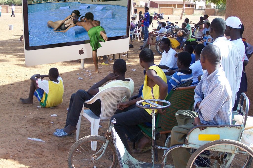
wow. when did africa afford THAT huge mac? .. lol look at their seets. theyr not so luxorious :P ,, N
very nice idea, 
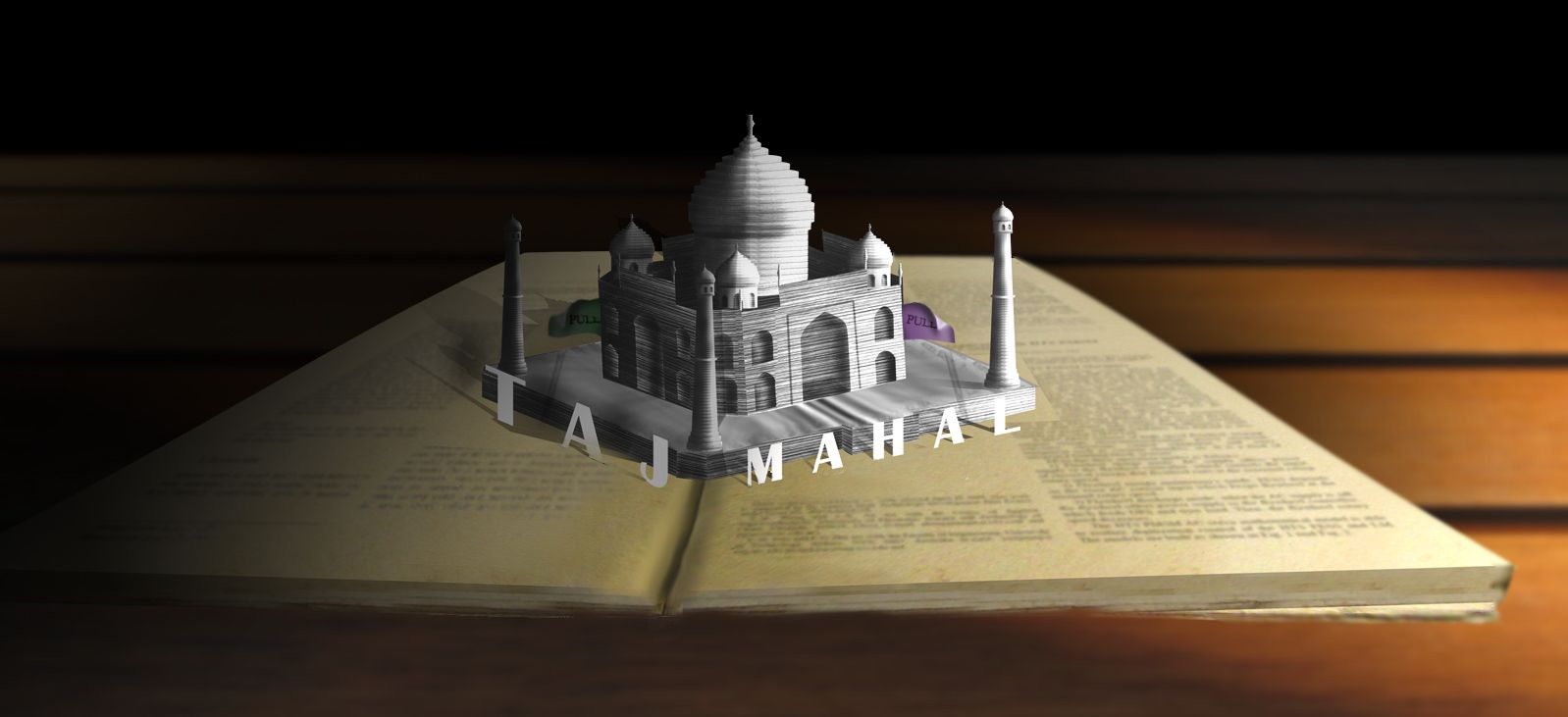
Excellent idea, thou the blending to the screen could be locateda bit better. Also the screen perspective is a little off.. but _very good_ idea, I like it..
Great idea.....only the screen perspective is a problem....Great creativity...
lol...
nice one! that's an art man..
Howdie stranger!
If you want to rate this picture or participate in this contest, just:
LOGIN HERE or REGISTER FOR FREE
(5 years and 3826 days ago)
IMO...your letters stand out a little too much, and the shadows aren't connected in some areas, and some have none at all. I don't see how they would pop up when the book is opened, but the actual building is well put together, and makes sense. I think you could have spent some time on the pages of the book because the two don't work together... and you thought about the pull tabs even if they are a little flimsy... on the whole though a very good effort GL
off theme, just looks like a building plonked on top of a giant book LOL
that's just because it's the only element... and doesn't blend well with the pages... that's why it looks so 'plonked' (lol)
its to copy/paste and should be blended way better...but i like the idea
nice idea , good luck.
Thank you for source images: (1) book & (2)table------ nkzs
Sorry, I agree with barnacle. This isn't a pop up book.
Howdie stranger!
If you want to rate this picture or participate in this contest, just:
LOGIN HERE or REGISTER FOR FREE
Photography and photoshop contests
We are a community of people with
a passion for photography, graphics and art in general.
Every day new photoshop
and photography contests are posted to compete in. We also have one weekly drawing contest
and one weekly 3D contest!
Participation is 100% free!
Just
register and get
started!
Good luck!
© 2015 Pxleyes.com. All rights reserved.


Howdie stranger!
If you want to rate this picture or participate in this contest, just:
LOGIN HERE or REGISTER FOR FREE