(5 years and 2382 days ago)
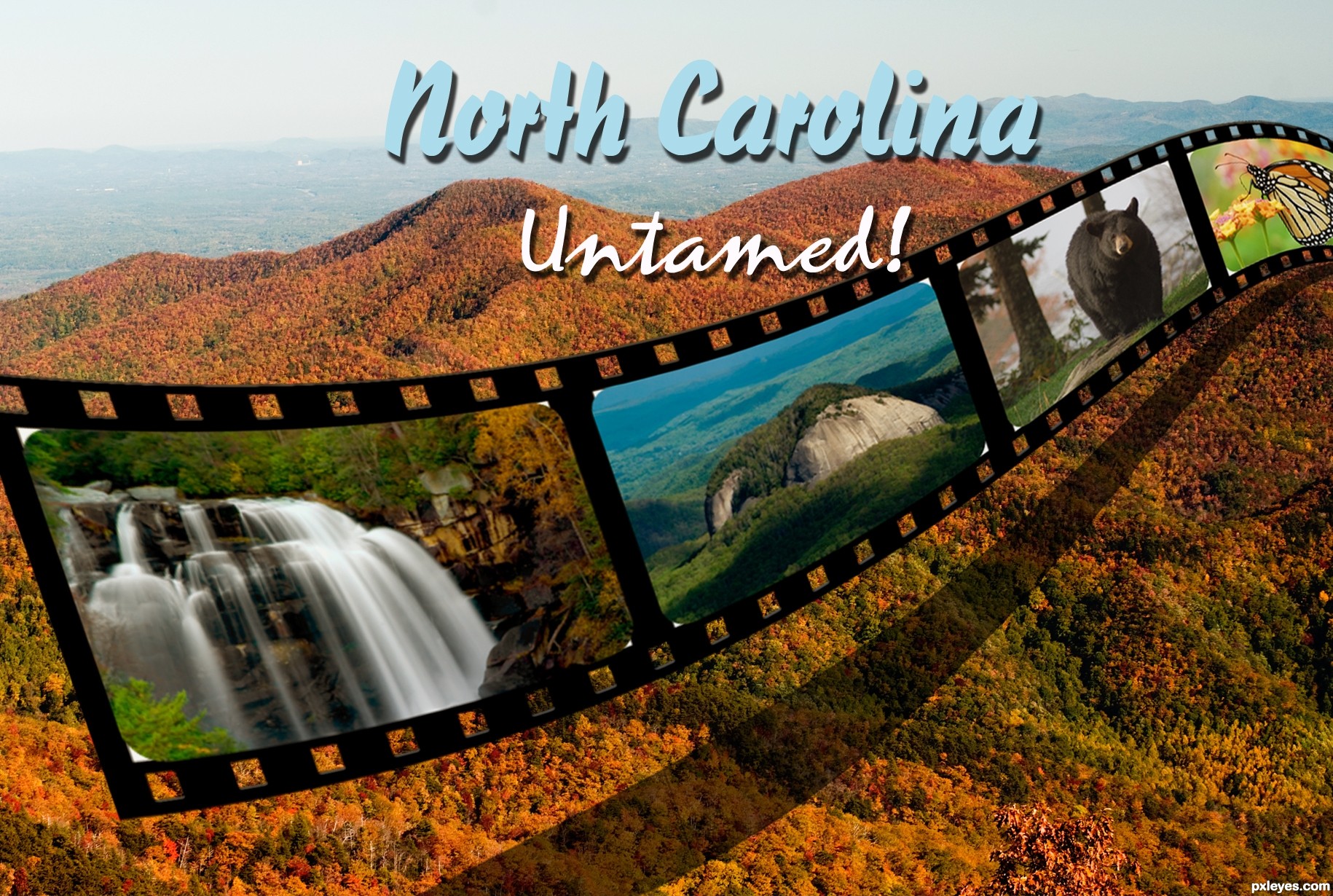
this is a bit improved from my first upload. here I used the beveled layer effect on the filmstrip to give it more of a 3d feel.
used the filmstrip tutorial found on photoshop roadmap (5 years and 2424 days ago)
Howdie stranger!
If you want to rate this picture or participate in this contest, just:
LOGIN HERE or REGISTER FOR FREE
(5 years and 3594 days ago)
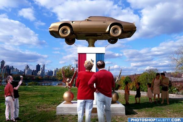
very cute Idea.. I think the two people in the front of the piece is enough, but I do like that fact that you decided to play with the shadow and light sources.. good luck on this...it will make a GREAT teaching piece.. good hard work here
nice idea
good work. nicely placed the people.
Thw two people in front match the light source very well. The guys on the left don't work as well. They are in partial shade, but a little of that direct light would filter through to them. Additionally, their light source comes from the right & they should be closer to the size of the two people in the front. I'm not sure about the ones to the right. I don't want to sound negative here because you did a GREAT job on the two in the foreground, as they fit, IMO, perfectly.
Edit: The light on the guys looks better.
Thanks for the comments and suggestions everyone, I have worked on the shadows on the guys on the left, hope the looks better, cheers.
nice image but the shadow under the trophy is a little funky
Not sure all people are the same size, still great job!
Nice idea. Love the couple directly in front! The disinterest of the small kids works too. Perfect!
you did very well
Howdie stranger!
If you want to rate this picture or participate in this contest, just:
LOGIN HERE or REGISTER FOR FREE
Photography and photoshop contests
We are a community of people with
a passion for photography, graphics and art in general.
Every day new photoshop
and photography contests are posted to compete in. We also have one weekly drawing contest
and one weekly 3D contest!
Participation is 100% free!
Just
register and get
started!
Good luck!
© 2015 Pxleyes.com. All rights reserved.


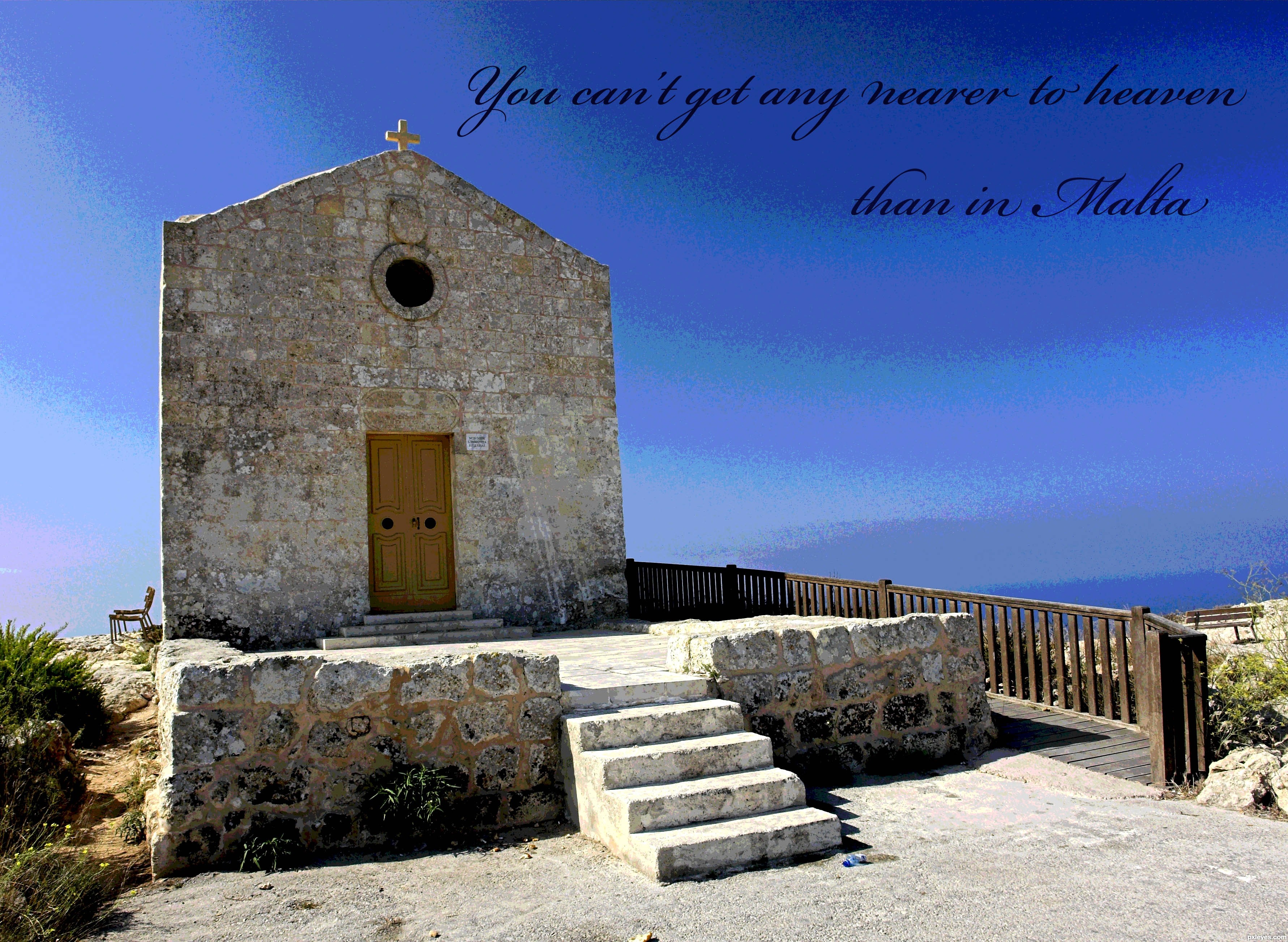
The posterized sky is a very cool touch. With all the empty space in the northeast quadrant, I don't see the need for the text to encroach on the cross atop the church. Making "Malta" bigger or a different font might be more 'postcardier.'
Text should be larger and white against a dark background. Not a very exciting font anyway.
Howdie stranger!
If you want to rate this picture or participate in this contest, just:
LOGIN HERE or REGISTER FOR FREE