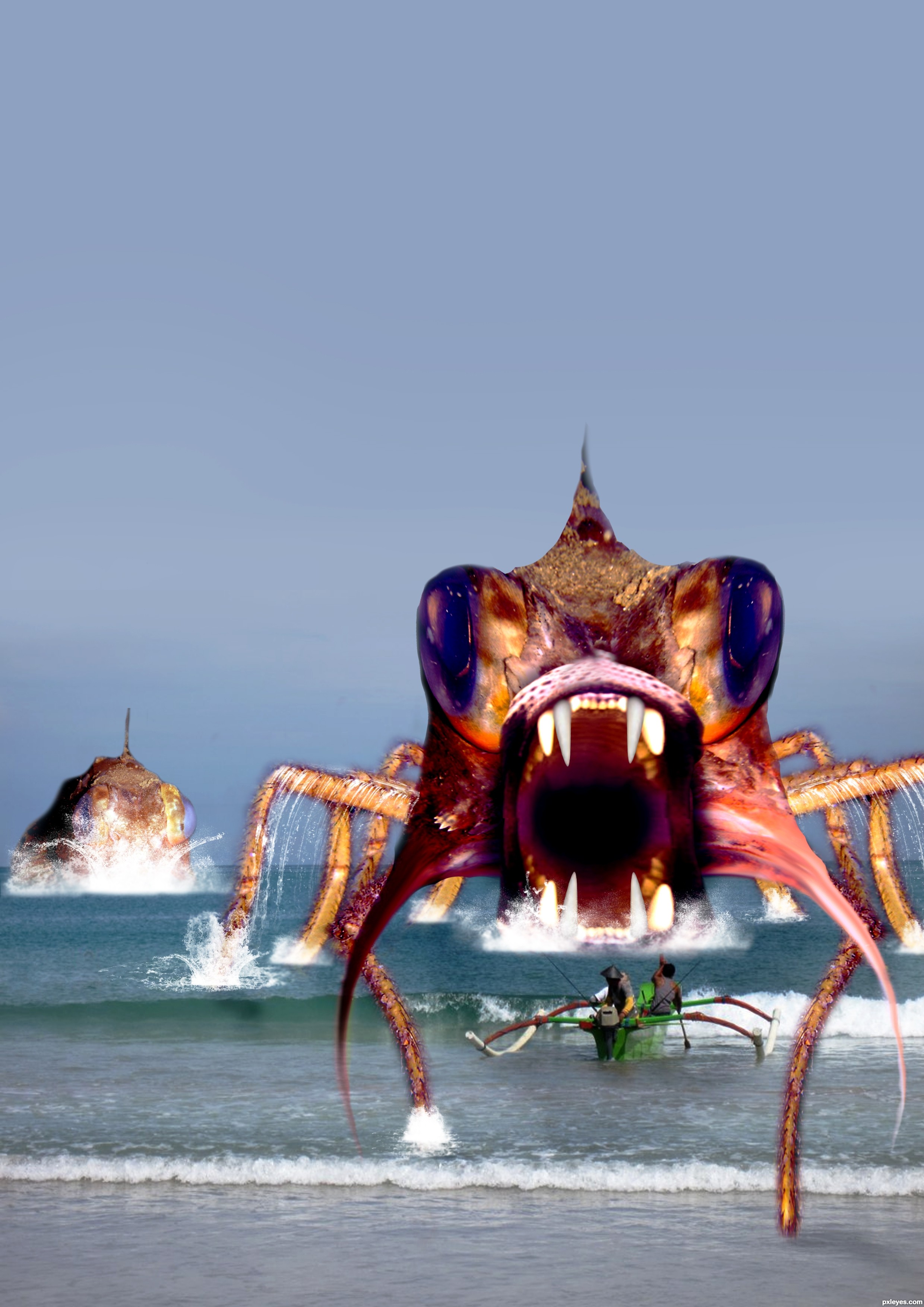
(5 years and 2883 days ago)
(5 years and 2903 days ago)
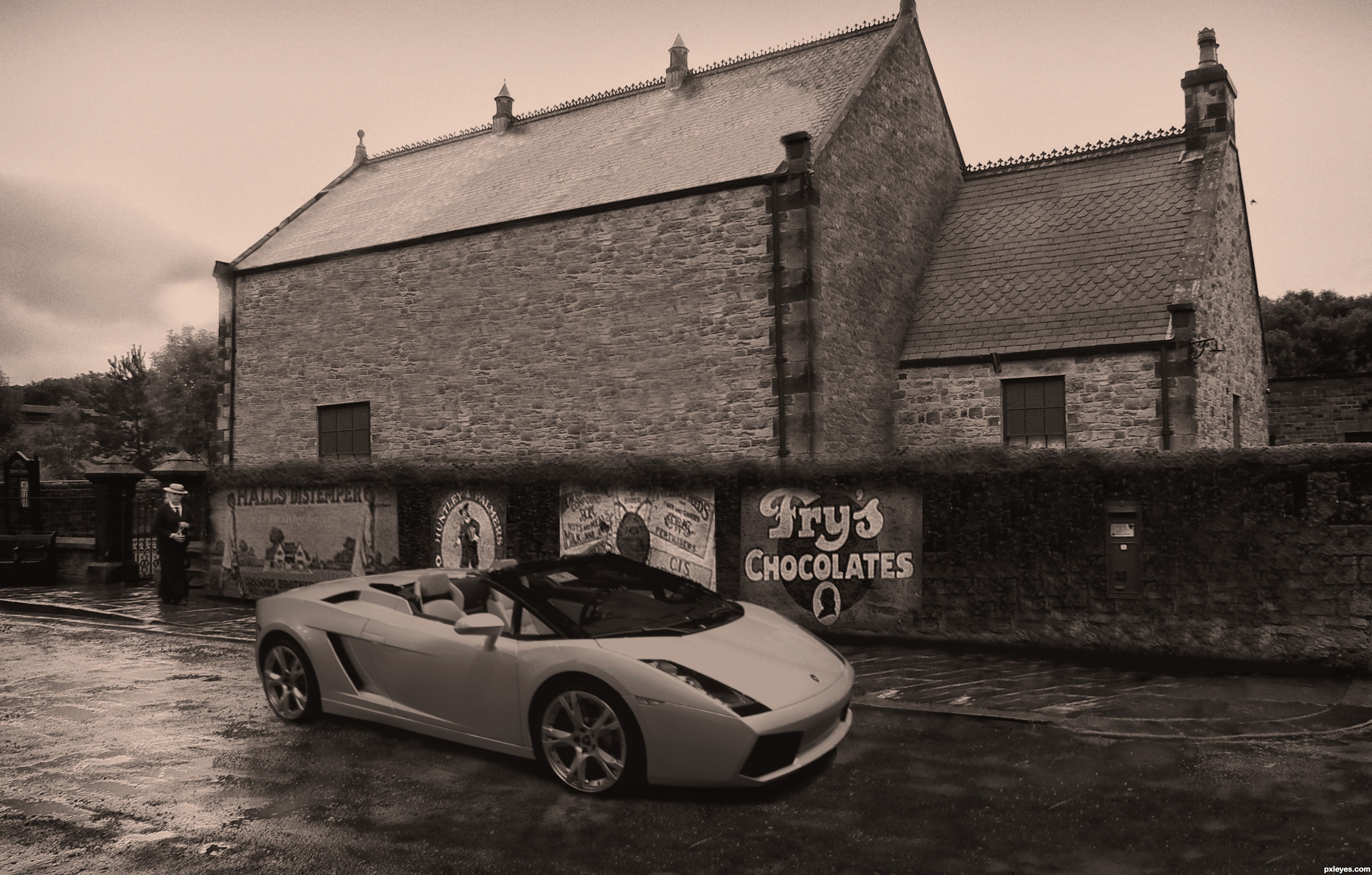
Looks better in Hi-res...imho
The cloning of the stones on the large wall looks too patterned, with a couple really noticeable stripes running across...
The top of the wall with the advertising is too lumpy and blurry. You need to clean up and even that wall top edge...
And the "new" car is too sharp of focus for the rest of the image. If you gave it just the slightest bit of a layer blur, it would better fit into the image.
@ mossyb, thanks for taking the time to comment. I've made suggested changes 
But please understand there is not much image for me to clone 
Considering the source image i dont think i done a bad job........
Cheers mate
You certainly did not do a bad job author !!
Would be cool to make the house less borring ?
Mayby by using parts of the beamisch tram ?(window for house windows)
Wel good luck author !! 
I know the car is like that in the original image, but in the entry it seems to me as if it has flat tyres. Maybe you could "inflate" them a bit...
Good work author!
Howdie stranger!
If you want to rate this picture or participate in this contest, just:
LOGIN HERE or REGISTER FOR FREE
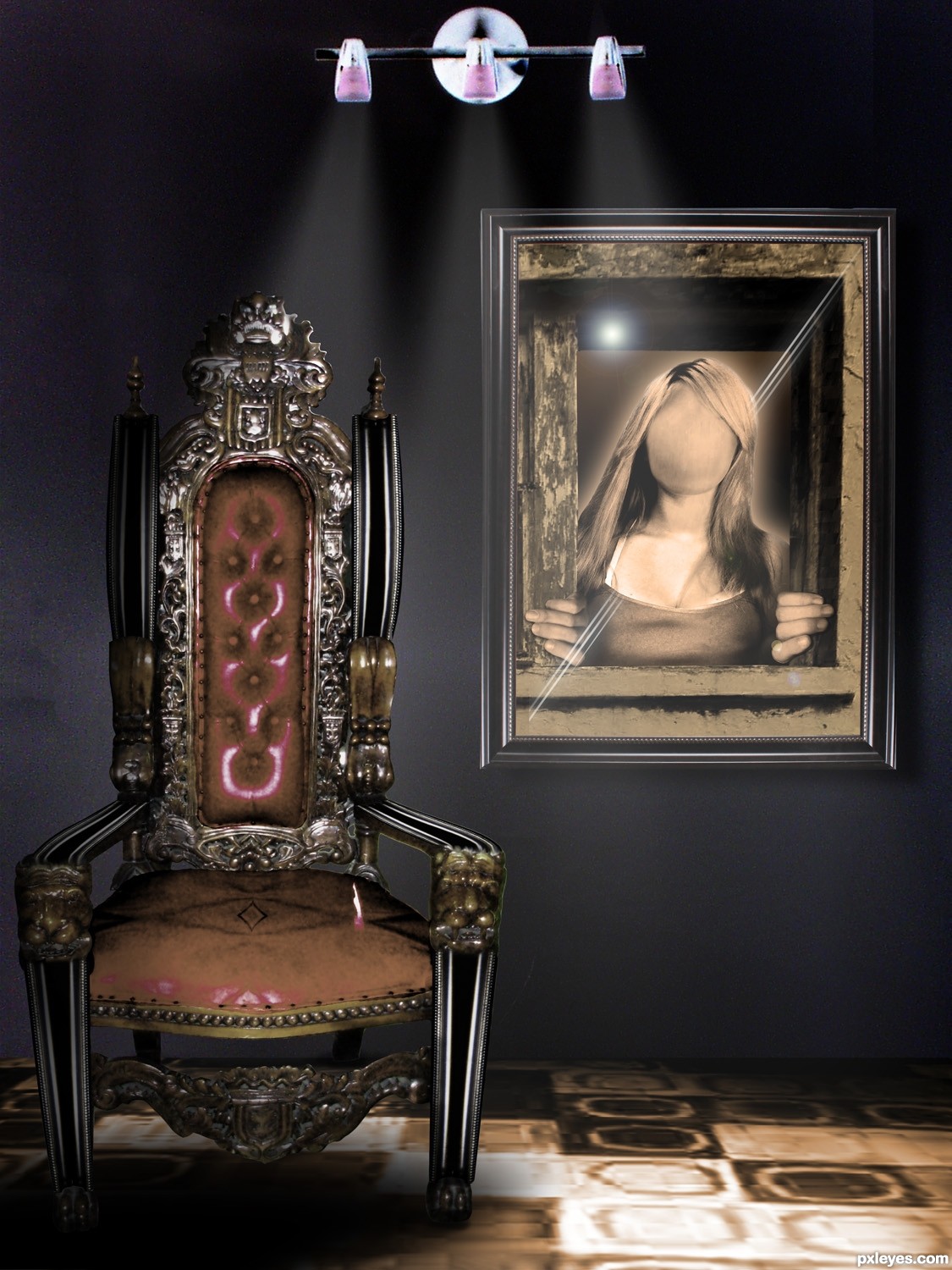
my photos combined with source (5 years and 2945 days ago)
this is a great image!
little nic pic's...
that random line on the 'seat' of the chair is distracting - doesn't make since to me.
I like the lighting on the chair but if the lights are on the wall then the front of the lege should have the same brightness?
Only giving those nic pics because this is a great image
Another awesome job author!!!!
great imagination
i can't get the point of this........sorry!
Very interesting concept in the way you used the image of the girl and the frames. I don't like the carpet either, but I like the chair, clever way you updated it.
Howdie stranger!
If you want to rate this picture or participate in this contest, just:
LOGIN HERE or REGISTER FOR FREE
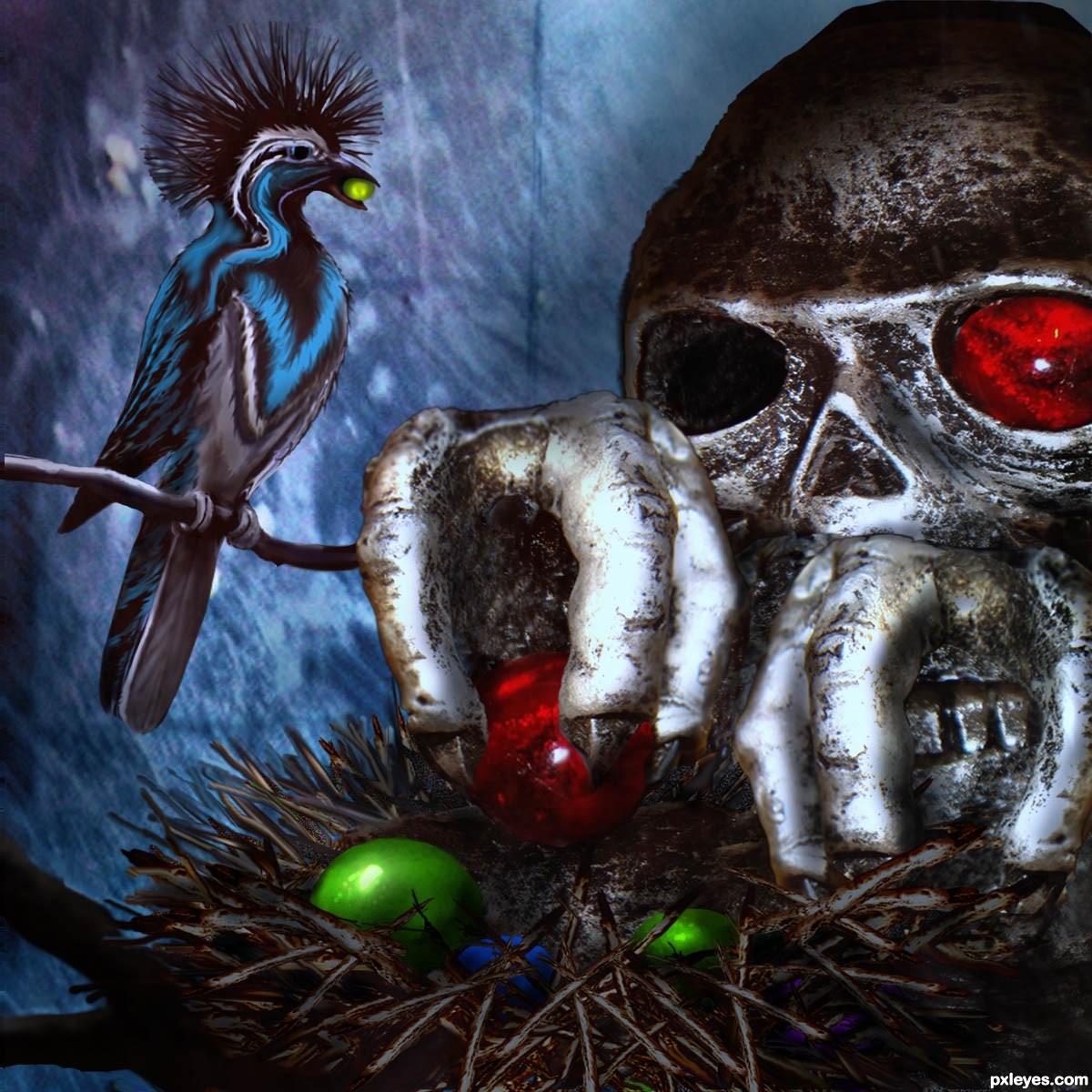
Just the source is used except for the background. Thanks to ArtbyChristi at flckr.com for the background source. Bird and nest are created from source. (5 years and 2949 days ago)
nice job .......... 
this is a great idea , i think the hands should be switched left/right , good luck
very very cool work author...i like dark feel on this one...best of luck
Love the feathery thief
hey Cornelia, love your mustache. Author love your chop! 
Clever use of source
Howdie stranger!
If you want to rate this picture or participate in this contest, just:
LOGIN HERE or REGISTER FOR FREE
(5 years and 2965 days ago)
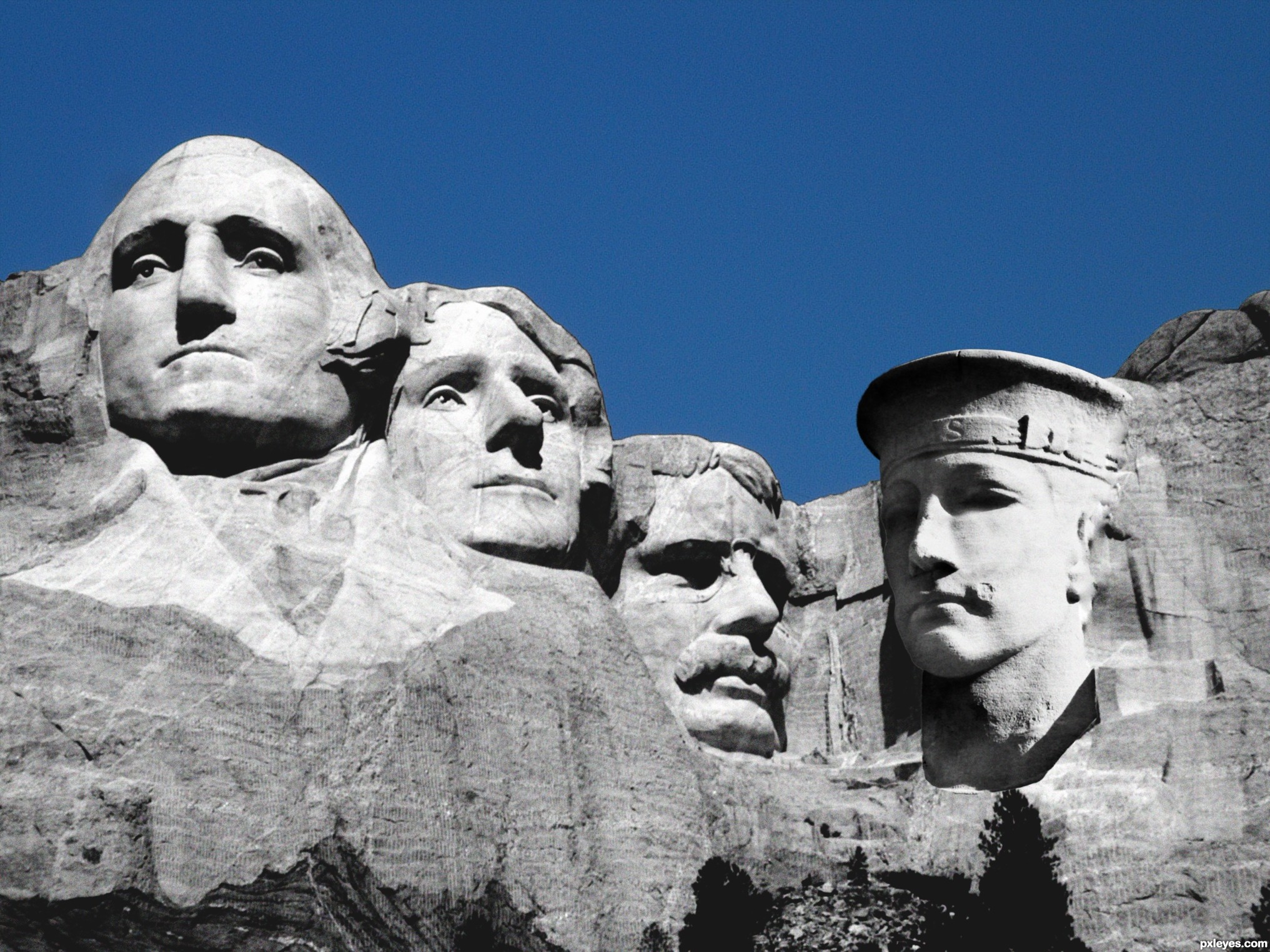
NIce idea. Fits good into the source. Try to darken the white parts of the mountain (by his ear and hat) and maybe make his stone also with some straight "stonelines" it will be even better. But I like this a lot anyway! GL
Very imaginative, but the shadows are facing the opposite side of the rest of the image. Perhaps you should reverse the sailor's face...
lol you tricked me author! i thought it was a picture of mt. rushmore until i looked to the right of the image! great job! good luck as well
nice idea.....but it need a lot of work on the shadows of neck & face good luck author............
Hello guys, and thanks for the heads up and comments. I see the shadows that are not all are in the right place, that's cause of original shadows, sun made, but I been fulling around with magic wand tool to select the shadow area, levels and brightness & contrast to lighten up the shadow area to look bright and not lose quality, like the other side. Im working on it.
cool work author...gl
nice work author ..good luck !!
Howdie stranger!
If you want to rate this picture or participate in this contest, just:
LOGIN HERE or REGISTER FOR FREE
Photography and photoshop contests
We are a community of people with
a passion for photography, graphics and art in general.
Every day new photoshop
and photography contests are posted to compete in. We also have one weekly drawing contest
and one weekly 3D contest!
Participation is 100% free!
Just
register and get
started!
Good luck!
© 2015 Pxleyes.com. All rights reserved.


Howdie stranger!
If you want to rate this picture or participate in this contest, just:
LOGIN HERE or REGISTER FOR FREE