(5 years and 1292 days ago)
2 Sources:
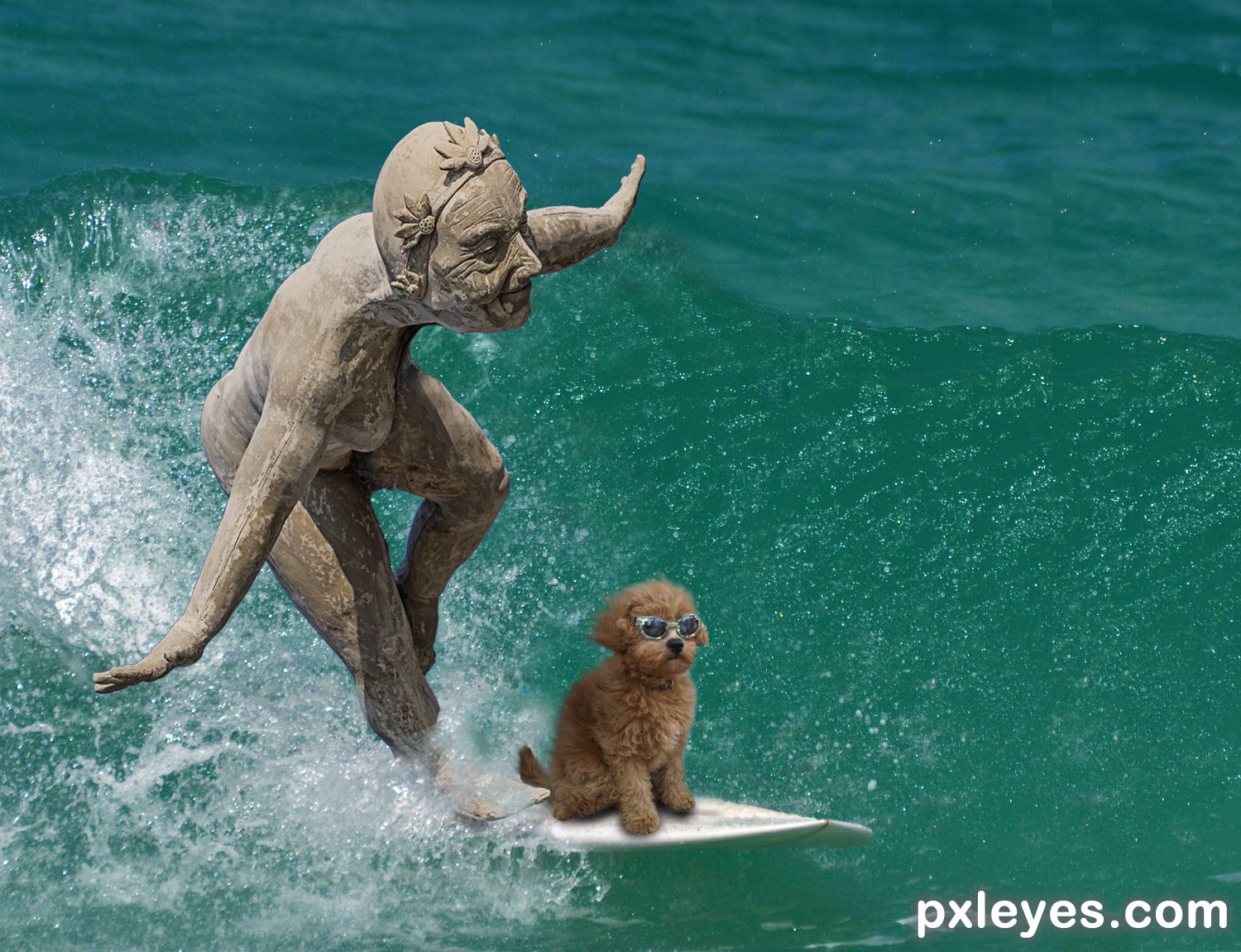
I did not know what to do with the image source. I think I did ok...fun working the image of a falling statue.. (5 years and 1569 days ago)
hehehe, very sweet (this would probably happen everyday down here in Florida LOL)
It was fun.... thanks.
Howdie stranger!
If you want to rate this picture or participate in this contest, just:
LOGIN HERE or REGISTER FOR FREE
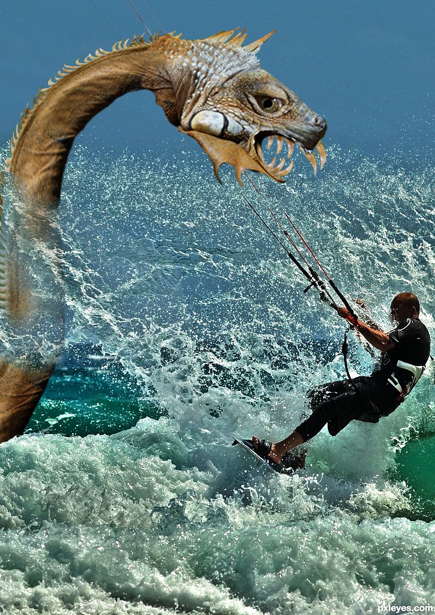
The font that was used is Arial (5 years and 3017 days ago)
Howdie stranger!
If you want to rate this picture or participate in this contest, just:
LOGIN HERE or REGISTER FOR FREE
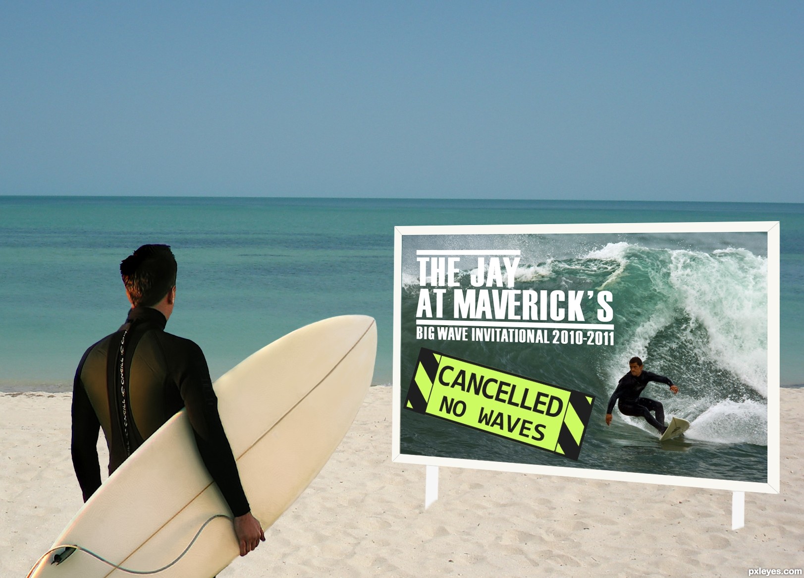
Sadly, after starting this entry on Thursday, I read of the drowning death of Sion Miloskym, a big wave surfer at the Mavericks the day prior. He will be missed.
The article for this image can be found here:
http://www.reuters.com/article/2011/02/23/us-surfing-california-idUSTRE71M0MA20110223
(5 years and 3406 days ago)
Bummers can be funny. I like the idea. The sign does not look right, no dimension to it.
Fantastic idea author...super cool thinking...IMHO u should work a bit more on a sign to give more realism there...everything else is well made...best of luck
The sign is being problematic for me...I tried adding some shadows, and it looked even more "fake" (like the rest of the image is SOooo realistic!)...
Any suggestions on how to improve the sign would be most welcome!
hmmmm...maybe instead of white frame u could use some a bit rusty metal texture and create frame with that....if u do that u have to create shadow in frame too...also would be cool to create some detaching parts on the surfer poster to achieve casual look...this is just and idea author...GL
You can try duplicating the sign author and just distorting it so it look 3d... wish I could help, but its not something ive done yet. Otherwise try adding some noise and a bit of an off white colour to the poles... Better yet the chances of it having some rust on it from being close to salt water 
Other than that, its funny
Your main problem IMO is that the frame is all one color, the main surfer has an orange sunset glow on his back so that same light will cast a slight burned shadow at the back of the sign (on the sand) and an orange to black gradient overlay at very low opacity on the sign will give it more realism. Hope that helps.
Howdie stranger!
If you want to rate this picture or participate in this contest, just:
LOGIN HERE or REGISTER FOR FREE
(5 years and 3626 days ago)
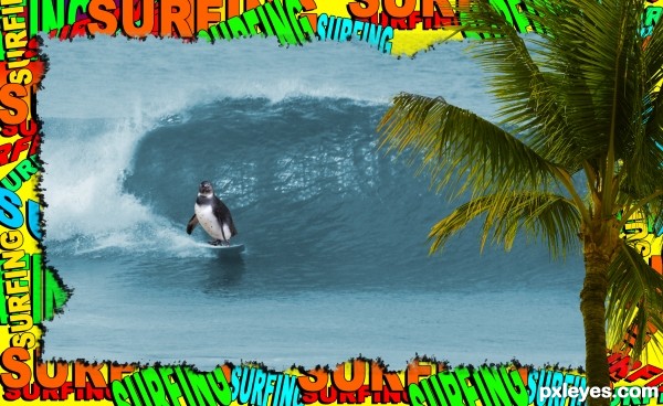
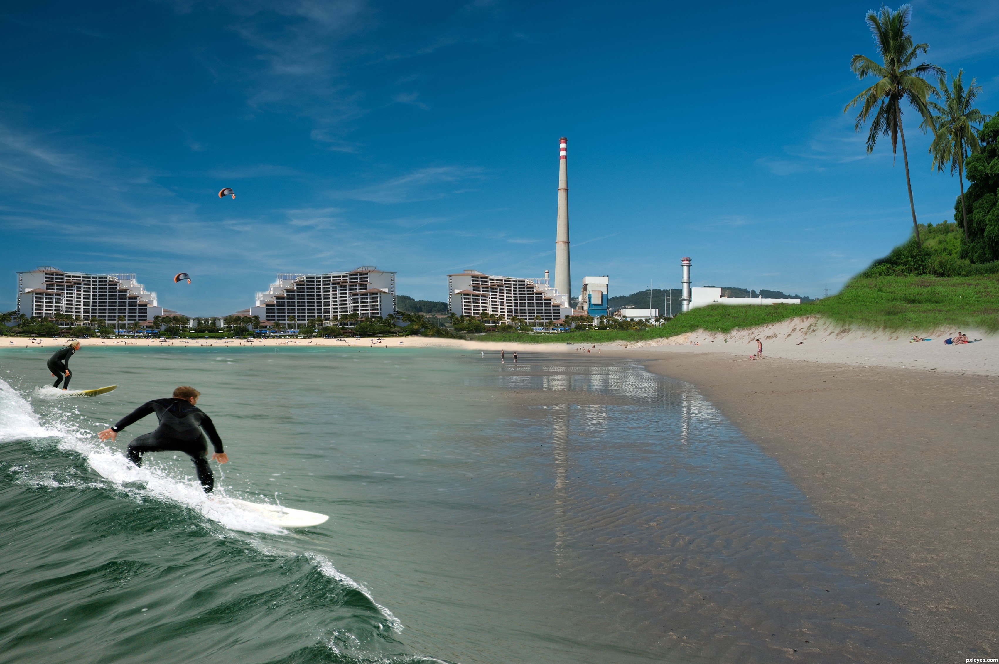
In high resolution is few crop-ing problems,around the palms,girl surfer have some strange big black dot close to head...idea is nice,blend is ok too,but try to fix that details author...good luck
cool 1
Howdie stranger!
If you want to rate this picture or participate in this contest, just:
LOGIN HERE or REGISTER FOR FREE
Photography and photoshop contests
We are a community of people with
a passion for photography, graphics and art in general.
Every day new photoshop
and photography contests are posted to compete in. We also have one weekly drawing contest
and one weekly 3D contest!
Participation is 100% free!
Just
register and get
started!
Good luck!
© 2015 Pxleyes.com. All rights reserved.


Howdie stranger!
If you want to rate this picture or participate in this contest, just:
LOGIN HERE or REGISTER FOR FREE