(5 years and 3295 days ago)
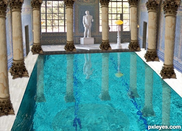
3 Sources:
- 1: clear water
- 2: background
- 3: column
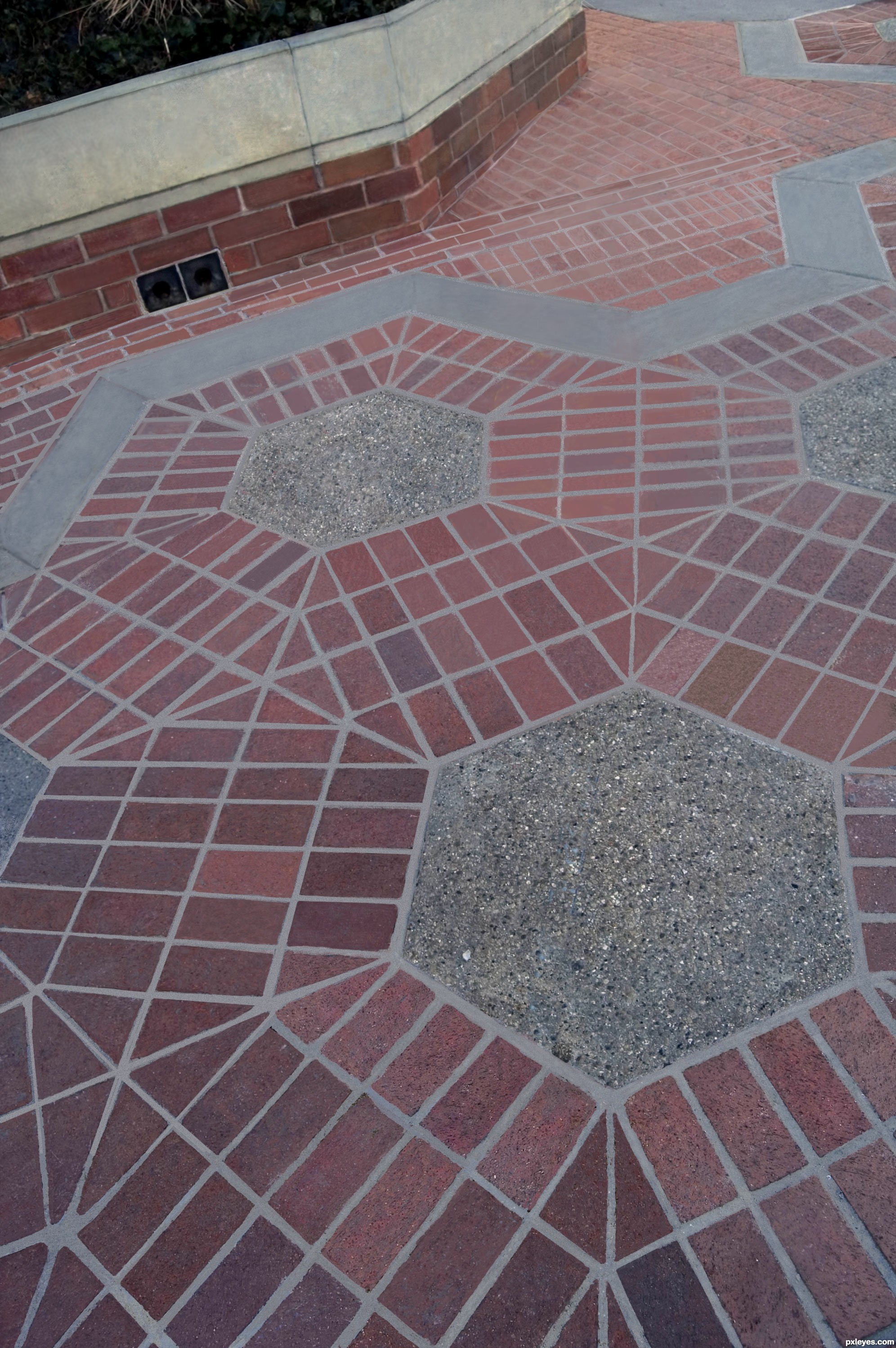
Almost good as new! (5 years and 3451 days ago)
Excellent work here, I'm sure it took you quite some time = )
Not exactly original......
Perhaps, but it's not a CBR, and it shows a bit more effort...
CBR?
CBR = "Chopped Beyond Recognition"
When you can't make out the original image at all.
oooo I gotcha! Been wondering what to call them. lol ty! 
Author this is very nice clean work without any doubt but its true that is not very original....Its not problem in CBR or anything similar...thing is that one other author did the same thing few days ago...so in that case your entry was a copy...i know that is not and that u put effort in this but its not original...maybe u did not watch other entry's in the contest...who knows...any how i wish u best of luck
I think the author did a bit more than the other. Both are great and i think that it took a lot of work to get rid of the moss etc. Nice work!
I think it is original because the author took the extra steps to get rid of the moss etc.
Good luck to all and have fun!
Renovating the image is MUCH more than simply copying getting rid of the sign...But everyone is entitled to their own opinion.
Unlike simple "cut and paste," I drew out the mortar lines, which, if you take the time to look, you will see are MUCH more accurate than the other, simpler version...
As opposed to just removing the sign, I "renovated" the walk. Not a copy at all...But definitely an improvement. 
IMO, you should have taken the time to add defocus to areas because right now it all looks too clear. You cloned the bricks from up from and restored the background in the same clarity, Making the DOF look off.
And least in the first version, they got the DOF right.
This is a good clean job. Would you please come and do my driveway? 
Howdie stranger!
If you want to rate this picture or participate in this contest, just:
LOGIN HERE or REGISTER FOR FREE
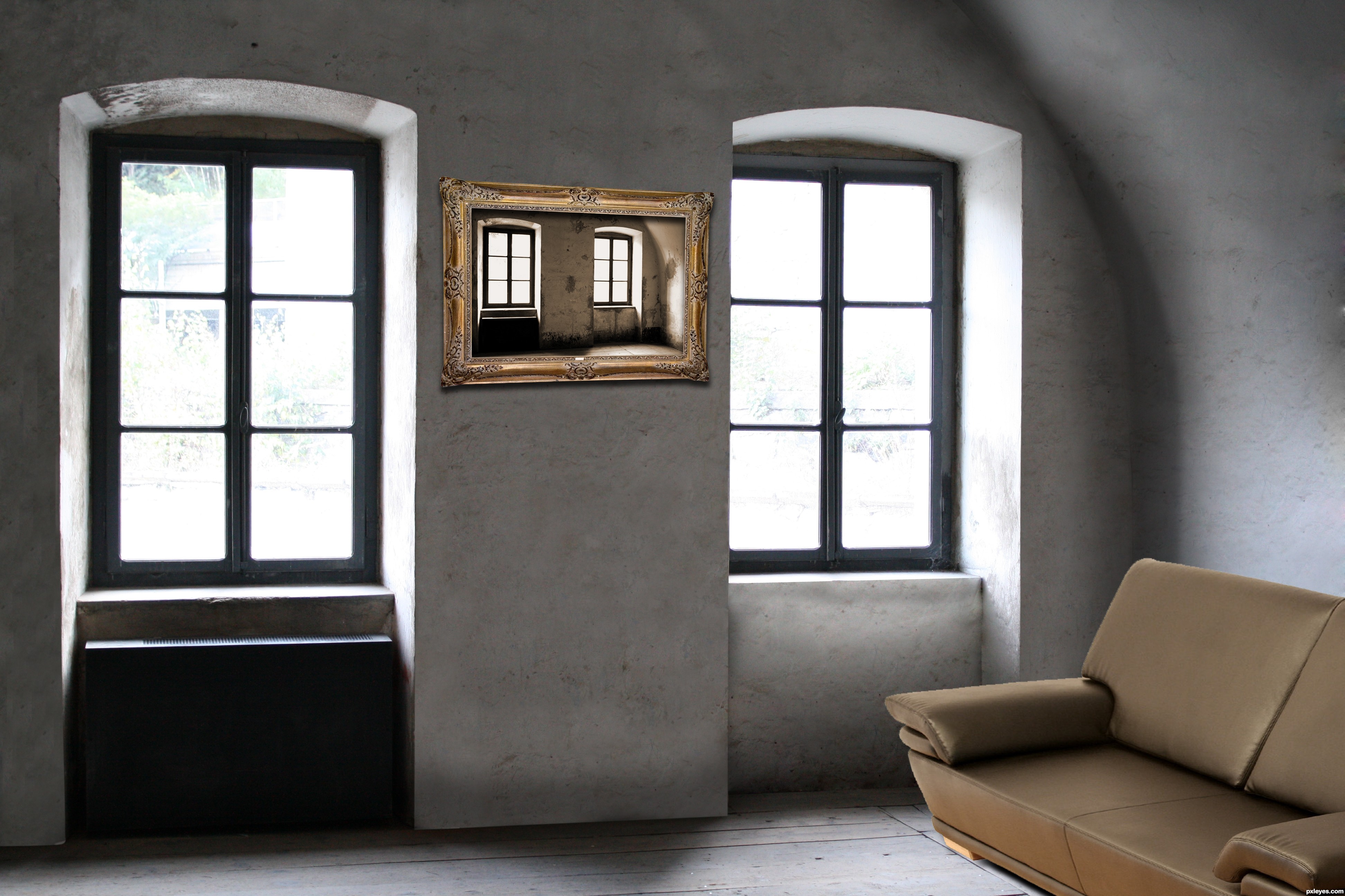
I renovated the walls. Then i added the photo and the couch (5 years and 3735 days ago)
Very good ! I really love it!
This 'life' is still a bit austere. The horizontal edges of the picture frame are off, however. Draw lines connecting the horizontal edges and muntins of the two windows on either side of the picture to get guidelines for the picture frame's horizontal edges.
@DanLundberg: Thx for the comment (:! I really tried to make it austere, because a lot of these modern houses have this kind of atmosphere? I'll try to deal with the edges of the picture frame, thanks for the comment!
I like this........ and good luck 
nice !
like dis idea..cool
nice but I would have definatly given it the full droste effect, good luck
Howdie stranger!
If you want to rate this picture or participate in this contest, just:
LOGIN HERE or REGISTER FOR FREE
Photography and photoshop contests
We are a community of people with
a passion for photography, graphics and art in general.
Every day new photoshop
and photography contests are posted to compete in. We also have one weekly drawing contest
and one weekly 3D contest!
Participation is 100% free!
Just
register and get
started!
Good luck!
© 2015 Pxleyes.com. All rights reserved.


The filter used on the columns is very fake looking, because it is too flat and does not change in perspective as it recedes into the horizon line.
Also, the pool you used is at a different angle than the contest source, which makes the lines look extremely crooked, and the pool then appears to be tilting.
The statue is too large in proportion to the pool, and the lighting is not consistent with the rest of the image.
This is a really good concept, but it looks very rushed, without enough attention to detail...
Well commented MossyB. This is a good entry Author. However, i agree with MossyB. Please take the feedback as a way to improve and advance your entry and artistic skills.
I hope that you get the time to make adjustments to your entry.
Thank you for comments i did some adjustments and waiting for new comments.
Love the changes.. If you look at the base of your NEW coloms you will see that they do not connect to your floor. To fix this add shadowing.
:look where your light comes from, use your BURN tool to add shadow. IF you want more information on how to do this Message me.
GOOD LUCK .
Shadow added.Thank you !
The 4 back columns look like they are hanging over the pools edge.... I would just make them a bit smaller, it will also had depth to the image
Howdie stranger!
If you want to rate this picture or participate in this contest, just:
LOGIN HERE or REGISTER FOR FREE