...well, it does doesn't it? :)
[Update] Added a gradient overlay to the LHS to give the effect of it actually being a mag rather than just an image. :) (5 years and 3476 days ago)
2 Sources:
i made a few changes... i hope you like it! (5 years and 3476 days ago)
Yaaay! 
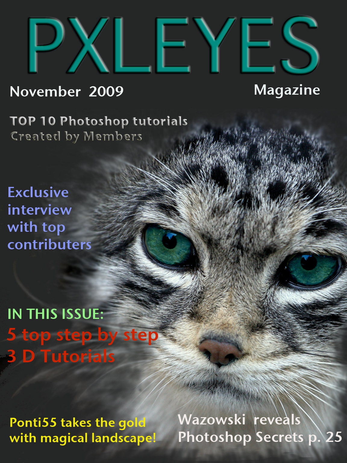
you misspelled CMYK
Nice fading effect around the cat picture!
nice I had to scroll by fast my dog hates cats...lol
Nice, but a bit crowded.
looks like a photography magazine not a photoshop magazine sorry.
Nicely Done!
Howdie stranger!
If you want to rate this picture or participate in this contest, just:
LOGIN HERE or REGISTER FOR FREE
(5 years and 3476 days ago)
i like it
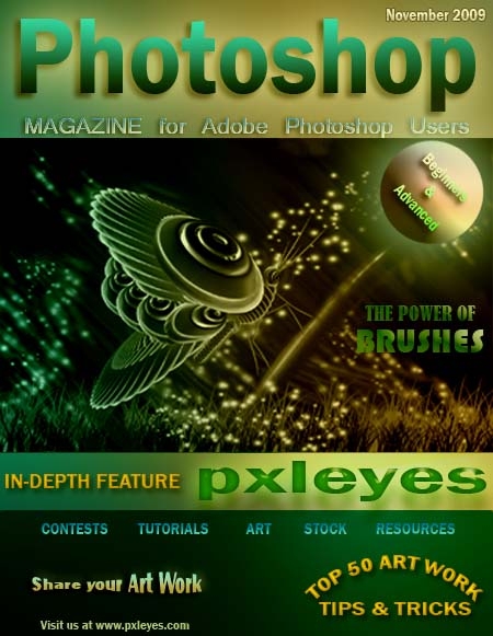
Nice gradient work and word art - would suggest making the lower portion smaller and having more of the image, though. Good job.
nice
Awesome!
Howdie stranger!
If you want to rate this picture or participate in this contest, just:
LOGIN HERE or REGISTER FOR FREE
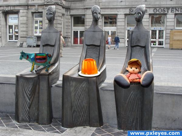
I made their eyes. Then couldn't think of anything else to do with them with their new eyes. So I figured, maybe they could hold something. Looked like they were holding something. So I looked through my own catalogue of images and found my folder of Pxleyes downloads and decided to give them cool stuff from the website.
PLEASE CHECK OUT HIGH RES TO CHECK OUT THE EYES!
All sources are from Pxleyes. (5 years and 3539 days ago)
you forgot to tweak the cow's shadow. i hope.  and why would you flatten the image at the end?
Nice
the shadow from the doll is wrong and the shadow from the cow doesnt match the others, i like how you did the eyes on the statues and the idea is cool...
Merge layers? Flatten layers? Someone want to tell me the difference? I tried different ways to make that cows shadow. I did it and redid it. It was kicking my butt. If anyone has any suggestions they would be greatly appreciated. There's one thing that I know I didn't try, but I'd forgotten how to do it and where I saw it before.
flattening the image IS merging all layers.. you should put the shadow layer below the cow layer, put some blur, play with blending options to see which one fits best. i don't see why you don't use the same technique you used with the other shadows
I didn't use the same technique with the cow as I did with the others because when I used the drop shadow on the cow it affected the others. I know that there's a way to stop that from happening, but I couldn't figure it out. I need to redo the whole cow because I accidently put the cow and the shadow in the same layer. Thanks a lot ELFICHO for the tips. I will try them out. Thanks to Eladine for pointing out the problem with the doll's shadow. I think that I had it right at first. I know what to do. Thanks everyone for the comments. They're appreciated. 
Please take a closer look now! I have fixed my cow shadow and the doll's shadow! Thanks to everyone for your feedback!
Cool :*)
he he
Howdie stranger!
If you want to rate this picture or participate in this contest, just:
LOGIN HERE or REGISTER FOR FREE
(5 years and 3543 days ago)
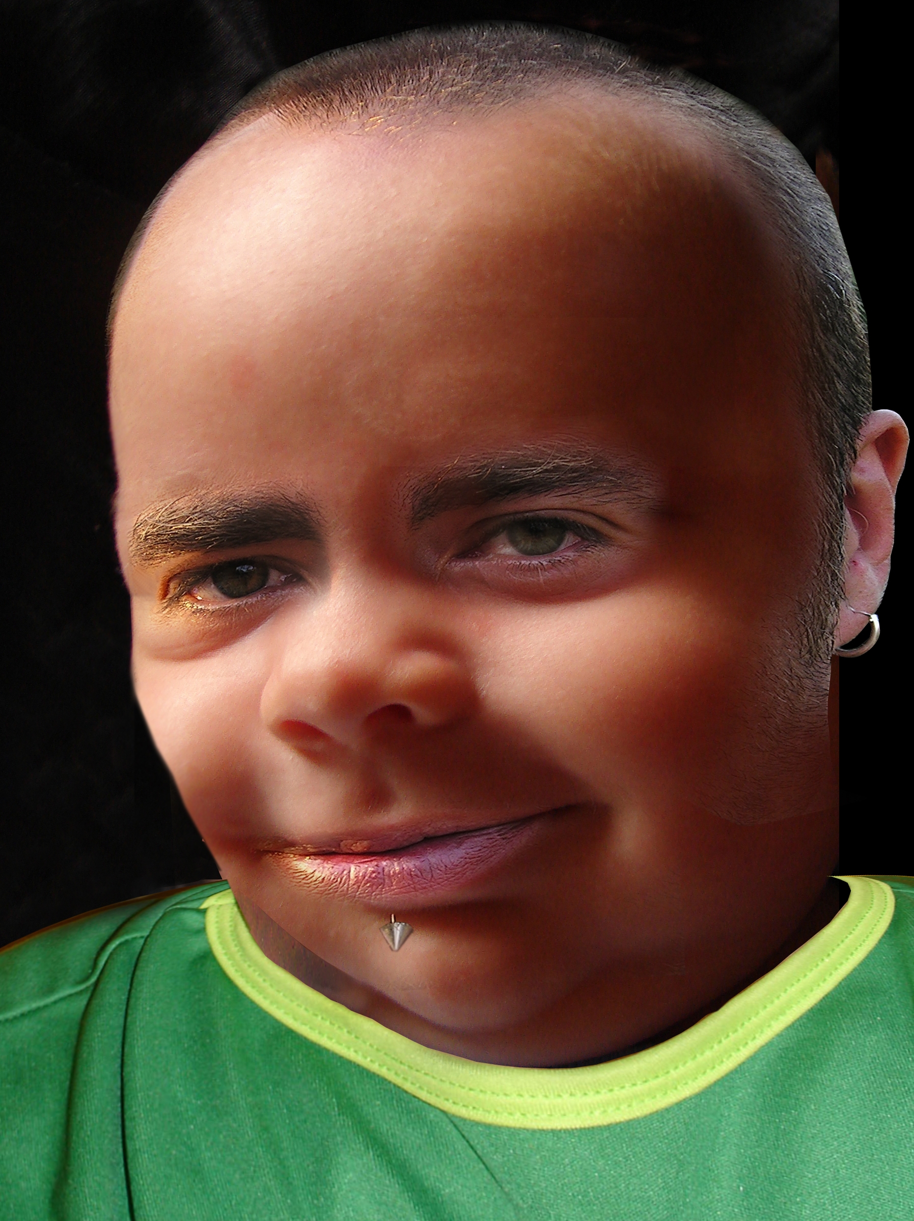
Babies have beards & chest hair?
i think it's a little off-theme, sorry!
I think if a baby did have chest hair and a beard, he'd look just like this, I think it's absolutely adorable... good luck author.. reminds me of a sweet version of a Mapplethorpe
i don't think "adorable" is the word... but the beard is way too sharp compared to the skin 
umm k pretty cool!
I think the left eye needs more work; there's like a skin bump to the side of his face but a good job overall
thats one uuuugly baby. But so far the only one that has stuck to the theme.
Well, ummmmmmm. OK! Different!
You might wanna try to play a bit with levels so the skin tone around his left eye, ear and lower lip matches with the rest of the face
Howdie stranger!
If you want to rate this picture or participate in this contest, just:
LOGIN HERE or REGISTER FOR FREE
Photography and photoshop contests
We are a community of people with
a passion for photography, graphics and art in general.
Every day new photoshop
and photography contests are posted to compete in. We also have one weekly drawing contest
and one weekly 3D contest!
Participation is 100% free!
Just
register and get
started!
Good luck!
© 2015 Pxleyes.com. All rights reserved.


Nice concept author !!
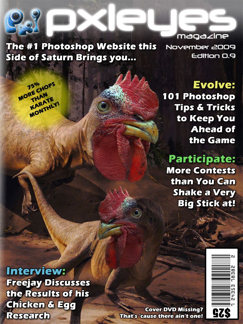
i'd remove that "missing cover" thing.. i wouldn't want to buy a magazine and read something dissapointing before i even open it.
'tis just a bit of light humour. I'd be put off by the price tag, let alone the missing DVD.
lol.....good job
Thanks - I try my best!
You got my vote Author great layout

super cool! Nice job!
Thanks peeps - you're too kind!
This is really very nice
Hahahaha, great stuff!
Thanks guys / gals - have my fingers crossed for a podium finish...
i like the picture you used, but the white background of the title takes away from it
Without the white background, the title looks a little to 'stark' - do you really think it detracts from the image?
Oh well.....Was surprisaed with the results and i thought it would make top 3.... but my opinion is biased i guess! Congrantulation on 6th anyhow.
Thanks Freejay - and anyone else that voted me up there - 6th is still a podiumish finish - it's boosted my talent at least!
Howdie stranger!
If you want to rate this picture or participate in this contest, just:
LOGIN HERE or REGISTER FOR FREE