
(5 years and 3261 days ago)
1 Source:
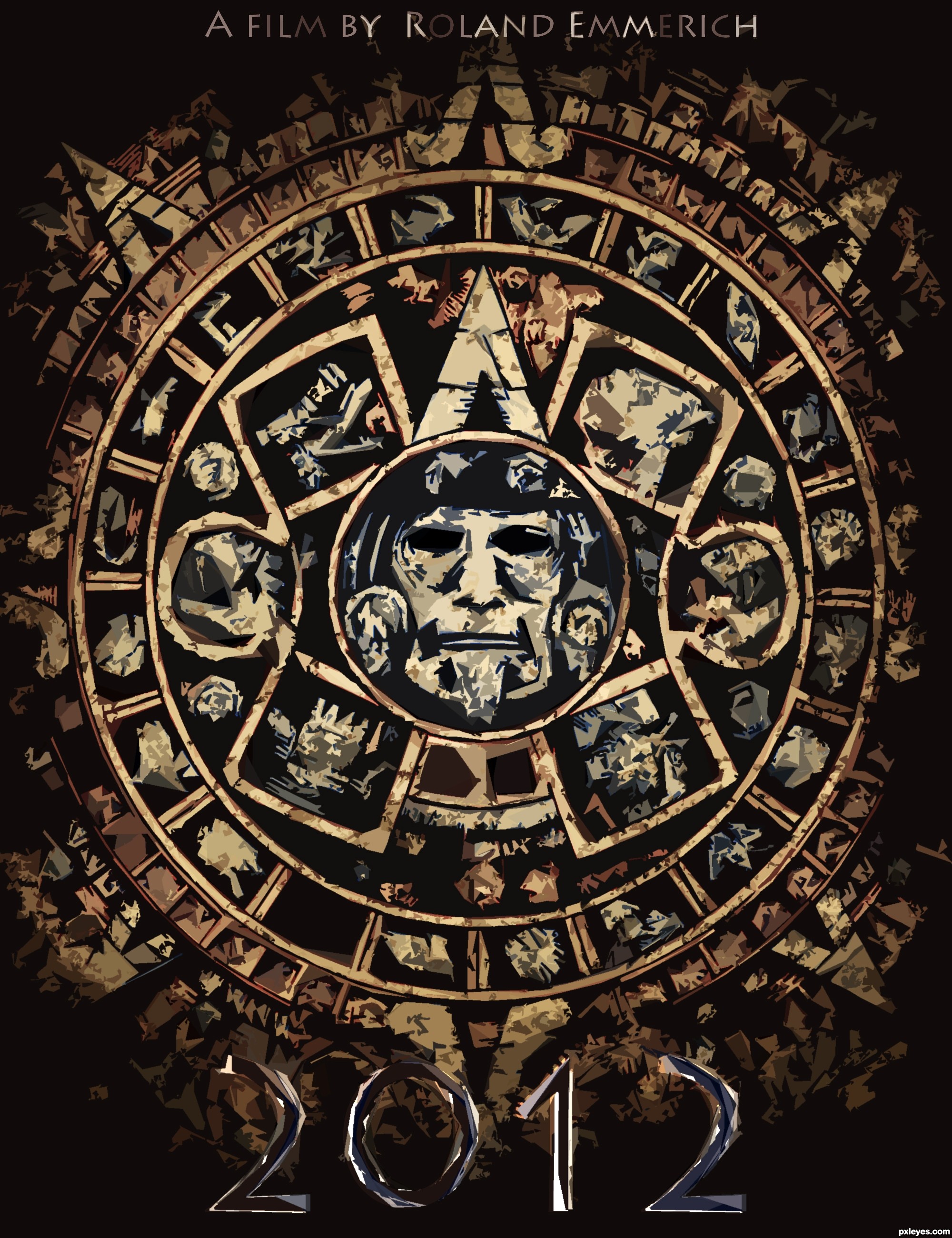
Is this the beginning of the end, or the end of a beginning?
Though its A minimalist poster, I spent much time into this one..
Please look at HQ because everything is worked out into details!!
Also be sure to check the SBS guide :)
Comments and/or suggestions are appreciated!
Thanks to louboumian for the maya calendar reference !!
Thanks to ba1969 for the grunge texture!
EDIT:
I listened to your comments and tried to make it more minimalistic, it's dramaticaly changed and many details are lost now. Though, it looks more minimalistic now.
Please comment if you agree!
(5 years and 3295 days ago)
It looks great but too complicated for a minimalist design.
It's really good though.
At first I thought that myself too.
But does a minimalist poster necessarily mean that the image can't be highly detailed? A minimalist poster is a poster wich in this case you should make a film poster by using a symbol wich is an important part of the film. In this case the poster is indeed a bit complicated, though it's consisting of just one image, more precisely, one symbol. So I think this image is on theme,
Anyway I appreciate your comment very much concrete and I hope you can agree with me?
Minimalism in design is specifically defined. This isn't it. I looked at your SBS. I appreciate the work you put into it so I consider that when voting. But as far as the guidelines of the contest, it doesn't really fit.
GL, author. 
I like this, even though minimalism is defined as "a style or technique (as in music, literature, or design) that is characterized by extreme spareness and simplicity."
It's the lack of tons of text that makes this minimalist to me. The Mayan calendar could possibly be stylized a bit more to make it even less detailed, but in this instance, I think it works fine as it is, since it shows no real depth. Perhaps lowering the saturation or opacity to make it blend into the background a bit more would help.
Nice entry.
I think you guys are right, but since I just used 3 colors (red,blue,yellow) and one tint (Black) and only one symbol to symbolise a movie of like 120 minuten, I hope/think it is (just barely) on theme right?
Anyway don't get me wrong, I appreciate your comments really much and I'm glad you guys want to help me !
But if you disagree with me, please say so, and please also say what I can adjust/improve to make it more 'minimalistic'
Would be a shame if this one would be deleted :O It was so much work  ..
..
Anyway again, thanks for the comments ^^
EDIT: To mossyB, At first, thanks for your comment !! Second, I lowered the oppasity a bit and also the saturation, but when I do it too much the 'power' of the image just dissappears... If it's still not OK, please say so!
Good image, but IMO not minimalist as defined by contest description & examples given.
Alright I give up, changed the image, (a pity that so much detail had to be lost).
Anyway, is it more minimalistic now?
sorry i couldn't comment on this one sooner  to achieve minimalism you need to get rid of all unnecessary elements of your artwork, less is more. Use 2 colors in your palette, and only the face with the elements around it that are inside the first circle. There you achieve minimalism...
Howdie stranger!
If you want to rate this picture or participate in this contest, just:
LOGIN HERE or REGISTER FOR FREE
(5 years and 3330 days ago)
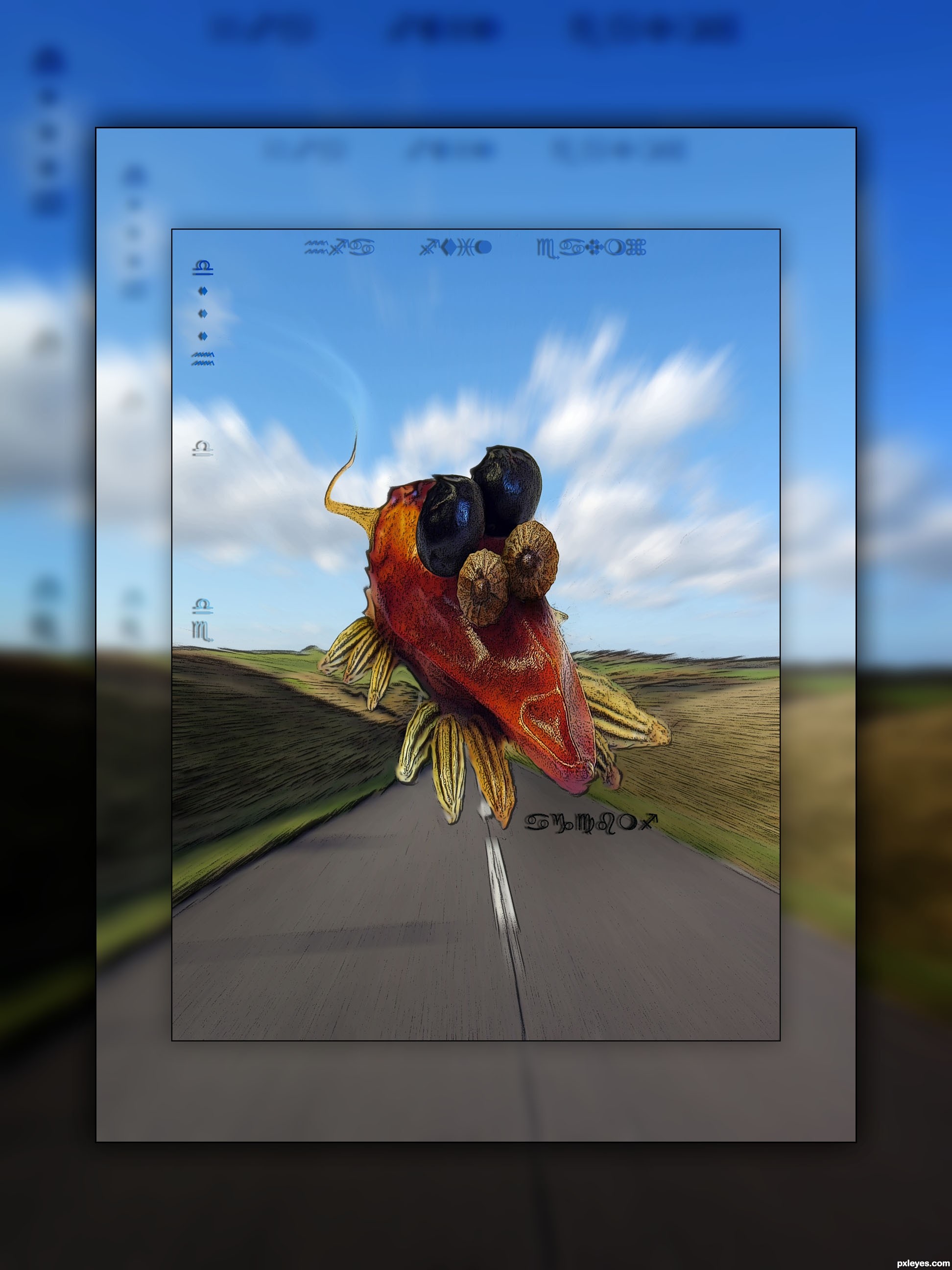
Nifty effect author.. GREAT JOB
Thanks!
Creative and cool. The subtlety of all of the text is extremely unusual for a movie poster, however. And I would clone out the distracting/confusing shadows on the highway (and maybe add an alien shadow?).
Howdie stranger!
If you want to rate this picture or participate in this contest, just:
LOGIN HERE or REGISTER FOR FREE
(5 years and 3367 days ago)
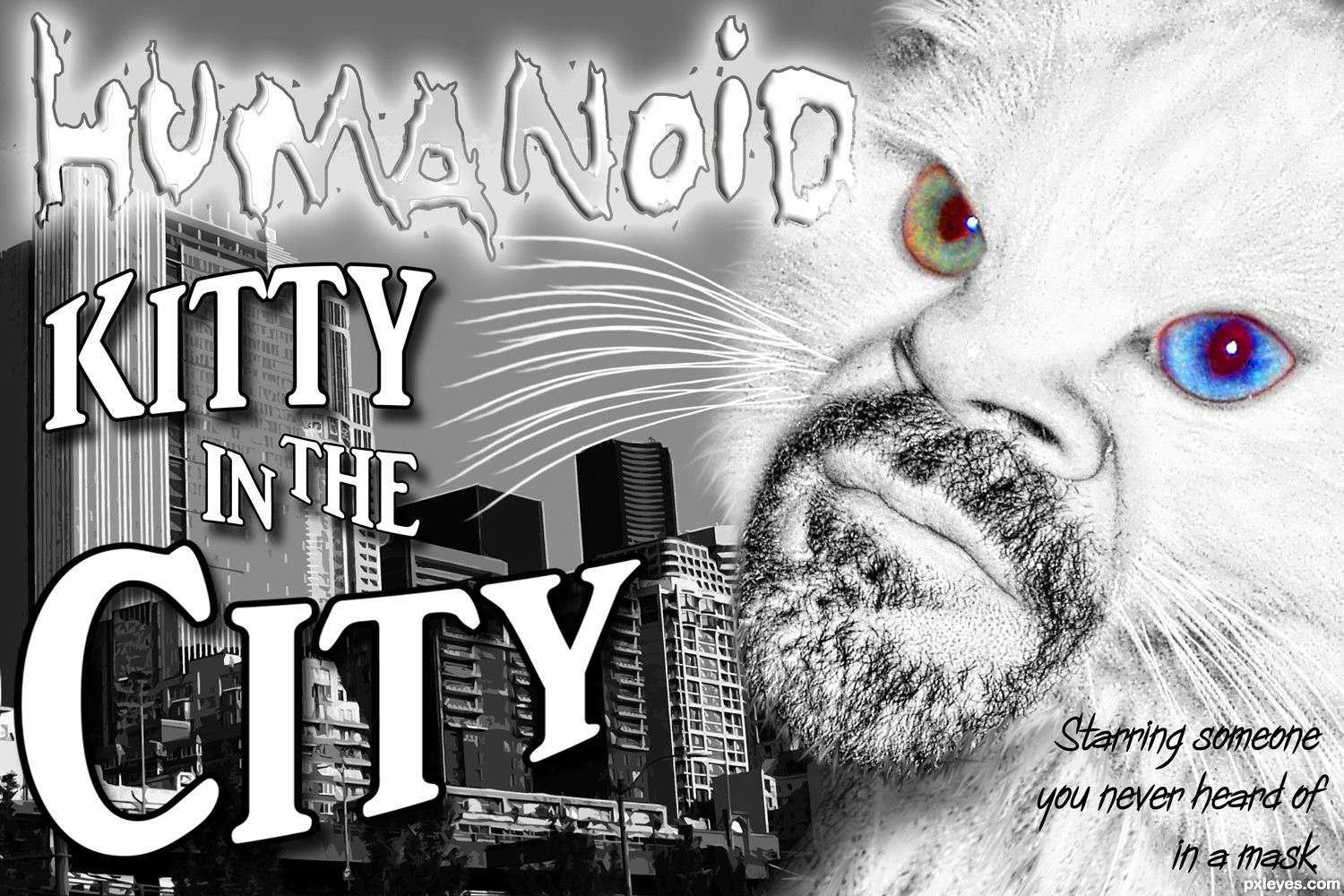
Awesome idea, great work and top notch title...lol...best of luck author
lovely
Great blending on the cat!!! and I like that you left only the eyes in color. 
Howdie stranger!
If you want to rate this picture or participate in this contest, just:
LOGIN HERE or REGISTER FOR FREE
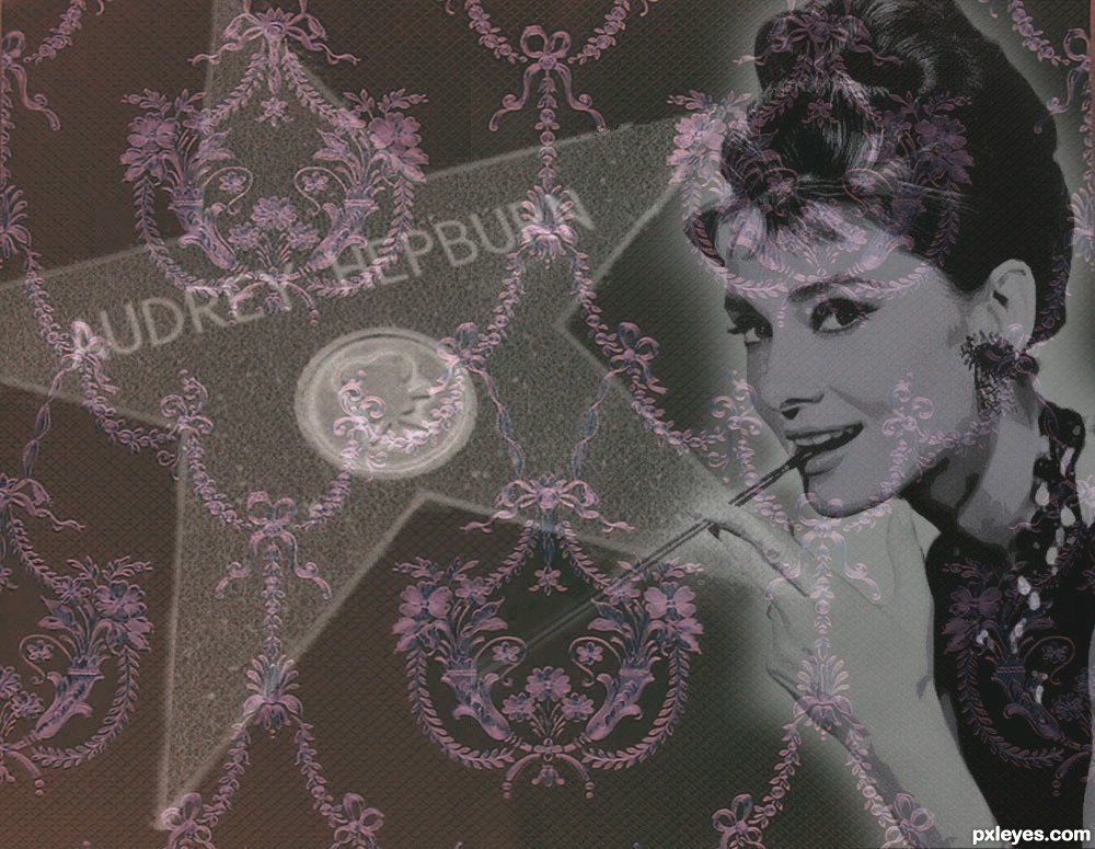
Had a hard time finding sources for Audrey Hepburn. If the sources are not useable please flag within a timefram that allows me to redo the image.
Credit to inspryetash-stock for the Victorian Wallpaper (5 years and 3456 days ago)
Very nice, nice idol BTW
Howdie stranger!
If you want to rate this picture or participate in this contest, just:
LOGIN HERE or REGISTER FOR FREE
Photography and photoshop contests
We are a community of people with
a passion for photography, graphics and art in general.
Every day new photoshop
and photography contests are posted to compete in. We also have one weekly drawing contest
and one weekly 3D contest!
Participation is 100% free!
Just
register and get
started!
Good luck!
© 2015 Pxleyes.com. All rights reserved.


Like your take on the source. GL author.
Very nice!!
Looks pretty real, and not mount ...
Fantastic!
very cool blend and nice final result...gl author
Congrats!!
Congrats, nice work
Howdie stranger!
If you want to rate this picture or participate in this contest, just:
LOGIN HERE or REGISTER FOR FREE