Photoshop Pictures: Mail


results 1 - 5 of 8

Special Delivery - created by BWR


Special Delivery
Favs: 2SBS: n/aHi-resRank: 1/5Score: 61.4% (35)15876 views

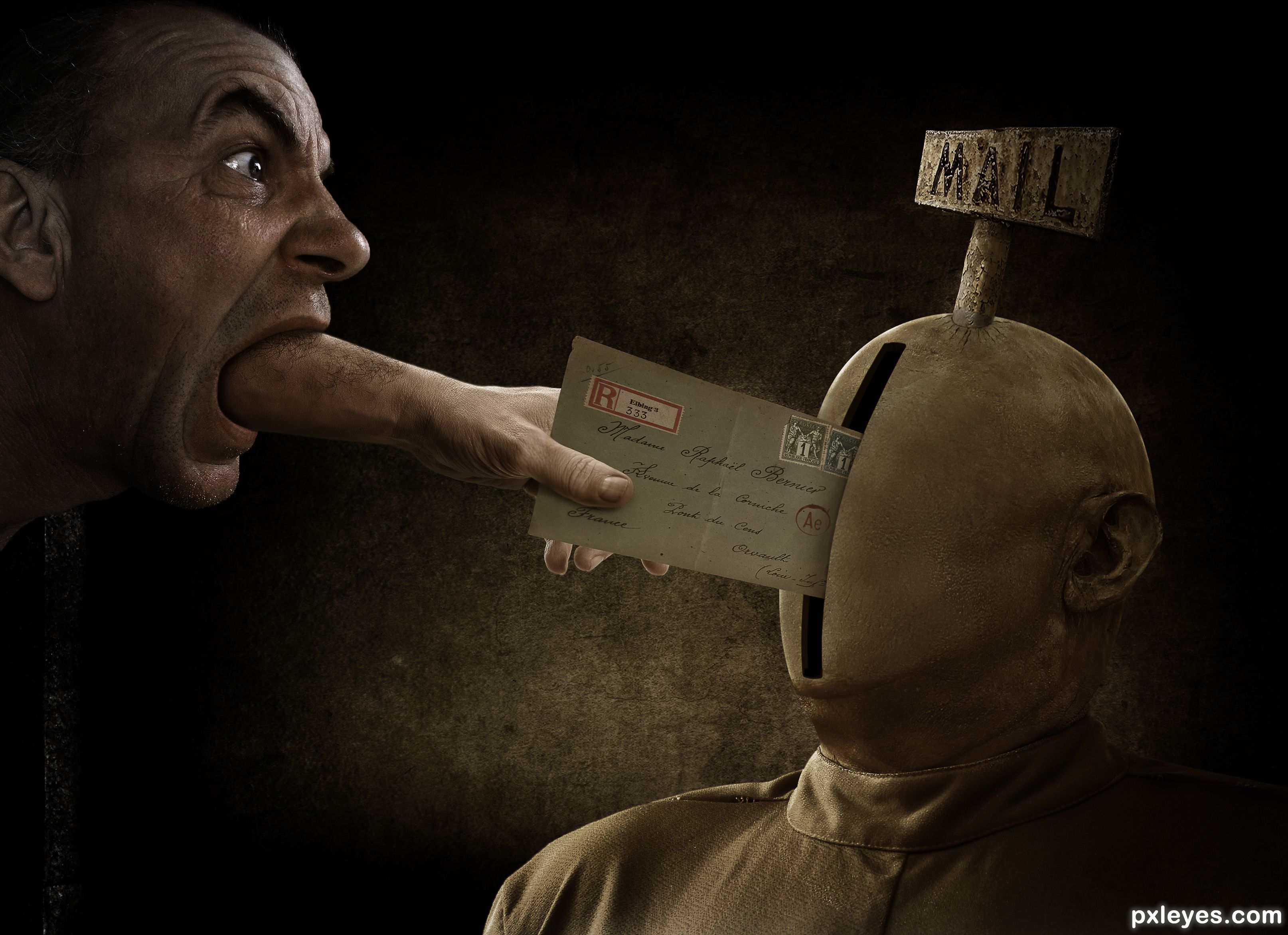
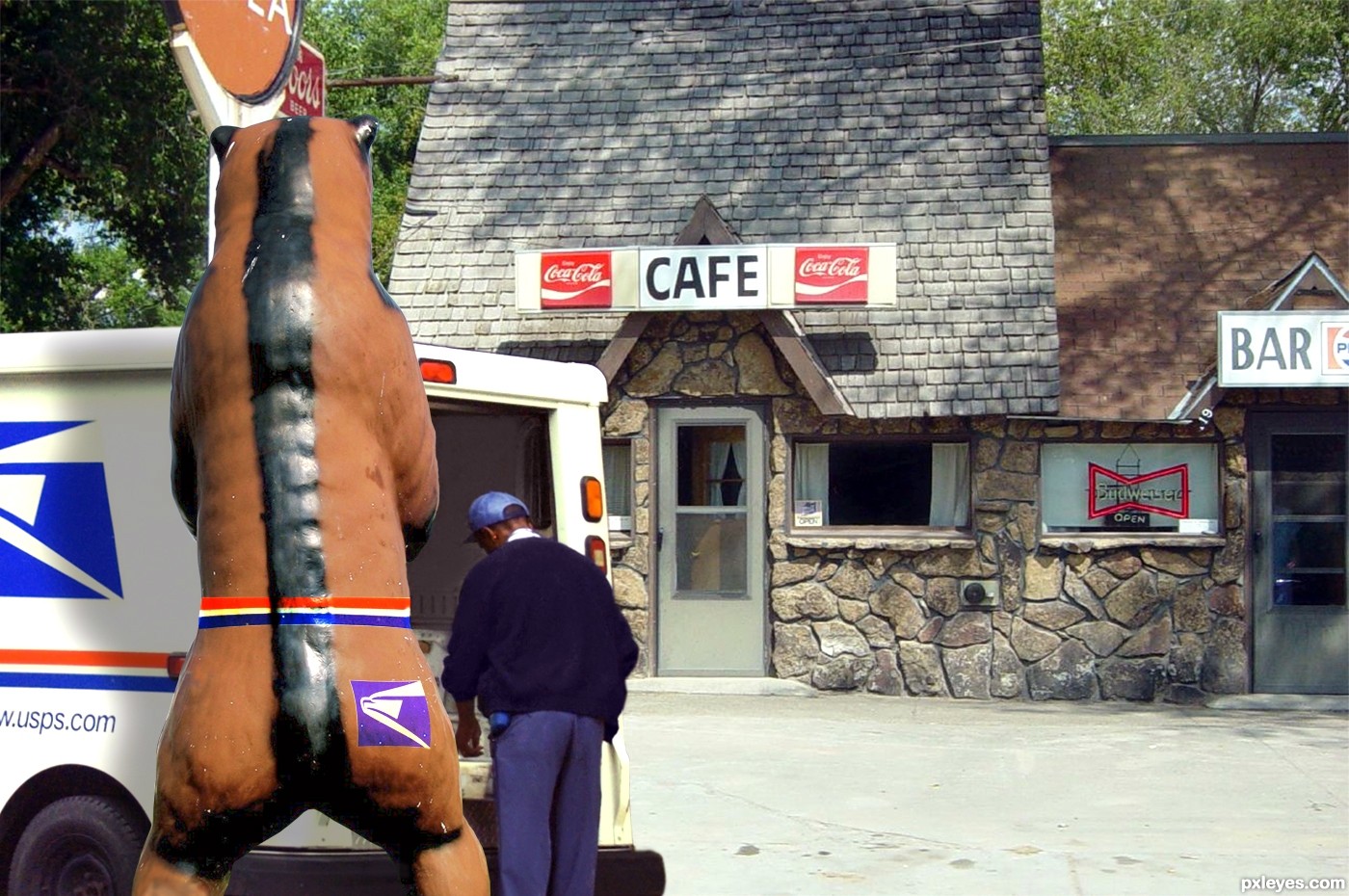
The guy on the right was smoothed out with a technique called "Frequency Separation". The cracks under the mail sign were made using his eye wrinkles. Letters for mail sign were copy/pasted from the "mail sign" source image and rearranged. (5 years and 418 days ago)

7 Sources:

avatar CMYK46
CMYK46 says:

Nice work. Just put a 1 pixel blur on the sharp edges, and include a link for the hand.

author says:

what do you mean by "sharp edges"? specifically where?

(5 years and 418 days ago)


avatar lchappell
lchappell says:

This is an interesting interpretation on the contest theme. I like where you are going with this.

In MHO i think you could fix the shadows where the hand makes contact with the letter and where the letter is entering that slot. Maybe the tone/density of the shadow around those points might help. Just seems a little flat at the afore mentioned places. Pretty cool though.

author says:

Thanks man. I will try.

(5 years and 417 days ago)


avatar lchappell
lchappell says:

Also, nice lighting even if is coming from everywhere. lol

avatar CMYK46
CMYK46 says:

All edges, but especially the face. The lighting looks consistent to me.

author says:

Sounds interesting. Let me see if I am understanding you. Select the man. Select > Modify > Contract by "X" Pixels. Select > Inverse. Now I will have the outer edge of the man selected. Then apply a 1 Pixel Gaussian Blur? If this is correct, how many pixels should be selected around the edge? Can this be done faster by Select > Modify > Border?

(5 years and 417 days ago)


avatar CMYK46
CMYK46 says:

First of all, the default setting on my lasso or pen tool is always set to a one pixel blur so I don't have sharp edges to mess with later. But all I'd do is select the outside of the face, expand 1 pixel, and then Select/modify/feather 1 pixel and clear.

author says:

A one pixel "feather"? Got ya. was confused by the term "blur".

author says:

Something wrong with my Photoshop. Think I have to re-install.

avatar skyangel
skyangel says:

Well done. The only thing I would get rid of is the highlight on the bottom lip. It would be in shadow with the arm coming out of the mouth.

author says:

Thanks SA. Good suggestions.

(5 years and 417 days ago)


author says:

Now this is weird. The colors get messed up in anything I open in Photoshop. I tried to edit my entry's Photoshop file and the colors and lighting are weird. Even if I save the file in PS, and try to view it in another programs, the colors are weird. It's like PS changes them once it gets opened. I tried a hard reset with Ctrl+Alt+Shift to reset Photoshop and it didn't work.

I made a printscreen with PS on the left and the same exact image opened in MSPaint. See how different they are? It should look like the one on the right which is much more vivid. Both of these were copy/pasted from the hi-res version of my entry.


https://i.imgur.com/VWF4kco.jpg

these are my color settings which really shouldnt matter https://i.imgur.com/RfJTF55.jpg

author says:

I have no idea what was wrong with my PS but it seems back to normal. Tried resetting PS and rebooting my computer and nothing worked. Woke up this morning and all is fine. Weird.

Anyways, I think I did everything you all suggested. Took out that lip highlight, reworked the shadows on the thumb and letter, and smoothed out the hard edges. Here is the old ver. for reference. Thanks for the help everyone!!

https://i.imgur.com/5CUA0zf.jpg

avatar still26
still26 says:

Good grief, this is top notch. Love the message, and the photoshop work is sublime. Thank you for describing the process, it is good for newbies to learn.

author says:

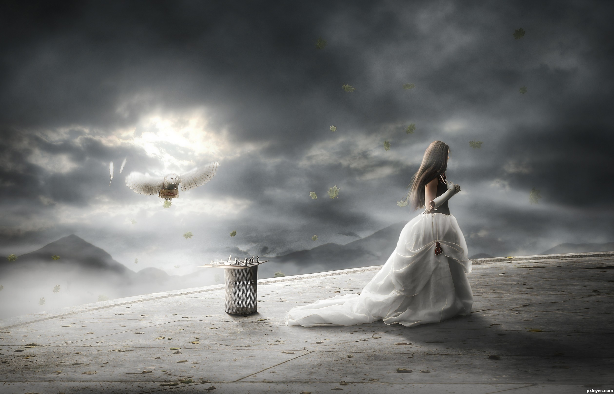
Thank brother or sister still. I made two versions and here is the other. I made a disclaimer in a post below about the bad guy that is in this image. It was taken care of in the final version.

(5 years and 406 days ago)


avatar robvdn
robvdn says:

Well done. Great win!

author says:

Mahalo Rob Van Dam. that's my nickname for you because that's who I think of every time I see your name.

(5 years and 406 days ago)


avatar skyangel
skyangel says:

Congratulations on the win. Superb work.

author says:

Thank you thank you. It was hard to choose between the two versions. (see my post a few posts below for the other version)

(5 years and 406 days ago)


avatar madamemonty

Congrats, well done

author says:

Ahh.. MM. Thanks seestah. Seems like i haven't seen you in a while. Or we just haven't crossed paths.

(5 years and 406 days ago)


avatar Zizounai
Zizounai says:

Congrats BW

author says:

There's my girl. Always there with a smiling face.

(5 years and 406 days ago)


avatar still26
still26 says:

Congrats on your win, you are some artist!

author says:

Haha. I struggle with almost every Photoshop I do here.

(5 years and 406 days ago)


author says:

This was another version. It was so hard to choose which one. This one with the woman is mostly done but doesn't have the finishing touches.

I worked on this Photoshop for a couple days before I realized Hitler was on the stamps. OMG!! I liked the way the letter looked so that's why I had to use a separate stamp source for the final version to cover him up. I just wanted to show this other version, so please don't be offended that he is still on this stamp as I had not yet noticed.

https://i.imgur.com/m7WDFQZ.jpg

avatar skyangel
skyangel says:

I like the mail box one the best out of your two versions.

Zizounai says:

Me too. This dummy face is fascinating.

(5 years and 406 days ago)


Howdie stranger!
If you want to rate this picture or participate in this contest, just:

LOGIN HERE or REGISTER FOR FREE


The Royal Mail Ship and Black Swan - created by Drivenslush


The Royal Mail Ship and Black Swan
Favs: 0SBS: n/aHi-resRank: 5/5Score: 65.1% (1)15381 views

(5 years and 2308 days ago)

3 Sources:

avatar Chalty669
Chalty669 says:

Very interesting image! I like that you took the time to add the reflection of the titanic. Good luck!

avatar lincemiope

fantastic sharpness, it seems the design of an engraver, bravo!

Howdie stranger!
If you want to rate this picture or participate in this contest, just:

LOGIN HERE or REGISTER FOR FREE


'15th Century' Chess By Mail - created by fatz8016


15th Century Chess By Mail
Favs: 8SBS: 16Hi-resRank: 1/5Score: 71.5% (42)16198 views

Credits to

auroradreams
NefaroStock (5 years and 2663 days ago)

6 Sources:

avatar Drivenslush

very neat interpretation of the source author, GOOD LUCK!!!

avatar MnMCarta
MnMCarta says:

I really love this one! Very nice soft blending

avatar minnie
minnie says:

Beautiful mood, good work!

avatar CMYK46
CMYK46 says:

The top edge of the owl kinda dies against the background, but nice work.

avatar sande1001
sande1001 says:

Very nice, good luck

avatar Eladine
Eladine says:

I think the darkoutline behind the skirt is A little too thick or dark maybe it really made the edge of the skirt sharp like a knife in contrary to the ege of the flooring where theres the same kinda dark outline on. dont get me wrong I really love the image , these two things just need to be matching a little better to make it perfect high score anyway

author says:

Thank you all for the comments! @ bob, i darkened the edge of the owl just a little bit. @ Eladine, thank for bringing that to my attention, its fixed now. again thank you all for your comments.

avatar jordyponce

Super Awesome..!!! smells like a winner to me
my fav also..

avatar Glockman
Glockman says:

nice looking image, gl

avatar pearlie
pearlie says:

Nice ethereal mood in this author, and interesting concept.

avatar madamemonty

Congrats, beautifully done

avatar enblanco
enblanco says:

Congrats!

avatar sande1001
sande1001 says:

Congratulations, very well

avatar Mina93
Mina93 says:

Congratulations,it's a remarkable work

Howdie stranger!
If you want to rate this picture or participate in this contest, just:

LOGIN HERE or REGISTER FOR FREE


You've Got Mail - created by Vexycon


Youve Got Mail
Favs: 2SBS: n/aHi-resRank: 3/5Score: 55% (25)11013 views

let's go kid , go go go :D


lots of work.. (5 years and 3004 days ago)

7 Sources:

avatar dreamboy
dreamboy says:

Good work. But you need to erase the line, where the rays end up.

avatar locale
locale says:

Good work !. IMHO rays could be gradient masked. GL

author says:

Tnx , I forgot that thing, I corrected

avatar pixelkid
pixelkid says:

Nice imagination!

avatar Floortje1973

They can bring my mail like that any time.. Great idea! Love the stretched version of the car..

avatar erathion
erathion says:

very cool work author...gl

avatar CorneliaMladenova

Postman Pat in Heaven Beautiful picture

avatar Floortje1973

Congrats!

author says:

Thank you

Howdie stranger!
If you want to rate this picture or participate in this contest, just:

LOGIN HERE or REGISTER FOR FREE


Mail Bear - created by lchappell


Mail Bear
Favs: 3SBS: n/aHi-resRank: 5/5Score: 53.4% (0)5691 views

(5 years and 3251 days ago)

3 Sources:

avatar demi
demi says:

great idea, very nice done.

avatar hereisanoop

good thinking and

avatar dollmommy
dollmommy says:

Gotta make sure that there isn't any goodies in the packages you send out through that mailbox....lol....good thinking!! GL

avatar itsdesign
itsdesign says:

nice...work on the hard edges

avatar swordfish
swordfish says:

good job .........

Howdie stranger!
If you want to rate this picture or participate in this contest, just:

LOGIN HERE or REGISTER FOR FREE