http://photoshopinspire.com/2013/06/12/create-a-beautiful-wallpaper-in-photoshop/
I had created this some time back. check here for details (5 years and 1768 days ago)
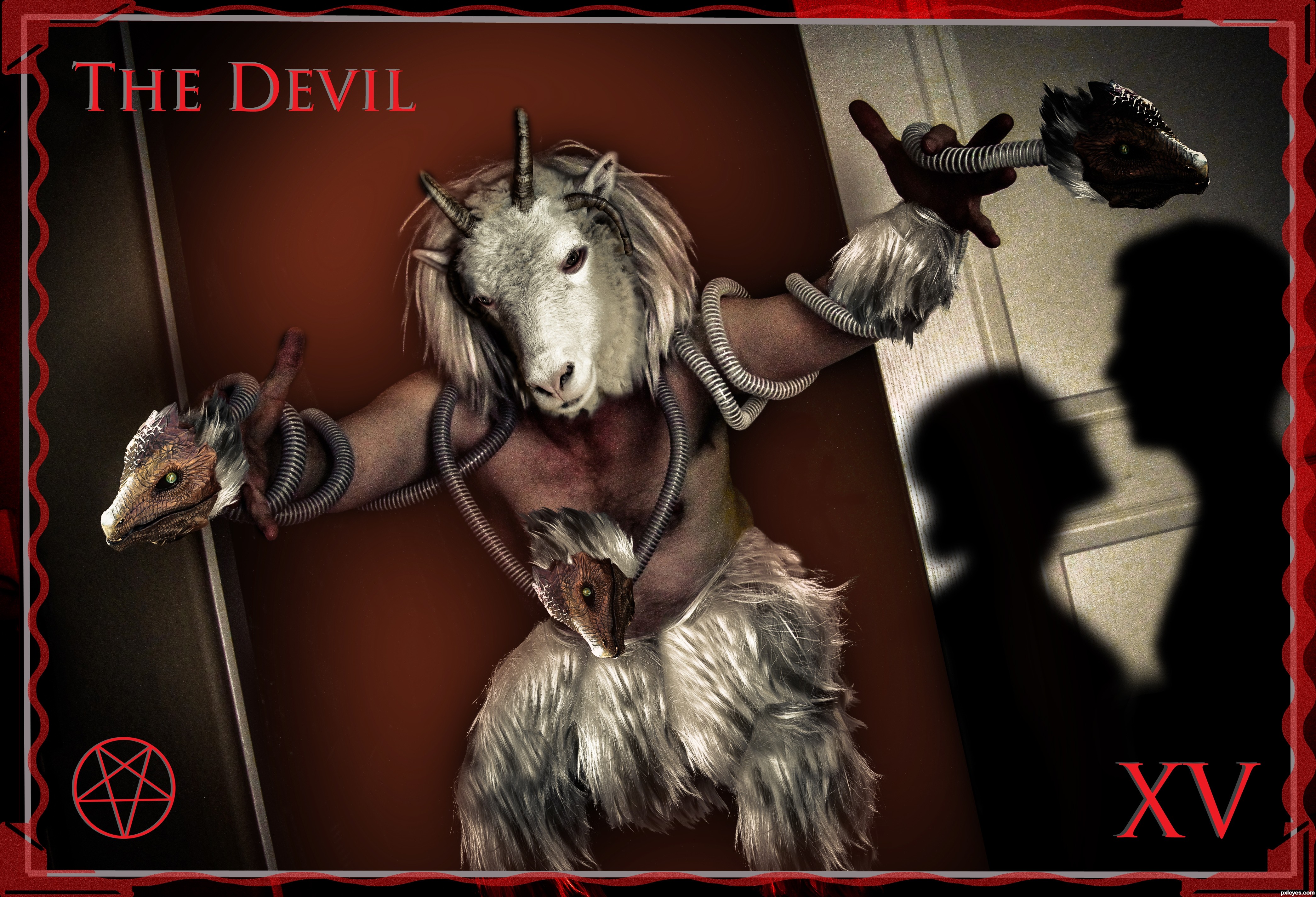
The Devil is another of the popularly misunderstood cards of the Tarot, perhaps second only to Death in this category. In our modern world we do not like to think that there is a seed of negativity in everyone, so we assume that anything bad that happens must be the work of some outside Devil, who is to be feared and shunned. But really, people do not do bad things because a force outside them is controlling their actions. They do bad things because the negative part of their own personality is expressing itself. To deny this side of yourself is to give it power over you, and to give it free reign over your life will eventually destroy you.
The symbolic portrayal of the Devil in the Tarot is a clear mockery of two previous Major Arcana, the Lovers and the Hierophant. The former parody is perhaps the more obvious. Where the angel hovers on the Lovers, the Devil stands on his card, cursing the man and woman rather than blessing them. They who were once connected to each other by love are now attached to the Devil by their chains of lust and ignorance. The Devil's hand mimics the gesture of the Hierophant, but perverts it. The true Hierophant offers spiritual wisdom and beckons to us with an open hand. The Devil's gesture hides his true intentions of hurtful wisdom - not really wisdom at all.
(5 years and 2645 days ago)
Nice! The picture in SBS step 2 is brilliant.  You have really creative ideas for making the photos that you need for your photoshop art!
So kind and much appreciated!
Dear author, I love your creativity making your own photos to provide the sources for the contest. Must say that this Devil is with a sweet expression... I like your concept... GL
Thanks for the kind words!
Kind of creepy, but real.... like your imagination...!
True, it is creepy, that's what I was going for in this one.
Howdie stranger!
If you want to rate this picture or participate in this contest, just:
LOGIN HERE or REGISTER FOR FREE
(5 years and 3234 days ago)
good idea author i like it
lovely
best luck
Thanks you, kushpatel.
Howdie stranger!
If you want to rate this picture or participate in this contest, just:
LOGIN HERE or REGISTER FOR FREE
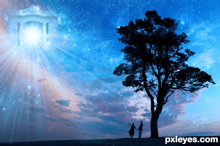
Song is by Coldplay. Hope you like it.
-EDIT- fixed the too dark problem :) (5 years and 3416 days ago)
Too dark. Half of your image is so dark, it's very hard to see what is going on, or what you are trying to communicate. Particularly the RH side. The building looks like a facade, with no real back to it, the stars seem to jam right up against the lit front, with the remaining blackness on the right just "dead space."
The figures are almost impossible to make out as a couple, the light swirl is too dominant.
Beautiful concept, just too "moody," with not enough consistent illumination for the viewer to clearly appreciate your efforts.
instead of give the author such negative comment, you could give some advice to improve the image mossyb, maybe its just someone how just get started with ps and then u need some build up comments and not that kind ur give
coldplay 4ever good job
The idea is good, however the image is very dark. Its almost like the saturation and contrast are making this image darker.
With the couple in the foreground, if you took a bit of the sparkles around them off, then they would be a little bit more clearer as well, the you may not need to lighten the image too much more 
Goodluck anyway author
Lovely image and great concept ... I agree it is a little dark but only a little ... I have seen a night sky where the stars stand out against a "void" when there is something that you cannot quite make out in front of them. I think a little lightening and some minor toning down of the sparkles would enhance the image .
To lighten you can apply a Levels adjustment layer and brighten it up so the image is "too" light ... then mask out what you don't want to lighten and set opacity to get it just right ...that is if you want to
EDIT: Better! 
i think its fine dark... its night time with no lights really... its supposed to be dark. i wouldnt lighten it up any more... if you must go that route in one way or another, instead bring out more details at the focal points to make them more pronounced, and bring in a little more detail in the darker parts to keep it balanced.
Very very nice piece of work...best of luck author
Howdie stranger!
If you want to rate this picture or participate in this contest, just:
LOGIN HERE or REGISTER FOR FREE
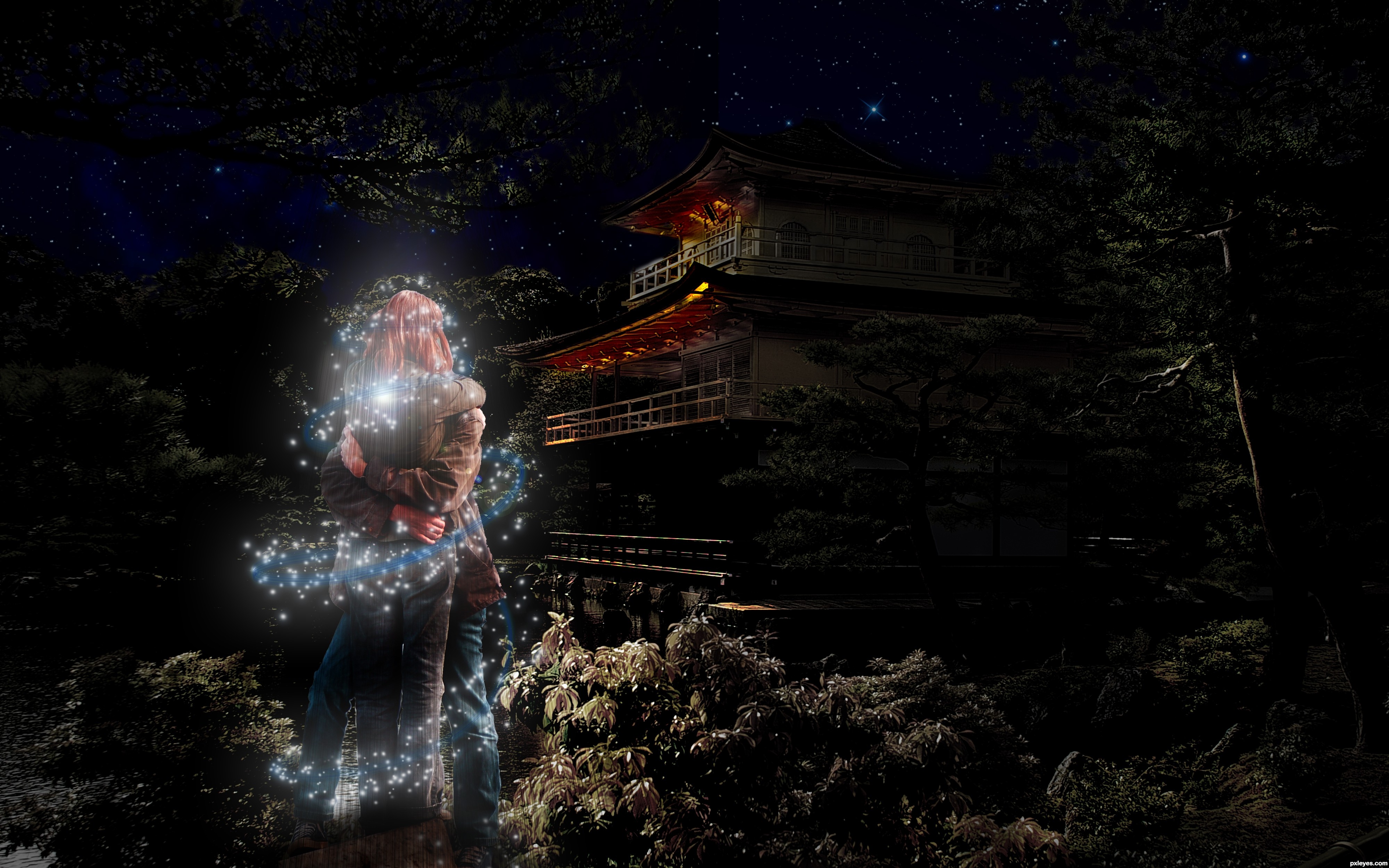
Step By Step and High Resolution uploaded for your convenience. (5 years and 3531 days ago)
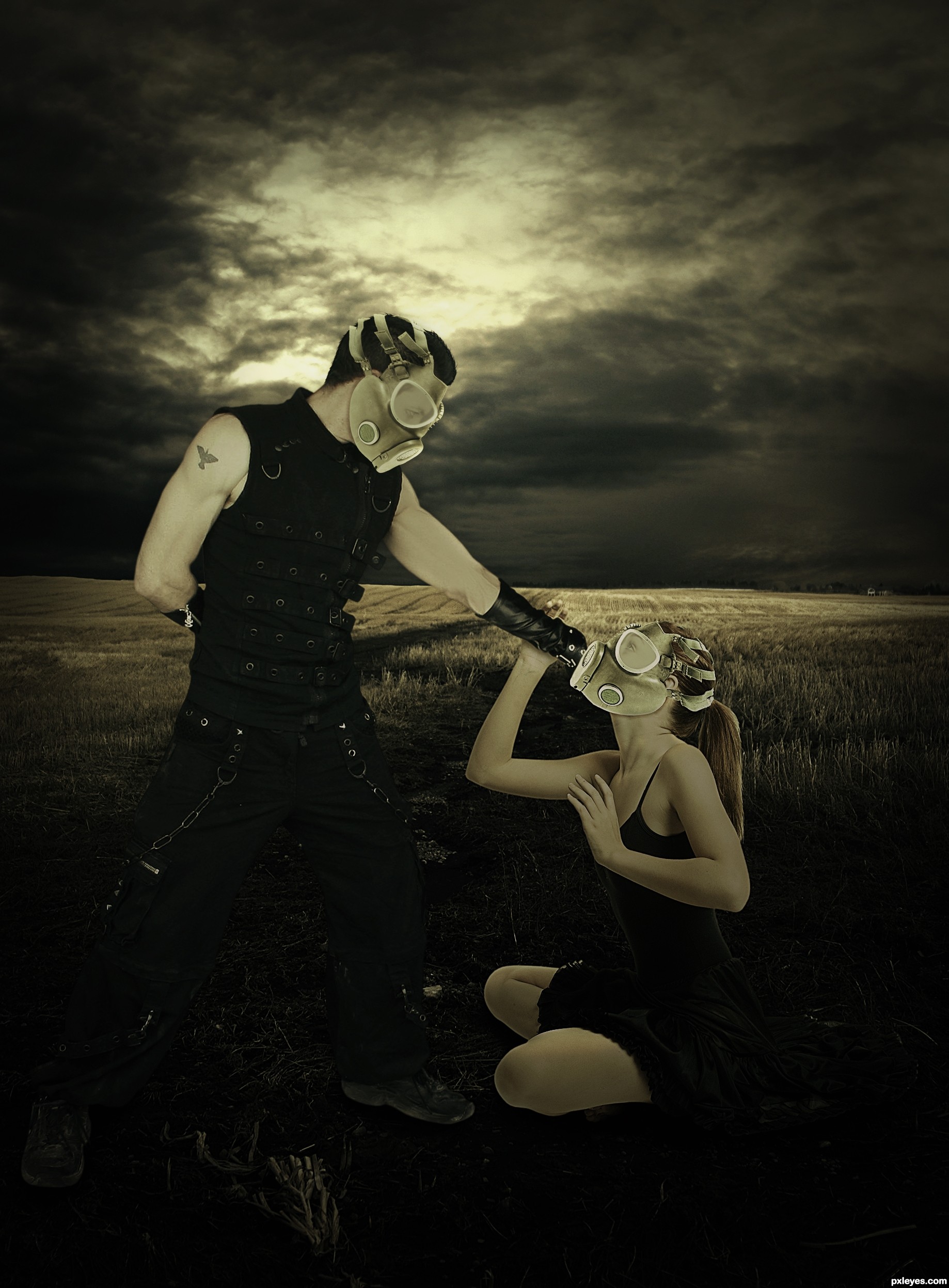
Good! I really like it. Sources need a bit of shadows... Try darkening the lover body parts...
That.. is.. awesome! The image looks fantastic! Follow Toca's sound advice and this image will be perfect. Well done!
great job,nice and smooth blending
Darkened the lower part of the girl as suggested. Thanks for the suggestion.
More shading!  (And try to get rid of the girl's outline...).
Great imagine and wonderful fitting of the masks on your outside sources! I would follow the other suggestions and this would be a top notch entry
i like it the idea,and very nice but somthing is messing
GL!
congrats on 4th, good wrk...
Howdie stranger!
If you want to rate this picture or participate in this contest, just:
LOGIN HERE or REGISTER FOR FREE
Photography and photoshop contests
We are a community of people with
a passion for photography, graphics and art in general.
Every day new photoshop
and photography contests are posted to compete in. We also have one weekly drawing contest
and one weekly 3D contest!
Participation is 100% free!
Just
register and get
started!
Good luck!
© 2015 Pxleyes.com. All rights reserved.


Great blending. Great job
I like the contrast. Welcome back author.
Welcome back and nice to see your work.
I was expecting you...
thank u all glad to see all old friends back!
I would have it on my wall
thank u
Howdie stranger!
If you want to rate this picture or participate in this contest, just:
LOGIN HERE or REGISTER FOR FREE