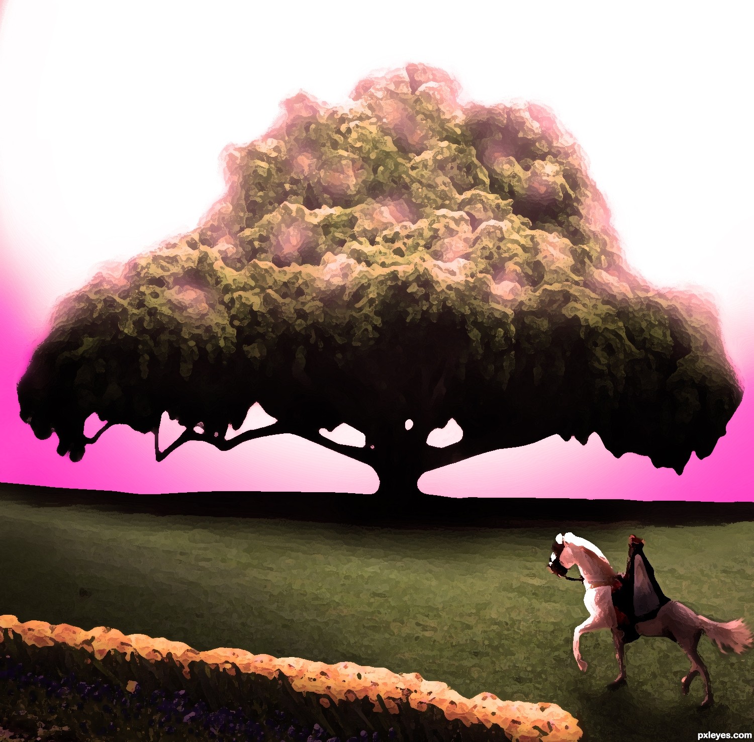
Storybook style illustration of The King going to count his golden apples. (5 years and 2751 days ago)
6 Sources:
Thanks:
http://www.sxc.hu/photo/406969
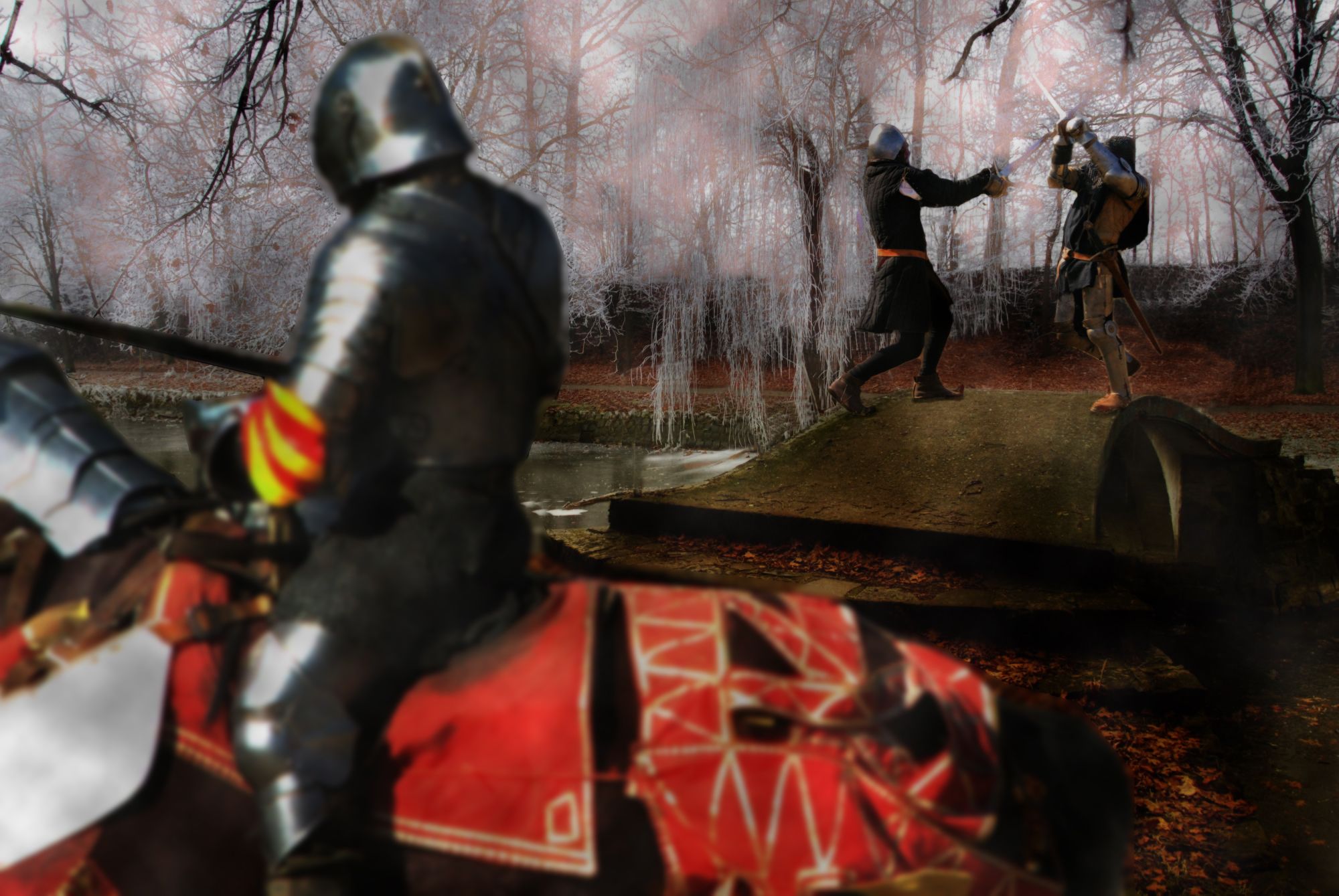
knights fighting
jmjvicente
http://www.morguefile.com/archive/display/94472
one knight on horse
ronnieb
http://www.sxc.hu/photo/1208374
other knight on horse
kamila t (5 years and 3509 days ago)
LOL... I kinda find the whole scene funny...  However the knights fighting on the bridge might need some shadow below their feet...
Also the knight on the right( in the bridge) need some masking between his arm... 
Edit: Ahhhhh.. A stalemate... Nice... And the pic looks better now...
Thanks for the advice.... I think I fixed it!? Primarily I was trying to get rid of the rails and make it look good!? The picture is a chess metaphor kings fighting and last soldiers are the knights on the horses.... it should be a draw and no one wins.
this is just a great take on the source.. good luck (you are an old soul)
I'd lose the mounted knight in the background...it looks just like what it is: a statue, and placing it between the two fighting figures is distracting. Also, you lost some of the foreground knight's sword.
Looks better now...good luck. 
Aww now it's not a stalemate anymore... I liked the previous one better... This one fine as well( I already had cast my vote, so doesn't matter)... However instead of removing that knight you could have done an another thing...
But no need to edit it anymore, cause too much editing can ruin the feel of the picture... Just saying this so you can apply this to an another image...
Instead of removing that horse rider, you could have blurred him a bit and also blur the background( blur the background more than you blur the horse rider in the back...)
And then you could have blurred the horse rider in the front as well... This would have created a nice dof and more focus would have been drawn to those two swordsman on the ground...
As I said no need to edit it anymore... Was just giving an example...
arkncheeze.... I thought about CMYK46 remarks and made adjustments... with my metaphor for chess as the main thought, I'm a chess dork, and even with removing the knight from the background it's still a draw in chess unless the lonely king makes an obvious blunder... lol....thanks for the comments and advice it's truly appreciate and helpfull...hopefully hear from you again.
This is great! Love the imagination, author! Shadows of foreground knight would be better darkened a bit more.
EDIT: Foreground Knight looks excellent now! Great job!
Very cool! Some shadows on the front knight will be nice! And maybe you should blur the front knight to add some "Depth of Field feel" to the image  Good Luck
Howdie stranger!
If you want to rate this picture or participate in this contest, just:
LOGIN HERE or REGISTER FOR FREE
Photography and photoshop contests
We are a community of people with
a passion for photography, graphics and art in general.
Every day new photoshop
and photography contests are posted to compete in. We also have one weekly drawing contest
and one weekly 3D contest!
Participation is 100% free!
Just
register and get
started!
Good luck!
© 2015 Pxleyes.com. All rights reserved.


This would be stronger if you had some apples on the tree...
Good composition but too filter heavy.
gOOOOOOOOOOd
Howdie stranger!
If you want to rate this picture or participate in this contest, just:
LOGIN HERE or REGISTER FOR FREE