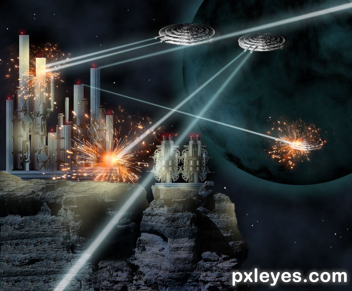
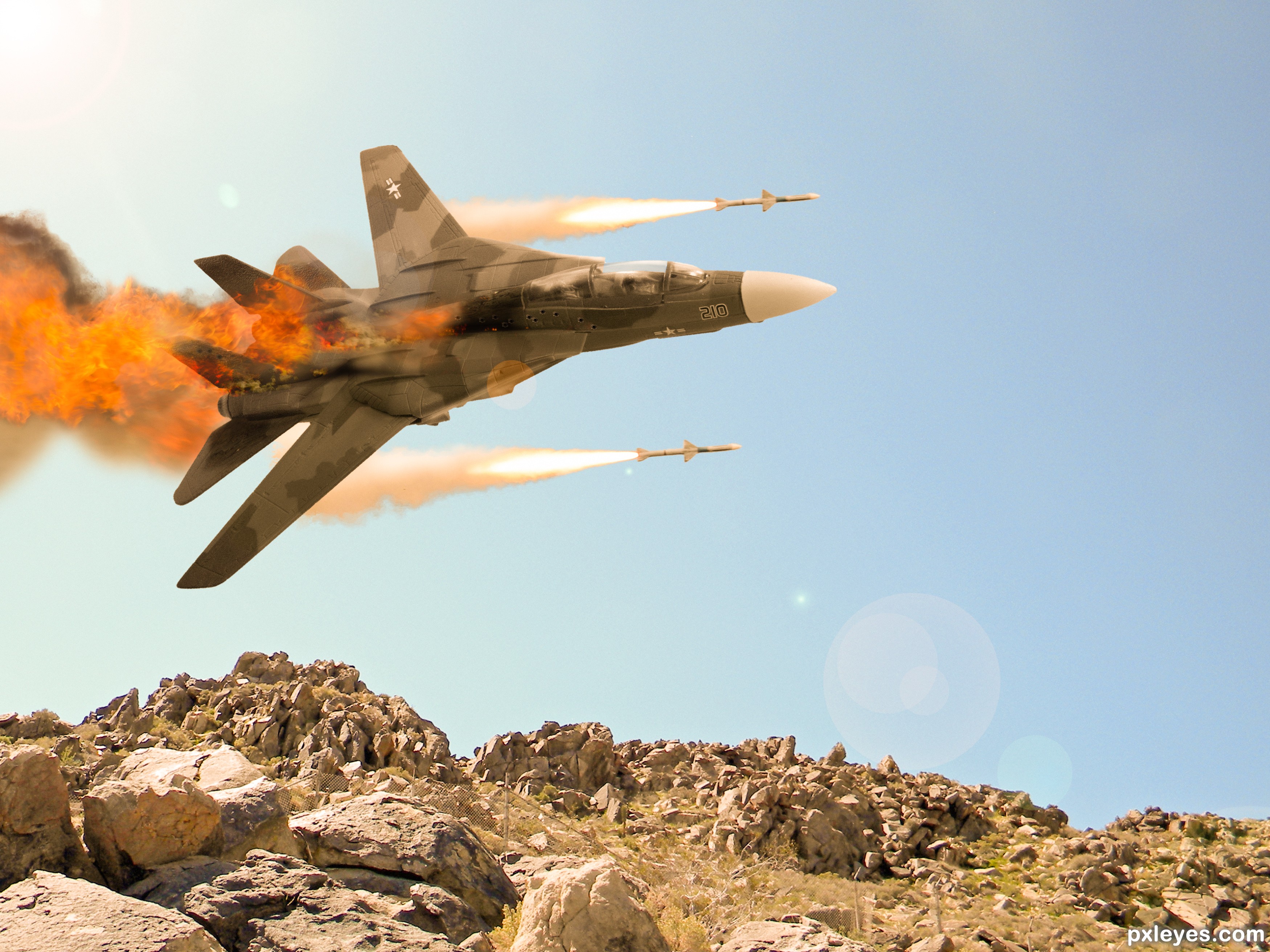
Just a space fight, thinking of Star Wars. Not really, but something like these fights for power can happen in space in a near future. (5 years and 1298 days ago)
2 Sources:
http://www.pxleyes.com/photoshop-contest/19905/shrunk-2.html (5 years and 1298 days ago)
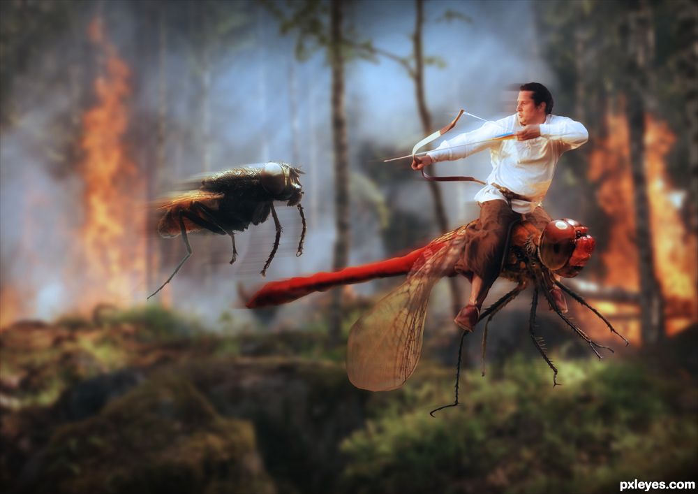
Maybe a giant mosquito would be more dangerous, but it's a good image. 
Good work, I like the sense of movement....
BZZZZZZZZZZZZZZZZZZZZZZZZZZZZZZZZZZZZZZ... hehehe
A fantastic image  Blur effects are very realistic and eye catching. IMO the rider should be smaller so that it fits and balance the weight on the dragonfly Hope you will get enough time for the edits. Good luck
Congrats 1, 2 & 3 Nasir
Congrats Nasir! The triple crown, 1st 2nd and 3rd place! It's been a long time since we saw that... 
Congratulations....
Congrats on first
Congrats on the sweep!
Thanks to all for your comments, votes and congrats.
Congrats for the 1,2,3 places... well done author
Congrats
Congratulations! First 3 places? wow!
Howdie stranger!
If you want to rate this picture or participate in this contest, just:
LOGIN HERE or REGISTER FOR FREE
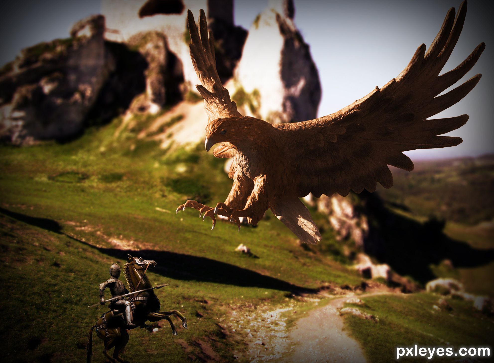
A scene created of a Knight guardian himself against the giant Bird. Hope you like! (5 years and 1989 days ago)
Pretty cool, but you might want to make the shadows on the knight match the shadows on the bird
Color values on bird & background are the same...your image would be much better with a contrasting background.
Love this one. Great balance and mood.
My opinion - the bird is just a touch too large.....making it appear that it's intended flight path is closer to us, and will thereby miss the knight all together. Reduce the size of the bird for increased scale and perspective.
Congrats Sebastian 
Howdie stranger!
If you want to rate this picture or participate in this contest, just:
LOGIN HERE or REGISTER FOR FREE
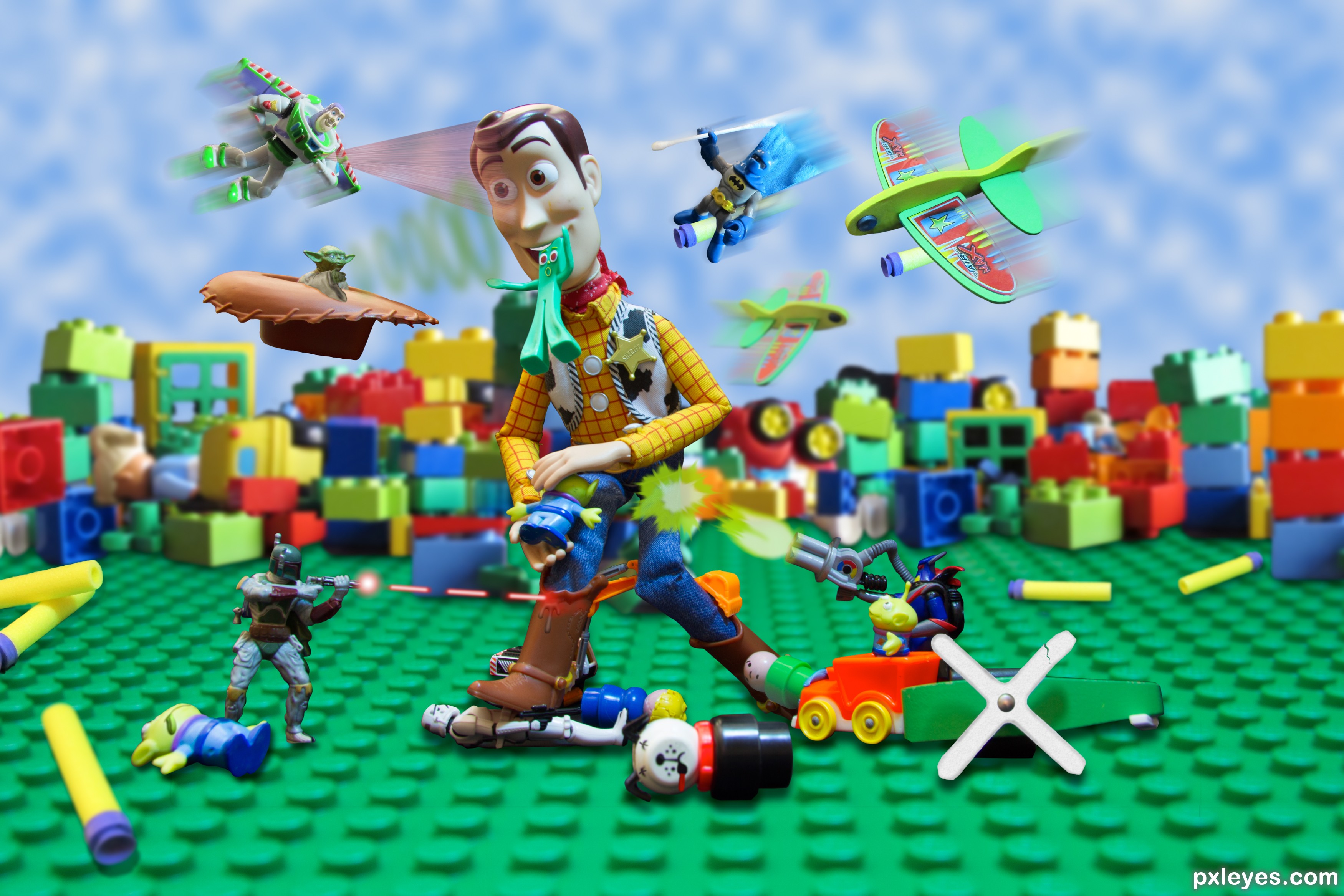
Tall vs Small (5 years and 2109 days ago)
Fun work here, author. A real massacre! One thing maybe, if you culd have made the clouds more like the Toy Story wallpaper from Andy's room, would fit more in theme. Good luck!
I didn't get it changed in time for the deadline but the movie wallpaper-like version worked well and I will keep it that way. I ended up drawing the clouds and then extruding to 3D, then rasterizing back to 2D before cloning. Pretty cool look. Thanks!
Congrats!!
Thanks!
Congrats Randy!!
Thanks!
congrats
Thanks!
Howdie stranger!
If you want to rate this picture or participate in this contest, just:
LOGIN HERE or REGISTER FOR FREE
(5 years and 2175 days ago)
I think this is well put together and a good idea
Thanks!
Howdie stranger!
If you want to rate this picture or participate in this contest, just:
LOGIN HERE or REGISTER FOR FREE
Photography and photoshop contests
We are a community of people with
a passion for photography, graphics and art in general.
Every day new photoshop
and photography contests are posted to compete in. We also have one weekly drawing contest
and one weekly 3D contest!
Participation is 100% free!
Just
register and get
started!
Good luck!
© 2015 Pxleyes.com. All rights reserved.


Good construction with the power houses.. I would suggest a little more details for the Ufo's, atleast for the weapon portions (where the The UFO fires) some hole or a gun like thing (up to you), Now it looks like the firing comes from nowhere. It's ok to imagine the weapons are located at the bottom, But it will be more dynamic if the image shows some. Great work on the sparks/ explossion. Construction of rocks (the base station) is superb. Also I would like to see some more yellow glows on the powerstaton and some glow on the rocks too, where the explossions happening ( Now it's cool and dont blow up if I am wrong). Good luck author
See what I can do, I agree with the weapon guns and the details on the yellow glows.
I'm afraid that the yellow glow/color is bit over done, former one was better auhtor
Super concept. Maybe giving the returning beams from the Buildings a different color, or making them into some sort of plasma lightening to create the idea that there are two different weapons to add to the realism. Just a suggestion. Love the concept.
I noticed that something was not right in the beams, a different color will make it.... Thanks my friend.
Love your idea. I would agree with hereisanoop and Drivenslush. I would like to add a small suggestion about your beams. I would make them solid not transparent and narrower. Other than that it's a great idea. Good luck author.
Thanks for your comment....
Congrats on 5th and 4th
I thank you again....
Howdie stranger!
If you want to rate this picture or participate in this contest, just:
LOGIN HERE or REGISTER FOR FREE