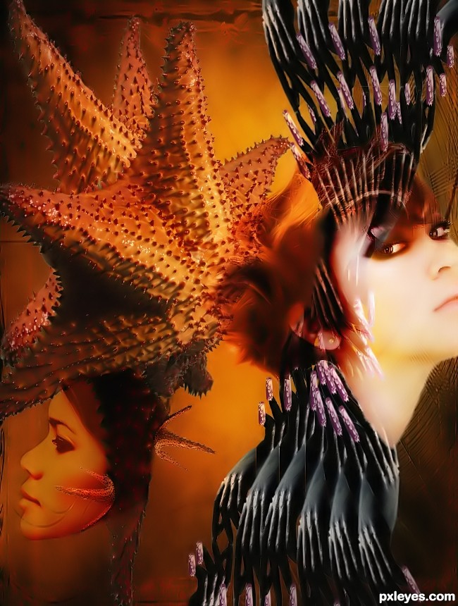
(5 years and 2978 days ago)
1 Source:
(5 years and 2998 days ago)
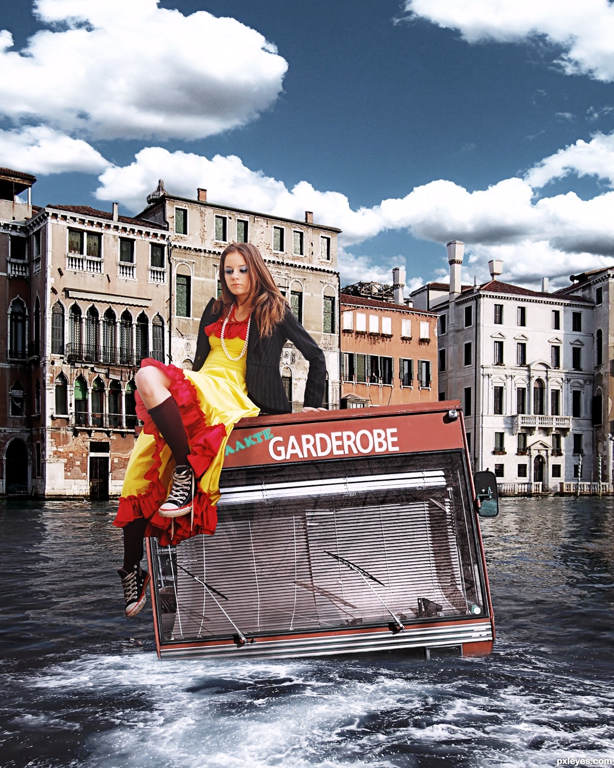
She's a giant...no wonder that bus is sinking. 
I see shapes no vanishing points and realistic
good!
very very nice blend author....don't worry about the size,i heard that this is mini bus...
he he im not worry, thank you!
Is Venice drowning! Oh no! Great concept!
very nicely done I love the color adjustments on this pic. oh well I think someone should come to save the girl hehehe
thank you, arca and dek!
cool idea, like it!
The look on her face is Priceless LOL
Howdie stranger!
If you want to rate this picture or participate in this contest, just:
LOGIN HERE or REGISTER FOR FREE
(5 years and 3027 days ago)
very nice compo author...love the color selection and mood is great...best of luck
Howdie stranger!
If you want to rate this picture or participate in this contest, just:
LOGIN HERE or REGISTER FOR FREE

Thanks to sxc.hu & Larry Bradby for 'VittoriaMari series 2 2' (5 years and 3058 days ago)
it doesn't make sense to why the nipple shows? it makes the art of the shirt kind of trampy..i really love the concept though!
I have to agree with Crystle. If you want to make it a shirt you need to significantly dull down or remove the nipple, alternatively remove the stitching and smudge the edges and call it body paint... then it would make sense that the nipple was still so prevalent.
More light on her dress would do good and somekind of distort ( either liquify, displacement or spherize) so it looks like it's on her.
If you wanna keep the nipples make them look like they are on purpose: place some vivid colour around them or dark lines from it like a sun, or something like this: http://shrani.si/files/rozeta10wq4.jpg
And there goes the 3rd comment about nipples, lol.
Now that's something I wouldn't have thought of! Good work! 
Thanks for the comments all of you.
RayTedWell you said ''If you want to make it a shirt you need to significantly dull down or remove the nipple...." But why ? Aren't shirt transparent ?
Not sure if I like this or not but it seems quite well done. There is just something about it that doesn't quite work for me. But it is interesting and I came back for a second look and believe me it wasn't the nipple I came back for 
Creative idea, but I totally agree with Ray Tedwell.
Howdie stranger!
If you want to rate this picture or participate in this contest, just:
LOGIN HERE or REGISTER FOR FREE
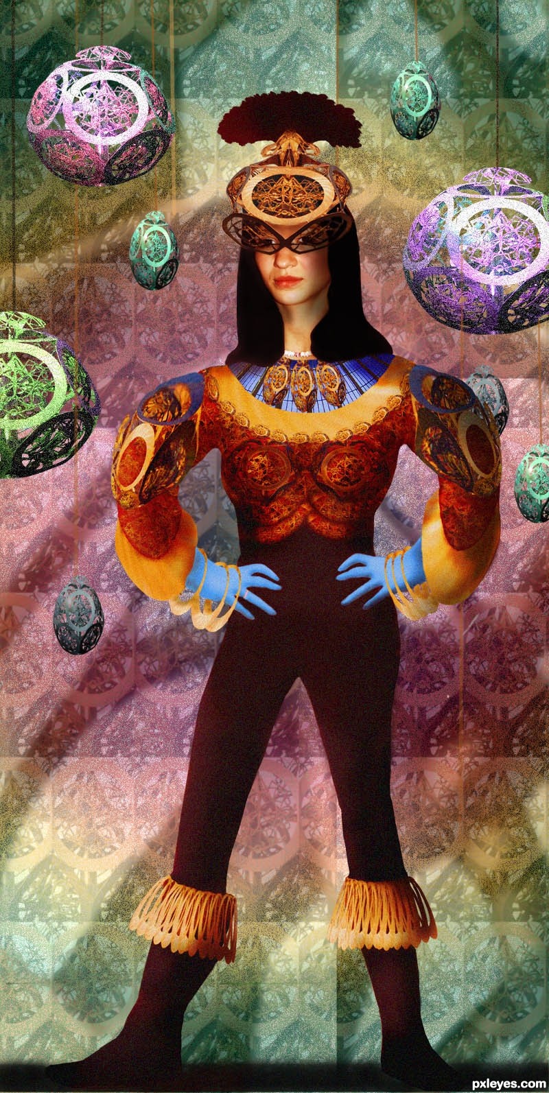
All is from source except the girl (my own photo-with permission) and the greenhouse source used for the neck of the costume. Thanks to frenchbyte at morguefile.com for the greenhouse photo.
Have edited by adding another pattern layer. (5 years and 3124 days ago)
OH LORD.. BWHAAA HAAAA HAAAAA (super fun piece... I'm sure Blackwell would have a field day with this.. LOL)
Cute author
very nice
She looks like she is ready for one wild night ... well she looks like she is ready for something! Fun piece!
cool idea...gl
Howdie stranger!
If you want to rate this picture or participate in this contest, just:
LOGIN HERE or REGISTER FOR FREE
Photography and photoshop contests
We are a community of people with
a passion for photography, graphics and art in general.
Every day new photoshop
and photography contests are posted to compete in. We also have one weekly drawing contest
and one weekly 3D contest!
Participation is 100% free!
Just
register and get
started!
Good luck!
© 2015 Pxleyes.com. All rights reserved.


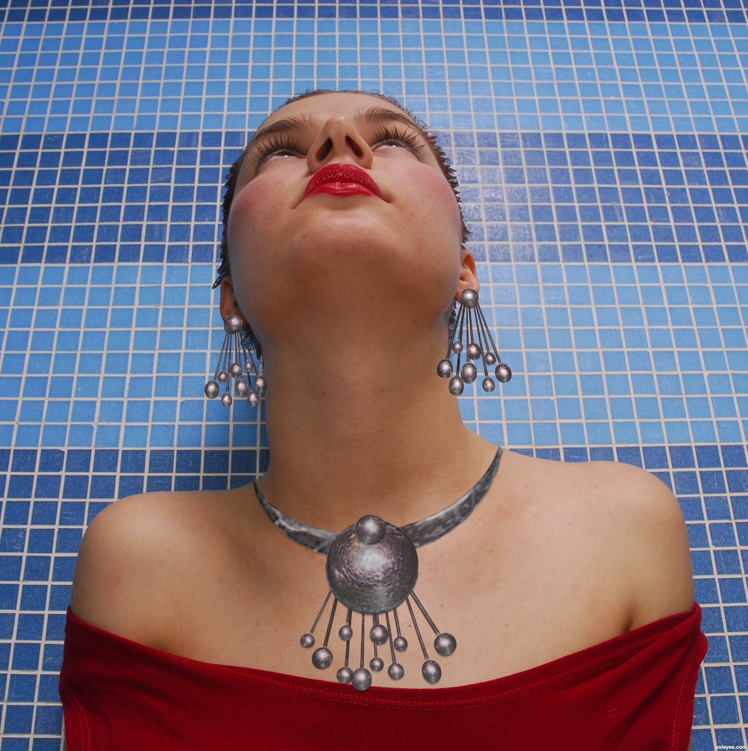
wonderful imagination! i love the earrings you've made out of the whiskers, if only they were gold, id buy em in real life!
It's a good idea but there are some problems:
- Light source : those earrings from her right ear - left side of the image would not receive as much light as those from the right side.
- Edges should be softer cause they make the accessories look flat.
- Shadows on the girl are soft, but the shadow from necklace is hard, like the light source is really close. This discrepancy makes the blend look less realistic.
- also the Design of the necklace could be improved- it doesn't look to nice at this moment.
I hope you won't mind for telling you this, you should know that i appreciate a blending entry more than a CBR where lights/shadows are abstract notions.
Thanks Greymval! It's always easy to be "too close to the trees," and a sharp eye like yours really helps to ground me!
Never be afraid to point out these things, it helps improve my skills to have a "second set of eyes" pointing out where I need to improve.
As for the "design of the necklace could be improved," that's one I can say about a lot of jewelry...lol! It WAS a whisk, after all!
Lol, i meant that metal band around her neck- the shape ( & texture) is not continuous and when it reaches the shoulders it seems it has no thickness. I guess who can easily fix it with a pen tool and a bit of cloning.
The easiest way to improve texture would be to take a sample of the whisk enlarge it and clip it over the shape, while you warp it to follow the curve.
For shadows you can :
- use a different layer in which you paint with black soft brush.
- or just duplicate layer, threshold it , lower opacity.
At the end you should use gaussian blur and fade it ( in Edit) if you think it's too much.
You can also add a few solid color layers on top of the final result with overlay & low opacity, so it improves the general mood & blending.
Some people use lighting effects & overlay to level out the main piece & place on second the BG - just try different things until you like it.
Great work with the earrings but the necklace need some shadows...best of luck author
Howdie stranger!
If you want to rate this picture or participate in this contest, just:
LOGIN HERE or REGISTER FOR FREE