i made a few changes... i hope you like it! (5 years and 3472 days ago)
1 Source:
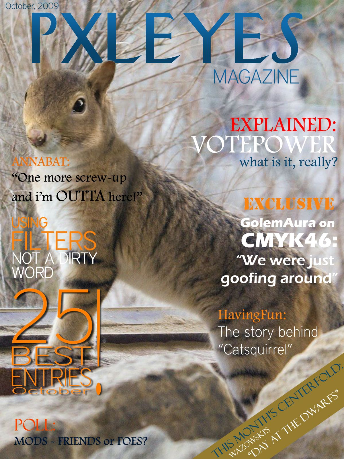
Thanks to HavingFun for letting me use his image! (5 years and 3473 days ago)
BWHHHAAA HAAA HAAA HAAA HAAA
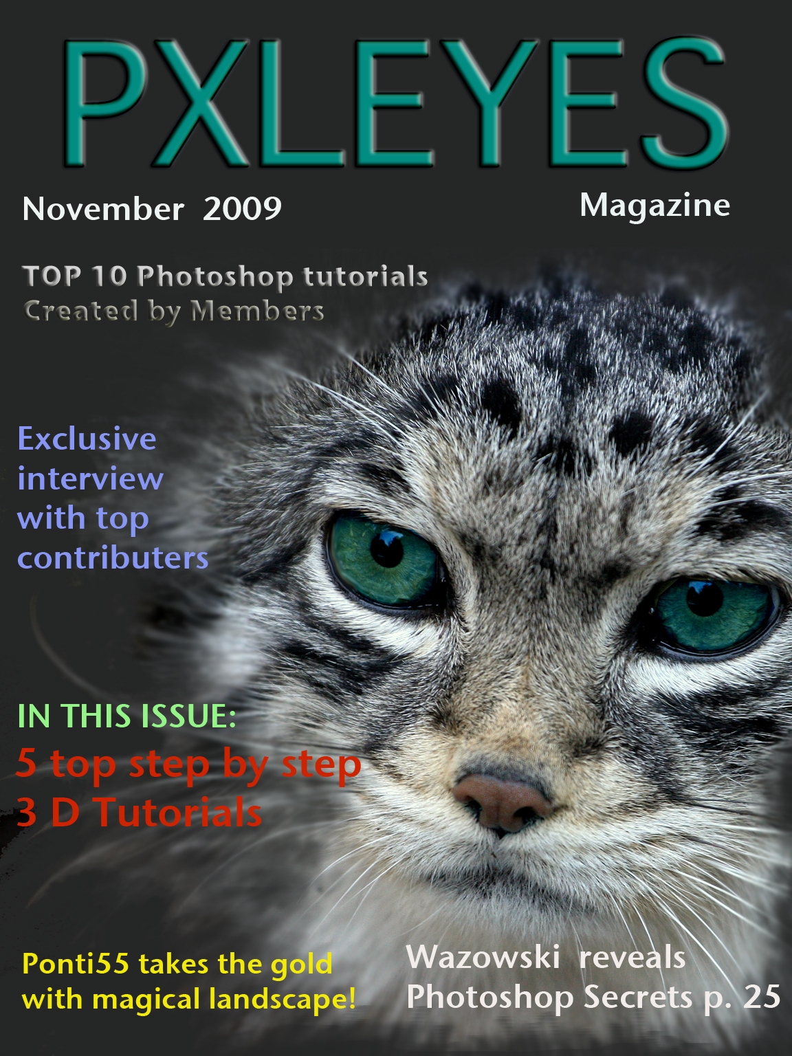
I really like the magazine, it looks very professional, i have a couple of ideas though, maybe you could use a darker font in 'Not a Dirty Word' because the D looks washed out. I also think that Wazowski is witha n 'i' not a 'y' but the rest is excellent.. LOL at the Exclusive.. now there's a story i would love to read!
OK, where can I subscribe for this mag ?
 thanks for the tips ponti! i've made the font a bit thicker so it's more visible now.
check in high res! it's easier to read
This looks good, I like the cutout over the title, nice touch.
you noticed!  thanks everybody
Wow, this is really cool!! Great ,great job on the cover!!!
YEAH!!! Simply awesome. Very well done. Thanks a lot too.

Great. Professional looking magzine.
very cool
Love the centrefold idea!
nice.....A squirrely cat...lol
Lol i think there's a lie there xD
good job
poor annabat 
Nice layout and of course main pic is great choice...but the personal jokes and 'inside' stories are a bit tiresome and don't really help the believability. Nice job with the tricky use of many fonts, though. It works!
pixelkid, when i made the entry i actually thought i would be the only one who'll think of these "inside" themes.. but hey, this is a fun contest, and i was having fun doing it. i could have written "amazing new tutorials" or "pen tool 1on1" but i wasn't really going for that. thanks for the comment! 
Congratulations for 3rd
congrats 
congrats
Congrats for your third place, Elficho!
congrats
congrat to you
Congrats
Elficho, great job!!!
Congratulations!
Congrats
Howdie stranger!
If you want to rate this picture or participate in this contest, just:
LOGIN HERE or REGISTER FOR FREE
(5 years and 3473 days ago)
Not bad, although I dont get well what the photo has to do with the magazine. Maybe if you connect it with an item that you can read inside the magazine it would help already. You also may want to look at the lay out, where you put what text and the font size. Ow, and remove the "m" from "Octomber". Good luck!
looks quite good, i just don't get the "socialize with friends" part.. how do i do that through a magazine?
Looks quite professional, good luck.
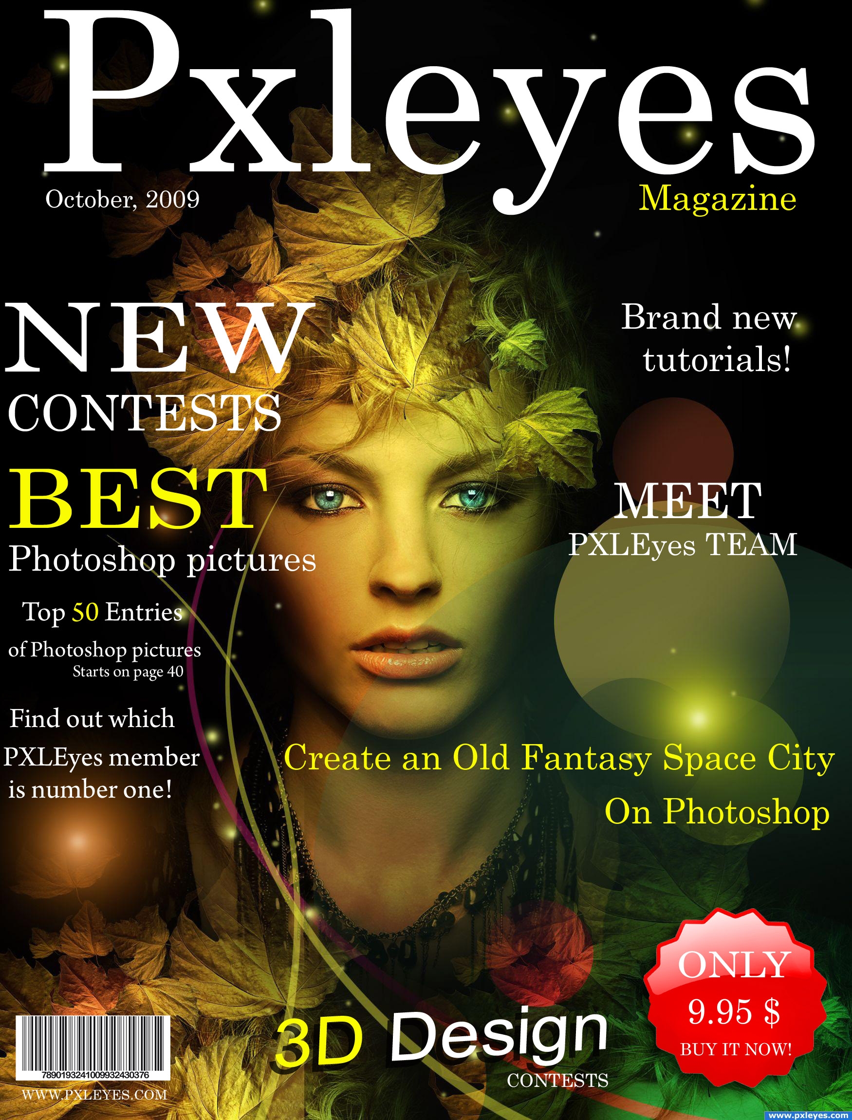
I really like the all over look of your cover, great job... the only thing that I wouldn't put on it is the bar-code...it's a bit of an eye-sore to me... but I love everything else! good luck!
i like it much better now that the bar-code is smaller!!
very nice!
A very good choice of cover image - I like it!
Wow nice job
good1
very very pretty
This actually looks like it could be a real magazine, except for the gigantic bar code (should be about 1/2 that size), so good job
i love the cover colours. IF i was to buy this i would ask : "What does the 3D Design mean?" there is no other reference why i should explore this aspect of the mag. GL nice entry.
I like this a lot!! Try and justify left the 'Top 50' copy. Capitalize 'October' too...
wow thats a good picture, the whole cover look pro i hope you win
have you changed the bar code? i think the scanner would have a hard time reading it now
yey, I'm on the cover magazine :P
yes you are!
nice layout, good source, good luck....
wow... another person that just added text to someone elses artwork..... low vote!!!!!
Exceptional!
great job
Congrats
Howdie stranger!
If you want to rate this picture or participate in this contest, just:
LOGIN HERE or REGISTER FOR FREE

Well I think I went overboard... But I loved the headphone stock... Wanted to use all, but could use only 4 outta 12...
But using the same person/ model does bring good consistency in this template...
Yes, I made it in a template, but it's a a mock template, coz it's not in the actual size...
Based on a 3 piece girl modern/soft rock band called "Gaussian Resonance" XD
There are some white line between the covers... Those are not border but rather gaps..
The top most leaflet is the double type fold able front cover...
The middle leaflet in the inlet cover...
And the bottom is the back cover and the cd itself...
Oh man, did this took lot of time... Editing the pic was fast... It was the text and lay outing that took away most of my time... Now I know why people want huge pay for lay outing lol...
The font I use is mentioned in sbs... Also the headphone link provided leads to a zip file... It's a pack... I didn't find separate images... So if you want to validate my source, you have to download the zip file...
Also permission is show in sbs as well...
Hope everyone enjoys this template...
View in High res to be able to see the song list properly...
And very much thanks to these person...
Thanks to da ~xopion for his awesome mockingbird guitar shot...
Thanks to da ~Lina-Tsu for her gorgeous and sensual guitar playing pic...
And most thankful to da =TwiggXstock which is the really the bulk of my template... XD (5 years and 3518 days ago)
This is absolutely incredible! This image is creative, catchy, cool, colorful, and careful in preserving even the most minute details found on CDs. Only a few things I can say that might be improved, and it's mainly a matter of my personal taste so don't feel the need to take my suggestion: first, the nude girl is not playing any chord which makes sense (though this neither matters nor can be avoided); second, the dots in the border around the picture of the nude girl should be blue and silver as opposed to blue and red, to preserve the color scheme.
I ran out of room, so let me continue. Third, the picture of the nude girl has too stark of a transition between itself and the sorroundings; maybe a fade effect could make it less harsh on the eye. Also, since the catch phrase is "blurring the blur in the music" you could perhaps find places to add blur in the image, such as faded edges or slightly blurred fonts to make this catch phrase more evident in the image. Other than that I can't really say anything. AMAZING image!
Thanks vibs... Well I agree with your suggestion although I am happy with the end result for now... Also my eyes are tired now... Will get some rest and then try tweaking it... And about that girl not catching any chord, I noticed it but I liked the pic so much I had to include it lol...
Edit: @ Golemaura I was waiting for someone to say something about the white space... Glad it was you... But I made this not a chop but rather a template... So I don't really care about the white space... Also if i try to expand the bottom cover, it would really really mess up the proportion of the covers... Coz even if the covers are not of actual size, they are proportional to each other... Maybe I should add an invoice to Gaussian Resonance in that white space...
@Akassa I was also expecting that... Knew some people won't see that as a rock cover... But I mentioned that the band is modern/ soft rock maybe with some element of pop... And band that is totally rock is quite rare now a days... And I made the album according to contemporary style... At least it is not emo lol... Well each has it's own opinion...
Thanks for the feedback peeps...
Edit: Added an cd to the white space...Just for you Golem cause I LUUBBB you ROFL ha ha ha ha... enjoy...
Also made the color scheme more consistence in the inlet cover... Got rid of the orange red color...
hehehe... things get out a hand every once and awhile..LOL.. the huge white space on the bottom right corner is a big NO NO.. but I know you know that already author.. LOL.. you could just expand the bottom image and lengthen the whole piece.. no big whoop .. good luck.. hehehe
EDIT: Simple excellent fix.. great save author
I love it, great creativity.
Very nice, it really looks like a real cd cover! Love the model but doesn't look like a rock cover to me.... maybe pop? :P
cool
Congrats for your third place!
Congratulations for 3rd
Congrats!
Congrats...
Thanks...
Congrats!
Howdie stranger!
If you want to rate this picture or participate in this contest, just:
LOGIN HERE or REGISTER FOR FREE
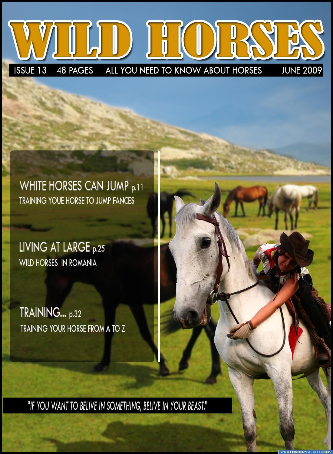
This is a fictional front cover of a magazine. I used two fotos(and that are made by me). Hoppe you like it. It sure was fun making it. (5 years and 3590 days ago)
whole lot of fun.. good luck!!
If this were a real cover, the type would be better under the logo and on the mountain, rather than in a ghosted box that obscures the main image. The line at the bottom would be better in white against the background, not in a black bar.
Great use of the source...Sorry but I'm a stickler about spelling...You misspelled "Training Your Horse To Jump Fences" Definitely on theme Good Luck
sorry about the spelling mistakes.I'm not english, but i will do my best to overcome this problems.
good idea. reduce the size of the box.
thank you guys for your advices, but your missing the point. If this would be an actual magazine it would have more text on the cover, because the photo would be presented inside the magazine without any alterations. But thank you for your input.
i like this cover
i like it
Faza cu caii salbatici din Romania face toti banii, tine-o asa.
mersi billyboy. bafta
Howdie stranger!
If you want to rate this picture or participate in this contest, just:
LOGIN HERE or REGISTER FOR FREE
Photography and photoshop contests
We are a community of people with
a passion for photography, graphics and art in general.
Every day new photoshop
and photography contests are posted to compete in. We also have one weekly drawing contest
and one weekly 3D contest!
Participation is 100% free!
Just
register and get
started!
Good luck!
© 2015 Pxleyes.com. All rights reserved.


Yaaay!

you misspelled CMYK
Nice fading effect around the cat picture!
nice I had to scroll by fast my dog hates cats...lol
Nice, but a bit crowded.
looks like a photography magazine not a photoshop magazine sorry.
Nicely Done!
Howdie stranger!
If you want to rate this picture or participate in this contest, just:
LOGIN HERE or REGISTER FOR FREE