(5 years and 2774 days ago)
3 Sources:
Source combined with my photo for brick texture (5 years and 3132 days ago)
this is really cool, GL author
nice stuff
nice work ......... 
Wild GL!
Really beautiful!
Great shapes author...best of luck
Fascinating!
congrats for the 4th place
Howdie stranger!
If you want to rate this picture or participate in this contest, just:
LOGIN HERE or REGISTER FOR FREE
just used the overlay layer to make it look like that. (updated) the sky had a white line. bricks updated and used dodge and burn tool.. sun brighter fixed some part of the glow (5 years and 3353 days ago)
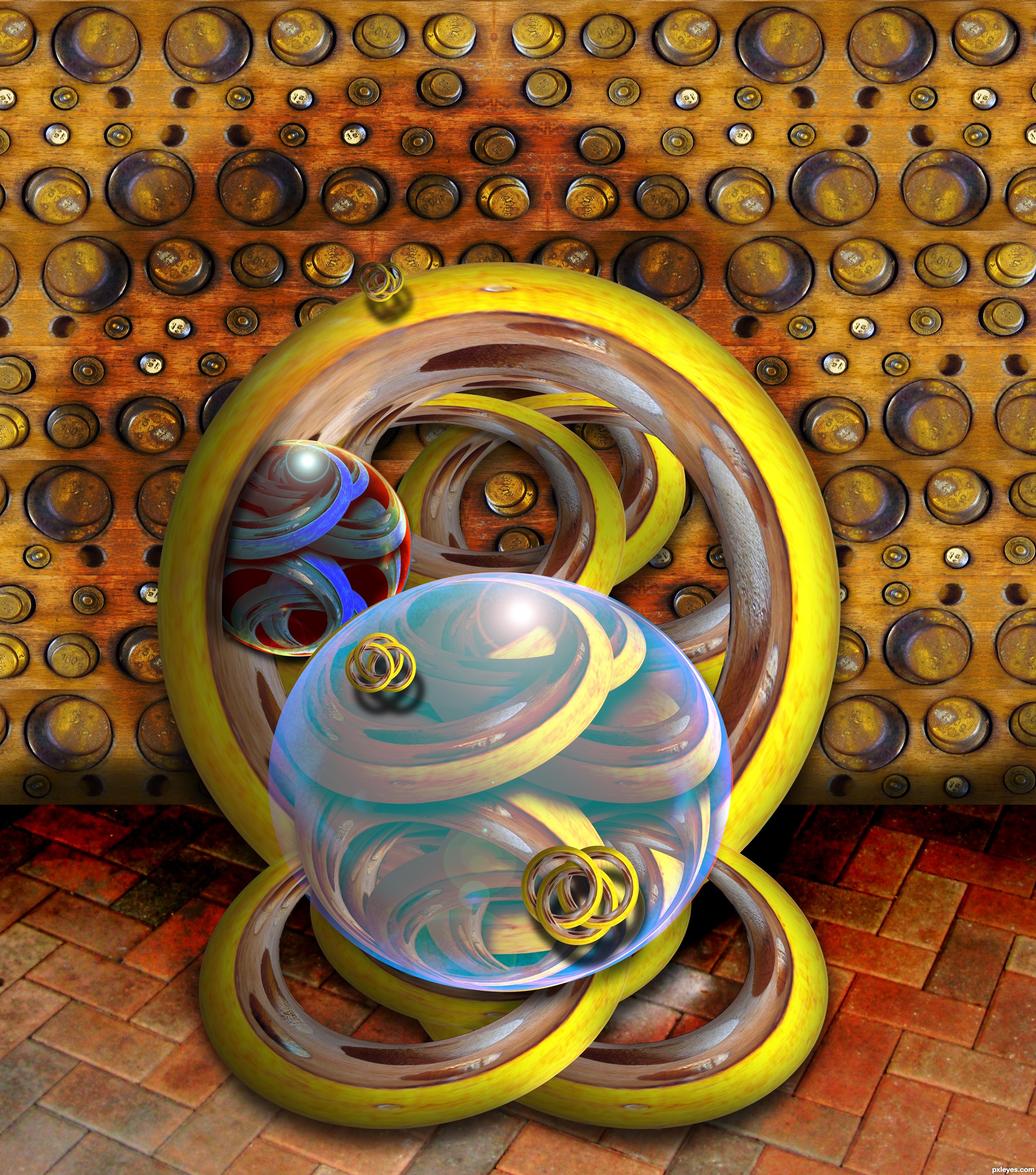
Some curves on the texture to give it roundness would be pretty good... 
Separeted layers would be better for it, because on forward column bricks have to seem bigger than on backward columns. Ok? 
Now it looks better; but you fixed the top but forgot the bottom... it's the same, you have to follow the direction of the concrete base.
With this sky columns would be way darker...try to fix edges they give a bit of glow effect...
Nice idea....
Howdie stranger!
If you want to rate this picture or participate in this contest, just:
LOGIN HERE or REGISTER FOR FREE
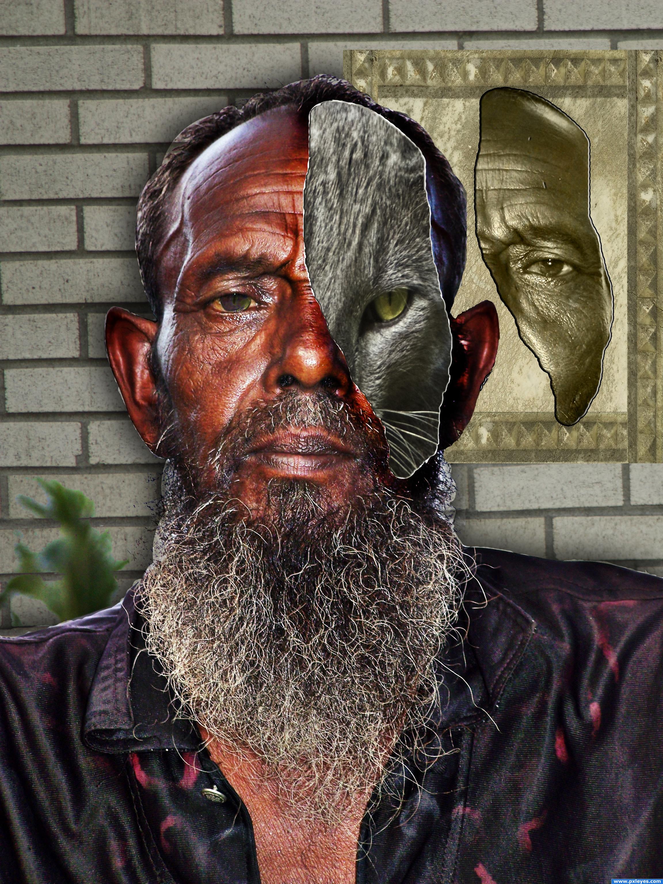
Here, the old man has part of his face ripped away to reveal that underneath he is a cat. An animorph.
I have 3 grey cats. This is Alvin. He is not the Alpha male of the bunch. But he is very kind and loving. His face looks angry all of the time, but he is sweet. I call him the diplomat. (5 years and 3567 days ago)
nice
huge marks for composition and clarity.. I'm not sure I understand the cat face properly.. if it's a mask it should have a shadow and the eye should be over the eye socket... IMHO.. it's very wonderfully well done.. it just seems that the two masks are floating in space.. if that was your goal then CONGRATS! (the white line of damage goes all the way round the cat face.. just thought I'd mention that).. good LUCK
Thank you for the comments. No, the cat is not supposed to be a mask. The man is actually the mask! When a piece of the man's face was torn away, the cat is revealed inside. That is why the tear goes all the way around.
Would've been a better look to just blend the fave with the cat...but good job all the same!
Howdie stranger!
If you want to rate this picture or participate in this contest, just:
LOGIN HERE or REGISTER FOR FREE
Photography and photoshop contests
We are a community of people with
a passion for photography, graphics and art in general.
Every day new photoshop
and photography contests are posted to compete in. We also have one weekly drawing contest
and one weekly 3D contest!
Participation is 100% free!
Just
register and get
started!
Good luck!
© 2015 Pxleyes.com. All rights reserved.


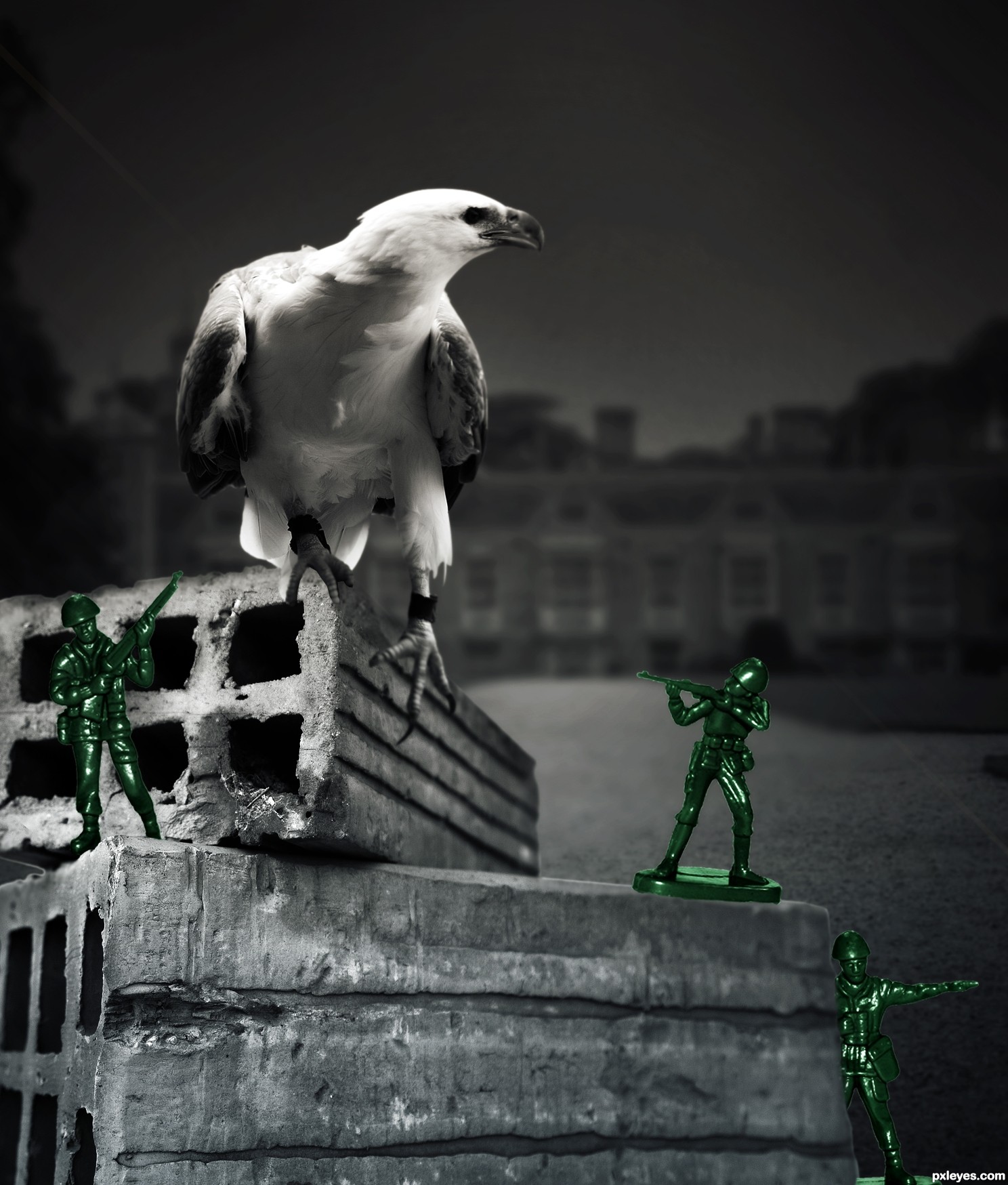
Very nice!! like the eagle .GOOOOOOD LUCK dude
Many many thanks Mina
Don't kill the sea eagle!! LOL, nice entry, good luck!
Howdie stranger!
If you want to rate this picture or participate in this contest, just:
LOGIN HERE or REGISTER FOR FREE