(5 years and 2816 days ago)
2 Sources:

Used a lot of pen tool in this 1.......... hope it's not prohibited o somethin.......... (5 years and 2822 days ago)
it is so sweet ,good luck
very nice, i like it 

very nice. minimal and effective!
Great looking positive image...good luck author
thanxxx a lot people......... \m/
Lovely work!
Good work & Good thoight
All the Best..
Howdie stranger!
If you want to rate this picture or participate in this contest, just:
LOGIN HERE or REGISTER FOR FREE
(5 years and 2836 days ago)
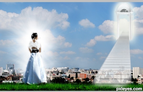
cute!
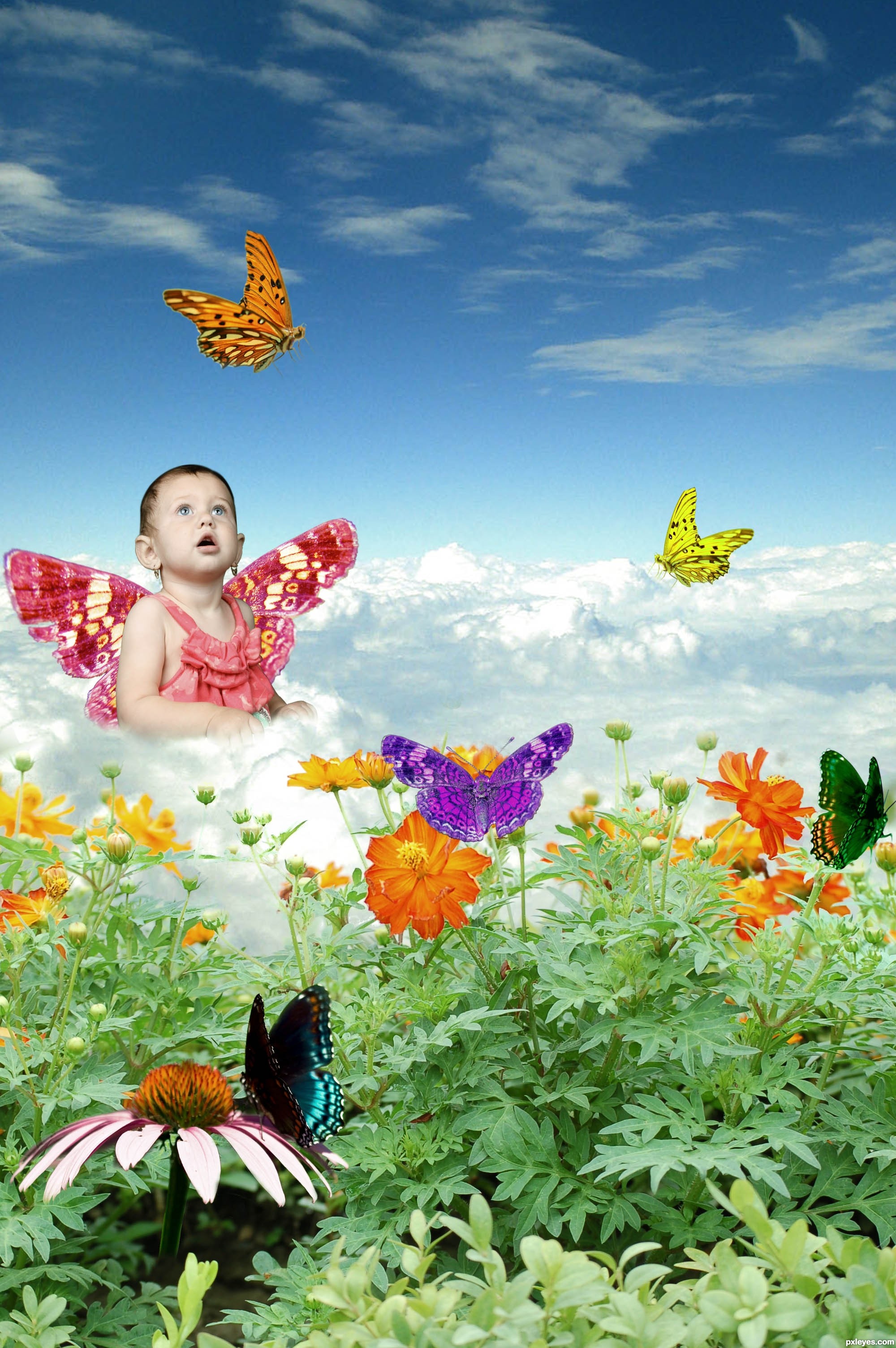
Nice idea but I would maybe suggest putting something to obscure the fade on the hands and lower body, maybe some simple sparkles or shiny bits, as if the child has just appeared if by magic. Also, a bit trivial, but scaling down some of the duplicate butterflies ever so slightly might make it immediately less obvious that they are identical.
try making the portion of a third to 2-thirds, the composition would be better.
have to match a main-theme object, now all very important... have to lead people's focus
on the baby instead
colorful idea
Howdie stranger!
If you want to rate this picture or participate in this contest, just:
LOGIN HERE or REGISTER FOR FREE
(5 years and 2845 days ago)
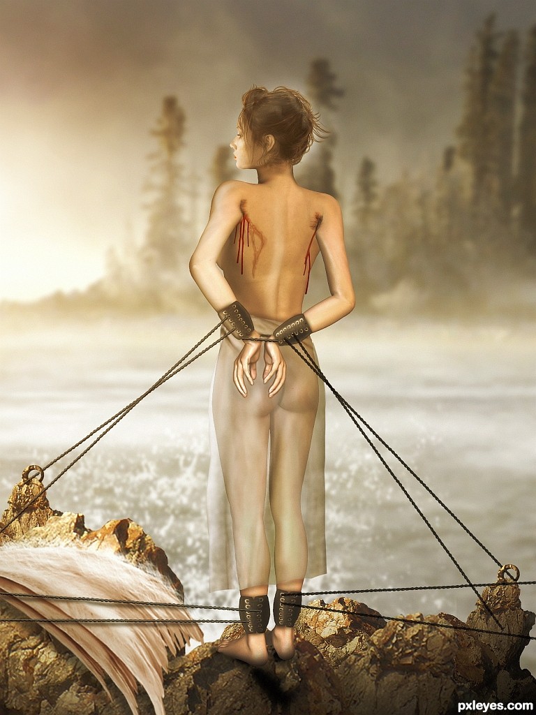
The anatomy is somewhat wonky. Her left leg is noticeably thicker than the right, as if she has a swelling problem. The left knee joint is also lower (which may be causing the swelling...)
suggestions:
1) make the waist thinner
2) let down her hair as if blown by the sea breeze
3) the thin gown should be "blown" by wind, not straight down
4) blood should be improved
nice idea, matching her facial expression
The concept is utterly breathtaking.
But it does look somewhat unfinished. Or at least unrefined. Ropes do not attach properly to anchors, they just point in the general direction. I'm not as concerned with a fluttering skirt because the wisps of hair around her face are also relaxed and not breeze-blown. However, MossyB made some excellent suggestions about the body. I will add two additional things that stand out to me: the right arm appears attached to her back, since the right side/ upper rib area extends too far; an armpit should be there and arm angled differently. The second thing is the right scar / wound - because these are not random injuries, but are where two symmetrical items (the wings) were removed, the scar/wound on the right would more closely match the left wound.
I wish you had more time to adjust!! Would love to see an edited version. :\ Good luck, author!
UPDATE: I just realized you used a 3-D concept for the body (that teaches me to look at the SBS before commenting!) The critique of the body is still valid. Just goes to show that not all 3-D renderings realistically and accurately depict anatomy with success.
Congratulations 
congrats!!
WOW! very creative and superb work!
congrats
Thanks for Your comments and votes.
Howdie stranger!
If you want to rate this picture or participate in this contest, just:
LOGIN HERE or REGISTER FOR FREE
(5 years and 2848 days ago)
Howdie stranger!
If you want to rate this picture or participate in this contest, just:
LOGIN HERE or REGISTER FOR FREE
Photography and photoshop contests
We are a community of people with
a passion for photography, graphics and art in general.
Every day new photoshop
and photography contests are posted to compete in. We also have one weekly drawing contest
and one weekly 3D contest!
Participation is 100% free!
Just
register and get
started!
Good luck!
© 2015 Pxleyes.com. All rights reserved.


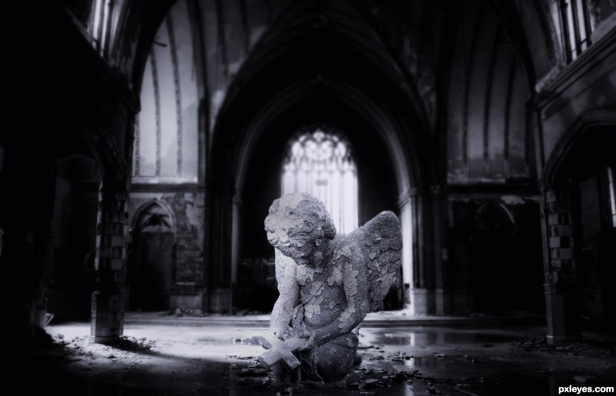
The cherub is too far forward, and is in a shaded area. If you move it back a bit into the light, the illumination on it will be more consistent with the rest of the image.
I agree with mossyB on the lighting on the cherub, but i do not think you should move it backward (or if you do, you should make it smaller). Proportions are OK at the spot it is now.
Otherwise, it is a nice idea, well executed.
Thanks for the comments!..I made a quick fix on the lighting just a tiny bit!
and I agree with u dustfinger moving the figure back to the middle,
its gonna make it so small...I've already tried that n did not like it..
but I will find someway to fix it..or give this another change on things.
Should have SBS, and IMO the angel could be moved back without scaling it down too much.
PS: There are better rust textures at http://www.cgtextures.com/
Howdie stranger!
If you want to rate this picture or participate in this contest, just:
LOGIN HERE or REGISTER FOR FREE