(5 years and 3271 days ago)
2 Sources:
Edge of Darkness  by eclipsy 18270 views - final score: 71.6% | Hope  by DanielaOwergoor 12568 views - final score: 66.3% | Windows To Heaven  by jordyponce 15431 views - final score: 66.1% |
Demolition  by imnicole 11504 views - final score: 62.9% | Silent Prayer  by AngeldustUK 12525 views - final score: 62.5% | Dream  by Mario 10203 views - final score: 62.3% |
Sad Angel 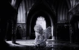 by jordyponce 11194 views - final score: 61.8% | Beginning the Reversal  by Drivenslush 6209 views - final score: 61.3% | omnia vincit amor 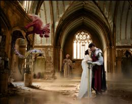 by dustfinger 16236 views - final score: 61.3% |
you lose its coming down  by jack2 9236 views - final score: 60.8% | The dream is over  by gchiou2008 7642 views - final score: 60% | flood 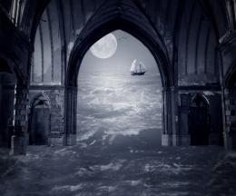 by Se7eN0f9 5234 views - final score: 59.5% |
Flooded 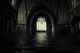 by jordyponce 6311 views - final score: 59.3% | Follow Your Path  by Wishfulthinking 7752 views - final score: 59% | Christo Redentor  by Darkrider92 7210 views - final score: 59% |
vacation  by jack2 3721 views - final score: 58.4% | Day at the beach  by AngeldustUK 6317 views - final score: 58.1% | Angeline 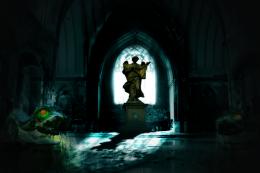 by vinshine 9845 views - final score: 57.8% |
Deadly church  by sebstgelais 5546 views - final score: 56.9% | Art wave ! 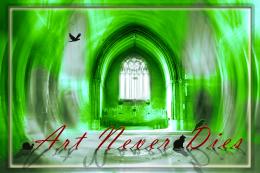 by Greatpapa 6844 views - final score: 54% | soldier...  by mehul 5991 views - final score: 51.9% |
Howdie Guest!
You need to be logged in to rate this entry and participate in the contests!
LOGIN HERE or REGISTER FOR FREE
Photography and photoshop contests
We are a community of people with
a passion for photography, graphics and art in general.
Every day new photoshop
and photography contests are posted to compete in. We also have one weekly drawing contest
and one weekly 3D contest!
Participation is 100% free!
Just
register and get
started!
Good luck!
© 2015 Pxleyes.com. All rights reserved.


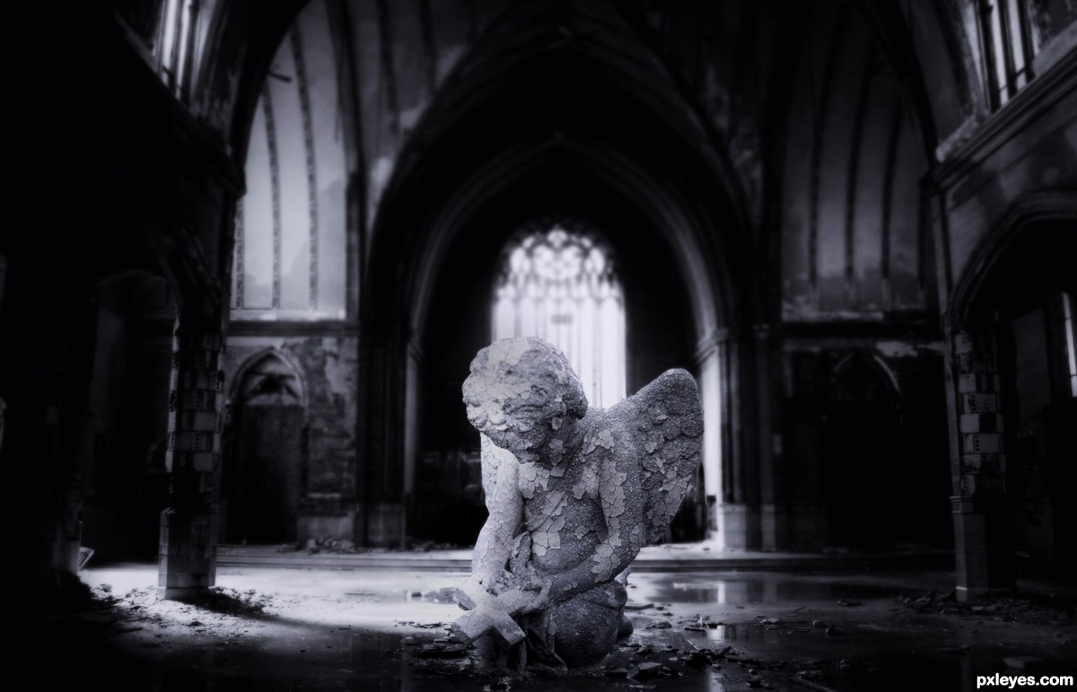
The cherub is too far forward, and is in a shaded area. If you move it back a bit into the light, the illumination on it will be more consistent with the rest of the image.
I agree with mossyB on the lighting on the cherub, but i do not think you should move it backward (or if you do, you should make it smaller). Proportions are OK at the spot it is now.
Otherwise, it is a nice idea, well executed.
Thanks for the comments!..I made a quick fix on the lighting just a tiny bit!
and I agree with u dustfinger moving the figure back to the middle,
its gonna make it so small...I've already tried that n did not like it..
but I will find someway to fix it..or give this another change on things.
Should have SBS, and IMO the angel could be moved back without scaling it down too much.
PS: There are better rust textures at http://www.cgtextures.com/
Howdie stranger!
If you want to rate this picture or participate in this contest, just:
LOGIN HERE or REGISTER FOR FREE