(5 years and 3446 days ago)
1 Source:
Dear Edward  by eclipsy 25260 views - final score: 63% | ROCKY  by lolu 12383 views - final score: 59.3% | Flamingo 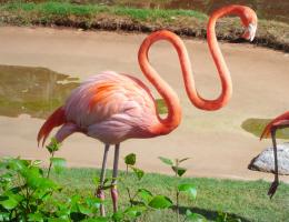 by RickLaMesa 18864 views - final score: 58.9% |
Thump  by RickLaMesa 8465 views - final score: 57.4% | Fathead  by RickLaMesa 11931 views - final score: 56.5% | Evolution 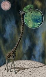 by minnie 6380 views - final score: 56.1% |
The Nose Knows  by MossyB 13694 views - final score: 55.3% | Big Head Big Hat 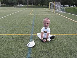 by Drivenslush 9126 views - final score: 55% | Son of Zeus 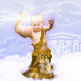 by Vexycon 36779 views - final score: 52.9% |
Ode to the Body  by Drivenslush 7800 views - final score: 52.1% | Ally Oop Girl  by Glockman 6248 views - final score: 51.9% | Pucker Up, Valentine!  by MossyB 11258 views - final score: 51% |
Oops  by filantrop 4238 views - final score: 50.5% | Big Hair Day  by Drivenslush 8084 views - final score: 49.4% |
Howdie Guest!
You need to be logged in to rate this entry and participate in the contests!
LOGIN HERE or REGISTER FOR FREE
Photography and photoshop contests
We are a community of people with
a passion for photography, graphics and art in general.
Every day new photoshop
and photography contests are posted to compete in. We also have one weekly drawing contest
and one weekly 3D contest!
Participation is 100% free!
Just
register and get
started!
Good luck!
© 2015 Pxleyes.com. All rights reserved.


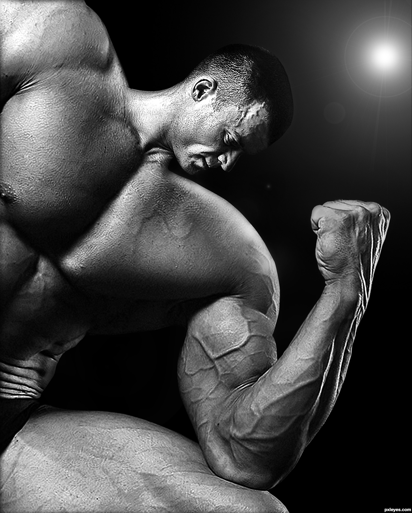
Nice reconstruction of the forehead, but in high res the neck is badly blended into the body, and you need to continue the strong highlight on the shoulder where the head was. This could be great with a few tweaks...GL author!
Thanks for your advice CMYK46, i try to change that...
hope it's better now.
Looks much better to me, author!
(If I could be permitted one more small nitpick, maybe blurring the sharp edges you've created would fit better with the rest of the original image, but I love your concept and choice of source material...good luck!).
GREAT JOB!!!!!
wow!
whahaha Amazing job.. This guy needs a very small pillow and a very big bed.. Great source and great execution! GL author!
Thanks to all for your comments !
GOSH! impressive!!!
no good blending! neck is way too bright!
Shiza you're wrong. Why so negative?
Dont worry author, Shiza is annoyed for being caught cheating in another contest...... its very nice work..I cant fault it
Nice chop....Confusing light on this image. To justify the wonderful contrast on this image is to lose the light source (spot light, camera?) in the right hand corner. Get rid of it. That corner should be the darkest part of the image. Looks great otherwise.
The light in the upper RH corner does not match the highlights on the skin, I'd suggest losing it, and I would tone down the neck lighting to match the rest of the body, but overall a nice job!
Top work author...this one will be in top 3 i am sure...listen to me i am pxl prophet...just joking...
My fave, great creation, and love the B&W here = )
Yikes, this would make a great image for a steroid ad! Well done, and the B/W works well for this.
Congrats!!
congratulations...
Howdie stranger!
If you want to rate this picture or participate in this contest, just:
LOGIN HERE or REGISTER FOR FREE