(5 years and 3451 days ago)
7 Sources:
Patience  by ponti55 14209 views - final score: 58.4% | Secheresse  by lolu 12451 views - final score: 56.7% | A Deserted Nesting Place  by artgirl1935 18592 views - final score: 56.7% |
Home of earth  by Haganino 12285 views - final score: 56.1% | Truth Fears No Questions  by Drivenslush 13036 views - final score: 56% | Its Elemental  by jadedink 8715 views - final score: 55.2% |
frost  by HELSIEN 7152 views - final score: 54.2% | Inner Death  by locxoul 6798 views - final score: 53.9% | Last flowers  by marina08 6208 views - final score: 53.7% |
Grungy  by ReDZN 4778 views - final score: 53.6% | Jelly Awaiting its Turn WEEEEE  by Drivenslush 12022 views - final score: 53.2% | Cathedral  by ReDZN 6679 views - final score: 52.6% |
Dancing By Moonlight 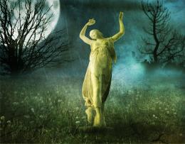 by Lamantine 7368 views - final score: 52.3% | Territorial Greed 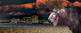 by Drivenslush 6407 views - final score: 51.2% | Hope 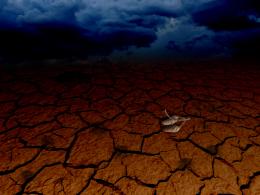 by locale 4473 views - final score: 50.4% |
Ancient Ways  by sgc 7645 views - final score: 49.8% | How much does water weigh?  by sgc 10376 views - final score: 49.6% | Angel or Demon 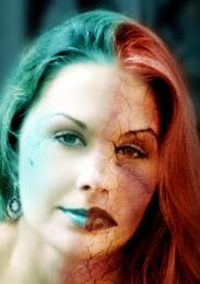 by kushpatel 8554 views - final score: 49.5% |
Stream 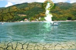 by shaiju1974 5557 views - final score: 48.7% | dry eye 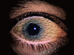 by farsite 12119 views - final score: 48.3% | Its a strike 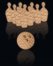 by Chuck 6638 views - final score: 46.2% |
Howdie Guest!
You need to be logged in to rate this entry and participate in the contests!
LOGIN HERE or REGISTER FOR FREE
Photography and photoshop contests
We are a community of people with
a passion for photography, graphics and art in general.
Every day new photoshop
and photography contests are posted to compete in. We also have one weekly drawing contest
and one weekly 3D contest!
Participation is 100% free!
Just
register and get
started!
Good luck!
© 2015 Pxleyes.com. All rights reserved.


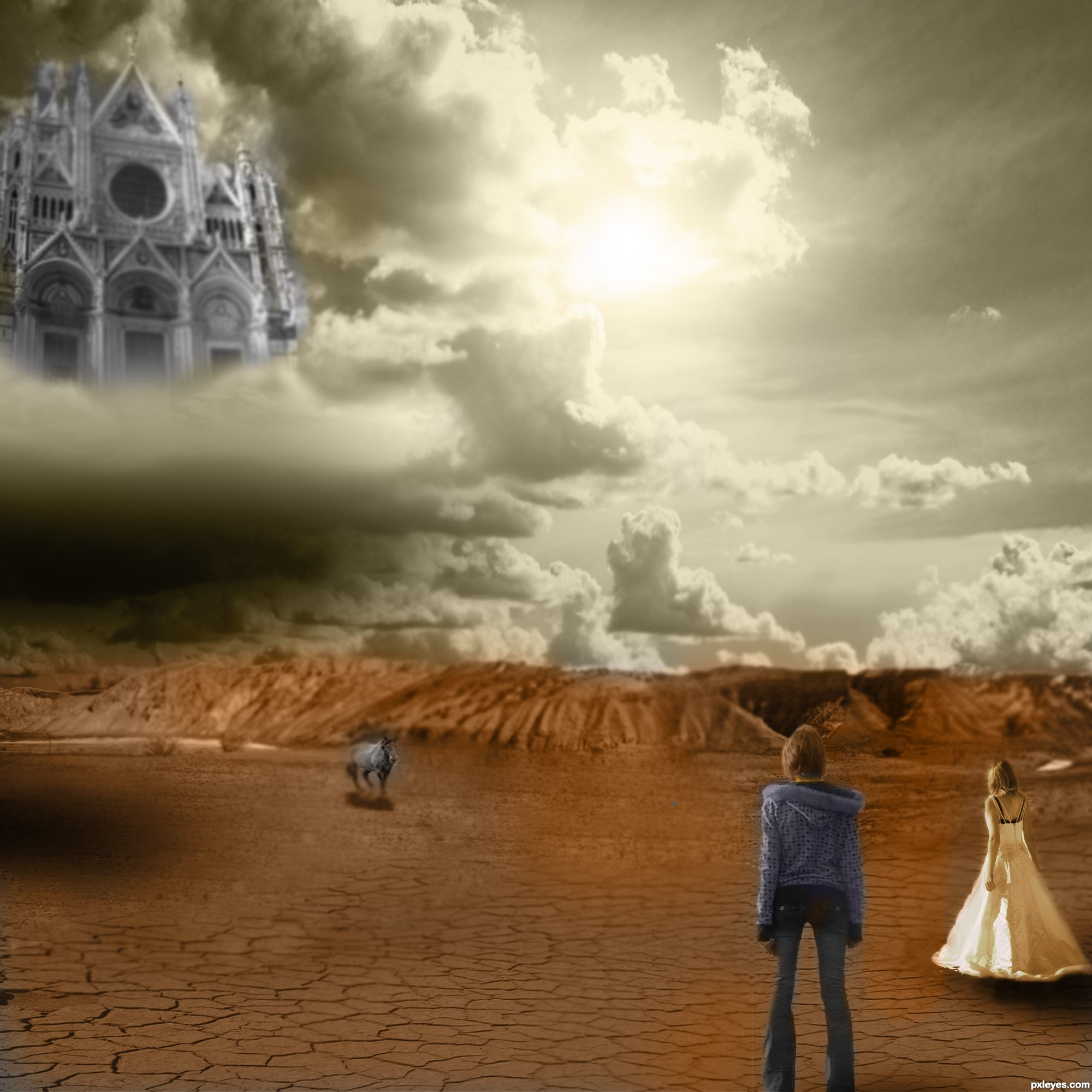
i really wish there were a high res of this..i'd like to see the details in the blendings of your sources. I think i'll hold my vote to see if you come up with a high res.
i find it interesting that you went monotone with it... is there a reason why??
Done
Good idea, but the vertical flip line at left of the foreground figure is too obvious, and some areas are needlessly blurry.
Nice work author...love the gray scale mood...best of luck
and now that you've put it in color..and you've put it in hi res...i have some nit picks.

one of your people (the jeans) is missing part of her leg. and there is color from the background seeping through the image.
part of the castle is sharp, and most of it is blurry. the castle was left monotone, yet..there is a part of it colored.
half your horse is overly blurry...adn the front half is overly sharp. same with parts of the background meshing. and then the girl in the white isn't blended in well at all.
there are a few things you can work on for future manipulations, as i think you are quite ambitious but you need to pay more attention to detail for hi res viewing.
Good Luck
Thank you , i will try next time
Howdie stranger!
If you want to rate this picture or participate in this contest, just:
LOGIN HERE or REGISTER FOR FREE