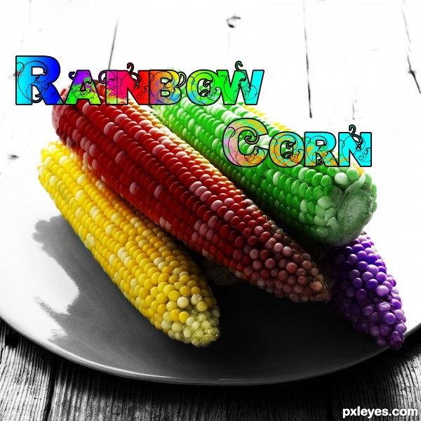
simple.
just played around with hue/saturation layers (5 years and 3717 days ago)
Andy Cornhol Butterflies  by Drivenslush 11454 views - final score: 63.7% | WORMS  by oana 11624 views - final score: 63.2% | Dino Closeup  by swordfish 13359 views - final score: 59.5% |
Pearls (updated) 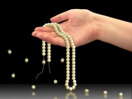 by erikuri 11209 views - final score: 56.6% | CORNtv 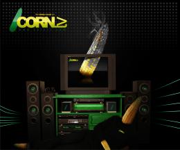 by dandesign05 9136 views - final score: 55.9% | corn 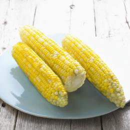 by harvester 4955 views - final score: 53.6% |
The band that needs no intro! 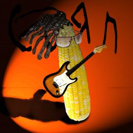 by HeinrichB 7497 views - final score: 53.1% | Floral 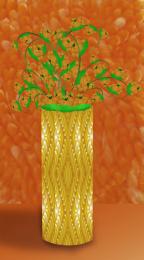 by Lamantine 4775 views - final score: 53% | Corny Couch 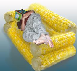 by Tip2Top 5905 views - final score: 52.6% |
super massive dark maize hole 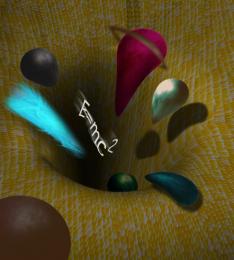 by migue1ito 7396 views - final score: 51.5% | Rainbow Corn 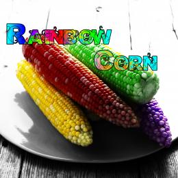 by BiBo 6783 views - final score: 51.4% | Corn man  by kevinice95 4574 views - final score: 51% |
Howdie Guest!
You need to be logged in to rate this entry and participate in the contests!
LOGIN HERE or REGISTER FOR FREE
i like the characters of the text, but u made it look weird by not keeping same distance between all letters... this fact is one of the professional designers's basic principes of work... either u feel it or u learn it in time ...and the bigg letter from the beggining of each word makes it looks less valuable as well... in my personal opinion... GOOD LUCK
I think you should either take the lettering out completely or move it elsewhere, not on top of the corn.
all the best ........
This is an cool idea, the colours are great.
The letters are very nicely colored as well. Have you made them yourself or know where they come from? GL
nice & simple!
Agrees about the text. Just remove it. It's obviously colored corn.
very colorful....good concept GL
good luck
Howdie stranger!
If you want to rate this picture or participate in this contest, just:
LOGIN HERE or REGISTER FOR FREE