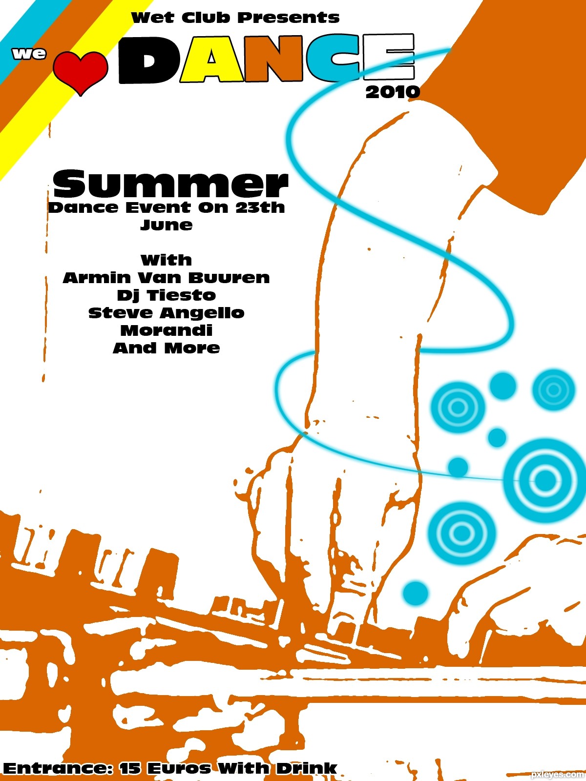
A Poster About A Summer Dance Event
I Hope You Like It...Please Comment To Tell Me Your Opinion (5 years and 3752 days ago)
1 Source:
- 1: source1
DJ Summer Festival  by genuine2009 14014 views - final score: 61.5% | The Blue Sky Festival  by jaescoe21 16089 views - final score: 61.2% | Polka-Palooza!  by DanLundberg 12534 views - final score: 60.4% |
Ren Faire  by cabldawg71 11077 views - final score: 57% | The Creatives  by Geexman 9585 views - final score: 56.8% | "Jitterbug's" Jazz Festival  by pearlie 9624 views - final score: 55.6% |
Volunteer Jam  by lchappell 5610 views - final score: 55.5% | Kats Weekender 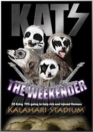 by Geexman 4227 views - final score: 54.9% | Spring Skunk Music Fest 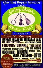 by lchappell 11808 views - final score: 54.6% |
Pxleyes music fest  by itsdesign 7756 views - final score: 54.4% | Jump on the dance floor 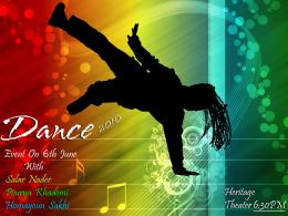 by AdhirAnimator 13901 views - final score: 53.9% | Dance Event  by Galows 14113 views - final score: 53.9% |
Damn Mark Chapman, Damn Cancer  by Drivenslush 7499 views - final score: 53.6% | Ac/Dc  by vinji 4065 views - final score: 52.9% | Silhouette Festival  by Lamantine 6598 views - final score: 49.8% |
Howdie Guest!
You need to be logged in to rate this entry and participate in the contests!
LOGIN HERE or REGISTER FOR FREE
Photography and photoshop contests
We are a community of people with
a passion for photography, graphics and art in general.
Every day new photoshop
and photography contests are posted to compete in. We also have one weekly drawing contest
and one weekly 3D contest!
Participation is 100% free!
Just
register and get
started!
Good luck!
© 2015 Pxleyes.com. All rights reserved.


I Hope You Like It...Please Comment To Tell Me Your Opinion
I really like the style of the person mixing.... and the swirl is a good addition... I really like this overal.
Thanx SuperRoss
Cool retro feel. I'm a little uncomfortable with the size and placement of "we" and the heart relative to "DANCE." Maybe center "we" above the heart? Move the heart up so it's in line with "DANCE" and then overlay "we" on top of the heart? "2010" should be right-justified with "DANCE" -- and I'd make it exactly as wide as the E or maybe even put it inside the E. The yellow stripe should go behind the D, and I think the blue spiral should go behind the text as well. "On 23rd [not 23th] June" should all be on the same line.
Ok...Thnx For Your Advice Dan
i like the dj but i don't think the fonts work. try downloading a different font from dafont.com they have some nice styles
I like all of this except for the "we" and the heart. They need to either be really off center or be completely on center with the "Dance." I really like the rest of it because it looks like an actual poster you'd see.
15 euros with drink!
Nice job.......GL
Howdie stranger!
If you want to rate this picture or participate in this contest, just:
LOGIN HERE or REGISTER FOR FREE