this was fun to do :D
comments and suggestions are welcome.
you might want to check high res before voting. (5 years and 3990 days ago)
2 Sources:
evil wins  by inanis 21276 views - final score: 66.3% | Door 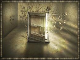 by jaskier 15951 views - final score: 62.6% | Mr. and Mrs. Ed 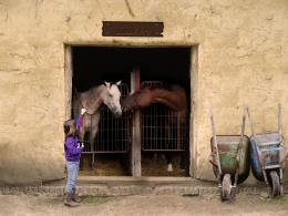 by MrBig 24554 views - final score: 60.5% |
Old School  by xsingthesorrowo 22482 views - final score: 60.2% | My House  by Poss 16670 views - final score: 59.9% | Looking out  by Palaekman 12381 views - final score: 59.7% |
Alone monk  by hereisanoop 6477 views - final score: 57.5% | Bottom of the glass 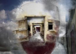 by Missy 5778 views - final score: 56.6% | The Modern Prometheus  by Stowsk 5977 views - final score: 56.5% |
Closed  by jsk123 4607 views - final score: 56.3% | Lonely  by ikhendo 5124 views - final score: 56.2% | Blue Door 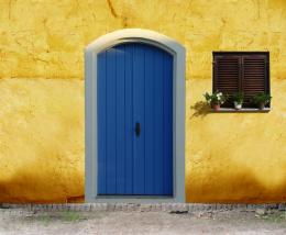 by JustinCase 5657 views - final score: 56.1% |
Wood'er Land  by mithrasr 5771 views - final score: 55.7% | Cast Away  by mithrasr 5537 views - final score: 55.5% | Cow and Calf 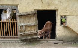 by friiskiwi 11381 views - final score: 55% |
Flooded barn 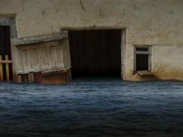 by Palaekman 5881 views - final score: 54.8% | Free at Last 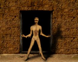 by ReapRevenge 5961 views - final score: 54.7% | Apollo Zero 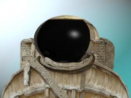 by ThisONE 4552 views - final score: 54.5% |
21ST CENTURY SHOPPING 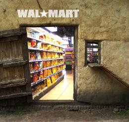 by BUMFEATURES 7350 views - final score: 54.1% | Drunk pig 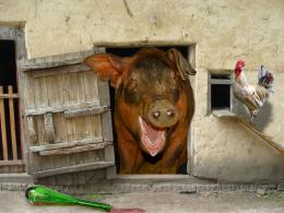 by filantrop 10075 views - final score: 53.2% | Santuary ...  by thecreative 3800 views - final score: 52.9% |
Would you risk?  by Draco 5815 views - final score: 52.8% | neighborhood  by Arryko 4683 views - final score: 52.7% | Mouse House 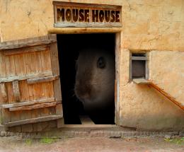 by PSA2009 7795 views - final score: 52.1% |
brrrr....cold  by Arryko 4931 views - final score: 51.5% | What the ....  by etherwarrior 4031 views - final score: 51.5% | witch hut  by martDart 6863 views - final score: 51.4% |
Night Time Barn  by kathmav 6657 views - final score: 51.1% | Make her leave!!  by kyluvlee 5493 views - final score: 50.7% | Pxleyed Punks  by woodztockr 4922 views - final score: 50.4% |
Dont go Inside  by theskepticaldesigner 12099 views - final score: 49.9% | No Diving or Jumping 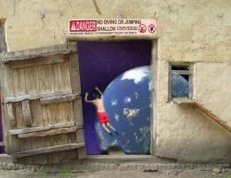 by woodztockr 5070 views - final score: 49.5% | play with me 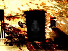 by SHIPLEYGIRL 4950 views - final score: 47.9% |
Barnstorming 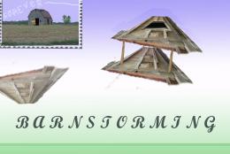 by jdib 5844 views - final score: 47.2% | barn on fire 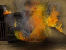 by ruchi 6118 views - final score: 46.3% | CondoRminium 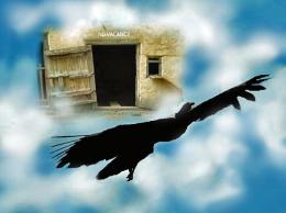 by wildwings 3725 views - final score: 46% |
Howdie Guest!
You need to be logged in to rate this entry and participate in the contests!
LOGIN HERE or REGISTER FOR FREE
Photography and photoshop contests
We are a community of people with
a passion for photography, graphics and art in general.
Every day new photoshop
and photography contests are posted to compete in. We also have one weekly drawing contest
and one weekly 3D contest!
Participation is 100% free!
Just
register and get
started!
Good luck!
© 2015 Pxleyes.com. All rights reserved.


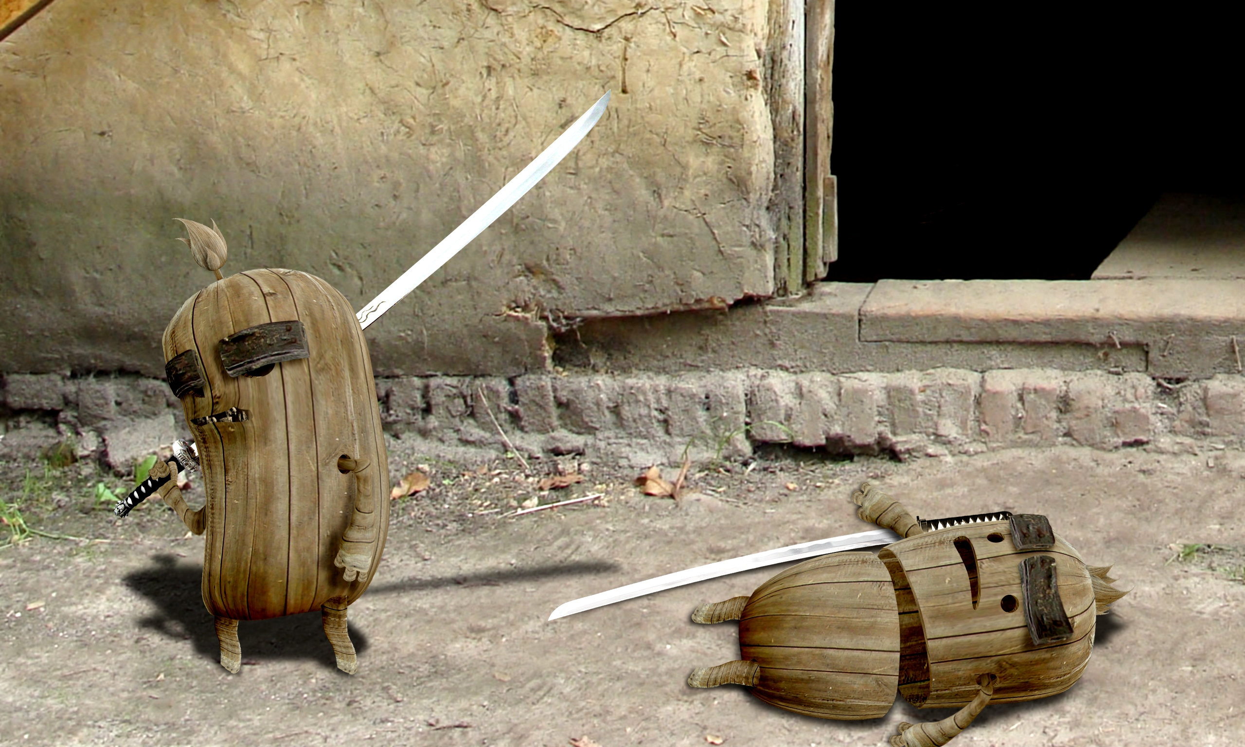
even though the result is technically horrific.. it's really quite cute.. good job and lots of work here
EDIT (Technically horrific in the sense that some one was technically sliced in half and it should be gross..(and it came out cute) it was a compliment)
what do you mean by technically horrific?
These guys are great! Light is from upper left in source pic, so you might want to rethink the shadows...still, high vote from me!

LOL ohh thats funny..or sad.....very well done
So cute.
CMYK46 i was looking at the leaf in the center and from the shadow it casts i believe the light is coming from upper right.
also the light in the source comes form top left, based on the shadows, but the source part used in my image was flipped, therefore what was top left became top right.
GolemAura thanks for the compliment.
haha very nice and funny
..i love it! xD
That's a great 'chop'
love it
wow this is amazing man really like it, it just looks right to me!
simply wonderful and creative! Love it!
good and funny!!
great idea , great result, gl
thank you all.
a little darker on sliced area and thats it perfect!
excellent use of the source. Agree with on the lighting angles, I missed the leaf, but the brick behind the twin on the left's right hand (if that makes any sense) tells the story. Excellent work here, author. Top marks. (with the "confirmed" lighting angle, I'm not so sure the shadow of the "winners" katana would be present on the blade of the fallen twin - but I am a beginner, so use your best judgement.) Great work.
you're absolutely right, the brick shows clearly that the light comes from top right, maybe i should have made the shadows more to the left. but since that's the only thing that shows the correct angle of the light source i think i have an other idea how to fix that contradiction. thanks for noticing.
A few more cuts and nicks would sell this some more.. The main shadow I saw as out of place was the one of the sword. You have the body shadow off to the left and the swords out to the right? Maybe shorten the swords shadow?? GL.
ditto on most of what everyone has already side. nice entry.
i thought about adding some more cuts and nicks, but then i said having one single clean slice would only show how easy the fight was, how easily evil won against good.
but i do have to make some minor changes to the shadows, when i do, i will shorten a little the sword's shadow too.
EDIT: made some minor changes.
this is cute!
part 2 "...but good never gives up" :
http://www.pxleyes.com/picture/8301/but-good-never-gives-up-.html
Congrats for your first place, inanis!
Congrats, really well done
Congratulations for 1st
Congrats!
Congrats!
thank you everyone for your high votes.
Howdie stranger!
If you want to rate this picture or participate in this contest, just:
LOGIN HERE or REGISTER FOR FREE