
source only (5 years and 4032 days ago)
I Love GUCCI...! 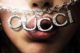 by Nellista 23566 views - final score: 58.1% | The Nightclub 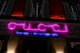 by pixelkid 13762 views - final score: 57.9% | Celtic Knot  by madamemonty 25094 views - final score: 57.1% |
Giallo 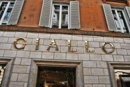 by CMYK46 12508 views - final score: 56.9% | Gucci, The Future? 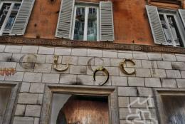 by SulliGirl 15373 views - final score: 56.7% | after shopping  by SilvanaDD 4827 views - final score: 55.3% |
Perspective Changed 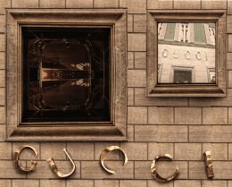 by nasirkhan 5396 views - final score: 53% | Wash Board of Modern Market  by GolemAura 6861 views - final score: 52.9% | GUCCI ... years from now 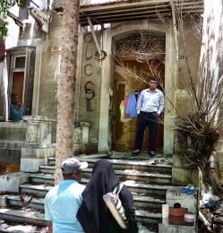 by momvera 8698 views - final score: 51.9% |
OBEY 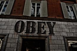 by CMYK46 5298 views - final score: 51.4% | Gucci Baby 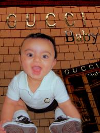 by JoeCacia 11312 views - final score: 49.3% | pxleyes 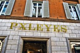 by itsdesign 4195 views - final score: 49.2% |
logo  by minimonst100 17022 views - final score: 46.3% |
Howdie Guest!
You need to be logged in to rate this entry and participate in the contests!
LOGIN HERE or REGISTER FOR FREE
Photography and photoshop contests
We are a community of people with
a passion for photography, graphics and art in general.
Every day new photoshop
and photography contests are posted to compete in. We also have one weekly drawing contest
and one weekly 3D contest!
Participation is 100% free!
Just
register and get
started!
Good luck!
© 2015 Pxleyes.com. All rights reserved.


Interesting change! I like the way you're thinking here, but the 'Gucci' area looks cut and pasted. It doesn't blend with the other areas. See if you can make the 'Gucci' brick area work better with the rest of it. Good job!

EDIT: Ooh yeah, baby! Great!
pixelkid thanks for suggesstion, I have extracted all five alphabets with masking and place them and added shadow.
Bricks are badly re-aligned on the right side, with extra vertical seams, and the Gucci logo in the large window is now illegible...
prettycool
CMYK46 thanks, I have tried to fixed them.
Howdie stranger!
If you want to rate this picture or participate in this contest, just:
LOGIN HERE or REGISTER FOR FREE