Check out full resolution (Sorry, it's kinda big.. well.. HUGE) for details..
http://fi.wikipedia.org/wiki/Shambhala (5 years and 3656 days ago)
8 Sources:
What could've been  by ponti55 15308 views - final score: 61.5% | A door to the outside world  by genuine2009 19039 views - final score: 59.9% | The Big Man  by Geexman 15360 views - final score: 59.7% |
Way to Out 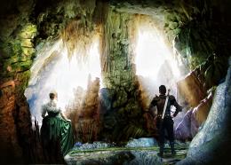 by nasirkhan 12864 views - final score: 59.3% | Underground City 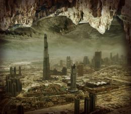 by nasirkhan 19414 views - final score: 58.8% | Underground  by genuine2009 6460 views - final score: 58.3% |
Back in down  by genuine2009 5234 views - final score: 58.2% | Shambhala 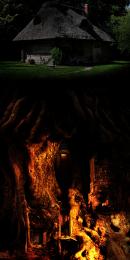 by Widiar 9948 views - final score: 57.4% | Hidden Place  by nasirkhan 7853 views - final score: 57.1% |
the cave  by dekwid 5131 views - final score: 56.1% | Daemon city  by filantrop 7637 views - final score: 56.1% | life in the cave 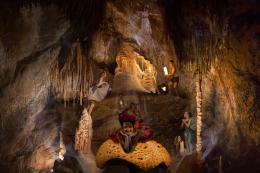 by friiskiwi 5827 views - final score: 53.2% |
Howdie Guest!
You need to be logged in to rate this entry and participate in the contests!
LOGIN HERE or REGISTER FOR FREE
Photography and photoshop contests
We are a community of people with
a passion for photography, graphics and art in general.
Every day new photoshop
and photography contests are posted to compete in. We also have one weekly drawing contest
and one weekly 3D contest!
Participation is 100% free!
Just
register and get
started!
Good luck!
© 2015 Pxleyes.com. All rights reserved.


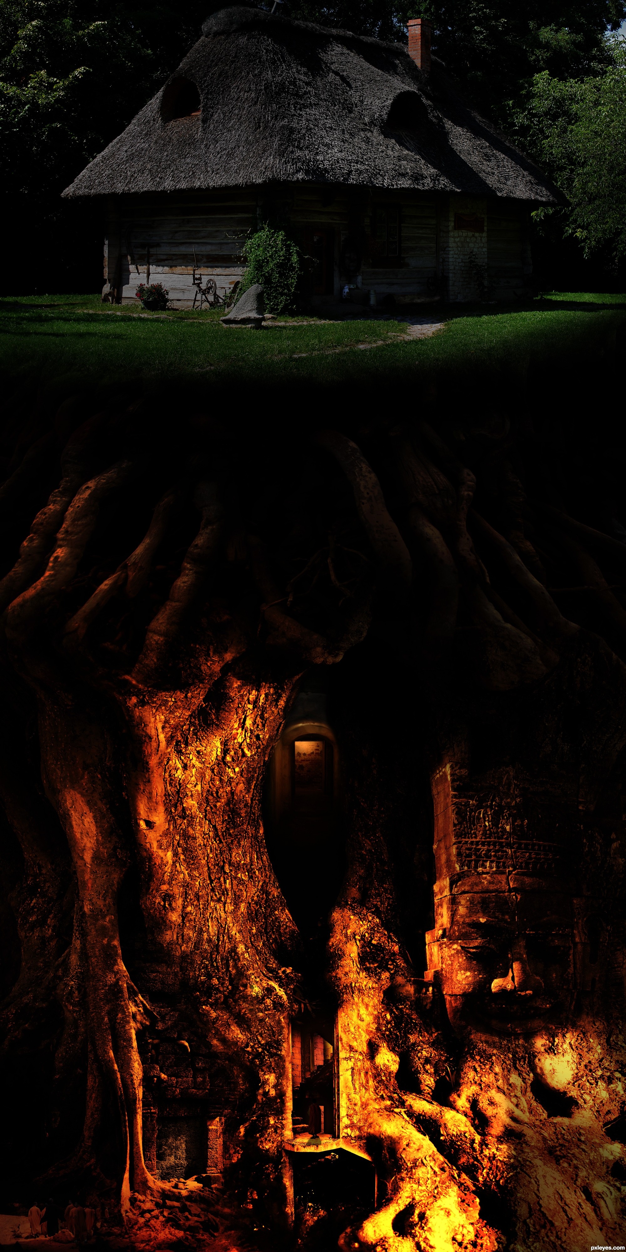
I would suggest to make the left side of the image, just beneath the house, where the roots are, just as dark as on the right side. Right now it's overlapping with the grass. Otherwise, this is a great image, and a great idea... GL!
Thats a pretty cool picture!
nice blending.
But I agree with nemanja, you could also just erease a bit of the roots on the left side where the grass already begins.
I think that the piece is fantastic. Besides what the others have said, I have only one problem with the composition itself. There is a LOT of natural light coming from within the corodors of the underground temple without any indication that there is a skylight or something from above! But that's ok. It looks really nice.
Thanks for the comments. I darkened it a little bit, but I really prefer it to show through a little bit, so I don't want a complete fade out for the roots.
I wish the monks were a tiny bit larger, they almost go unnoticed, but really nice blending of these elements. Cool little cottage you put this beneath.

I like this, nice work.
nice work author...i like under colors so much...gl
I like the darkened top, gives the underworld more attention... lol
lol

And... OMG there are monks here?
Oh, now i see him.. I mean only one monk... Are there more?
Great!
Not bad, missing only 9 more monks here.. maybe the high resolution version helps spotting the rest
Very mysterious mood... Nice entry, author!
Ok, author i give up! Either you're joking with me, or else, i need some good pair of glasses! lol
lol

But, the contest is not about my eye range...
Good Luck!
OMG! Here by, i publicly apologies to the author for my short eyed vision! Guess the glasses are waiting... sniff... sniff... lol
lol
The top seems a little too dark, maybe brighten a little. But otherwise a nice work
Well I like it, if for no other reason than the "find the monks" game you incorporated
this is great
this is great
Scary dungeon!
Howdie stranger!
If you want to rate this picture or participate in this contest, just:
LOGIN HERE or REGISTER FOR FREE