
Original image
step 1 of 6
I adjusted the levels a tiny bit first. I then added a solid cream colored fill layer over the top of the image and set it to a low opacity. On top of that layer I added two layers of noise, one fine speckled noise and one larger speckled noise.

step 2 of 6
In this step I just did a simple black to transparent radial gradient on the image and added in some scratch lines on the top and bottom of the photo using some PS brushes and the eraser tool as well. These are my own brushes I made in photoshop a while ago for aging things but you can find a lot of free brushes on the internet if you search for "decay" or something similar. I then added a little white radial gradient to the interior of the image with low opacity.

step 3 of 6
At this point I really didn't know what I was going to do with the image and I decided to move away from the typical "old" photograph thing and just start distorting the image and see what happens. I pretty much just kept using the blur filter over and over and playing with settings. I used a lot of radial and gaussian blur for this effect.

step 4 of 6
In this step I just threw some stain brushes with a low opacity on the image to add a layer of interest and then used the hue/saturation tool under the image menu and changes the colors ten or eleven times and saved each resulting file.

step 5 of 6
I next chose 6 of my favorite variations from the last step, resized them all to fit all 6 into a similar sized document as the source for this contest in two columns of three.

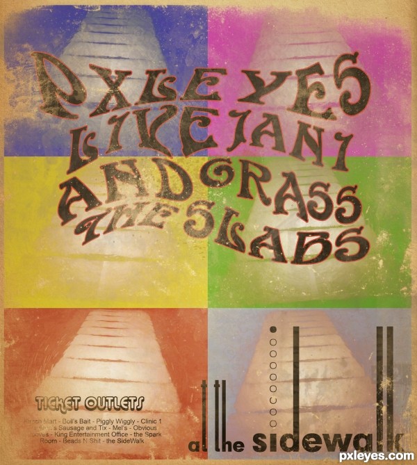
step 6 of 6
In this step I added in the text for the bands and used several of the distort tools to melt each word at a time to make them fit together in a similar flowing effect. I did nothing else special to the text other than to add a light red stroke to the band names. I then added a paper background and scaled down the image of the 6 color variations so that there was a paper border showing through from below. Then it was just a matter of using some of my grime brushes as an eraser to make it look old and worn as well as add some dirt on top of the poster till I was too tired to continue. Hope you like it.
(all brushes i used were made in photoshop from hand made black and white painting, not from source photos)
(all brushes i used were made in photoshop from hand made black and white painting, not from source photos)

Final result
Pxleyes
Photography and photoshop contests
We are a community of people with
a passion for photography, graphics and art in general.
Every day new photoshop
and photography contests are posted to compete in. We also have one weekly drawing contest
and one weekly 3D contest!
Participation is 100% free!
Just
register and get
started!
Good luck!
Follow us:


© 2015 Pxleyes.com. All rights reserved.