(5 years and 3969 days ago)
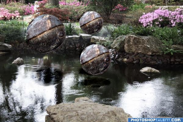
Used Corel PSP 9 Circle selection to make the Spheres of "heavy metal". Then floated them over my photo of a small pond in a local garden center.
In building SBS, I actually liked what I came up with better than my original version, so I'm doing a swap. (5 years and 4029 days ago)
Nice one, magic balls 
Holding my vote till I see the process.. what I see so far is very nice... can't wait to see the SBS
ARGHHHHHH.. the SBS was SO SIMPLE.. that is just AWESOME.. and the piece looked so Complex.. High marks from me (as much as I love the technical hula hoops alot of authors go through, I love seeing complex work that takes a keen sharp mind to create and find great way to do it..) Great job author
Good, but would be more interesting if they weren't all the same...or at least at different angles...
CMYK46, I tried all those variations - color and angles- and wasn't happy with any of them...this looks the most real to me so I guess we're in the land of "subjectivity." Thanks for your comment.
this imag could have worked in distorted gravity contest  good
good
I don't think the reflections/shadows are in the right position. It looks like they are a bit too far back. Could be me, Nice idea... good luck
good, listen to CMYK46 & BlueSparkle......
good
maybe they should be a little darker at the bottom .. just a thought
you did very well
Howdie stranger!
If you want to rate this picture or participate in this contest, just:
LOGIN HERE or REGISTER FOR FREE
Photography and photoshop contests
We are a community of people with
a passion for photography, graphics and art in general.
Every day new photoshop
and photography contests are posted to compete in. We also have one weekly drawing contest
and one weekly 3D contest!
Participation is 100% free!
Just
register and get
started!
Good luck!
© 2015 Pxleyes.com. All rights reserved.


Really good.. and uniqe in this contest.. goodluck..
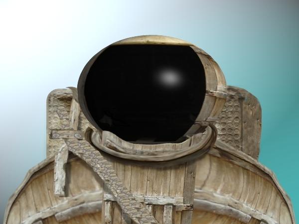
I think you should work on his helmet a little more, and maybe give dodging and burning a go. Other than that, it's nice. Good luck!
excellent use of source... good luck!!
Interesting idea...try to make it less flat.
very good, maybe a space background would make this pop off the page just that much better.
very creative. beyond my abilities.
looks like a lot of work
Howdie stranger!
If you want to rate this picture or participate in this contest, just:
LOGIN HERE or REGISTER FOR FREE