Photoshop Pictures: Wrong (page 2)


results 6 - 10 of 31

wrong sunglasses - created by enblanco


wrong sunglasses
Favs: 0SBS: 6Hi-resRank: 5/9Score: 61% (15)9290 views

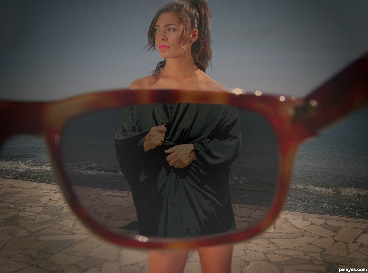
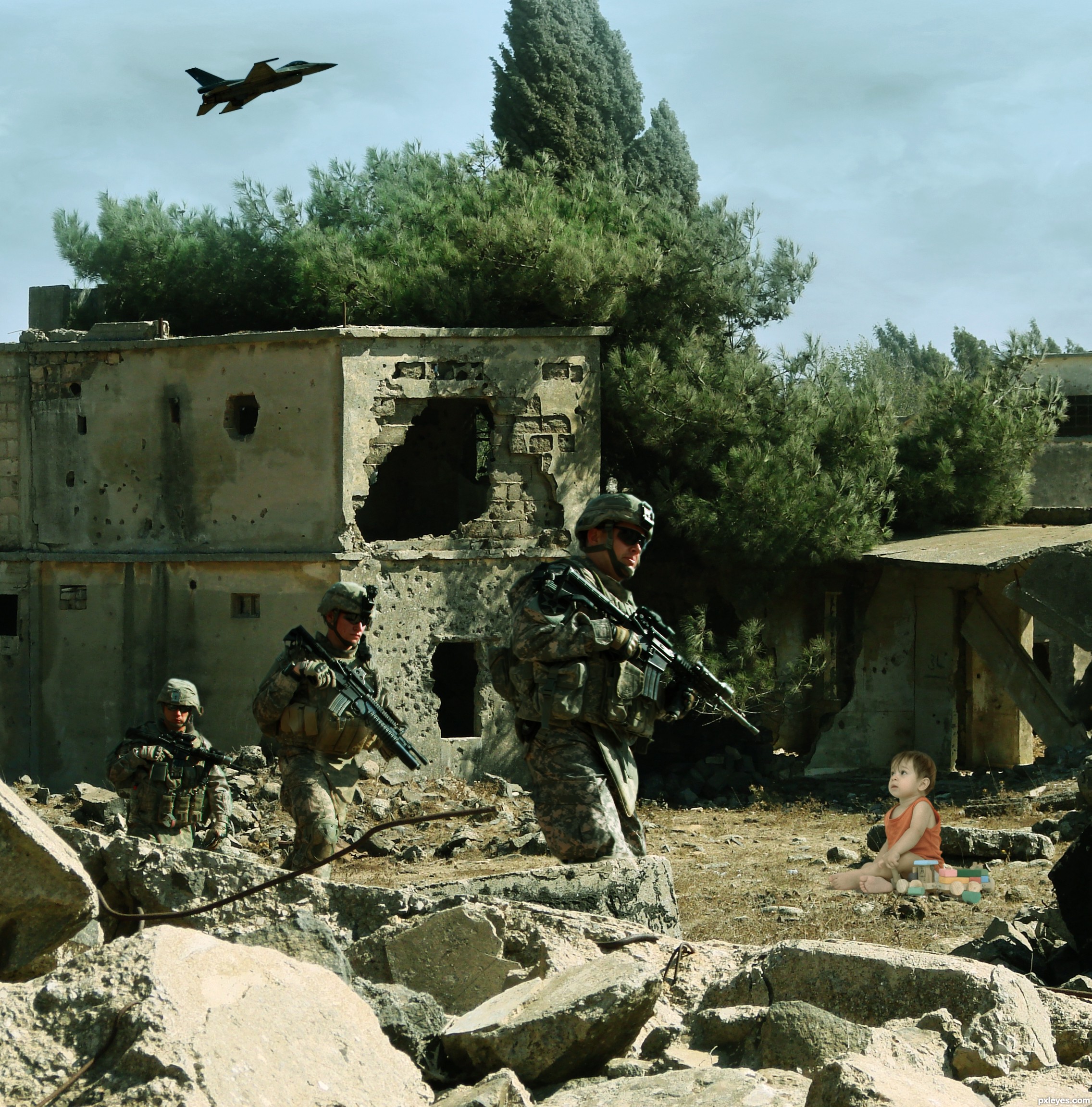
This entry was edited because the original image (girl) cannot be used for this contest. Author of the pic offers to download it from his page for free so I don't know why was removed... Anyway it's not a great lost, I've redone my work, hope you like it.

thanks to:
bussywear: head
yanboechat: burka
scottsnyde: legs

SBS is still from the old entry, the process is the same (5 years and 2780 days ago)

3 Sources:

avatar Drivenslush

very funny author.. LOL GOOD LUCK!

avatar Krashd
Krashd says:

hahaha.. nice

Howdie stranger!
If you want to rate this picture or participate in this contest, just:

LOGIN HERE or REGISTER FOR FREE


Wrong Landing - created by jordyponce


Wrong Landing
Favs: 1SBS: n/aHi-resRank: 9/9Score: 58.5% (0)4244 views

It's gonna be a bad landing!.. (5 years and 2781 days ago)

3 Sources:

avatar aheman
aheman says:

"Cat Ahoy!" ... guess you are going to land on "Mouse-Island" right?

avatar chakra1985

nice work

avatar kushpatel
kushpatel says:

good colors good mood like it author
the edges look too sharp but overall this is very nice
good luck author

Howdie stranger!
If you want to rate this picture or participate in this contest, just:

LOGIN HERE or REGISTER FOR FREE


Wrong Order - created by GAYART


Wrong Order
Favs: 0SBS: 5Hi-resRank: 9/9Score: 52% (0)4692 views

(5 years and 2831 days ago)

1 Source:

avatar MnMCarta
MnMCarta says:

haha! In some countries this would be considered normal!

Howdie stranger!
If you want to rate this picture or participate in this contest, just:

LOGIN HERE or REGISTER FOR FREE


2 different flowers - created by wooyuenfoo


2 different flowers
Favs: 1SBS: 2Hi-resRank: 9/9Score: 57.3% (0)4181 views

(5 years and 2836 days ago)

avatar MossyB
MossyB says:

The edge of the lily is too sharp, a wee bit of blur along the edge would help it blend better with the image.
A very low opacity warming filter would also help with the tones, which are a bit cool for the background.

Howdie stranger!
If you want to rate this picture or participate in this contest, just:

LOGIN HERE or REGISTER FOR FREE


Wrong - created by minnie


Wrong
Favs: 1SBS: 2Hi-resRank: 9/9Score: 55.7% (0)3852 views

Baby's in a wrong place...

Thank you to Redvisualg at sxc for the lovely baby photo:
http://www.sxc.hu/photo/1023719 (5 years and 2839 days ago)

5 Sources:

avatar Hayato
Hayato says:

Hi there, I thought the baby's too bright. =D

My suggestions, you could try to reduce the tone of the baby with a little levels adjustments or curves or exposures. And try to color balancing the whole part of your scene with Photo Filters or just play with the channels.

Good luck! Poor baby! Lol!

author says:

Hi Hayato!! Thanks for your tips, I've just post the SBS and there you can see I've already used curves and vibrance and saturation... I just don't know how to do it!!
Anyway, I'll keep on playing with the values!!

avatar Hayato
Hayato says:

Hi Author, I love how you trying to balance the images with the SBS provided. It's great with so many experiments already. Love it! But one distracting thing is the hand of the baby (right side of the image) looks so bright... or it's just my monitor screen??

avatar MossyB
MossyB says:

Author, if you apply about 5% of Cooling Filter 82 (Image>Adjustments>Color Filter), you will help get the adjustment for the skin tones and clothing that you need - The baby is too warm toned for the image.

The baby is also too large for its position within the picture. The head is almost as large as the head of the soldier, but he is much closer to the viewer than the baby. If you scale the baby down by about 10% (Edit>Transform>Scale, type in 90% for height and width), you will bring it into better proportion for the image.

You may also want to sparingly use the Dodge tool on the top back of the baby's head to reflect the strong sunlight.

Hope this helps, it's a good concept!

author says:

@hayato, I know what you mean. And that highlight wasn't so bright before the curves adjustment layer. I'll try and fix it.

@mossyB thanks for the tips. I'll try them right now!!

Thanks for helping me guys!!

EDIT: Kid's smaller and tried photo filter (3%, 5 it was too much ) I also redid the layer with the dodge, I made it too much the first time. Hope it is better; though here, at the web, it looks darker than in photoshop...

avatar MossyB
MossyB says:

It looks MUCH more realistic. Nice changes!

avatar nilknarfsoive

poor baby...

avatar Mina93
Mina93 says:

I love these kinda of pictures,uh finally sees what I like,,but It looks better without the baby haha..I know it's the main purpose of your work..but that's what i think..

Howdie stranger!
If you want to rate this picture or participate in this contest, just:

LOGIN HERE or REGISTER FOR FREE