Photoshop Pictures: Son (page 5)


results 21 - 25 of 26

SON GOKU TOU! - created by JamesD


SON GOKU TOU!
Favs: 0SBS: 26Hi-resRank: 3/9Score: 56.2% (25)12695 views

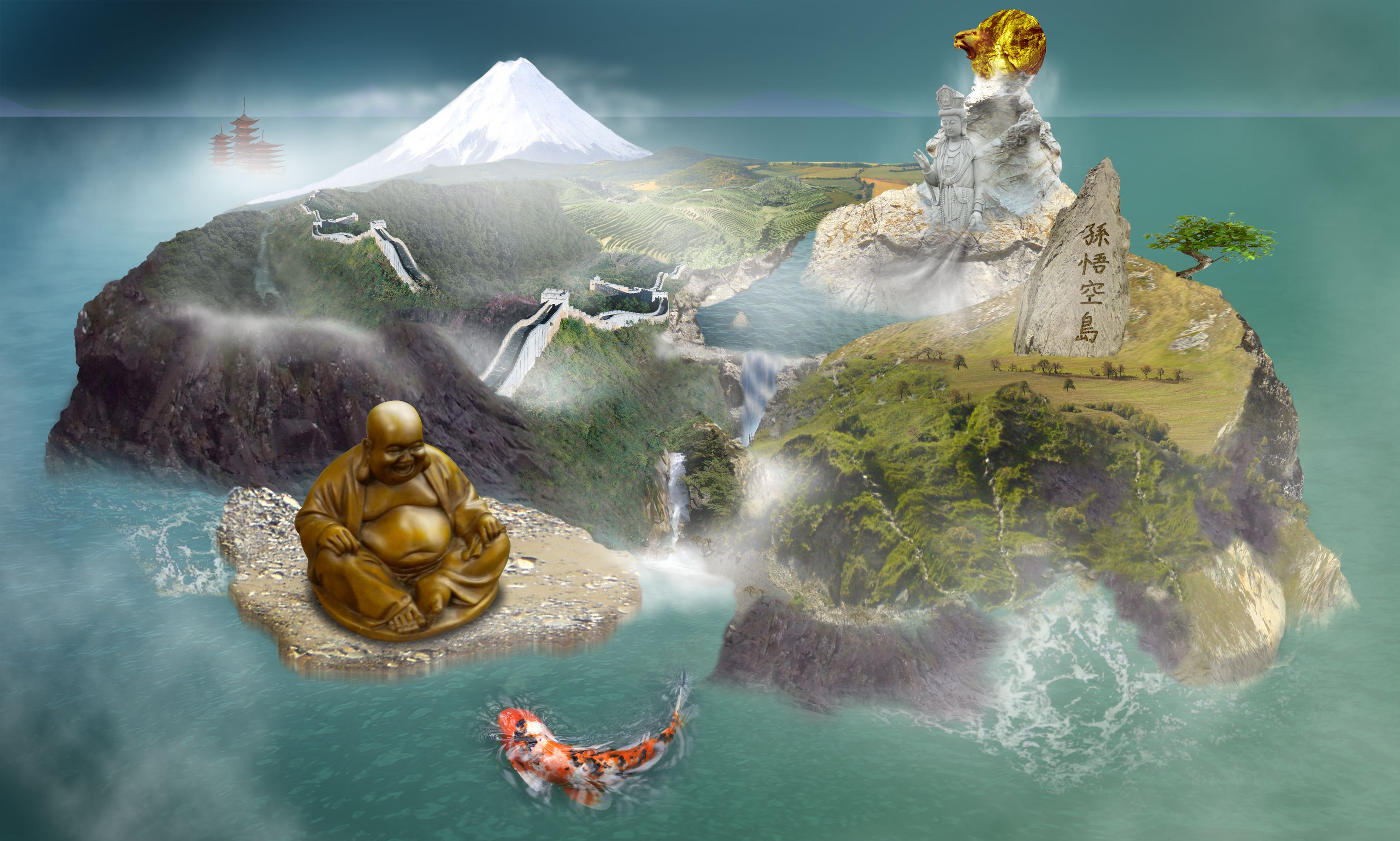
The island (country) of the MONKEY KING!

better view high res


sorry but I have 3 other source images from sxc.hu to include in the production of this image which I couldn't add to the submit page cause there is only space for 10 and as this is a fairly complex piece I needed a few more...
They are:-

Landscapes by 134265
http://www.sxc.hu/photo/673212

Bonsai Tree 2 by ired
http://www.sxc.hu/photo/766548

edit: Also!! Patas Monkey by jungleboy
http://www.sxc.hu/photo/894149 (5 years and 3394 days ago)

10 Sources:

avatar jaescoe21
jaescoe21 says:

this is sweet. what does goku even mean?? i know its a characters name on dragon ball z hahah. i haven't watch it in a long time though. the koi fish seems a little big. it would be amazing if your island was like a ying yang because that would definitly fit with everything. but overal it is a really great image. i like it alot. probably one of my favorites. gl

author says:

yeah it's a name... my theme is monkey king... (you know it?) - and dragonball Z was apparently inspired by it hence goku!?! - Yeah the Koi is meant to be big... it's all gods and mythology and all that... lol.

avatar CMYK46
CMYK46 says:

Nice idea & blend of sources. Bad mix of perspectives..

avatar jaescoe21
jaescoe21 says:

oh ok hahha great job then. i like your work

avatar jawshoewhah
jawshoewhah [banned] says:

The wave on the right is not in theright perspective. I understand this is supposed to be abstract and just my opinion, not quite on theme.

author says:

CMYK46: yeah it was hard to get the right images. to fit exactly... but hopefully I get the idea across... thanks though... Jawshoewhah: I know the wave looks a little odd... and as for being off theme... I think I have satisfied the goal / brief: I've fulfilled each point; it's new, it's obvious it's a country of some sort, i've highlighted the features, I've given it a name... but I appreciate you understand that its abstract :P

avatar jawshoewhah
jawshoewhah [banned] says:

Well at least it's not another planet

avatar shivthink
shivthink says:

nice but something unclear !

author says:

I have made some minor adjustments to the mist layers, thought they were a little too thick; also removed the wave cause I decided I didn't like it!!

avatar chakra1985

great job

avatar jawshoewhah
jawshoewhah [banned] says:

I think it looks a lot better now. GL to you!

avatar Lelaina
Lelaina says:

Congrats for your third place, James!

avatar demi
demi says:

Congrats

Howdie stranger!
If you want to rate this picture or participate in this contest, just:

LOGIN HERE or REGISTER FOR FREE


My son, the genius - created by ice


My son, the genius
Favs: 0SBS: 6Hi-resRank: 9/9Score: 50.6% (0)10738 views

While on a school trip to Peru, the hotel caught on fire... thinking quickly on his feet he grabbed a kiddie elephant blow up pool and a oar that was just laying around and escaped.

(Source image used, a flickr photo as credited was used, and my own pictures of my kid, yes in a blow up pool used) (5 years and 3516 days ago)

1 Source:

avatar ponti55
ponti55 says:

Nice work!

avatar jsk123
jsk123 says:

Lol i like it! maybe make the paddle and boat darker

avatar pixelkid
pixelkid says:

I like the burnt building and fire very much...the foreground subject doesn't belong...it's too bright and clean. This image would be SO MUCH better without it...no offense to your son...in my opinion.

author says:

Hey, no offense taken. 
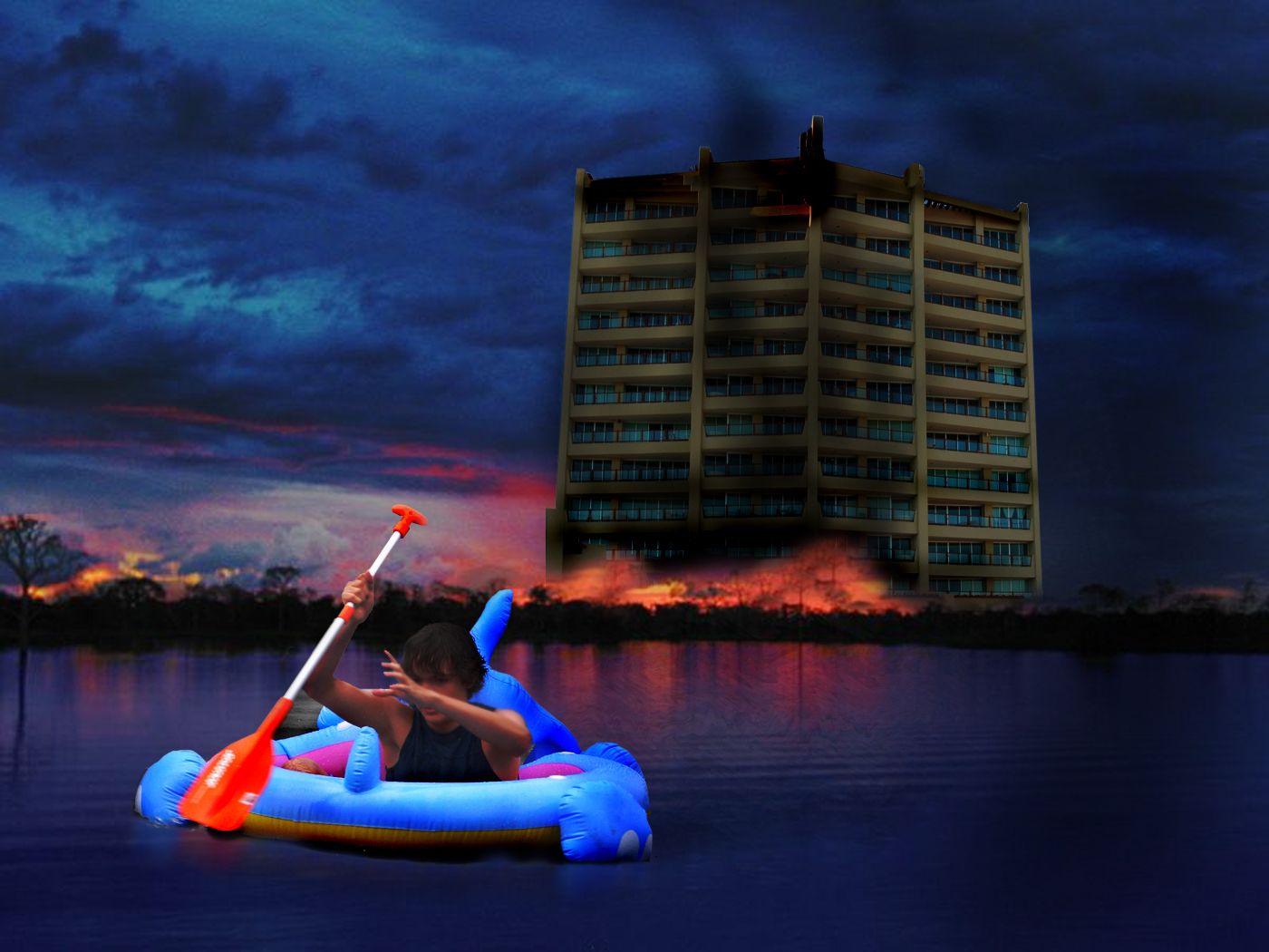
I agree it doesnt belong, (neither does a teenager rowing a elephant down a lake in real life), but its just a fanatsy picutre... I would like to think they have real boats to escape with in real life, hehe

Howdie stranger!
If you want to rate this picture or participate in this contest, just:

LOGIN HERE or REGISTER FOR FREE


Native Son - created by lchappell


Native Son
Favs: 0SBS: n/aHi-resRank: 6/9Score: 59.1% (0)7815 views

Yes this is a total remake with the same title from my first post for this contest. (5 years and 3522 days ago)

7 Sources:

avatar ponti55
ponti55 says:

very nice composition, and great blending! Good luck

avatar inanis
inanis says:

nicely blended, just as the first one, i would change two minor things though. first the hill with the trees could be more saturated, to mach the green of the foreground, second the little teepee, although in low res looks ok, in high-res it looks copy-pasted, and besides that, it's on an inclined surface, so the perspective is wrong, and it is illogical anyways.

avatar Giallo
Giallo says:

Fine job!!! ...but probably the sky is not really fitting is a little too brighty...good job man

EDIT: good improvement !! IMHO now is better more natural

avatar Eladine
Eladine says:

still very peacefull

avatar animmax
animmax says:

Nice - i would add a very slight blur along the edge of the treeline to break up some of the sharp edges you have - especially with the mountains. GL.

avatar Leanord
Leanord says:

Nice job , but the one thing I noticed is, the front male on the horse seems to have more contrast and shading than the girl in the background.

avatar k5683
k5683 says:

nice job

avatar laulei
laulei says:

Very good blending and the composition is terrific!

avatar CMYK46
CMYK46 says:

Lookin' good from where I sit!

no avatar
Marcia says:

Very nice!

avatar thefinalcut

Great image! I agree with leanord, the man in the front came from a brighter source than the girl in the background.

avatar hereisanoop

NICE Work!

avatar pixelkid
pixelkid says:

Great blend!

avatar George55
George55 says:

good job!

avatar Lelaina
Lelaina says:

Very good blending! I'd totally believe, that this is a real picture. Good luck!

avatar oana
oana says:

congrats!

avatar FairyGardens

beautiful picture, nice mood

Howdie stranger!
If you want to rate this picture or participate in this contest, just:

LOGIN HERE or REGISTER FOR FREE


Our son the saver ! - created by gibbo192


Our son the saver !
Favs: 0SBS: n/aHi-resRank: 3/9Score: 53.3% (25)16274 views

Family looking on at their son :) (5 years and 3534 days ago)

1 Source:

avatar GolemAura
GolemAura says:

very cute idea... good luck (might want to clean up around the family.. they have some debris around them..

avatar ponti55
ponti55 says:

Try adding some shadows, as well as following GolemAura's advice. Good luck!

avatar wazowski
wazowski says:

Funny . Lightsource in the contest image is from left, you should flip your own image to fit with the light. Also, I'd add some yellow-ish photofilter for the family, so that they match better with the color of the source image. Good luck!

avatar Lelaina
Lelaina says:

Congrats for your third place!

avatar RichieMB
RichieMB says:

Congratulations for 3rd

avatar nasirkhan
nasirkhan says:

Congrats!

Howdie stranger!
If you want to rate this picture or participate in this contest, just:

LOGIN HERE or REGISTER FOR FREE


Mother and Son - created by nasirkhan


Mother and Son
Favs: 2SBS: 1Hi-resRank: 3/9Score: 58.7% (25)23984 views

This is my old entry. I have deleted PSD and also SBS :-(.

Thanks to CynTurek, jazza and bergertv at sxc.hu for stock images. (5 years and 3596 days ago)

4 Sources:

avatar nishagandhi

very nice

avatar jaskier
jaskier says:

Very good one.

avatar pixelkid
pixelkid says:

Nice job! Good blending! She looks a bit 'dazed'...

avatar Glam0urGirl2007

WOW

avatar mariosilva

nice job

avatar gopankarichal

nice work!!

avatar ushurani
ushurani says:

I remeber this great work.

no avatar
olga says:

very well done author!

avatar RichieMB
RichieMB says:

Congratulations for 3rd

avatar pixelkid
pixelkid says:

congrats!

avatar nishagandhi

congrats

avatar gopankarichal

congrats

Howdie stranger!
If you want to rate this picture or participate in this contest, just:

LOGIN HERE or REGISTER FOR FREE