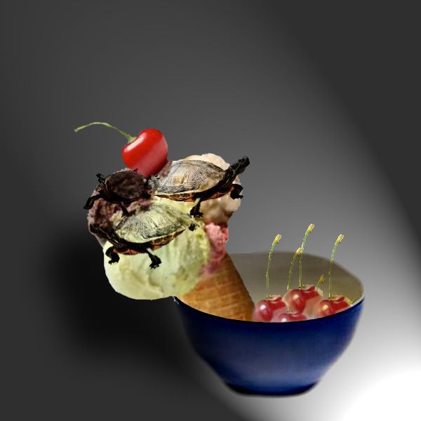
Turtle Ice cream is one of my favorites!!
STEPS:
1) Cone with Ice cream
2)Turtles
3)Sprinkles
4)Cherry
5)Bowl
6) Put it all together (5 years and 3353 days ago)
Thanks to Kalilo for the nice stock :-)
"Never have more children than you have car windows".
Erma Bombeck. (5 years and 3367 days ago)
looks like a nice well-executed chop. Well done
Thx 
Good work! just maybe make shadow a tad lighter...or less blur? GL 
Nice stretch! 
loopyluv, i will try to fix it, but it was hell geting this far
Good job.. sometimes the simple looking images are the best
Nice.....
Any drive thru at a fast food restaurant would love to see this gargantuan rolling into the lane.
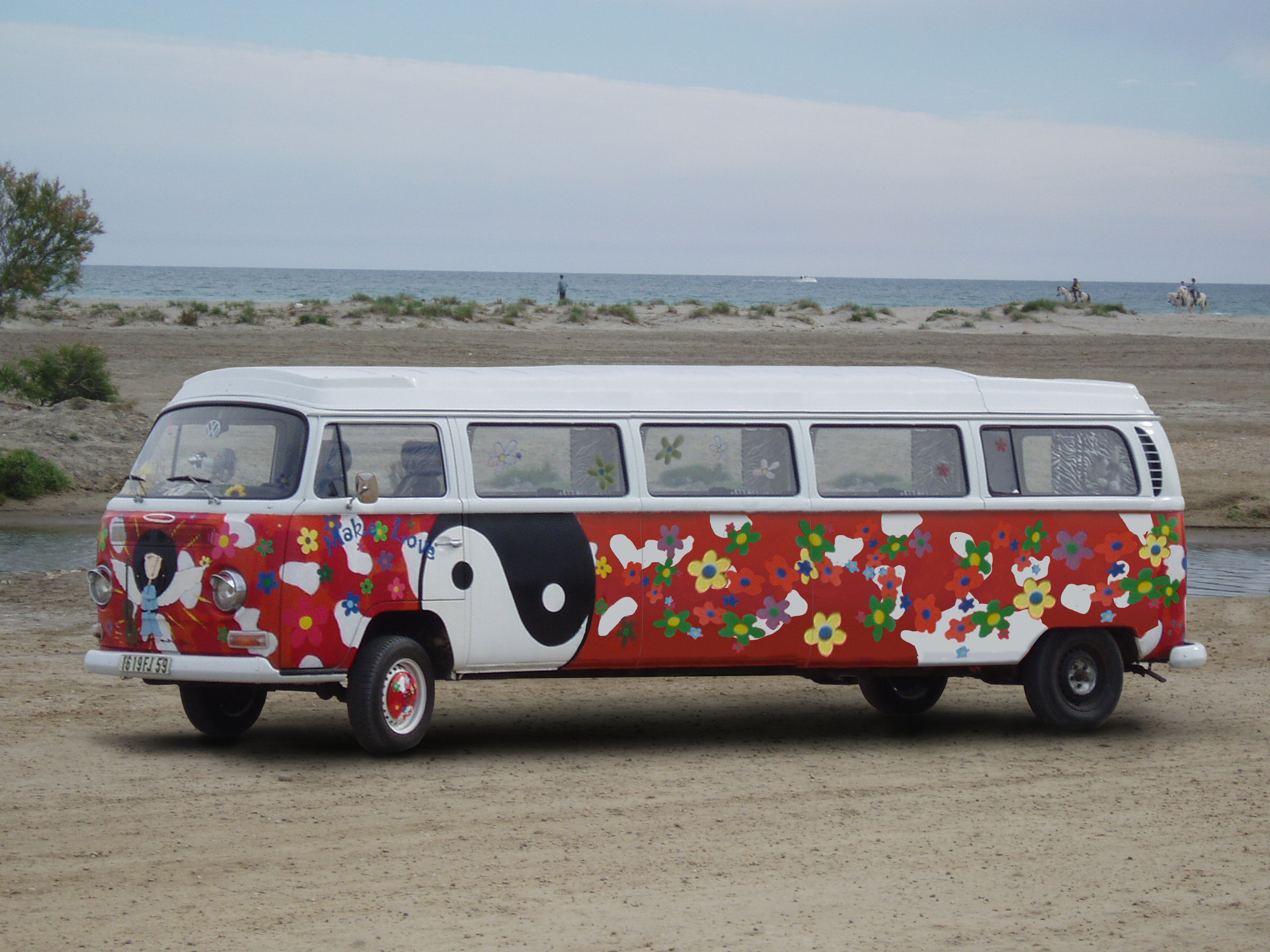
OMG, Mormon hippies! :LOL2: Well done.
Congrats on 3rd
Congrats for your third place, Clinge!
Howdie stranger!
If you want to rate this picture or participate in this contest, just:
LOGIN HERE or REGISTER FOR FREE
(5 years and 3376 days ago)
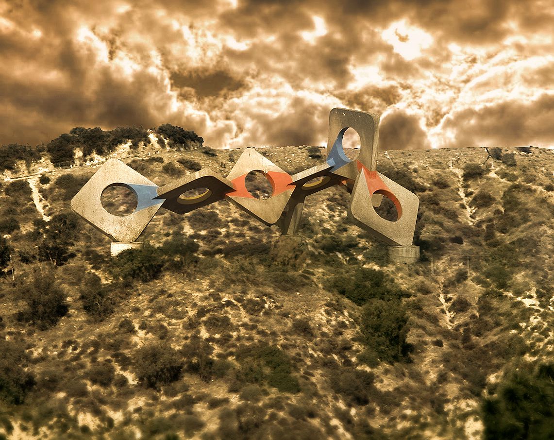
nice idea,love the colors...
Great mood.. nice and straghtforward.. good job.
great job
Howdie stranger!
If you want to rate this picture or participate in this contest, just:
LOGIN HERE or REGISTER FOR FREE
no out side sources used (5 years and 3389 days ago)
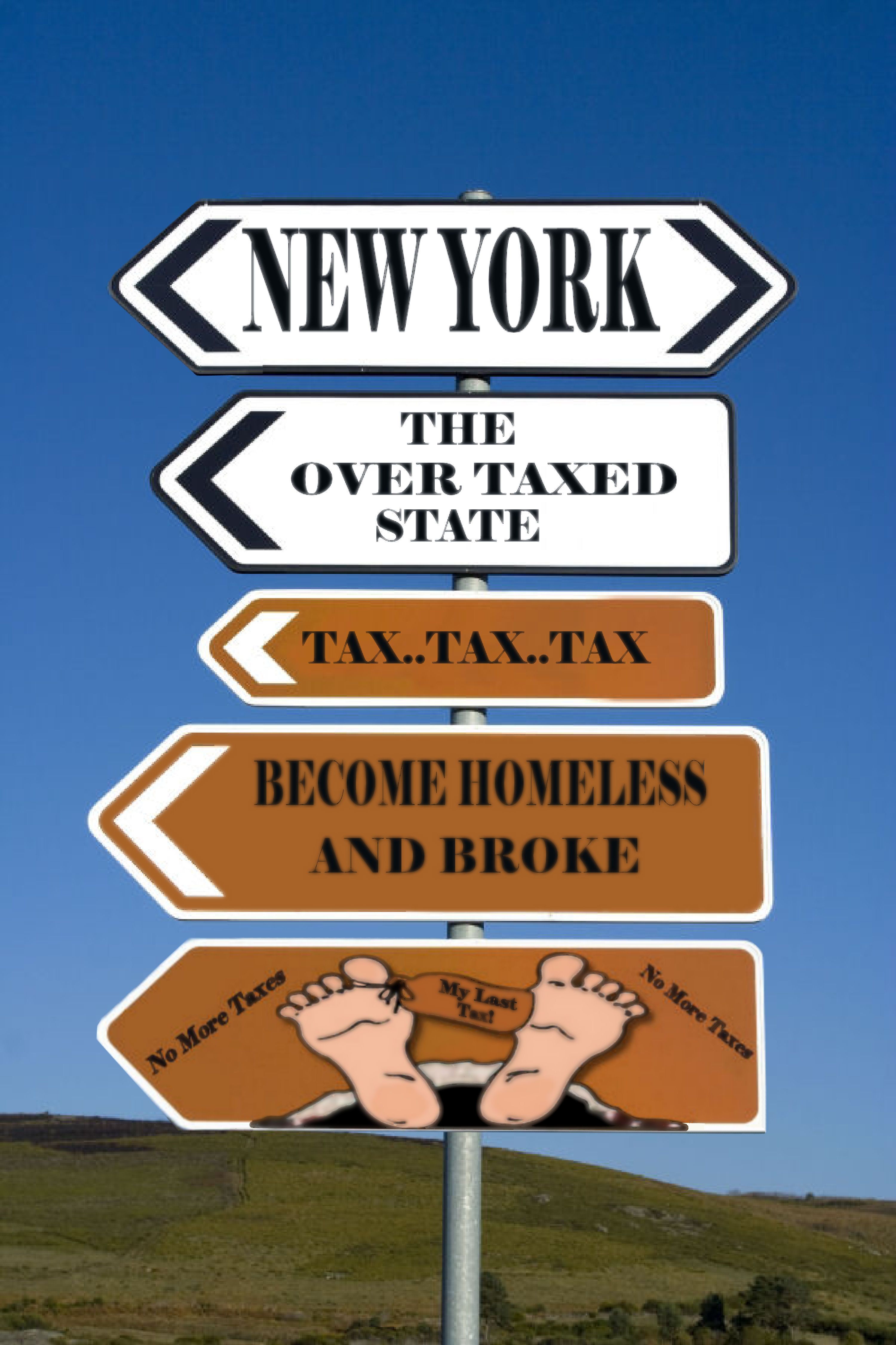
Needs a high res...can't read the red type. (And hey, just be glad you don't live in NJ like me!).
Why exactly did you put "My Lard Tax" on the big toe, because that's what it looks like in this resolution. If you're not going to put much effort into the source, the least you could do it make the fonts clearer and sharper and a little bit more level to the signs. "Home of taxes" is not level, noticeable even in this res.
Thanks guys I guess red wasn't a good idea I hope this is better I also inlarge picture.Oh yea it says My last Tax because even when you leave this world you have to pay a tax...LOL
That's better, but you should blur the fonts a little bit. The resolution of he source is not that clear and it would look more authentic and not so chopped if you did.
Hey again Thanks ! I hope I didn't over blur. It does give it the weathered look I never even thought of that. I did see I had one panel that was not blured like others I took care of that also Thanks.:cool
Better than it was before. You can also take down the olpasity on a font layer for a better effect. GL!
Howdie stranger!
If you want to rate this picture or participate in this contest, just:
LOGIN HERE or REGISTER FOR FREE
(5 years and 3449 days ago)
add some details to the background and the ground
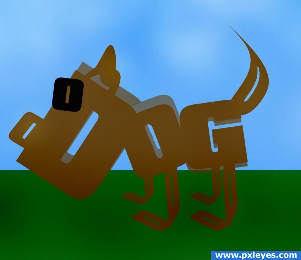
The other one wasn't made from fonts. This one may seem more boring to you but at least it's on theme now!
I think you shoulda replaced your first entry with this one...
beg for deleting this double image...
It's a little too simple in my own opinion.
Very interesting yet simple idea. Sometimes simpler is the best way to go. I might have added shadows, but that is a personal preference. Nice Job. Good Luck!!
You know there is a cartoon character almost identical to one on a public television program called "word world" and may be considered copy-righted.
good job on the dog
Howdie stranger!
If you want to rate this picture or participate in this contest, just:
LOGIN HERE or REGISTER FOR FREE
Photography and photoshop contests
We are a community of people with
a passion for photography, graphics and art in general.
Every day new photoshop
and photography contests are posted to compete in. We also have one weekly drawing contest
and one weekly 3D contest!
Participation is 100% free!
Just
register and get
started!
Good luck!
© 2015 Pxleyes.com. All rights reserved.


masking and blending all need work. The ice cream should note be bleeding through the turles for example and the edges of the bowl are quite rough. A little more time will yield a much better image.
thank you! I fixed the bowl...im working on the other
Seems like the edge of bowl is too blurred now.
thanks...ill see what i can do
Yeah the icecream is a bit too blurred and see if you can fix the cherry above the turtles a bit. Anyway, nice work and good luck !
!
thanks...i fixed the picture again i hope this one looks better!
cool...
Howdie stranger!
If you want to rate this picture or participate in this contest, just:
LOGIN HERE or REGISTER FOR FREE