(5 years and 916 days ago)
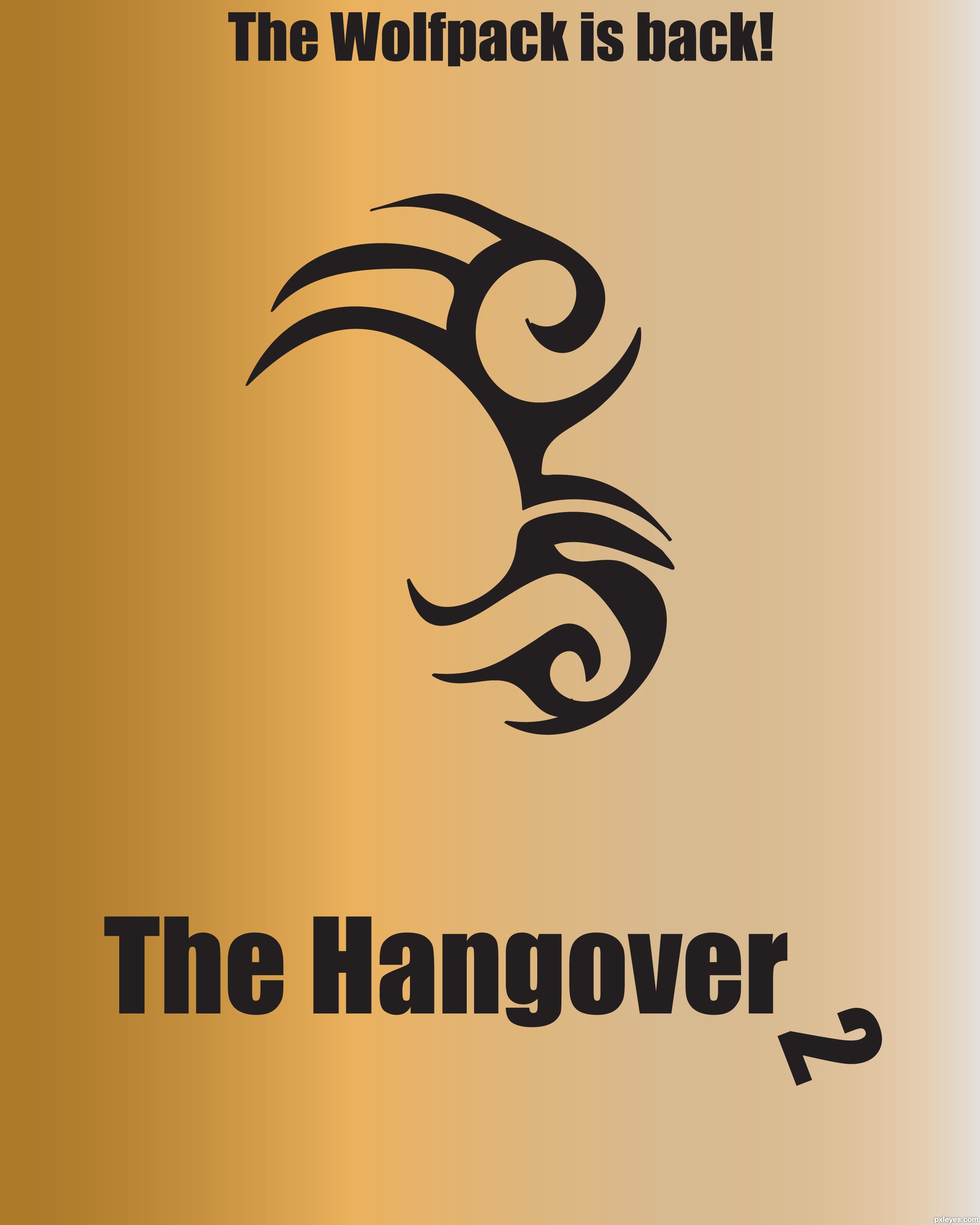
I chose colors that they seem to use a lot in the posters for this movie.
For those unfamiliar with the movie, the significance of the tattoo is that one of the characters wakes up with that same tattoo on his face! (5 years and 2851 days ago)
Lol I knew exactly what you were after. I've never watched the movie, never going to, but this poster for it is great! Grab your eraser and get rid of that little dab on the bottom right spike and it'll be perfect. 
Thank you IDt8r! Trust me, I have tried so hard to get rid of that little dot. I created this last night, but I didn't post it until today. I noticed it and tried to fix it. Eraser doesn't work. It just messes up the background. Even when I hide the background layer, it still makes the layer lighter. I will try again, but if anyone has any ideas, this was created in Illustrator.
*Fixed.*
Nice...I like the "hanging" 2 in Hangover! 
Thanks CMYK.
Great idea! don't love the font choice but still works... try to center the elements vertically, there's a lot of blank space below "the hangover 2" and so lil' above "the wolfpac is back!". Also think it should look better using a solid color rather than a gradient. =)
Mike, you're right. There really isn't enough room at the top, and too much on the bottom! I will fix that when I can. Unfortunately, it will be a while. Shoot. I tried the solid color and I didn't like it. I was bored with it.
Howdie stranger!
If you want to rate this picture or participate in this contest, just:
LOGIN HERE or REGISTER FOR FREE
Photography and photoshop contests
We are a community of people with
a passion for photography, graphics and art in general.
Every day new photoshop
and photography contests are posted to compete in. We also have one weekly drawing contest
and one weekly 3D contest!
Participation is 100% free!
Just
register and get
started!
Good luck!
© 2015 Pxleyes.com. All rights reserved.


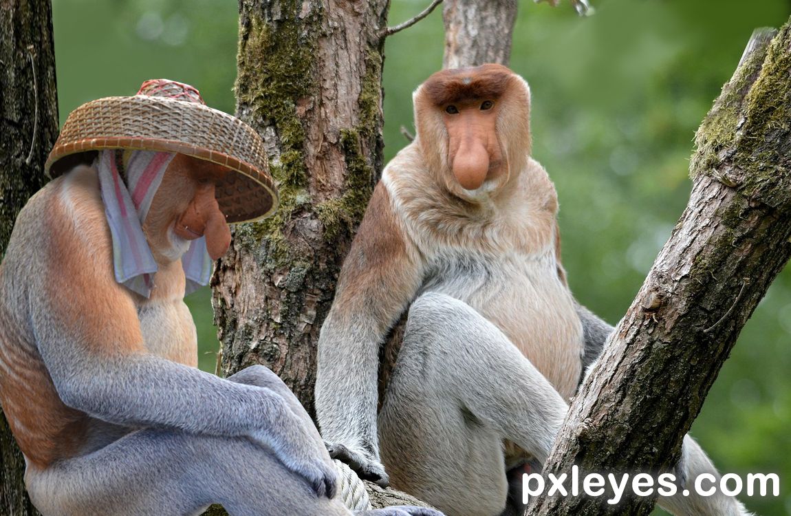
hehehe, how you made a Chinese Woman hat into a Hangover Cure is beyond me.. hehehe Great Job
He stole the hat from one of the downtown parties... some one got drunk. No, I think he found it in the jungle....
Congrats on 4th
It was fun...I wonder if the Chinese woman found her hat...Thanks.
Congrats
Demi, I appreciate your congrats...
Congrats, so funny!
Howdie stranger!
If you want to rate this picture or participate in this contest, just:
LOGIN HERE or REGISTER FOR FREE