(5 years and 3372 days ago)
2 Sources:
- 1: Wooden Fence
- 2: Background
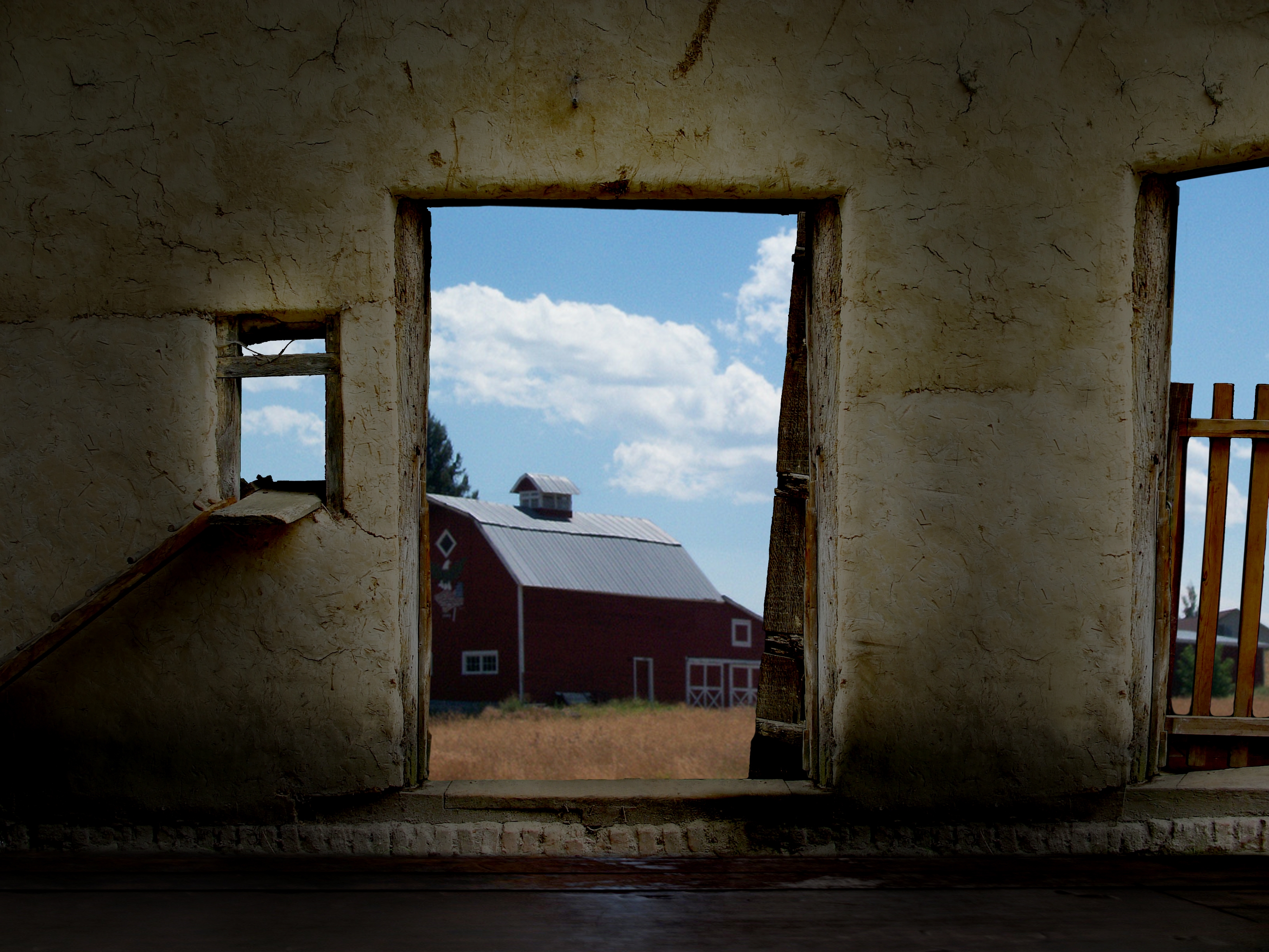
I made the picture so it looks like you're standing inside the barn and looking out. (5 years and 3533 days ago)
oh my.. why not just pull my heart out and make it melt.. what a lovely idea.. good luck author.. I hope you do well
(stupid nit pic.. get rid of that micro line in the main frame.. it looks like a power line.. dont notice it in normal res .. but in high res can see it.. doesn't bother me .. but I know it willbother the voters  .. good luck
Fixed it. Thanks!
excellent fix.. hehehe.. gave you a perfect entry score because no one ever listens to me because I'm loop the flippin loop.. LOL.. its a very lovely image.. .good luck author/artist
Great idea! Almost everyone looks into the door. (I can think of one other looking out pic.) This one is really great, though.
Excellent! good thinking and very well done.
Ahh i saw this a while ago but my computer crashed just as i was typing a comment! Very nice image, you did a GREAT job.. everything fits perfectly and those light beams from the winow... tip-top!
I really like this. well done. However one small problem is the use of the same door frame. Perhaps clone different sections of it to create different grains and marks. good luck
I love the fact that you thought about flipping the image... great job and great blend! Good luck.
nice choice of images author. lovely outcome
now that's inventive!
Neat!
Howdie stranger!
If you want to rate this picture or participate in this contest, just:
LOGIN HERE or REGISTER FOR FREE
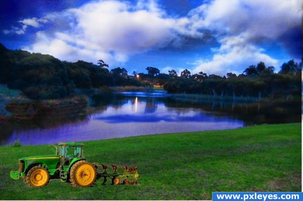
these are free stock landscapes images from turbo photos (5 years and 3556 days ago)
Looks nice, but maybe brighten the image a little. Good luck!
???? The sky reflected in the water is totally different.
Great fix! Pay attention to what CMYK says though, otherwise, great image!
this is a nice image i like it a lot
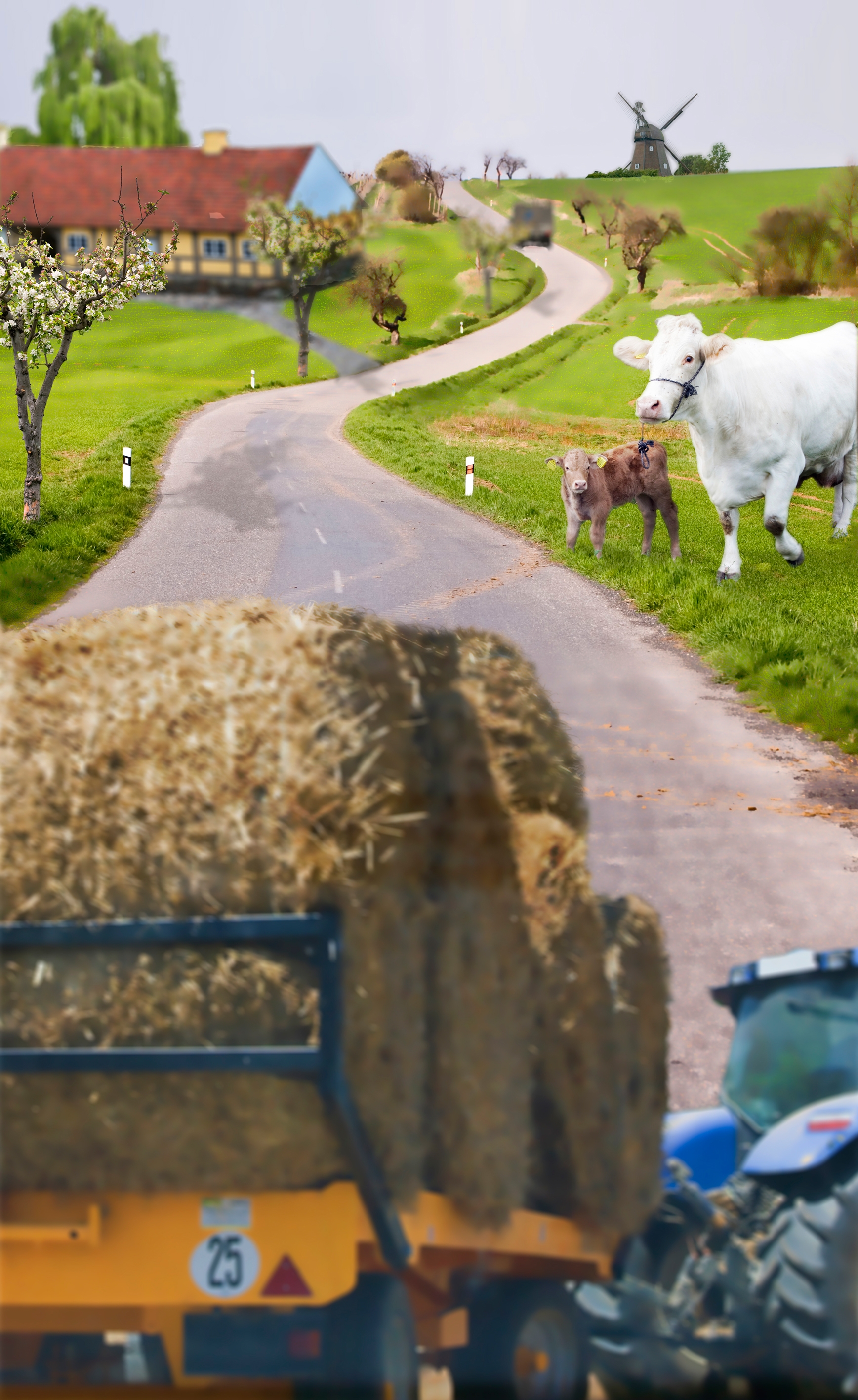
Nice colours.....but the tractor looks a little transparent to me
Nice effort, but the tractor doesnt seem to fit in. You could start making some shade below the tractor...
nice work.gl
tractor is too small; or is it a toy tractor?
Howdie stranger!
If you want to rate this picture or participate in this contest, just:
LOGIN HERE or REGISTER FOR FREE
(5 years and 3573 days ago)
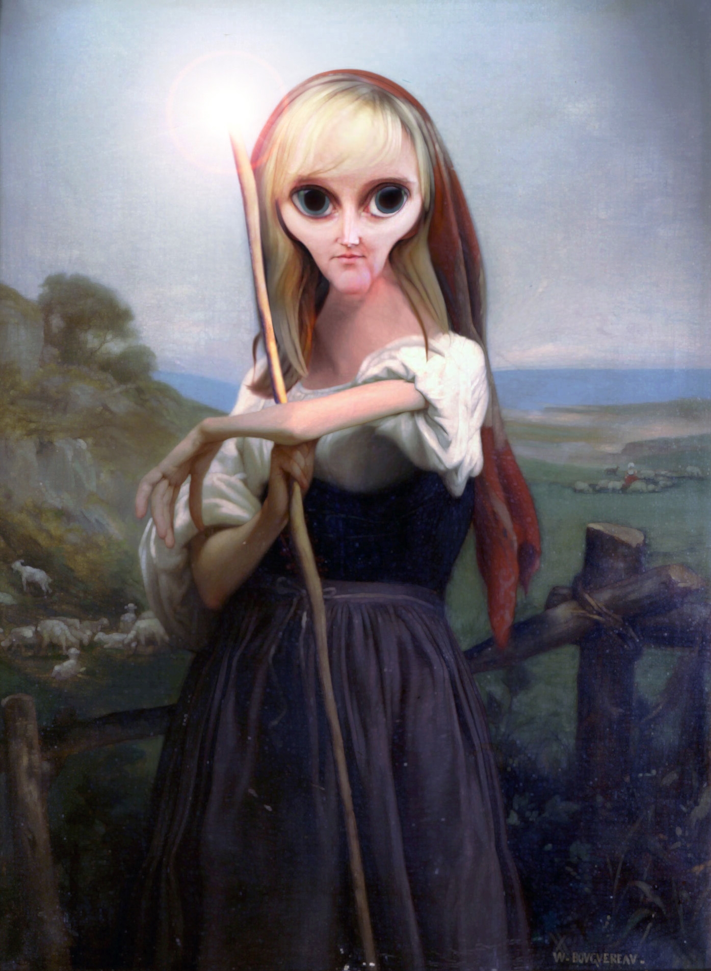
The blend is fantastic. Perhaps her face is just a touch too bright. Check the mid tone levels for that layer. she's really not that "caricature -ish" but great result none the less. Really outstanding authentic looking piece. Great Work, author!
Very good work..but how is this a caricature?
This isn't a caricature, but it is a beautiful blending. The expression is perfect for this artwork. Maybe you should suggest this (blending modern faces with classic art) as a contest.
good photoshopping, but not a caricature.
exactly! so how to vote on this one?
A fine piece of work not a caricature but nice work
great work author but how does t fit the contest guidelines
LOVE IT LOVE IT LOooooVE IT!!!
This is really beautiful and wish it fit this contest, but sadly it does not. I really like the the expression of hilleke in this. 
great blend! she looks tired from so much work on the field
Not too much of a caricature, but it's a nice, well presented idea. Good job!
now thats cool
love it !
Hahahah...nice change Good job!!!
now it really fits with the theme
Very nice
good change now it's a caricature
Very very nice super blending great stuff!!
Very good.
If compared to the original pic, I would say this is a caracature plus +++
Howdie stranger!
If you want to rate this picture or participate in this contest, just:
LOGIN HERE or REGISTER FOR FREE
I used 6 of my own images, lots of clear cutting and layers. (5 years and 3595 days ago)
oh my.. this really need some TLC... author..when using so many different images..you really need to get all of their light sources going in the right direction.. at the moment, all the shadows are every which way but loose.. when masking out images its good to place them all in a clear layer and move them around until you line up all the shadows.. then move them into the project.. your composition is solid..now the work to balance and add shadow begins..good luck... I'm sure more peeps will be along to help you along..
some perspective problems exists.
not very well blended but i like it
I have made some improvments, and added a truck.
Howdie stranger!
If you want to rate this picture or participate in this contest, just:
LOGIN HERE or REGISTER FOR FREE
Photography and photoshop contests
We are a community of people with
a passion for photography, graphics and art in general.
Every day new photoshop
and photography contests are posted to compete in. We also have one weekly drawing contest
and one weekly 3D contest!
Participation is 100% free!
Just
register and get
started!
Good luck!
© 2015 Pxleyes.com. All rights reserved.


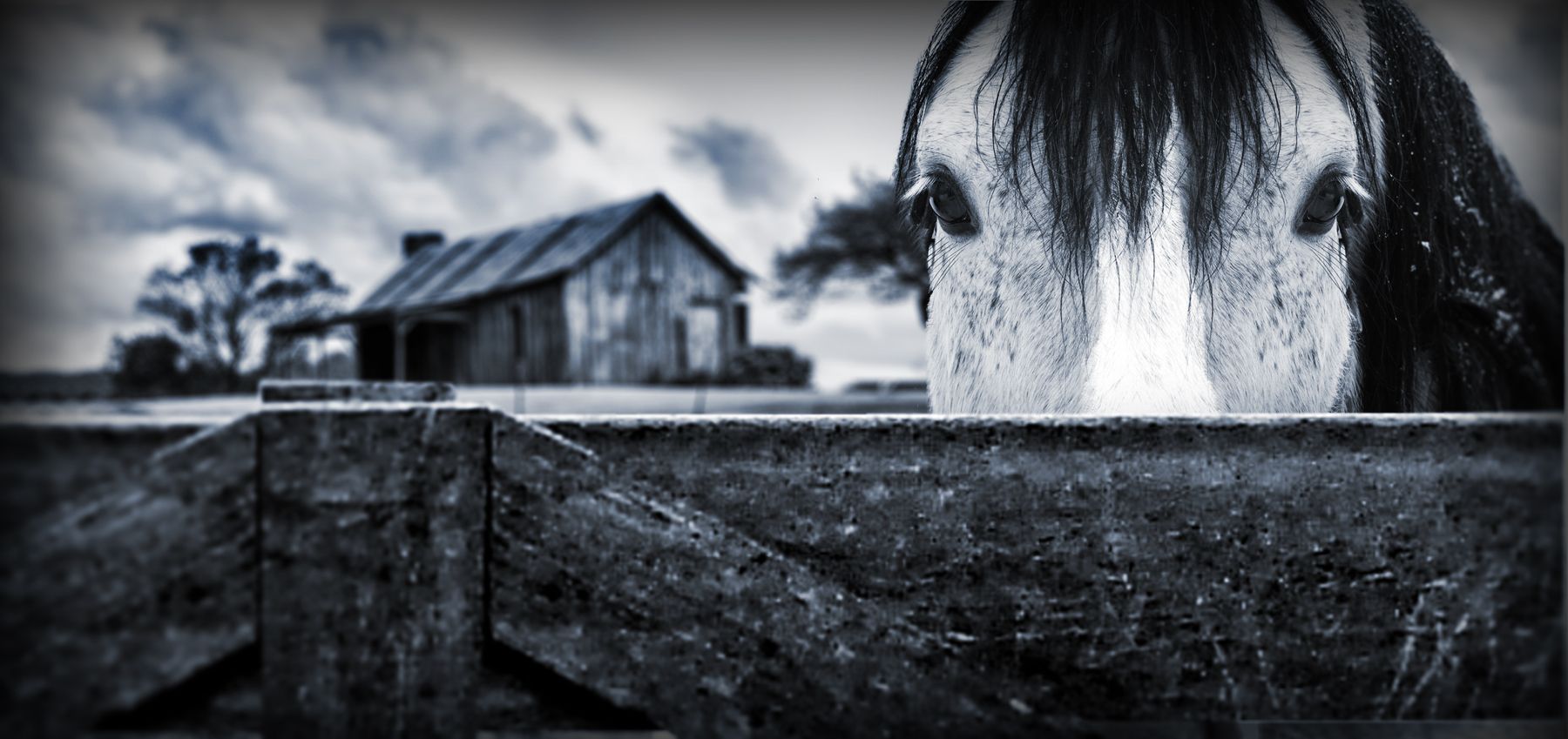
Looked almost photography, except the house, the part behind the horse should be blurred, instead of the right part.
Thanks for the comment..i've updated it now
Very nice shop, looks really beautiful too!
grwat work, you got good thinking skill
Best one so far GL
GL
great work
Beautiful work....And it really seems as if its a photograph...Too good...
Yes, much better. You can improve even more in some details: (1) to make the DOF more shallow, you need to blur the fence layer a little bit, so the main plane will be on the face of the horse. (2) Instead of Gaussian blur, you should use lens blur, which have the blur pattern similar to the real lense, and don't forget to add a small amount of noise, (3) in photography, you should avoid the continuous horizon because it cut your photo into 2 pieces, so you can make one more layer of something to disrupt this horizon (I mean the fence)
I think you over blurred the fence now. But this is still one of the better entries. And author, not all constructive criticism is... right. You're the ultimate critic. You decide.
nice job
Thanks for all the comments!..langstrum thanks for your comments, they were very helpful..and i actually did use lens blur not gaussian...and jawshoewhah thank you for your comments and the advice..i did leave it as is after i made changes to the background
Good work!
Nice idea from source...perhaps heal brush areas on one side of face to remove 'mirrored' look. Eyelid area should be different and maybe remove some strands of hair to make each side a bit more different (random). Nice work author!
I believe this is the best one..... GL. Very nice idea and work.
Congrats for your second place, Fatz!
Congrats!
Congratulations for 2nd
Congrats on 2nd palce Fatz! Great work
Congrats!
Howdie stranger!
If you want to rate this picture or participate in this contest, just:
LOGIN HERE or REGISTER FOR FREE