(5 years and 2771 days ago)
2 Sources:

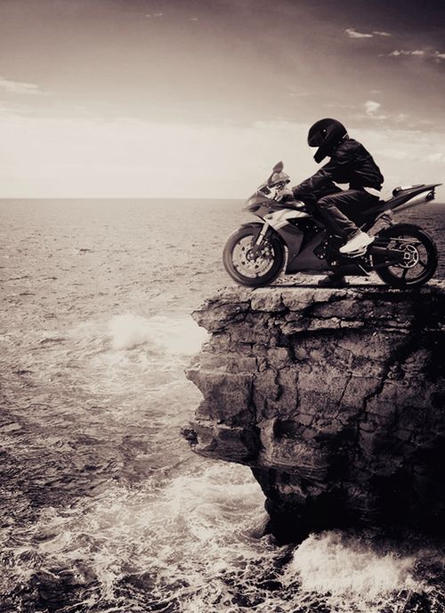
It's only when we truly know and understand that we have a limited time on earth -- and that we have no way of knowing when our time is up -- that we will begin to live each day to the fullest, as if it was the only one we had.
- Elisabeth Kubler-Ross (5 years and 2773 days ago)
Very powerful image, but the text is unnecessary and distracting. The font is too hard to read, and the bright outline steals attention from the image. I would forego it entirely, and let the image speak on its own.
Thanks MossyB! I actually had thought about it but not so sure until I get other point of view. So glad you've pointed it out so soon. I removed the text witten on the clock
very nice image, and all the better for not having the text there too
Great concept, good luck!
Thanks Ray and Enblanco for appreciating this entry of mine!
My Fav!..
Thanks Jordy & enblanco for the fav and to everyone for your comments and precious votes!
Nice image author, a few minor details I could pick up on , but at this late stage I`ll say its great!
Very surreal
congrats
Howdie stranger!
If you want to rate this picture or participate in this contest, just:
LOGIN HERE or REGISTER FOR FREE
(5 years and 2811 days ago)
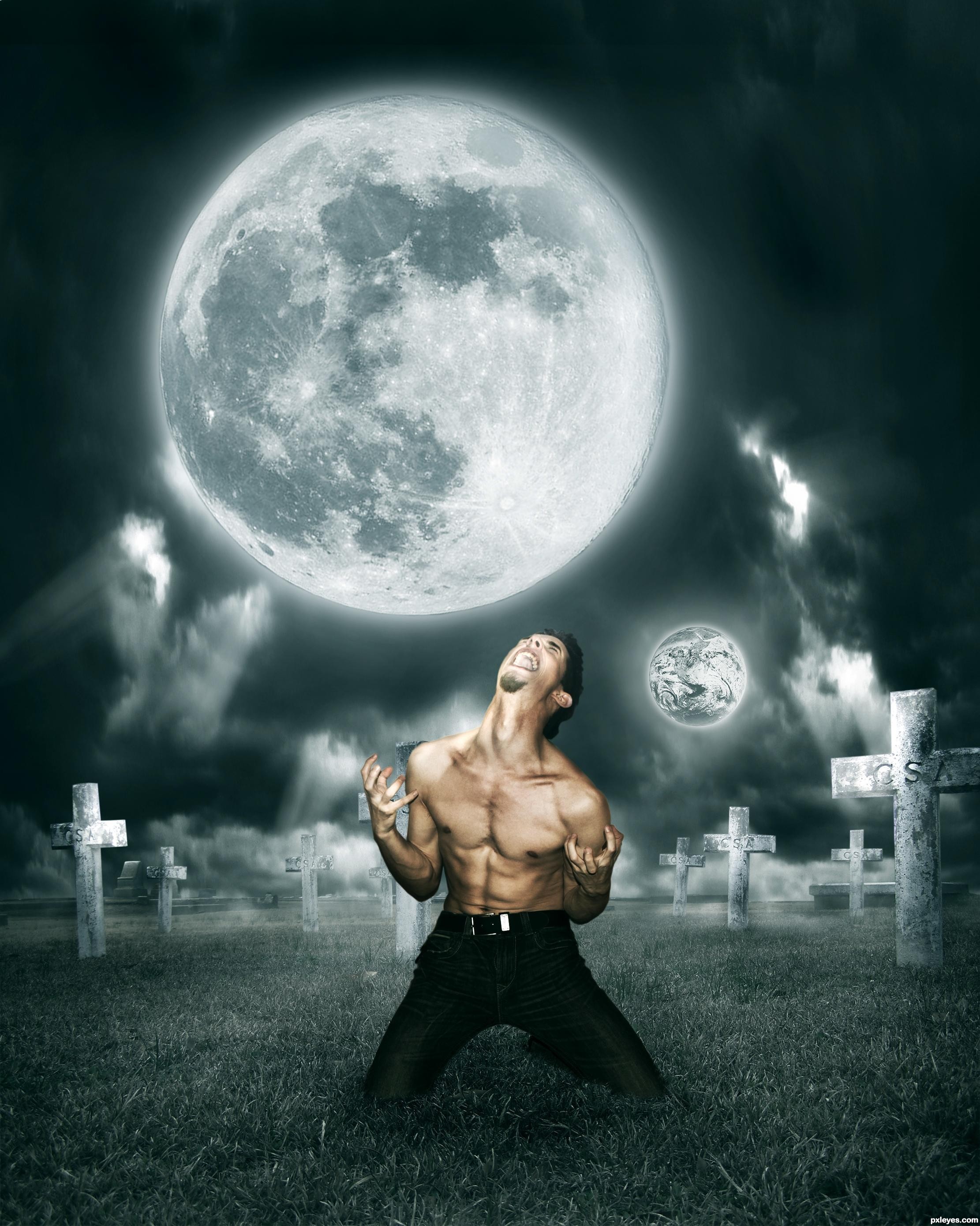
Although the large full moon is behind him, the man has no backlighting, and appears to be illuminated from the front...The second moon is distracting.
its k Mossy B
i like this entry as it is and i am not going to change anything because it's my dad's fav entry
by d way u r taking this theme in wrong way MossyB.
Not really, author. "Under" means "under." Lighting needs to be consistent, even "under" a full moon that is behind you in the sky...Whether or not you make changes is up to you. But at least you are aware of the inconsistencies in your execution of the image.
i think d moon is only 15cm up to d person and 3ft from ground
not behind him in d sky
common MossyB u r d senior member
try to understand
I am trying to understand, author. Since you have chosen the Moon, which orbits our Earth, it should visually make some sense to the image. The Moon is illuminated by the Sun. Therefore, it can't be "15 cm from the person and 3ft from the ground..." Where would it get the light that is reflecting off of it???
If you had made a glowing orb to light the man, THAT would be believable. But to take a LARGE planetary body, and simply stick it in the image is incongruous and illogical.
Oh mossy where have you been all this time? Have you ever heard of something such as fantasy art, sci fi art, surreal art... any of them? Many kinds of art don't imply the representation of reality but yes the distortion of it. A free world where you can represent whatever you wish, implying off reality subjects and concepts.
There's a fine line between "fantasy" and "foolish," akassa. Good fantasy art is visibly believable, not just a bunch of stuff stuck together. I've been around quite awhile, and some of the best Fantasy Artists (digital and traditional) are successful not for being able to stick a bunch of images together, but for being able to do so in a convincing and realistic manner...
its enough guys
i got ur point MossyB
i ll surely improve my skill
thanks for ur kind advise
thanks a lot Akassa
thanks a lot Nator
nice work...lighting is superb.
thanks a lot mehul..
really nice..

nice work gl author..!!
thanks a lot neo, RAZOR and passionboy
Howdie stranger!
If you want to rate this picture or participate in this contest, just:
LOGIN HERE or REGISTER FOR FREE
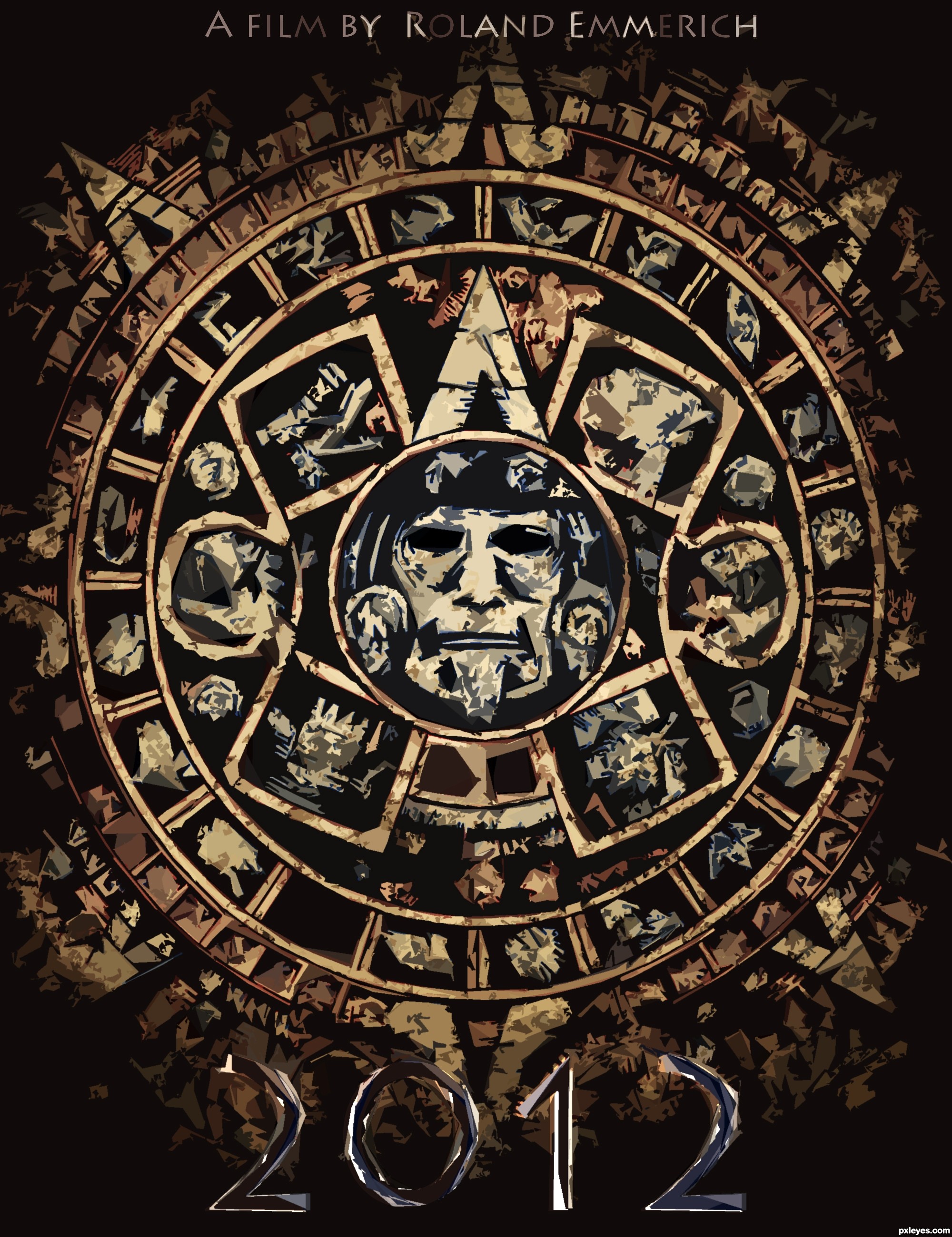
Is this the beginning of the end, or the end of a beginning?
Though its A minimalist poster, I spent much time into this one..
Please look at HQ because everything is worked out into details!!
Also be sure to check the SBS guide :)
Comments and/or suggestions are appreciated!
Thanks to louboumian for the maya calendar reference !!
Thanks to ba1969 for the grunge texture!
EDIT:
I listened to your comments and tried to make it more minimalistic, it's dramaticaly changed and many details are lost now. Though, it looks more minimalistic now.
Please comment if you agree!
(5 years and 2852 days ago)
It looks great but too complicated for a minimalist design.
It's really good though.
At first I thought that myself too.
But does a minimalist poster necessarily mean that the image can't be highly detailed? A minimalist poster is a poster wich in this case you should make a film poster by using a symbol wich is an important part of the film. In this case the poster is indeed a bit complicated, though it's consisting of just one image, more precisely, one symbol. So I think this image is on theme,
Anyway I appreciate your comment very much concrete and I hope you can agree with me?
Minimalism in design is specifically defined. This isn't it. I looked at your SBS. I appreciate the work you put into it so I consider that when voting. But as far as the guidelines of the contest, it doesn't really fit.
GL, author.
I like this, even though minimalism is defined as "a style or technique (as in music, literature, or design) that is characterized by extreme spareness and simplicity."
It's the lack of tons of text that makes this minimalist to me. The Mayan calendar could possibly be stylized a bit more to make it even less detailed, but in this instance, I think it works fine as it is, since it shows no real depth. Perhaps lowering the saturation or opacity to make it blend into the background a bit more would help.
Nice entry.
I think you guys are right, but since I just used 3 colors (red,blue,yellow) and one tint (Black) and only one symbol to symbolise a movie of like 120 minuten, I hope/think it is (just barely) on theme right?
Anyway don't get me wrong, I appreciate your comments really much and I'm glad you guys want to help me !
But if you disagree with me, please say so, and please also say what I can adjust/improve to make it more 'minimalistic'
Would be a shame if this one would be deleted :O It was so much work  ..
..
Anyway again, thanks for the comments ^^
EDIT: To mossyB, At first, thanks for your comment !! Second, I lowered the oppasity a bit and also the saturation, but when I do it too much the 'power' of the image just dissappears... If it's still not OK, please say so!
Good image, but IMO not minimalist as defined by contest description & examples given.
Alright I give up, changed the image, (a pity that so much detail had to be lost).
Anyway, is it more minimalistic now?
sorry i couldn't comment on this one sooner  to achieve minimalism you need to get rid of all unnecessary elements of your artwork, less is more. Use 2 colors in your palette, and only the face with the elements around it that are inside the first circle. There you achieve minimalism...
Howdie stranger!
If you want to rate this picture or participate in this contest, just:
LOGIN HERE or REGISTER FOR FREE

I used source at 4 different place and in 4 new way (5 years and 2872 days ago)
Howdie stranger!
If you want to rate this picture or participate in this contest, just:
LOGIN HERE or REGISTER FOR FREE
Photography and photoshop contests
We are a community of people with
a passion for photography, graphics and art in general.
Every day new photoshop
and photography contests are posted to compete in. We also have one weekly drawing contest
and one weekly 3D contest!
Participation is 100% free!
Just
register and get
started!
Good luck!
© 2015 Pxleyes.com. All rights reserved.


Interesting concept, but needs a high res version to show how well you've incorporated the source image.
believable... lacks a little "wow" factor
Blend very realistic, it seems an old photo! Very good !
Great blend
looks good to me, I agree about the hi-res needed though.. GL!
Nice one, good luck!
Howdie stranger!
If you want to rate this picture or participate in this contest, just:
LOGIN HERE or REGISTER FOR FREE