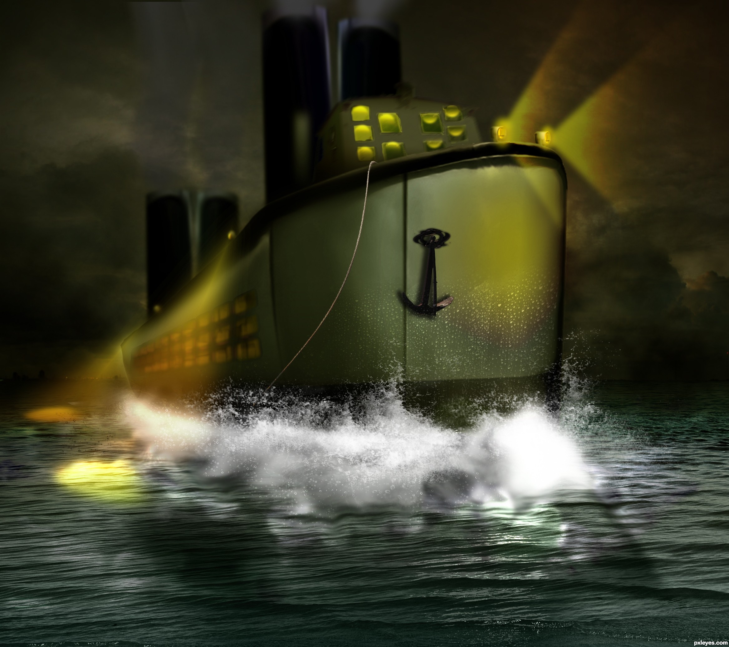
I changed my last work alot and this is the result , I wanted to add it as an independent work but moderators removed it as duplication and honestly I don't know why because it is totally different from the other.
but there it goes guys , hope you enjoy it.
special thanks to CMYK46 and Drivenslush.
thanks to Kriss Szkurlatowski , COFFY | MOTIONDESIGN & mqtrf for their nice photos and permitting me to use as resource (5 years and 2828 days ago)
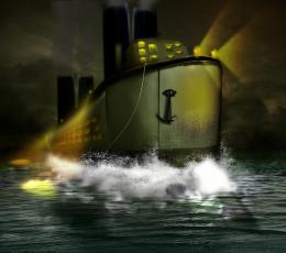
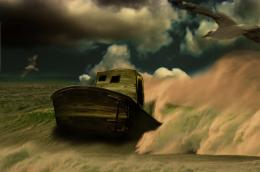
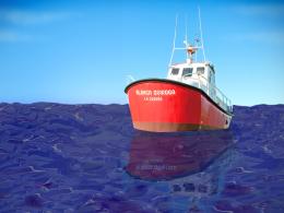


Good idea, but a bit sloppy, especially with the front windows. Might be better to crop the foreground of the ocean source so it doesn't look like the ship is running aground.
thank you CMYK46 for your comment , could you please specifically tell me the fails?
the waves are used from another image and honestly I don't like them too ! but I am not a pro so...I guess I need some help and guidance
going through the image with a blur brush over the rough edges would really help (high res visual).. (print version would probably turn out okay, but in a digital setting everything will show... thinking about the agitation that would happen to the surrounding edges would be helpful as well

the overall image is very fun and interesting.. half the battle, you need to just take a step back and say "what can I do to make this even better".. (in all honesty it is very well done) especially when it comes from your heart
Good luck and be happy.. just always remember there is room for improvement
thank you very much Drivenslush
having your courageous words as comment really motivates me ... its nice of you
I don't know that how much time is left for correction ,on the other side I am busy right now so Its kinda hard for me to put all I have , But I will try and use your opinion to make it better
please tell me more so that I can learn more
also , I will use your words on my future works , it really makes sense and you are quite right about it
thanks again
Much improved, good work good fix and good luck
thanks Drivenslush !
Nice changes, author! Good luck!
thank you CMYK46
some of it's improvements are because of considering what you have mentioned before.
they really helped
thanks alot
You did a good job... the image looks nice.... good colors though. Good luck!
thank you very much !

please tell me the down side too , so that I could do better in future
thanks again
Howdie stranger!
If you want to rate this picture or participate in this contest, just:
LOGIN HERE or REGISTER FOR FREE