thanks to auroradreams
sacral-stock,nightfatestock (5 years and 2965 days ago)
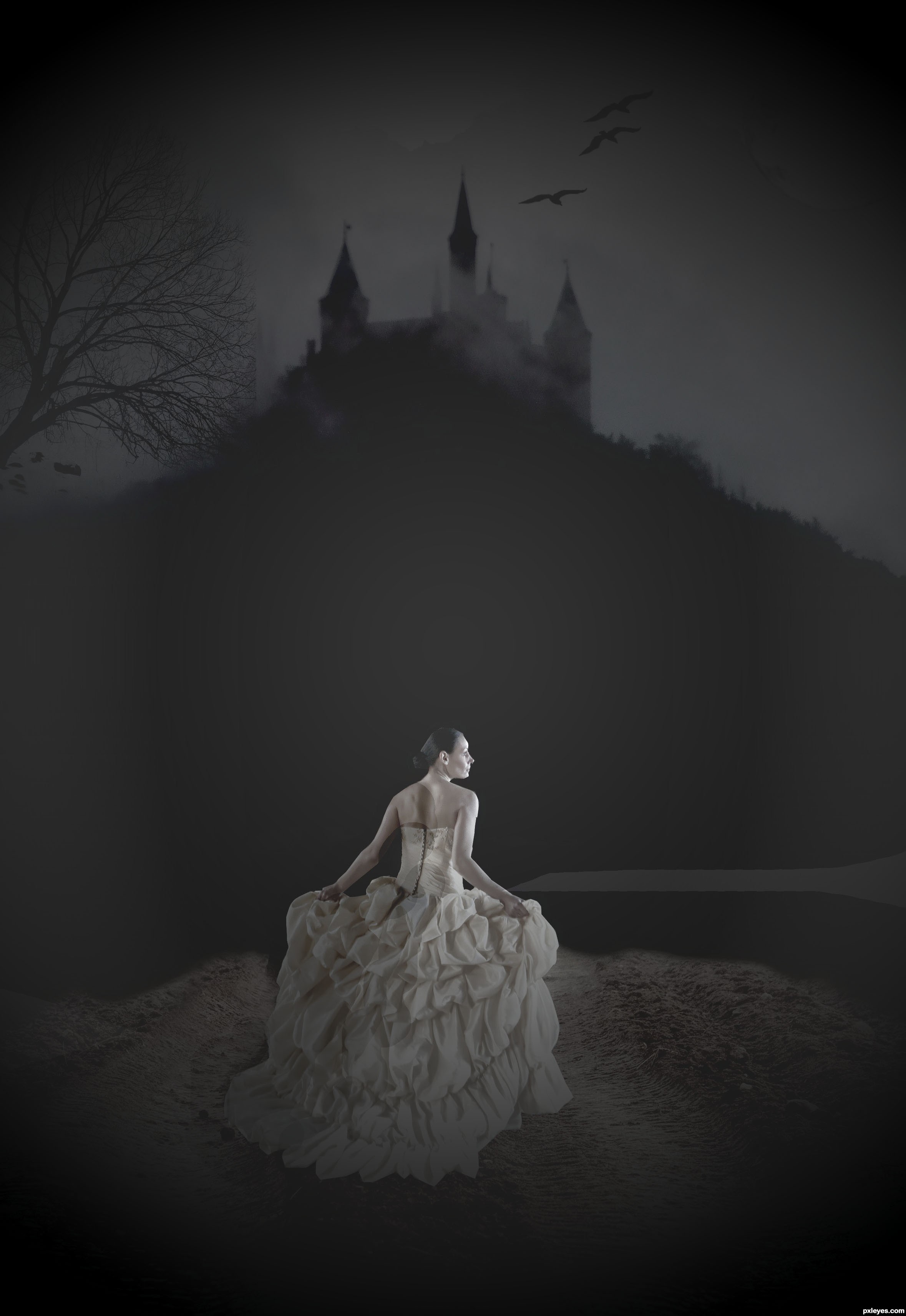
7 Sources:
- 1: model
- 2: castle
- 3: moon
- 4: road
- 5: tree
- 6: bird burshes
- 7: cloud brushes
thanks to auroradreams
sacral-stock,nightfatestock (5 years and 2965 days ago)
Alien attack  by samanway 26578 views - final score: 78% | Waiting For You  by DanielaOwergoor 13570 views - final score: 71.5% | FireStarter  by jadedink 17762 views - final score: 70.8% |
Flaming Cat  by pshoudini 24685 views - final score: 70.6% | Make a wish 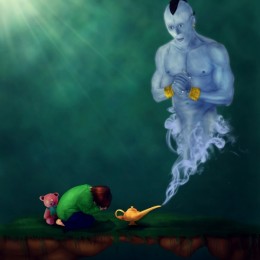 by kushpatel 11789 views - final score: 68.4% | Fire angel  by tnaylor21286 6547 views - final score: 67.6% |
Strange Japan Dream...  by jordyponce 7348 views - final score: 65.9% | Abstract_hand  by lahiripartha 6709 views - final score: 62.4% | Becoming A Zombie  by jordyponce 5570 views - final score: 62.4% |
Drink 4 life !  by lolu 7537 views - final score: 62.1% | Deep in the Blue  by EmiK 7051 views - final score: 61.3% | Highlights of the Show  by MnMCarta 10148 views - final score: 61.2% |
Feather Rainbowwitch 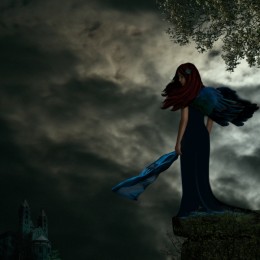 by Sofie73 5972 views - final score: 60.3% | A Beautiful Day 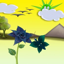 by vipinm 6642 views - final score: 59.9% | Baby Survivor  by jordyponce 6769 views - final score: 59.8% |
queen of the forest  by SHIPLEYGIRL 7997 views - final score: 59.1% | Alien DNA  by detractor 7435 views - final score: 57.4% | Makeover  by RickLaMesa 3927 views - final score: 57.4% |
night princess 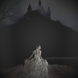 by SHIPLEYGIRL 4907 views - final score: 57.2% |
Howdie Guest!
You need to be logged in to rate this entry and participate in the contests!
LOGIN HERE or REGISTER FOR FREE
Photography and photoshop contests
We are a community of people with
a passion for photography, graphics and art in general.
Every day new photoshop
and photography contests are posted to compete in. We also have one weekly drawing contest
and one weekly 3D contest!
Participation is 100% free!
Just
register and get
started!
Good luck!
© 2015 Pxleyes.com. All rights reserved.


Mask work of the woman is too sharp and angular as though you used the polygonal lasso. There are several tint shape layers on the figure which make no sense as though they are off register. The straight right side of the tree where the image ends makes it obvious it's pasted on, you could fix that with some careful cloning, the tree shouldn't be so sharp either it should match the softness of the rest of the image at that distance. The moon should be softer as well. I think you could improve your entry if you would work on these basic problems.
I think the dark shadow from the hill to the ground needs to be more gradual/subtle. AS it sits now, I think it's too powerful and takes away from the image. I also agree with spaceranger's comments. Good luck. I will hold my vote in case you decide to make changes.
It a nice entry, I see were you going with this, if your going to re-edit the image, don't forget to put the moon behind the clouds. Cause the moon is in space, not in the atmosphere.
hope this is better
The woman fits better. Maybe use the burn tool to give her a cast shadow and also darken the left side of her body since the light source is coming from the top right. When you are making the cast shadow keep in mind where the light source is coming from. Keep working on it and you'll have a cleaner image. Good luck!
is that better
The concept and the composing of the image is very nice, but some things are wrong.First, low the contrast of the moon adding some blur on it. Moreover I think there's too much light on the girl and on the track she's running on, thinking about the moon should be the only source of light she should not be so shiny. Things will change if a car is behind her! Sincerely, i would modify a lot of things, but I don't know where to start from.
Howdie stranger!
If you want to rate this picture or participate in this contest, just:
LOGIN HERE or REGISTER FOR FREE