PLEASE SEE Hi-Res. and SBS (5 years and 3014 days ago)
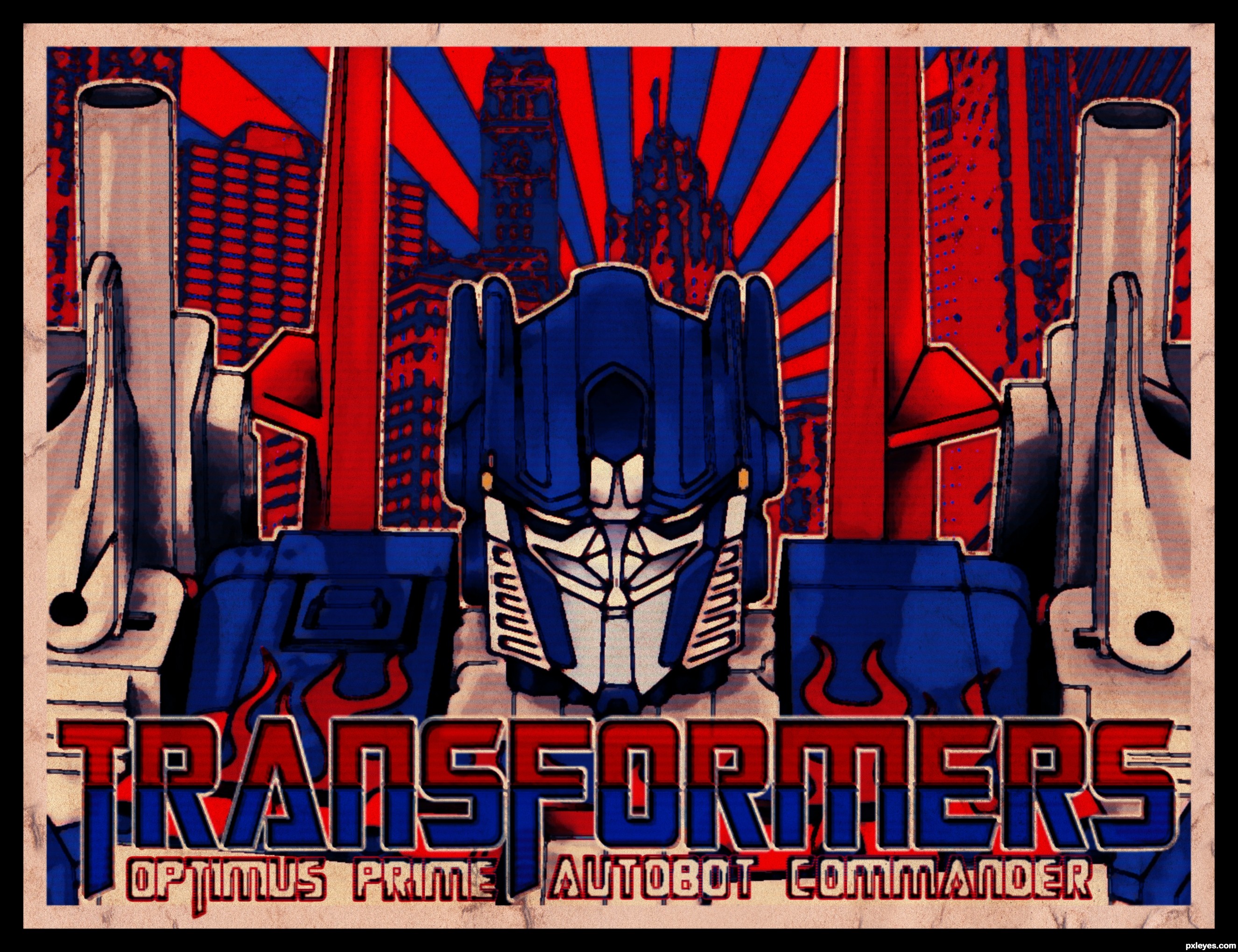
4 Sources:
- 1: Optimus Prime
- 2: Chicago
- 3: Font
- 4: Texture
Butcher robot poster  by grupax 19277 views - final score: 75.8% | CAPTAIN AMERICA  by TimeGenius 15261 views - final score: 69.8% | Binford Does BBQ  by pearlie 17592 views - final score: 67.4% |
The Dark Knight of Gotham 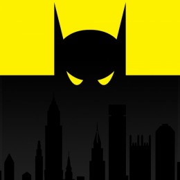 by tnaylor21286 14879 views - final score: 66.5% | Have Times Changed?  by Majkman 14076 views - final score: 65.9% | revolutionary 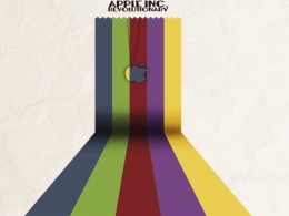 by li3N 5907 views - final score: 65.4% |
Tame the world  by divair 6350 views - final score: 65.2% | Rocketlantis 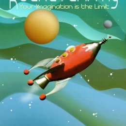 by detractor 11955 views - final score: 65.2% | Man of Steel 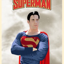 by tnaylor21286 8217 views - final score: 64.9% |
Queen of the galaxy 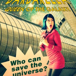 by divair 7905 views - final score: 64.8% | Red Planet Excursions 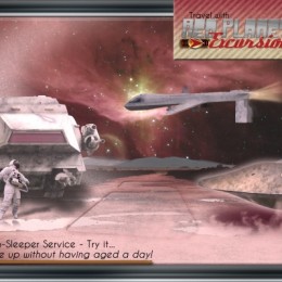 by pearlie 11943 views - final score: 63.7% | OPTIMUS PRIME 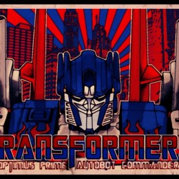 by macarhign 14620 views - final score: 63.5% |
El Salvaje Felino 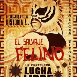 by jordyponce 4898 views - final score: 63.4% | PEACE  by Nator 3970 views - final score: 63.4% | Alien Attack  by tnaylor21286 4483 views - final score: 63.4% |
New BIM 5210  by detractor 12817 views - final score: 63.2% | GOD OF WAR  by macarhign 24486 views - final score: 62.9% | Someone Stepped on the Cable  by Drivenslush 7018 views - final score: 62.9% |
Deadpit Presents this Friday  by detractor 13021 views - final score: 62.6% | The Beatles - COLORS  by TimeGenius 8236 views - final score: 61.8% | Retro Poster Contest 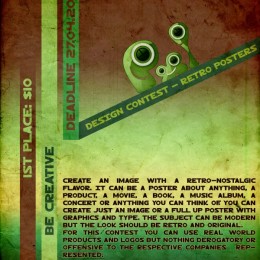 by Arryko 9243 views - final score: 61.3% |
iPod's Past 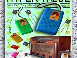 by Drivenslush 6904 views - final score: 59.7% | Pxleyes Museum 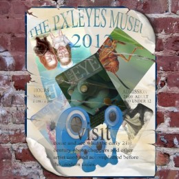 by Glockman 5784 views - final score: 59.7% | Torment 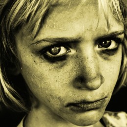 by layerstack 4583 views - final score: 59.5% |
the battle continues 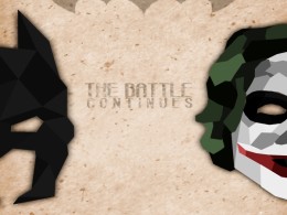 by li3N 7396 views - final score: 58.7% | Come to the Orient Proposal  by Drivenslush 6389 views - final score: 57.2% | my life - my rules  by Androla 7548 views - final score: 57.2% |
Howdie Guest!
You need to be logged in to rate this entry and participate in the contests!
LOGIN HERE or REGISTER FOR FREE
Photography and photoshop contests
We are a community of people with
a passion for photography, graphics and art in general.
Every day new photoshop
and photography contests are posted to compete in. We also have one weekly drawing contest
and one weekly 3D contest!
Participation is 100% free!
Just
register and get
started!
Good luck!
© 2015 Pxleyes.com. All rights reserved.


The illustration looks good, nice use of colors. Foreground and background fit nice together. It's just a pity that imo the text is a bit too obviously put on top of the rest, like it's not an active part of the whole poster but just something that had to be added. Perhaps it can work better already if it's not transparent (and placed somewhere else where it really fits as part of the whole image). Good luck!
thank you so much wazowski for your comment and suggestion, it gives more improvement to this entry for me.
what can you say now wazowski??
hope you like the bigger text...
Absolutely way better! Good luck!
thanks
Howdie stranger!
If you want to rate this picture or participate in this contest, just:
LOGIN HERE or REGISTER FOR FREE