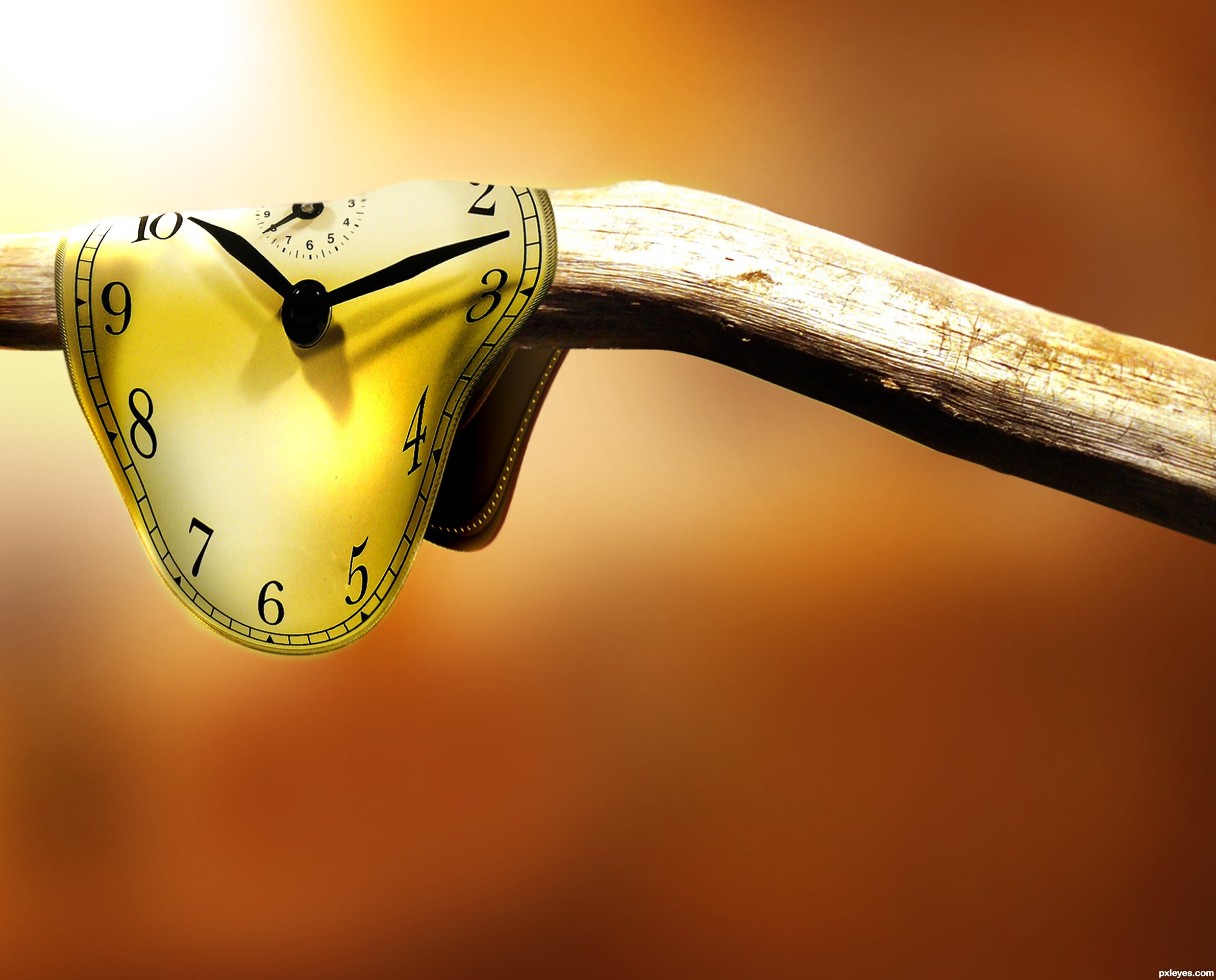
inspired by Salvador Dalis "persistence of time"
thanks to
Mihraystock at deviant art
and zbyszek80 at sxc.hu (5 years and 3122 days ago)
Time waits for nobody  by robvdn 20861 views - final score: 71.8% | Time is Restless  by Akassa 20387 views - final score: 70.9% | Many moon days have passed...  by jordyponce 23303 views - final score: 70.4% |
Saving Time  by lchappell 15816 views - final score: 68.5% | idle time 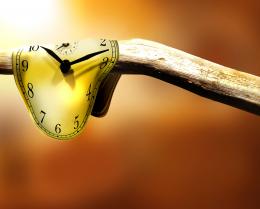 by Inker 18435 views - final score: 66.6% | Timeless Tours  by layerstack 12373 views - final score: 65.8% |
Space-Time Continuum  by pearlie 7628 views - final score: 65.7% | Time  by tnaylor21286 5093 views - final score: 65.1% | Life is a Journey  by laulei 9796 views - final score: 64.5% |
Clocks  by tnaylor21286 6188 views - final score: 64.5% | The Wheels of Time  by lchappell 8465 views - final score: 63.9% | Sleep Little One, I Have Time  by Drivenslush 12882 views - final score: 62.9% |
Never Ending Time  by NuTz123 10411 views - final score: 61.7% | Time Slip 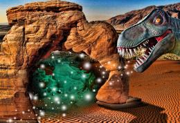 by Drivenslush 4525 views - final score: 61.6% | Lost in Time  by Drivenslush 5149 views - final score: 61.2% |
Where Did Time Go? 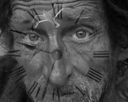 by George55 9176 views - final score: 60.9% |
Howdie Guest!
You need to be logged in to rate this entry and participate in the contests!
LOGIN HERE or REGISTER FOR FREE
Photography and photoshop contests
We are a community of people with
a passion for photography, graphics and art in general.
Every day new photoshop
and photography contests are posted to compete in. We also have one weekly drawing contest
and one weekly 3D contest!
Participation is 100% free!
Just
register and get
started!
Good luck!
© 2015 Pxleyes.com. All rights reserved.


Not bad. Might have more depth if the background values differed from the foreground.
nice idea and well done -- the edge of the watch could use a touch up -- maybe a bit of burr to remove the pixelation
ok, those are good suggestions i will probably edit this entry soon,
what i was most concerned about was context for the branch, any ideas on how to make it seem more natural?
Nice job, author. Notice how bright the wood branch is to the right of the 'clock'...maybe try and brighten the clock right next to that bright spot with a soft edge and follow through that highlight area.
UPDATE: i took most of the suggestions, changed the background color for some depth and added more lighting effects and edge blurs for added realism and consistency,

thanks for the help
Much better image now, IMO...good luck!
Nice work on the clock. It would be nice if the little pointer was not cut off, but extended a little above the rest.
Howdie stranger!
If you want to rate this picture or participate in this contest, just:
LOGIN HERE or REGISTER FOR FREE