(5 years and 3177 days ago)
StylaVase  by artgirl1935 7725 views - final score: 70% | Portal Engine  by Akassa 12900 views - final score: 69% | The Awakening  by George55 8580 views - final score: 68.7% |
Aqua Surreal  by loopyluv 8915 views - final score: 66.2% | Waiting 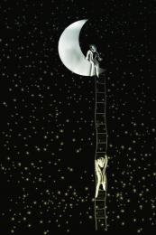 by WYSIWYG 9830 views - final score: 65.1% | ...Page 57 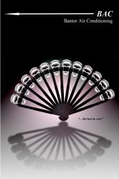 by Drivenslush 5626 views - final score: 64.2% |
OMG, I missed my halloween  by dekwid 8432 views - final score: 63.6% | Please Write Soon... Missing U  by Drivenslush 8876 views - final score: 61.7% | Fight  by WYSIWYG 4418 views - final score: 61.5% |
Howdie Guest!
You need to be logged in to rate this entry and participate in the contests!
LOGIN HERE or REGISTER FOR FREE
Photography and photoshop contests
We are a community of people with
a passion for photography, graphics and art in general.
Every day new photoshop
and photography contests are posted to compete in. We also have one weekly drawing contest
and one weekly 3D contest!
Participation is 100% free!
Just
register and get
started!
Good luck!
© 2015 Pxleyes.com. All rights reserved.


Oh wow! You do this sort of thing for a living, don't you? I'm gonna be kinda picky here and suggest you smudge the center white dot in the background and also smudge the gradient next to the top of the 4th brace on the right. This is a wonderful and clever use of the source. Well done!
Nice idea!
Anyway there is a green big dot in the middle that i would not put it there.
thanks, did some enhancing of the color,
Hmm, honestly, I liked the unenhanced one better. I'd like it even more without the dot. But its your entry and if you like it, that's all that's really important.
Back to the original with removed white DOT that was BEHIND the fan, (you have no idea how many little white specs I cloned out before realizing what you were talking about, I put a lot of them back because it looked weird, oh lord
 , removed the enhancing and lighted the gradiant, darn my eyes
Thank you oh great Tater Tot
Oh too funny. That dot was the only one I saw. lol I like this much, much better now. Gonna tuck it into my favs.
Lol! This is fun. Very clever (I know you) author.

Seems real to me. Good luck.
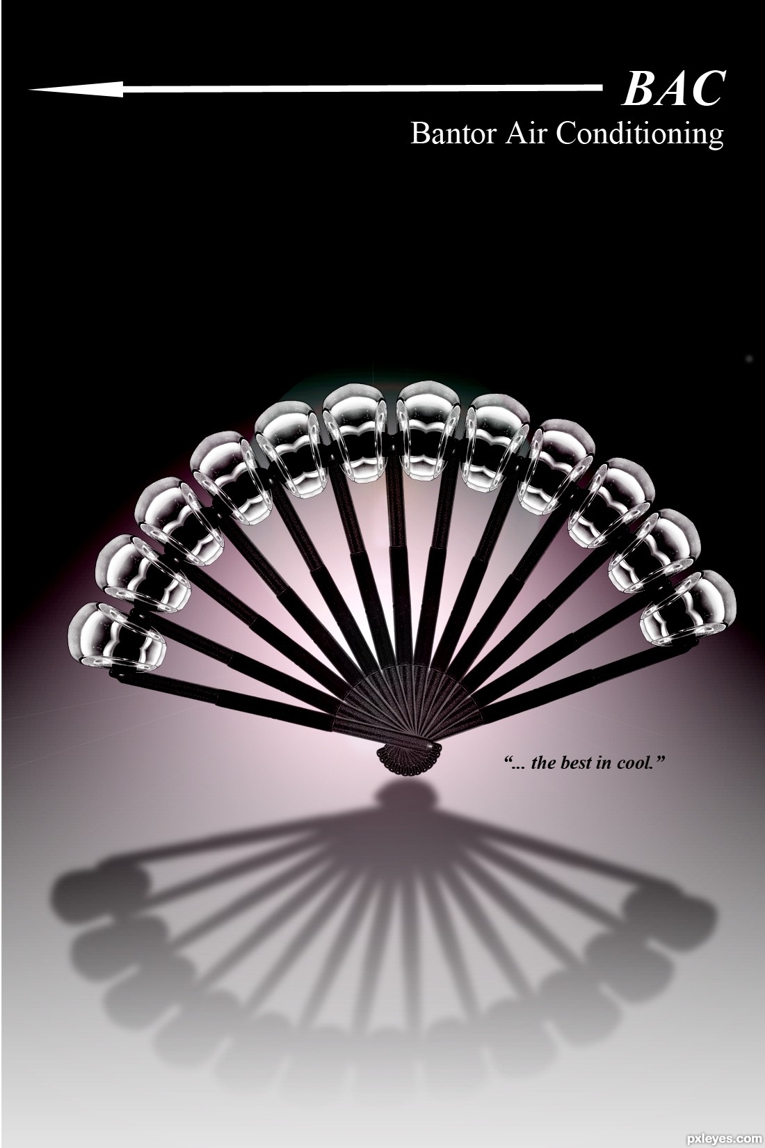
like the fan, dont liek the text on top. think it should have been a bit more stylish imo. i dont like the arrow on top either. the fan however is "cool".
sorry Eladine, I used to do advertisements for companies and I always had to follow their suggestions.., I used that here.. a Fan representing a BAC company (thus the arrow symbol) I'm sure you could have done better, but it was all that came to me during my creation.. thanks!
just an ad in a magazine, something I used to do all the time
Oh no i dont think I could have done it so to speak better, I would have done it differently tho . The essential part of the image imo is the fan and I truely do like it. hence my wordplay saying its cool
  . on my screen if i scroll down so the text is not vissible on top, I like the image a lot better. I dont know what is BAC and the relation with the arrow, google couldnt help me much either there..
BAC as in Bantor Air Conditioning (the arrow is what you see on a keyboard for backspace) has to do with marketing/letterhead/company logo
well I still dont see what the backspace key on the keyboard has anything to do with airconditioning I've never heard of the company BAC either, but i guess i dont know enough about marketing, letterhead and logo design for that... Anyhow good luck with the entry , again like i said i love how you created the fan very clever not only the way you created it but also in relation with the airconditioning part.
Pardon me author, I write poems & make cheesy rhymes, and this just struck me after reading the entire thing:

"...the best in cool"
".. if you're looking elsewhere, guess who's the fool?"
@Eladine, I think it's the company name BAC(kspace) hence the arrow. Only wished somebody would've told them it's so NOT cool. -_-"
oh lord, pray for my soul LOLOLOLOLOL or what's left of it
WOW! (Very pleasantly surprised.) Great job with the fan design, love the texture on it. The logo has that classic look of advertising from 'back in the day' - I was there, too, author. Wax pasteups, and Times Roman was the font of choice. I think the arrow works with the font and remainder of the image - simple and classic.
Howdie stranger!
If you want to rate this picture or participate in this contest, just:
LOGIN HERE or REGISTER FOR FREE