(5 years and 3256 days ago)
1 Source:
- 1: source1
The Darker Side  by jadedink 17486 views - final score: 69.8% | Smile for the camera  by CMYK46 11805 views - final score: 63.9% | Cheer Up, Clown!  by artgirl1935 14536 views - final score: 63.6% |
I'm not Joker 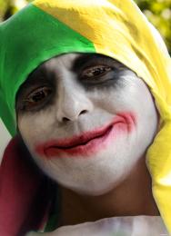 by sanjayaisland 19094 views - final score: 62.5% | Broken Girl 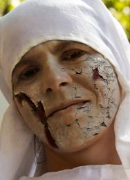 by Ayumi89 13178 views - final score: 61.3% | THE JOKER 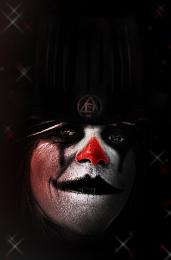 by lolu 6737 views - final score: 59.9% |
Mother Nature's Son 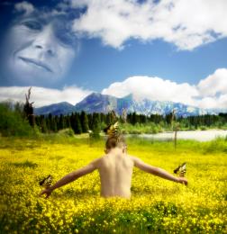 by JimLemon 12354 views - final score: 59.9% | Tom Riddles Sister  by xwd 11846 views - final score: 59.8% | soul imprisoned  by marifre 6131 views - final score: 57.9% |
I am, I cried I am, said I  by Drivenslush 5475 views - final score: 57% | Picture frame  by carmen 6243 views - final score: 53.5% |
Howdie Guest!
You need to be logged in to rate this entry and participate in the contests!
LOGIN HERE or REGISTER FOR FREE
Photography and photoshop contests
We are a community of people with
a passion for photography, graphics and art in general.
Every day new photoshop
and photography contests are posted to compete in. We also have one weekly drawing contest
and one weekly 3D contest!
Participation is 100% free!
Just
register and get
started!
Good luck!
© 2015 Pxleyes.com. All rights reserved.


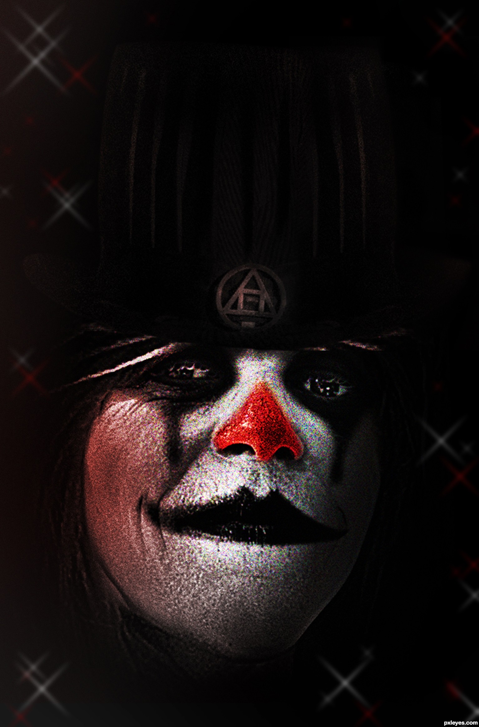
Wow, very nice!!!
I think you could crop some of all the dead space from the top for a more dynamic image, but good effect, none the less!
Just a tad more light on that stovepipe hat will make up the difference in what looks like waaaaaaaaaay too much dead space on top.
Agree with Elemare. This could be a much more powerful image.
EDIT: Now it's overkill.
Thanks to all for your usefull advices
agree with the others
The lensflare is distracting. It became the focal point.
i like it...
I've followed your good advice MossyB, hope it's better now !
Better to have "dead space" at the top, rather than a "stab your eye" bright spot commanding you to focus on it...
Howdie stranger!
If you want to rate this picture or participate in this contest, just:
LOGIN HERE or REGISTER FOR FREE