(5 years and 3107 days ago)
1 Source:
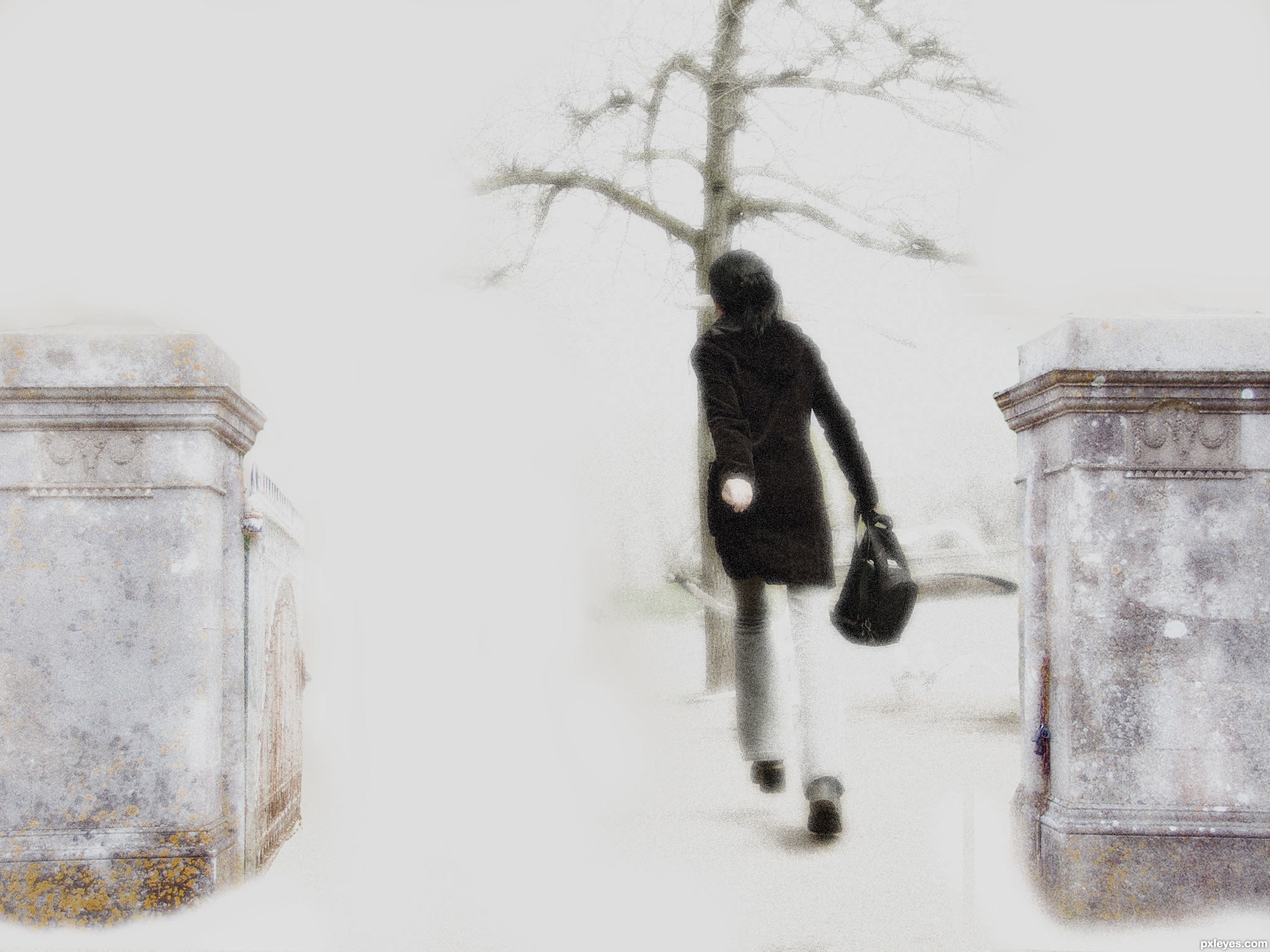
- 1: Gate Posts
The Battle  by Zakfuego 13666 views - final score: 62.8% | Rooted: I want To Fly-Updated  by apixeldot 17701 views - final score: 62.4% | Happiness is..  by ponti55 15150 views - final score: 59.7% |
Kingdom of Heaven 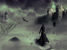 by Siddhartha 14742 views - final score: 58.9% | Between heaven and hell.  by marina08 30007 views - final score: 58.1% | Bus 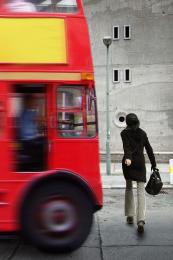 by Nator 4642 views - final score: 56.1% |
stare 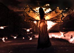 by rakib888 4668 views - final score: 56% | Dawn of the Dragon 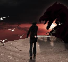 by PSA2009 6766 views - final score: 54.6% | I'm Late  by sanjugs 4586 views - final score: 54.5% |
MARELLA  by DigitalPro 5687 views - final score: 54.2% | Lost Cowboy  by DigitalPro 7170 views - final score: 53.7% | yearing 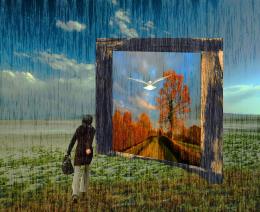 by hazem 5320 views - final score: 53.5% |
Ghost Park Walk 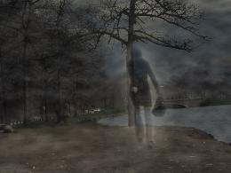 by luvbug1982 10582 views - final score: 52.9% | Trip  by gplazi 3868 views - final score: 52.7% | Seeking Help  by Lamantine 4565 views - final score: 52.1% |
Through the Portal  by PSA2009 8921 views - final score: 51.8% | Walking Through A Dream 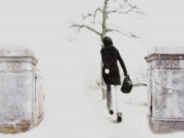 by junkieball 5498 views - final score: 51.3% | Frequent Flyer  by DigitalPro 4951 views - final score: 51% |
The challenge  by shankarsadamate229 3395 views - final score: 50.1% | i'ts not about the color  by gornats 5599 views - final score: 49.5% | walk in tempest 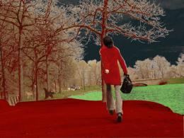 by Bikudo38 7320 views - final score: 45.3% |
Howdie Guest!
You need to be logged in to rate this entry and participate in the contests!
LOGIN HERE or REGISTER FOR FREE
Photography and photoshop contests
We are a community of people with
a passion for photography, graphics and art in general.
Every day new photoshop
and photography contests are posted to compete in. We also have one weekly drawing contest
and one weekly 3D contest!
Participation is 100% free!
Just
register and get
started!
Good luck!
© 2015 Pxleyes.com. All rights reserved.


A bit too high contrast. It's almost too bright to look at...Generally you only want to use "bright white" (with no toning or shading) very sparingly as highlight accents. Also, the columns look crooked, throwing the angle of the image off.
Thanks for the input i have tried to correct the angle of the columns and take on broad about the high contrast. I have updated the image so you can now at least look at it without your eyes hurting!
Nice mood.
Unusual image ... I like it; I would like to see it printed as I think it might have more impact than on the screen. Sometimes the "light" can detract from softer, less contrasty images.
IMO
Arca thanks for the comment. Printed on a canvas i think would look good. Would need more work though as only had a laptop and mouse pad to do this whole image.
Howdie stranger!
If you want to rate this picture or participate in this contest, just:
LOGIN HERE or REGISTER FOR FREE