
(5 years and 3640 days ago)
2 Sources:
The Dragons Realm 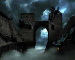 by rufkut 18646 views - final score: 59.8% | Moonlight Lovers 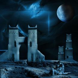 by George55 13295 views - final score: 59.4% | Adiemus 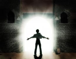 by ponti55 10584 views - final score: 58.6% |
Lake Towers 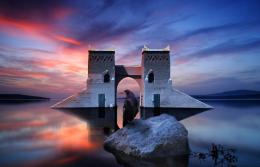 by GarethWaring 11366 views - final score: 58.5% | At the gates of hell... 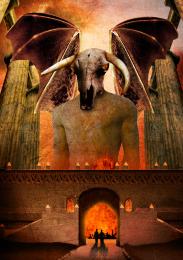 by Clinge 18126 views - final score: 58.1% | Peru 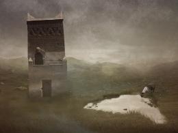 by Cherish 5794 views - final score: 56.2% |
The Four Seasons Castle  by Widiar 9175 views - final score: 55.8% | fishing nightmare  by nanaris 5799 views - final score: 53.8% | promise land 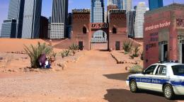 by jack2 5662 views - final score: 53.7% |
tourist! 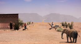 by lvstealth 4166 views - final score: 52.8% | Night tower version 2  by theudulf 8350 views - final score: 52.5% | The heart of desert  by bingbong088 5988 views - final score: 52.2% |
Red Chairs el Gato 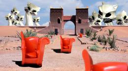 by Drivenslush 5547 views - final score: 51.6% | heaven's door  by jack2 11562 views - final score: 51.4% | An Oasis in the desert  by Chuck 7668 views - final score: 51.3% |
VEGAS baby!!  by jcooke426 6302 views - final score: 49.8% | The way to the sea 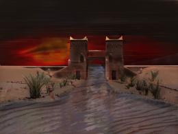 by neeraj55 5340 views - final score: 49.4% | Sweet 18** 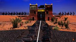 by riggz95 4204 views - final score: 48.5% |
Painted 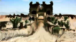 by billyF 5281 views - final score: 47.5% |
Howdie Guest!
You need to be logged in to rate this entry and participate in the contests!
LOGIN HERE or REGISTER FOR FREE
Photography and photoshop contests
We are a community of people with
a passion for photography, graphics and art in general.
Every day new photoshop
and photography contests are posted to compete in. We also have one weekly drawing contest
and one weekly 3D contest!
Participation is 100% free!
Just
register and get
started!
Good luck!
© 2015 Pxleyes.com. All rights reserved.


Very creative idea, I do have a couple of suggestion for improvements......The two men and the bench are to sharp compared to the source. The shadows are to small and not dark enough IMO and facing in the wrong direction, if you refer back to the original source (stone border) you will see what direction your shadow should be......it’s a great effort keep up the good work!
cool 1
thanks Warlock. i will work on the things you said.
edit: Warlock, I changed the shade of the shadows and made them half as big as the guys (the shadows of the rocks are about half the rock) and i applied the images of the guys so they look a bit more like they should be there.
Very nice work author...i have few nit picks do...first thing,elephant have to be a bit bigger,and u will achieve better blending if u use some color layers.With color like this my recommendation would be dark brown color layer with low opacity and maybe blue-gray soft light or color layer with very low opacity...just an idea...good luck
erathion, didnt get home in time to do any work on this. but i am using almost exactly the layers just like you say! i have a brown layer (leaning toward red just a hair) and a blue grayish layer. the elephant is just an optical illusion, i actually looked it up and did the math based on the original rocks at the dirt road and based on the step in the elephant image. then i used that to size the men using vanishing points.
Howdie stranger!
If you want to rate this picture or participate in this contest, just:
LOGIN HERE or REGISTER FOR FREE