Thanks to eirian-stock.deviantart.com, steppelandstock, ,www.obsidiandawn.com,tomarthur,mqtrf and kables (5 years and 3241 days ago)
6 Sources:
Kingdom of Heaven 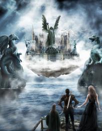 by langstrum 19641 views - final score: 65.8% | Cloud Ride Home  by Ressiv 14368 views - final score: 62.4% | Retrofutureopolis 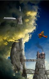 by CMYK46 10673 views - final score: 61.3% |
Nimbusopolis 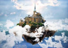 by RickLaMesa 9811 views - final score: 60.6% | Valkyrie City 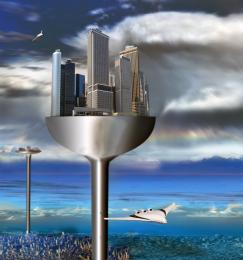 by lchappell 12441 views - final score: 58% | A violin above the sky  by genuine2009 5675 views - final score: 57.7% |
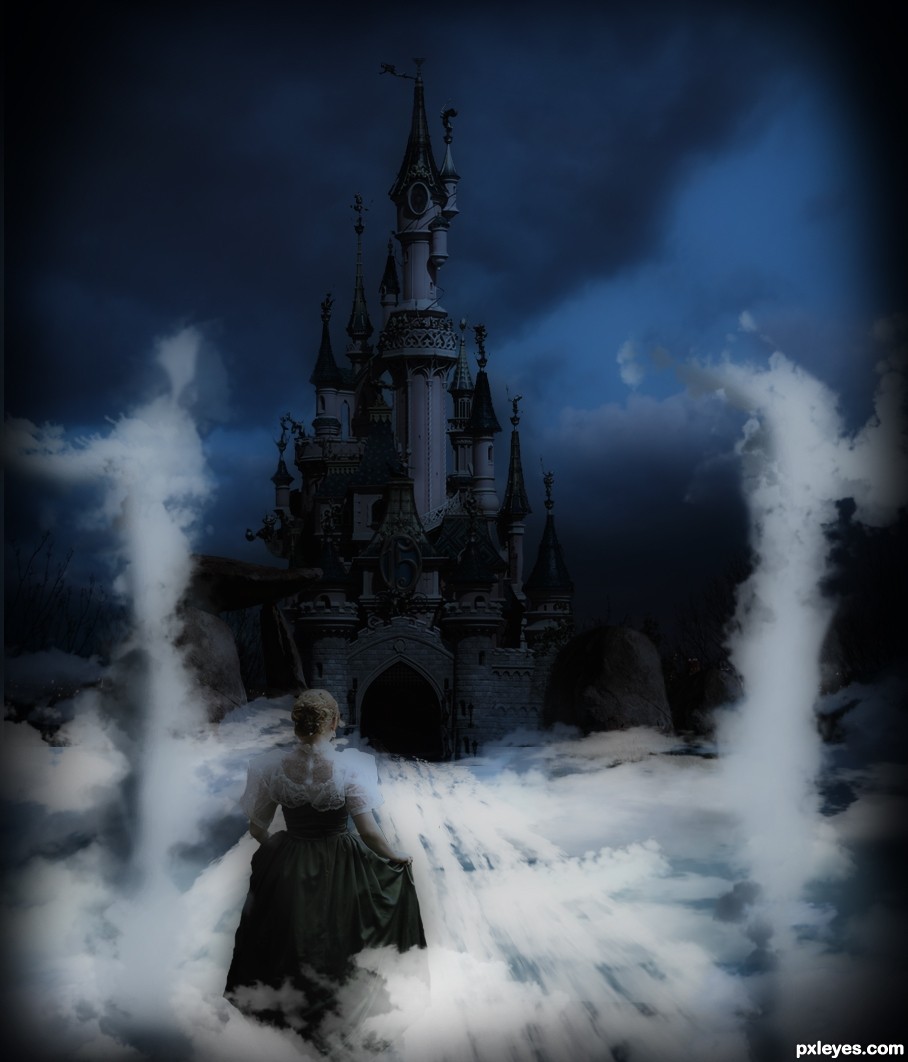
Castle in the Sky 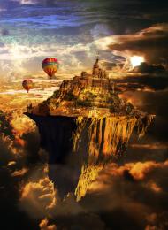 by sjsmiuk 6705 views - final score: 57.3% | New Journey  by nasirkhan 3824 views - final score: 57% | island in the sun 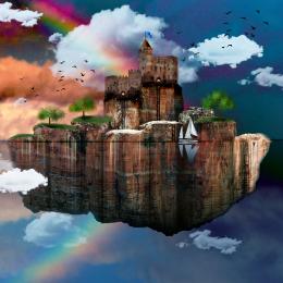 by yahidithmonnalisa 6667 views - final score: 56.5% |
Nowhere 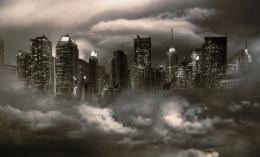 by Missy 6268 views - final score: 55.1% | In the skies of Mars 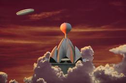 by CMYK46 5264 views - final score: 54.6% | Welcome 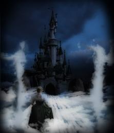 by nasirkhan 4192 views - final score: 54.4% |
Guardian Snail Fountains 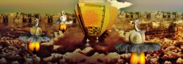 by Drivenslush 6072 views - final score: 54% | upper world 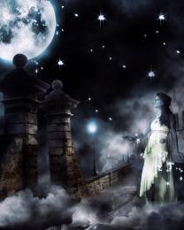 by sawan911 3984 views - final score: 54% | !0 Miles Out of Cloud Town  by lchappell 7596 views - final score: 52.5% |
Howdie Guest!
You need to be logged in to rate this entry and participate in the contests!
LOGIN HERE or REGISTER FOR FREE
Photography and photoshop contests
We are a community of people with
a passion for photography, graphics and art in general.
Every day new photoshop
and photography contests are posted to compete in. We also have one weekly drawing contest
and one weekly 3D contest!
Participation is 100% free!
Just
register and get
started!
Good luck!
© 2015 Pxleyes.com. All rights reserved.


I can't help but think that the 'welcome sign' really detracts from the overall image. I'd remove it and let the 'welcome' part be in the title of the entry. Nice job!
The sign is levitating? Why not let the image stand on its own?
Thanks pixelkid. CMYK46 and Nator. Welcome sign has been removed
Slightly interesting but uniform, mid-day lighting offers no drama.
Now is better author...good luck
beautiful image ......... but i agree with dan, i think mid-day lighting is not suitable for that image ......... all the best ...........
You know it's more like a castle than a city. Nice chop but.. ya..

GL all the same!
Yes nice chop Author good luck
Howdie stranger!
If you want to rate this picture or participate in this contest, just:
LOGIN HERE or REGISTER FOR FREE