Additional source photo by Pietroizzo (5 years and 3863 days ago)
1 Source:
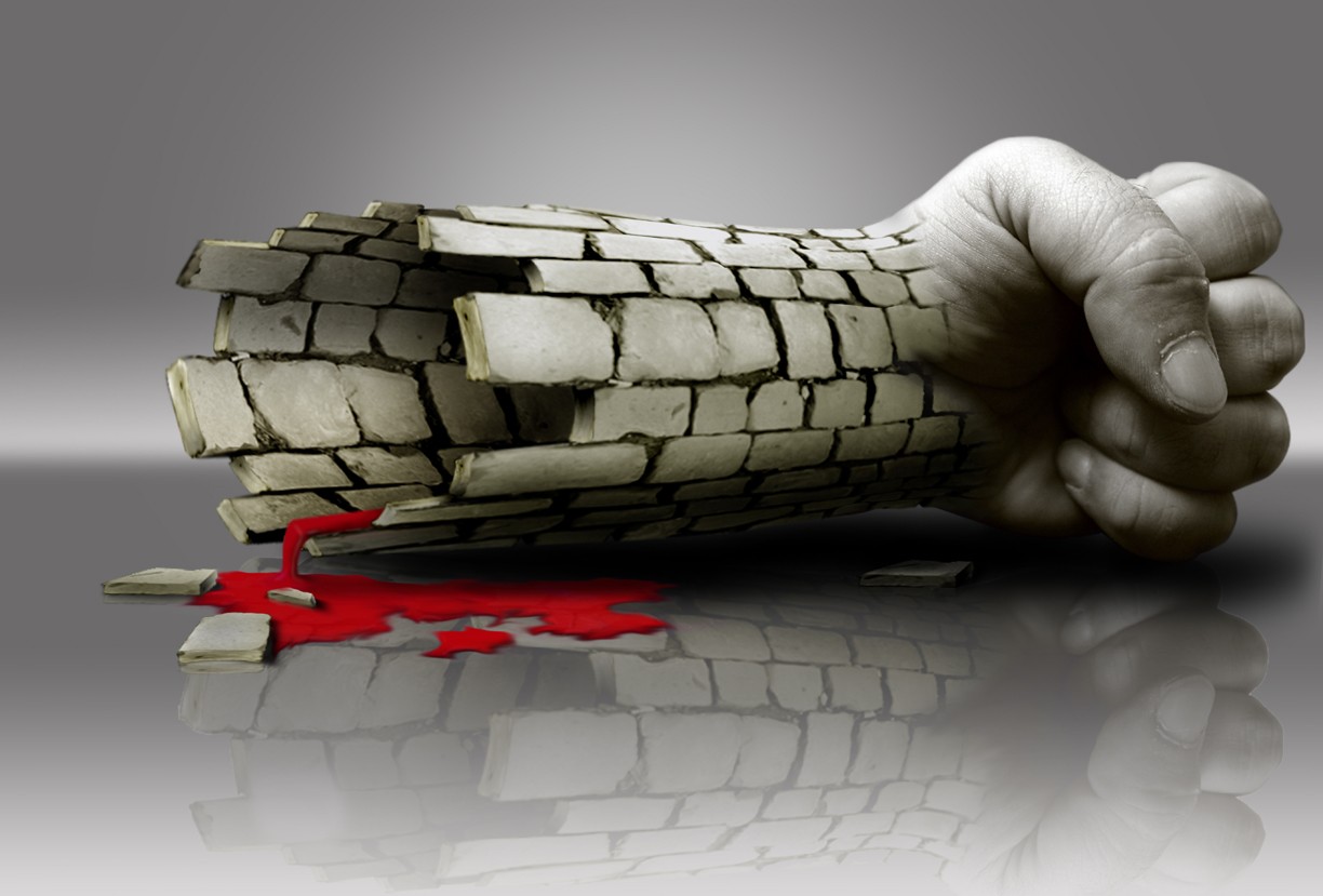
- 1: fist
The Ripper  by Clinge 38085 views - final score: 63.5% | Power and Weakness 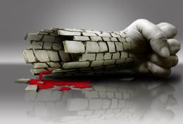 by buzzy 40816 views - final score: 63.1% | Covered in ivy  by divair 41451 views - final score: 58.3% |
Castle 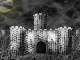 by mindopener 37341 views - final score: 57.7% | the crying wall 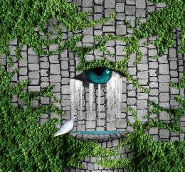 by jaescoe21 40017 views - final score: 56.1% | Paved Room 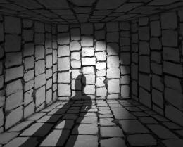 by Goberphoto 5797 views - final score: 55.8% |
Chalk Artist 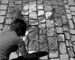 by Neptune 7806 views - final score: 55.6% | Kiss Me Before Midnight  by isshabhelle16 9806 views - final score: 55.3% | Trapping Zod  by Drivenslush 4804 views - final score: 54.7% |
release you self 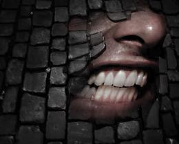 by mariosilva 6013 views - final score: 53.8% | Vaporised  by vampatmidnight 7292 views - final score: 53.5% | Curved Path 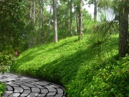 by Drivenslush 6676 views - final score: 53.4% |
Agua de vida 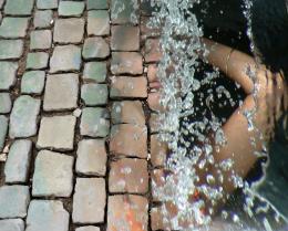 by Zulibleu 8641 views - final score: 53.1% | New Backsplash 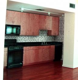 by paradise1278 6449 views - final score: 51.7% | Oppression 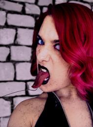 by solkee 4182 views - final score: 51% |
Cowgirl  by DigitalPro 9438 views - final score: 49.4% |
Howdie Guest!
You need to be logged in to rate this entry and participate in the contests!
LOGIN HERE or REGISTER FOR FREE
Photography and photoshop contests
We are a community of people with
a passion for photography, graphics and art in general.
Every day new photoshop
and photography contests are posted to compete in. We also have one weekly drawing contest
and one weekly 3D contest!
Participation is 100% free!
Just
register and get
started!
Good luck!
© 2015 Pxleyes.com. All rights reserved.


Oh i really like this one, GL
Interesting image, imo would maybe work better without the distorted reflection. The reflection in the blood is a nice detail though. If you can try to make the top and bottom a bit more round (the sides seem to go a bit too much vertical). Good luck!
The blood is the only thing that doesn't really look right. The angle of the floor doesn't seem as steep as the angle of the blood puddle.
Hey Waz' and Jowsh' thanks for the tips, after looking at it from your view i did notice it. I have corrected your suggestions! Hope you like it and Thanks Again!
yeah that's better. GL!
Blood looks like plastic...try to color match the blocks & the hand.
Good work!
nice blend... but still as everyone above has said.. 'BLood needs work'.. Good Luck..
Nice idea and work. Agree with above blood does not work for me. Reflection is too much, fade around 50% of reflection. Where is the reflection of two seperate blocks?
OK guys, i performed a little "plastic surgery" on it... Hope this is better?
nice image,...the blood layer might have looked more realistic of you set the layer mode to color burn but still a very nice job
Good one.
I think you finally got it right, the blood that is.
Congrats,
congrats!
Congratulations on 2nd!
Congrats! for another win.
nice
Congrats for also a great second place, Buzzy!
Howdie stranger!
If you want to rate this picture or participate in this contest, just:
LOGIN HERE or REGISTER FOR FREE