no outside sources (5 years and 3420 days ago)
Home office  by divair 35107 views - final score: 62.7% | Waiting  by nasirkhan 32369 views - final score: 62% | World  by CorneliaMladenova 31500 views - final score: 61.8% |
Winter Hibernation 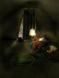 by donh 37146 views - final score: 61.4% | "Why?" 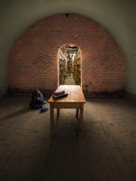 by pingenvy 41330 views - final score: 61.2% | The world out there  by divair 6427 views - final score: 58.9% |
Prisoner's hope  by marina08 6497 views - final score: 58.9% | Fight for Treasure 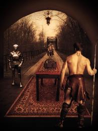 by nasirkhan 6311 views - final score: 58.4% | NEW ROOM  by oana 8042 views - final score: 58.1% |
Happy New Year!!!!!  by artgirl1935 4602 views - final score: 56.7% | In full bloom  by divair 4928 views - final score: 55% | Space Invaders in Gray  by Drivenslush 5262 views - final score: 54.6% |
Three Little Pigs 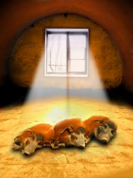 by Drivenslush 11273 views - final score: 54.4% | Butcher 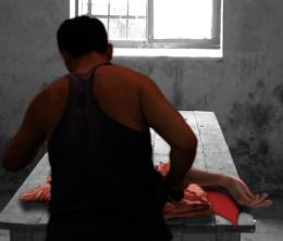 by filantrop 3911 views - final score: 53% | A delicate obscure Perspective 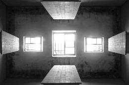 by jawshoewhah 12931 views - final score: 52.8% |
Oh! my fate!! 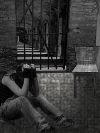 by shaiju1974 4661 views - final score: 50.9% | slaughter  by mariosilva 4121 views - final score: 50.9% | The Observer 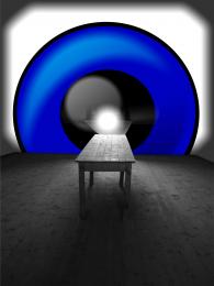 by gotmeamuse 5368 views - final score: 50.1% |
Howdie Guest!
You need to be logged in to rate this entry and participate in the contests!
LOGIN HERE or REGISTER FOR FREE
Photography and photoshop contests
We are a community of people with
a passion for photography, graphics and art in general.
Every day new photoshop
and photography contests are posted to compete in. We also have one weekly drawing contest
and one weekly 3D contest!
Participation is 100% free!
Just
register and get
started!
Good luck!
© 2015 Pxleyes.com. All rights reserved.


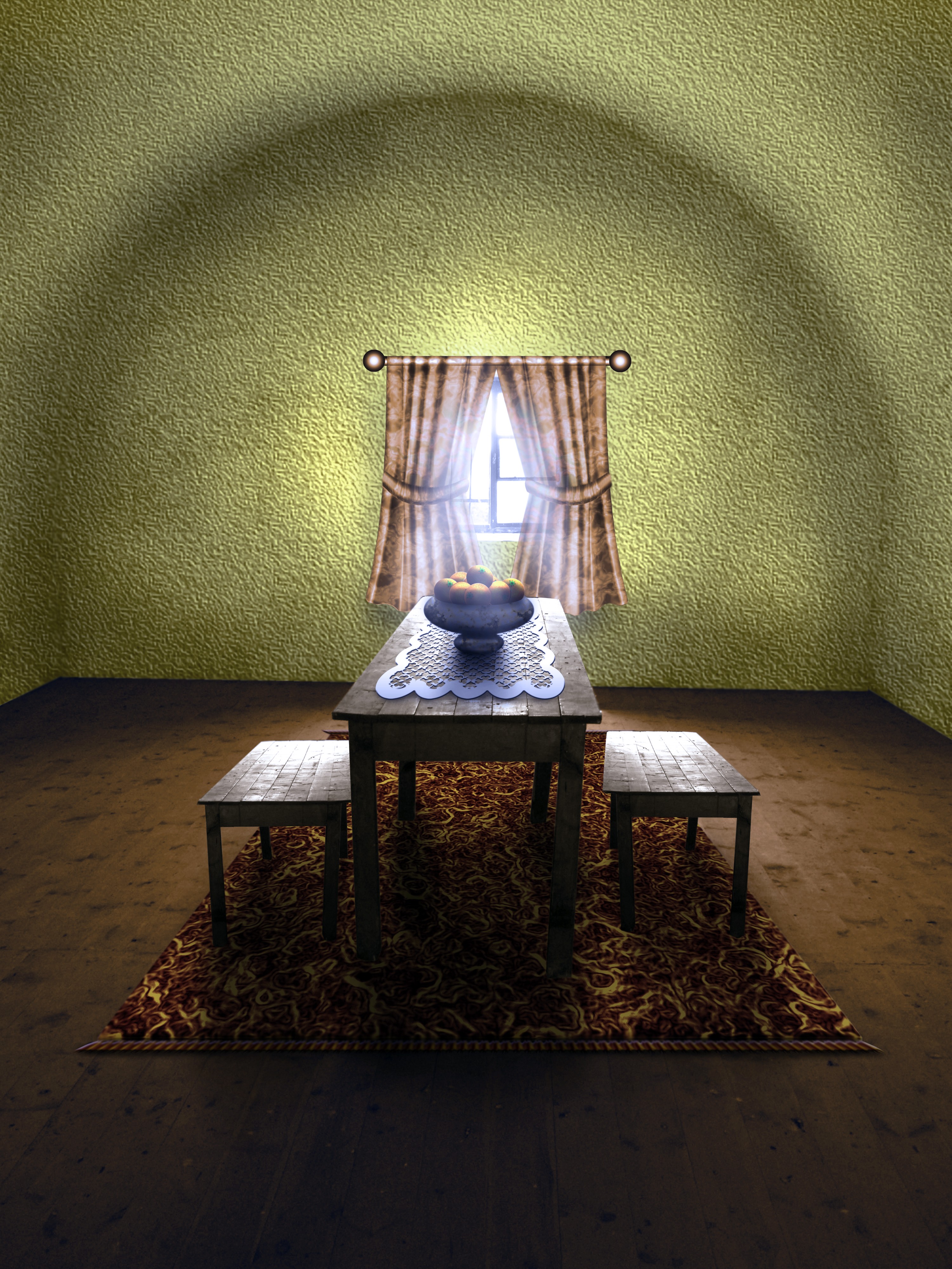
That is a nice change to the empty room, and also a nice entry....gl author.
Good work, I was thinking of doing something like this my self.
Great idea, and a wonderful change!
Wonderful room,nice chop Author

Furniture looks good, curtains not so good, wall texture, color & lighting not good...
The vanishing point on the benches is much lower than the vanishing point on the table. nice job on the floors and the rug
well done author... just a small nitpicking... there should be a smooth merging of light b/w wall and floor... presently wall is bright even where it touches the dark floor....
Great sbs, love the making of the carpet, the best use of glowing edges I've ever seen
Looks like Martha Stewart chopped it I agree with pingenvy's comment. The perspective looks off because the benches don't match the table. I would try to line up one of them .
thank you all for your kind comments and suggestions! i agree with all of them but, unfortunately i can't make any changes right now.
thats cute but if the wall was further back the room would look bigger
Nice work author. Texture wall did'nt work for me. Also shadow of windows curtain and rod is missing. Overall nice image
Howdie stranger!
If you want to rate this picture or participate in this contest, just:
LOGIN HERE or REGISTER FOR FREE