
(5 years and 3890 days ago)
3 Sources:
- 1: Grungemaps
- 2: Girl jumping
- 3: Clouds
The curved house 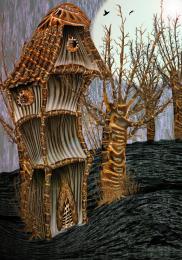 by satire 12490 views - final score: 64% | Inka Spirit 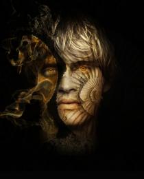 by siderismaris 12537 views - final score: 62.6% | Primitive Art Forms  by George55 12013 views - final score: 60.3% |
Stylist Peacock 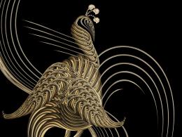 by lahiripartha 10527 views - final score: 59.4% | smoky night 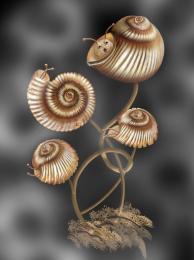 by closedeyes 10946 views - final score: 58.5% | Celtic Serpent 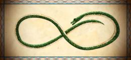 by fezjez 8045 views - final score: 58.1% |
Come out of your shell  by divair 7372 views - final score: 55.8% | Stoned in golden light 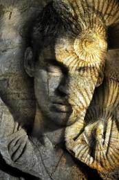 by siderismaris 5182 views - final score: 55.7% | Fossil Timepiece 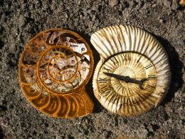 by Clinge 11911 views - final score: 55.1% |
AFFRO SHELL 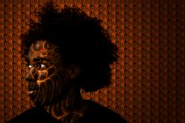 by lolu 7837 views - final score: 52% | Fossilized Yin Yang 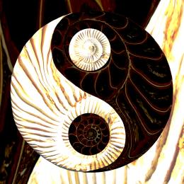 by jawshoewhah 6925 views - final score: 51.4% | weird melon 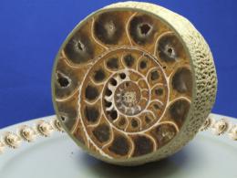 by jaescoe21 8084 views - final score: 51.2% |
snail mail  by jaescoe21 4345 views - final score: 50.5% | Fossil  by mysaurav 5515 views - final score: 50.3% | Almost fractal  by divair 4189 views - final score: 48.5% |
colourful fossils  by JEN750 5089 views - final score: 46.8% |
Howdie Guest!
You need to be logged in to rate this entry and participate in the contests!
LOGIN HERE or REGISTER FOR FREE
Photography and photoshop contests
We are a community of people with
a passion for photography, graphics and art in general.
Every day new photoshop
and photography contests are posted to compete in. We also have one weekly drawing contest
and one weekly 3D contest!
Participation is 100% free!
Just
register and get
started!
Good luck!
© 2015 Pxleyes.com. All rights reserved.


Interesting. IMHO would be better if the girl was in color and she was closer to the opening of the shell...
The image looks real good, the background blends nicely with the shell, the jumping girl, adds life to the image. I personally think, that you do not need the text. (My opinion). This image speaks by itself. You can make the shell a little biger, and the girl jumping from inside.Very well done and a nice work! Good luck!
Thank you CMYK and George. I had used the text because some may understand the message without words, some may need words to link the image to the message
Author, your image looks much better. I am sorry I told you about the text. Like you say, some, need the written message over the image. But I think, the "Tittle tells everything". I love your image now, the added color is wonderful too! good luck!
Author, the image is much better...IMHO the type in the header is enough. Good luck!
Thank you guys for your helpful suggestions and comments
Thank you guys for your helpful suggestions and comments
Thank you guys for your helpful suggestions and comments
I missed the first previus chops but it looks cool as is
Very nice grunge image!
Howdie stranger!
If you want to rate this picture or participate in this contest, just:
LOGIN HERE or REGISTER FOR FREE