I am not offering advice, this is just for fun.
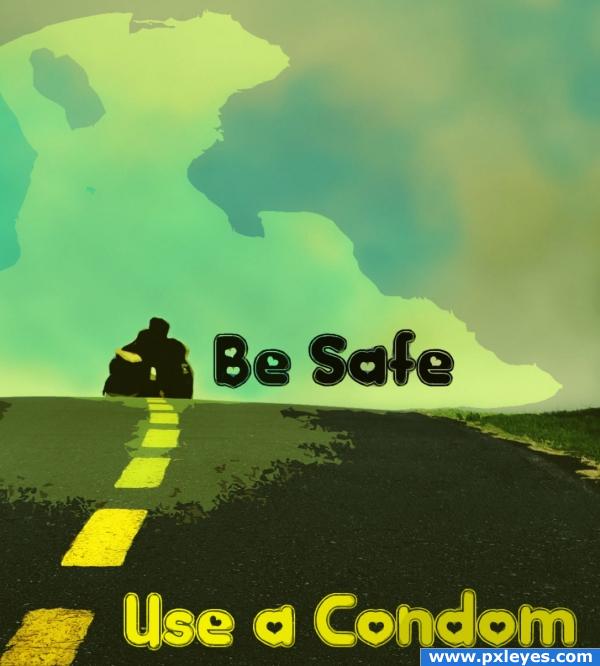
The image reminded me of a Condom advert.
I downloaded a font and changed the lighting slightly. (5 years and 3976 days ago)
1 Source:
- 1: source1
Just Another Day  by JustinCase 12648 views - final score: 62.3% | Surfer  by filantrop 10429 views - final score: 59.2% | WRONG TURN!  by paradise1278 13800 views - final score: 57.6% |
love u 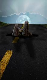 by KEVIV 9681 views - final score: 56.7% | Through car window  by Palaekman 14123 views - final score: 55% | It's all about love  by Akassa 6346 views - final score: 53.4% |
Direction LOVE.....  by lolu 12084 views - final score: 53.2% | Lucky Bunny  by JustinCase 7280 views - final score: 53.1% | They're coming!  by ThisONE 5595 views - final score: 52.6% |
Anamorphic Chalk Drawing 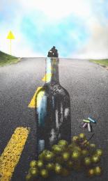 by paradise1278 12000 views - final score: 51.7% | No Diving 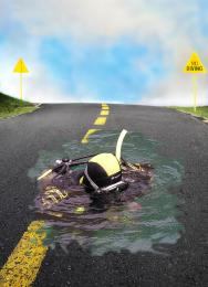 by trueman2 5626 views - final score: 51.3% | in love  by SHIPLEYGIRL 3602 views - final score: 49.2% |
Lazy Sources  by BUMFEATURES 6228 views - final score: 49% | Love Hill 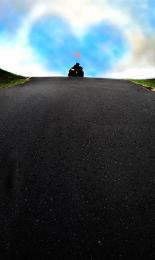 by stormieweather 6998 views - final score: 47.9% | Heartshaped Sky 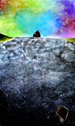 by ea8322 5033 views - final score: 47.3% |
Asphalt 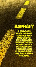 by BUMFEATURES 5186 views - final score: 46.8% | Condom 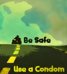 by BUMFEATURES 4035 views - final score: 46.3% |
Howdie Guest!
You need to be logged in to rate this entry and participate in the contests!
LOGIN HERE or REGISTER FOR FREE
Photography and photoshop contests
We are a community of people with
a passion for photography, graphics and art in general.
Every day new photoshop
and photography contests are posted to compete in. We also have one weekly drawing contest
and one weekly 3D contest!
Participation is 100% free!
Just
register and get
started!
Good luck!
© 2015 Pxleyes.com. All rights reserved.


It's well done, just a bit too simple in my opinion.
Your probably right, i did make it more complex, however the complexity did not suit the subject matter. But thank you
huh..? you didn't do anything...
It made me chuckle but there is not alot to it.
wo. You just changed it. I'm not sure I like it though. Where is that tree coming from and why can we see through it? You have also drawn attention away from the heart shaped sky, if anything enhancing it will help this image.
Another thing, your font link does not lead to the font used.
Your all right, it is very very simple! It is just a very simple interpretation of the image. I dont believe virtuoso photoshop manipulation is necessary for every image. I do admire those skills though, although mine are very basic.
the tree was me just uploading a test image by accident.
http://www.metacafe.com/watch/1442/crying_condom_ad/ this is in the same flavor only with lots of humor
That is quite humorous GolemAura.
I think simple is JUST FINE sometimes when the picture say/shows what it needs to say/show. This ad says a lot to me actually. I agree with what you said author. Kudos!
I like the way the text appears to be "wrapped!"
i like it..it is little funny ad and your font is really nice (: .. but yoour change of color is not soo good yet (:
Howdie stranger!
If you want to rate this picture or participate in this contest, just:
LOGIN HERE or REGISTER FOR FREE