Just little displacement and work (5 years and 4046 days ago)
1 Source:
Almost Ready To Fly  by jaskier 35956 views - final score: 67.3% | The Lonely Fairy  by suresh 41627 views - final score: 66.5% | Berrypiller  by Paulus62 35578 views - final score: 64.3% |
Love is....  by loopyluv 33067 views - final score: 64% | bibbidi-bobbidi-boo  by Milena 40742 views - final score: 63.9% | Elegant romance  by loopyluv 7475 views - final score: 62.8% |
Redis.  by fille 10330 views - final score: 62.2% | The Halloween Pendulum 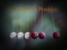 by Panshie 8480 views - final score: 58.7% | Frankenberry 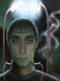 by IDt8r 6132 views - final score: 57.9% |
Fossile 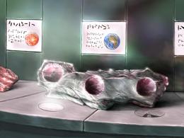 by Sander 5502 views - final score: 55.7% | Berry world  by jlmina714 6134 views - final score: 55.2% | king's Cherry Horse 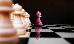 by Nav777singh 8653 views - final score: 55.1% |
can't believe my eyes  by ryandon 8638 views - final score: 53.9% | Spider in berry  by shaiju1974 7844 views - final score: 53.1% | painted rose  by wtfayla 5075 views - final score: 48.8% |
Berry Glen  by tapiona 5864 views - final score: 46.6% |
Howdie Guest!
You need to be logged in to rate this entry and participate in the contests!
LOGIN HERE or REGISTER FOR FREE
Photography and photoshop contests
We are a community of people with
a passion for photography, graphics and art in general.
Every day new photoshop
and photography contests are posted to compete in. We also have one weekly drawing contest
and one weekly 3D contest!
Participation is 100% free!
Just
register and get
started!
Good luck!
© 2015 Pxleyes.com. All rights reserved.


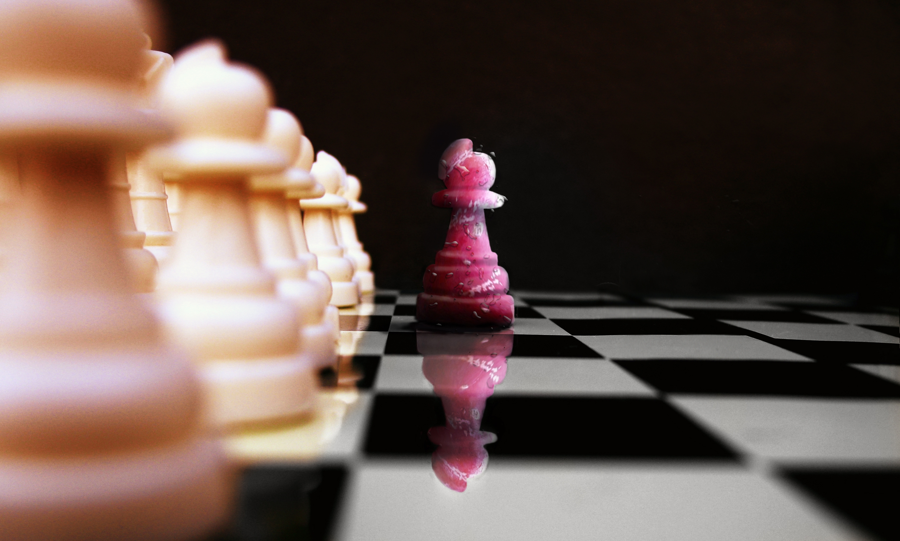
ditch in chessboard! good reflection
  good luck!
good work
creative! gl, author
The reflection of the drips on the cherry piece is different to what is actually on it. I think it would be better if you applied the drip thing to each piece individually as well, thewn you won't have them floating in mid air in between the pieces. You will also be able to apply some perspective to them as well, making them smaller as they go further back into the distance. Hope this helps.
Always like chess art.
i made pawnn this way that its reflection made it differ too
Nice idea - but your chess board squares dont line up? ]i see its in the source also - but I would slide it to suit. It may not be accurate - but will not draw the attention away from your figure] Also the water droplets on the row of pawns does not blur with the depth of field.
Not bad, but I'd make the reflection more transparent. For example, use a layer mask for the reflection and then in the mask make a gradient (white above, more grey till maybe even black down) to let it fade out more. Or play with the blending modes. Good luck!
Great job. i really like how the blurry effect is but it's not on the reflection on the one peice that line is blurry but the red peice is crisp... i think that's is the only minor thing that is messing with me! Still Wonderful idea, and Wonderfully put together!
i newer think acherry pawn!!! good lick author
nice work
Good image nice sense of depth well done..
nice job
Howdie stranger!
If you want to rate this picture or participate in this contest, just:
LOGIN HERE or REGISTER FOR FREE