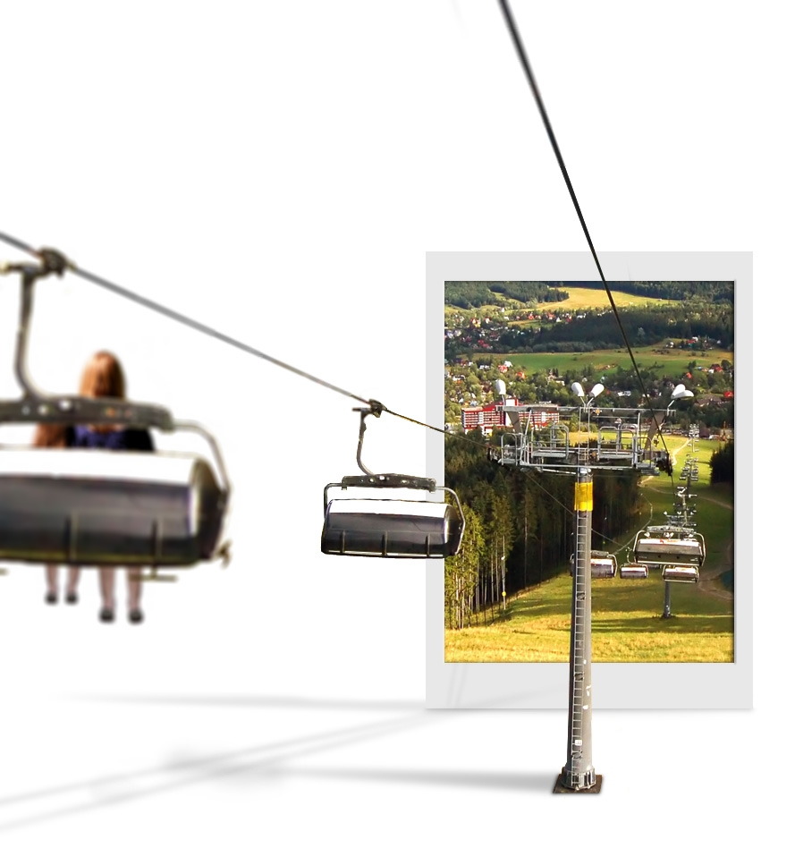
shadow fixed.
Add woman and her children on another glider.
Add depth of field by give it a lens blur.
your comment please! (5 years and 4039 days ago)
1 Source:
almost winter 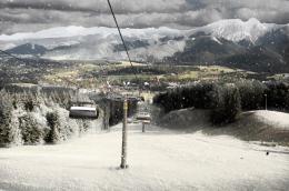 by friiskiwi 11184 views - final score: 63.5% | Tatrapiller 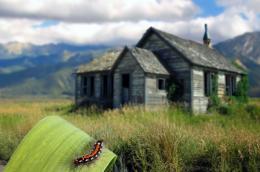 by Paulus62 11280 views - final score: 61.5% | Monday Morning 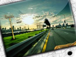 by Nav777singh 12871 views - final score: 60.5% |
entry to tatra 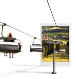 by mjeprie 11908 views - final score: 59.6% | No Rocket...No Worries  by pixelkid 11072 views - final score: 59.3% | Crowded Sky  by lchappell 5354 views - final score: 59% |
Pristine view  by CMYK46 5863 views - final score: 58.5% | Oh CRAP!!!!!! 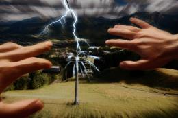 by Nigrechok 4081 views - final score: 53.2% | portrait drama 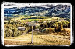 by crissanpablo 6933 views - final score: 52.2% |
Thunderstorms 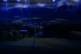 by veody 4775 views - final score: 51.3% | ChistChairs 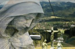 by Panshie 4802 views - final score: 50.7% |
Howdie Guest!
You need to be logged in to rate this entry and participate in the contests!
LOGIN HERE or REGISTER FOR FREE
Photography and photoshop contests
We are a community of people with
a passion for photography, graphics and art in general.
Every day new photoshop
and photography contests are posted to compete in. We also have one weekly drawing contest
and one weekly 3D contest!
Participation is 100% free!
Just
register and get
started!
Good luck!
© 2015 Pxleyes.com. All rights reserved.


Photograph's shadow seems awkward to me, but nice job overall
window to europe!
@kid: any idea why? The shadow for pole looks like that.
very good oob work
that's a good example of thinking outside the box:P
what about the shadow for the cable's and the seats
This image just scares me. Like a dream I once had.
The photo is so thin, it wouldn't have much of a shadow at all....
This concept is a good one, but I think it would be more effective visually if the car going into the photo was brought outside into the "white space" a bit. the partial in and partial out of the frame is distracting from the idea.
except for a couple of blurry spots on the photograph, this one looks visually brilliant.. do get rid of those blurry spots.. gl
I LIKE IT... really is good work AUTHOR.. in my humble opinion.. this would be magnificent in a billboard with an ad in the white space.. "leave your white dimension behind.. etc.. etc.. brilliant.. the tech stuff will happen but the composition an Idea are out of the park.. good job
Nice change of pace. I like the depth too. Great job! The white space area can have all it's own properties...shadows, color etc....since it's separate from Tatra. Very good.
Now you've got two light sources: one for the shadow of the pole and one for the cables...pick one.
good
love the idea, gl author
seems like the images should be blury farther away not close up?
AWESOME ! I LOVE IT!
very good concept!
Good work author!!!!
original
Good work, they would enter the tatra realm, but where are they coming from? My mind is aching!!
good work but if there is no camera blur it will be perfect
nice idea, very creative, good luck!
like the white background and shadows. very cool. maybe the woman+chair is too blurry?-you could just blur the second chair a bit if you cant make the woman clearer. good job!
nice job
Very Nice!
Brilliant idea very well executed!
Nice entry! If I were doing this pic I would hide the base of the pillar. GL!
you did very well, keep going.
Howdie stranger!
If you want to rate this picture or participate in this contest, just:
LOGIN HERE or REGISTER FOR FREE