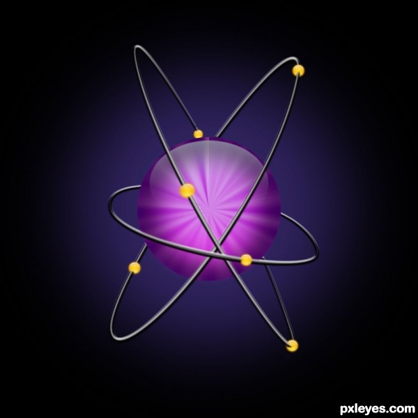
First, I chose the two basic colors I wanted in the nucleus part of the icon and made a gradient from the top of the project to the bottom.
Then I used a wave filter (Filter-Distort-Wave) to create an up and down pattern and then polarized it (Filter-Distort-Polar Coordinates-Rectangular to Polar).
Then I chose the section I wanted for the icon and messed with the color a bit by adding a circle the same size in the background and changing opacity.
Then I created two highlights for the top half of the nucleus and the bottom half. I also applied a few layer styles.
(The nucleus and two highlights are shown separately in the top right corner.)